Dashbuilder is a full featured web application which allows non-technical users to visually create business dashboards. Dashboard data can be extracted from heterogeneous sources of information such as JDBC databases or regular text files.
Some ready-to-use sample dashboards are provided for demo and learning purposes.
Key features:
Visual configuration of dashboards (Drag'n'drop).
Graphical representation of KPIs (Key Performance Indicators).
Configuration of interactive report tables.
Data export to Excel and CSV format.
Filtering and search, both in-memory or SQL based.
Data extraction from external systems, through different protocols.
Granular access control for different user profiles.
Look'n'feel customization tools.
Pluggable chart library architecture.
Chart libraries provided: NVD3 & OFC2.
Target users:
Managers / Business owners. Consumer of dashboards and reports.
IT / System architects. Connectivity and data extraction.
Analysts. Dashboard composition & configuration.
Distribution:
Independent application to deploy in WAR format.
You can get detailed information about how to build the different binary distributions here: https://github.com/droolsjbpm/dashboard-builder/tree/master/builder
If you want to build the project and execute a quick demo, please, proceed as indicated:
Prerequisites:
This guide assumes you have Java JDK 1.6 (set as JAVA_HOME), a Git client and Maven 3.0.5+ (set as MAVEN_HOME) in your system. The java and mvn commands must be added to the executable path as well.
Download the project from the GitHub server:
git clone https://github.com/droolsjbpm/dashboard-builder.git
Open a terminal window, go to the scripts directory and type the following command:
./buildandrun.sh h2
This command compiles, builds and runs the application. This procedure will take a few minutes (but only for the first time) because of the Maven build process needs to download a lot of third-party libraries.
Note
The application uses an auto deployable H2 embedded database. So no extra configuration is needed. But when you start the application for the first time it may take some minutes due to the database initialization procedure. The H2 database downgrades the application performance compared with other databases like PostgreSQL, MySQL, normally used in production environments
Once the application is started, open a browser and type the following URL:
http://localhost:8080/dashbuilder
The login screen will appear. Login as user root and password root. You'll gain access to the default workspace, called Showcase, which contains several sample dashboards as well as some administrative tools.
The following users are available by default:
root/root: to sign-in as the superuser. It's granted with administrative permissions.
demo/demo: to sign-in as an end user. It has only read only permissions.
You'll need to sing-in as superuser in order to be able to create and modify dashboards.
The purpose of this chapter is NOT to provide a full detailed explanation of the tooling, but to guide you through the key steps to get your first dashboards created. The following section will provide basic information about how to configure the system to retrieve information from existing databases or files, create new indicators and manage different dashboards.
For this guide, it's assumed the simple installation has been done, with the standard set of examples and user and role configuration. It's important to notice this configuration MUST NOT be used in production, since it provides default security credentials.
Note
Please, read the previous chapters to figure out how to get the application up and running
The procedure to create a brand new dashboard is pretty simple as we will see in the following sections. That procedure is composed of 3 main stages:
Get the data we want to manipulate.
Create key performance indicators on top of such data.
Create a new dashboard and drag&drop the new KPIs on it.
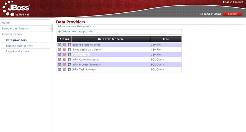
The first thing to do, after you have accessed the web application, is to create a data provider. On the left menu, go to 'Administration > Data providers' and once there, select the option 'Create new data provider'.
The purpose of data providers is to gather information from any system, either a database, a file or any other, and transform it to the internal in-memory representation for building dashboards. As you may guess there exists different data sources and therefore different ways to retrieve as we're going to see next.
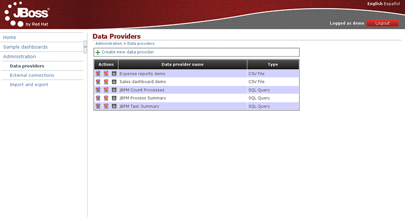
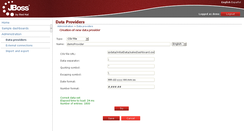
Click on 'Create new data provider'. The following fields will be shown in the form, with some sensible defaults:
Type: in this case - choose the CSV File
Name: Write the name you want to give to our data provider (this field is multi-language).
CSV file URL: Here write the URL where oyur CSV file is located.
As an example you can grab the CSV file used by the Sales Dashboard, just copy & paste the following URL:
https://raw.github.com/droolsjbpm/dashboard-builder/master/modules/dashboard-samples/src/main/webapp/WEB-INF/etc/appdata/initialData/expenseReports.csvData separator: Left as is.
Quoting symbol: Left as is.
Date format: Where we can define different date formats or even hour.
Number format: Where we can define the number format.
Once you have filled all the fields, click on 'Try', to check that everything works properly. The application will give you a message 'Correct data set ...' and we continue by pressing 'Save'.
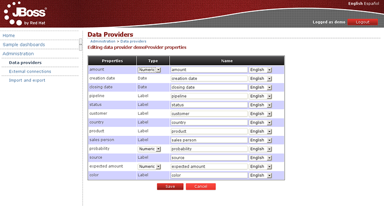
Next, a screen is shown with all the fields found after parsing the file, giving us the option to change the name of each field. For numeric fields it gives us the option to specify if we want numeric values to be treated as labels by the dashboard engine. This is something really useful when dealing with numbers which actually behave as labels, f.i: the numeric reference code of a product item.
After this last step, you can save and finish the creation of your new data provider.
You can create a data provider to query a relational database. Go to Administration > Data providersand click on 'Create new data provider'. Choose the 'SQL Query' option and fill the form with the data provider name and the SQL query that will retrieve the data.
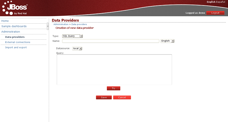
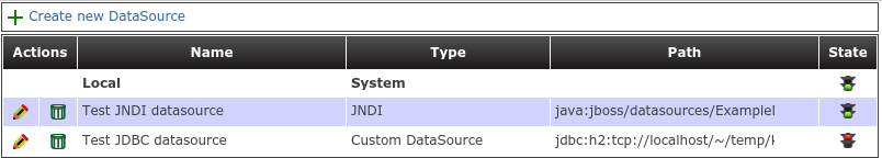
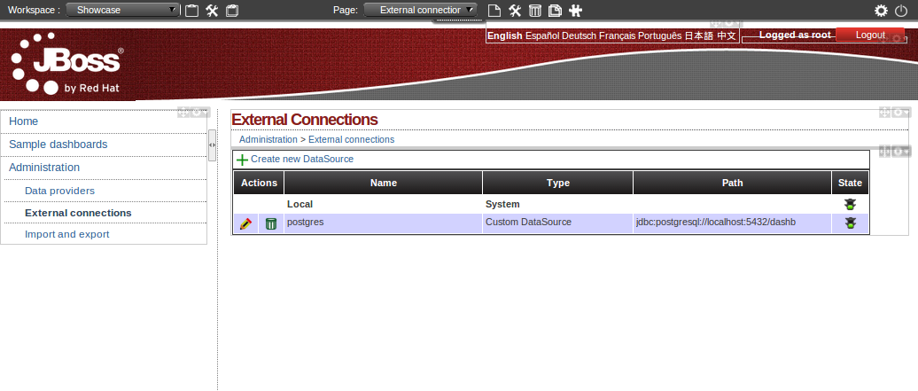
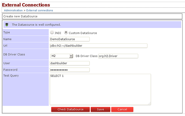
In this form you have the ability to select the data source where the data comes from. By default the local data source is selected but you can define new connections to external data sources. To do this you should go to the 'Administration > External connections' section and from there you can create a new data source connection.
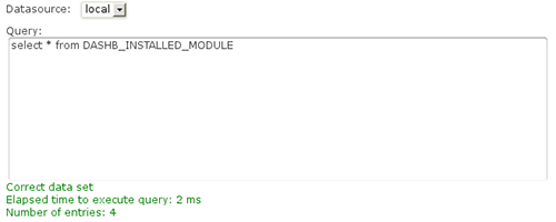
Let's get back to the creation of our SQL data provider. Once the data source has been selected and the query is typed in, you can click on the 'Try' button, and if the query is successful you will get the following message.
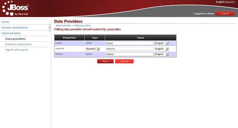
After that, you can rename the name of the properties to provide a more user friendly name.
Finally, just click the 'Save' button to confirm the creation of the data provider:
The previous sections showed how data could be loaded from plain text like CSV files or query from a database connection. When data is small enough, Dashbuilder can handle pretty well the small data sets in memory as far as it doesn't exceed the 2MB size limit. However, must of the time, our data sets are bigger and we can't upload all the data for Dashbuilder to handle it by its own. Is in these cases where database backed queries can help us to implement nice drill down reports and charts without preloading all the data.
Imagine a database containing two tables:
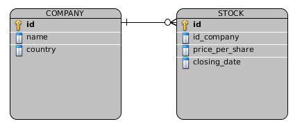
Now, let's take as an example a very simple example of a stock exchange dashboard which is fed from the two tables above. The dashboard displays some indicators about several companies from several countries selling their shares at a given price on every day closing date. The dashboard displays 4 KPIs as you can see in the following screenshot:
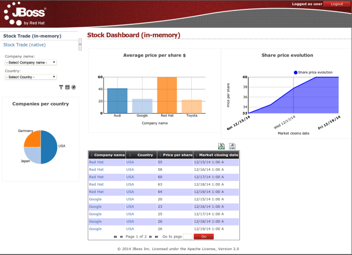
All the indicators are displaying data coming from the two database tables defined above.
Bar chart - Average price per company
Area chart - Sales price evolution
Pie chart - Companies per country
Table report - Stock prices at closing date
What we're going to start discussing next is the two strategies we can use for building a dashboard. This is an important aspect to consider, specially if we're facing big data scenarios.
This strategy consists in creating a data provider which load all the data set rows by executing a single SQL query over the two tables.
    SELECT C.NAME, C.COUNTRY, S.PRICE_PER_SHARE, S.CLOSING_DATE
    FROM COMPANY C JOIN STOCK S ON (C.ID=S.ID_COMPANY)
Every single indicator on the dashboard share the same data set. When filters are executed from the UI no further SQLs are executed since all the calculations are done over the data set in memory.
Pros:
Data integration logic keeps very simple
Only a single data provider is needed
Faster configuration of KPIs since all the data set properties are available at design time
Multiple indicators from a single data provider
Cons:
Can't be applied on medium/large data sets due to poor performance
The native approach consists in having a data provider for every indicator in the dashboard instead of loading an handling all the data set in memory. Every KPI is told what data has to display. Every time the user filters on the dashboard, the SQLs are parsed, injected with the filter values and re-executed. No data is hold in memory, the dashboard is always asking the DB for the data.
The SQL data providers are the following:
Bar chart - Average price per company
          SELECT C.NAME, AVG(S.PRICE_PER_SHARE)
          FROM COMPANY C JOIN STOCK S ON (C.ID=S.ID_COMPANY)
          WHERE {sql_condition, optional, c.country, country}
          AND {sql_condition, optional, c.name, name}
          GROUP BY C.NAME
Area chart - Sales price evolution
          SELECT S.CLOSING_DATE, AVG(S.PRICE_PER_SHARE)
          FROM COMPANY C JOIN STOCK S ON (C.ID=S.ID_COMPANY)
          WHERE {sql_condition, optional, c.country, country}
          AND {sql_condition, optional, c.name, name}
          GROUP BY CLOSING_DATE
Pie chart - Companies per country
          SELECT COUNTRY, COUNT(ID)
          FROM COMPANY
          WHERE {sql_condition, optional, country, country}
          AND {sql_condition, optional, name, name}
          GROUP BY COUNTRY
Table report
          SELECT C.NAME, C.COUNTRY, S.PRICE_PER_SHARE, S.CLOSING_DATE
          FROM COMPANY C JOIN STOCK S ON (C.ID=S.ID_COMPANY)
          WHERE {sql_condition, optional, c.country, country}
          AND {sql_condition, optional, c.name, name}
As you can see every KPI is delegating the filter & group by operations to the database. The filter magic happens thanks to the {sql_condition} statements. Every time a filter occurs in the UI the dashbuilder core gets all the SQL data providers referenced by the KPIs and it parses/injects into those SQLs the current filter selections made by the user. The signature of the sql_condition clause is the following:
{sql_condition, [optional | required], [db column], [filter property]}
where:
- optional: if no filter exists for the given property then the condition is ignored.
- required: if no filter is present then the SQL returns no data.
- db column: the db column where the current filter is applied.
- filter property: the UI property which selected values are taken.
Pros:
- Support for high volumes of data. The database tables need to be properly indexed though.
Cons:
- The set up of the data providers is a little bit more tricky as it requires to create SQL queries with the required filter, group by and sort operations for every KPI.
When designing a dashboard never forget of thinking thoroughly about the origin, type and the volume of the data we want to display in order to go for the right strategy.
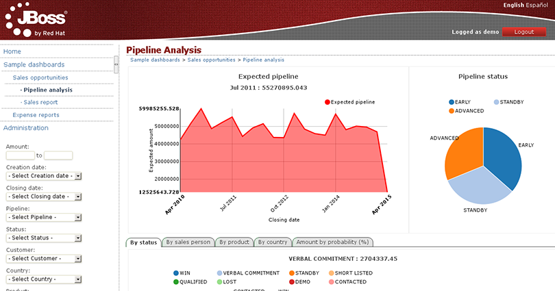
Once the necessary data providers have been created, you can continue by adding a new Key Performance Indicator to an existing page. All dashboards are created by adding indicators and other types of panels to pages. A dashboard is a page with a mixture of different kind of panels placed into it. The following screenshot shows an example of a Sales Dashboard:
Pages can be created from scratch, or duplicating an existing one. Both options are explained in the following sections. Meanwhile we will assume the page already exists and we only want to add an indicator.
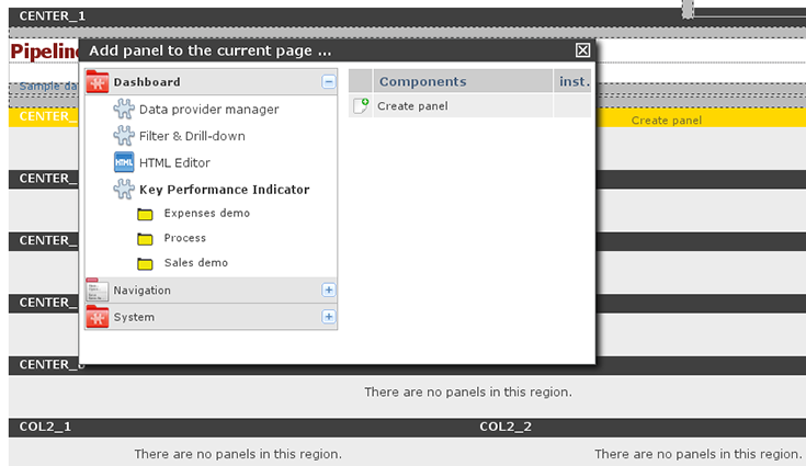
Indicators are a special type of panels, which are the widgets that can be placed within the page. To add a panel or indicator just click on the toolbar icon 'Add panel to the current page':

This will make a popup be shown with all the available panels:
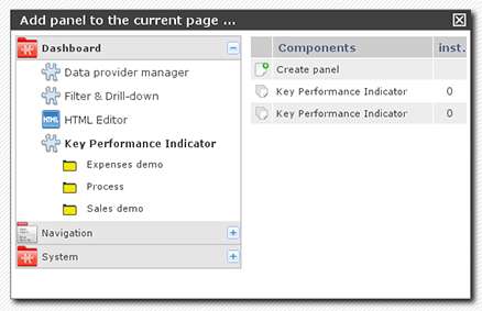
To add a new 'Key Performance Indicator', click onDashboard > Key Perfomance Indicator. Drag the 'Create panel' option and drop it into any of the page regions. You will see that they are being highlighted while you move the mouse over them, then simply drop the panel.
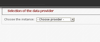
Once dropped, the first step is to select the Data Provider you need to use, as configured before, to feed the charts and reports with data. Select any of the data providers and then you can start creating a new indicator.
Now, you must see the chart edition panel. It's an intuitive environment which helps you configure different type of charts and reports...
|
|
    |
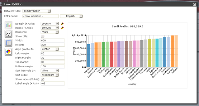
Domain (X Axis): The data column that is taken as the X axis. In this example, we choose the property 'Country'.
Range (Y Axis): Information to be grouped and aggregated for every domain interval. For example: 'Amount'.
Renderer: The rendering library to use. Each one provides different features and visualization style. By default 'NVD3'.
Sort intervals by: It's how the domain values can be sorted, for example, according to its range value.
Sort order: It can be ascending or descending.
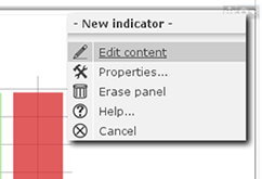
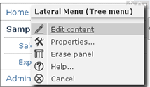
To finish the panel edition just close the panel edition window. If you want to get back again, just click on the right upper corner of the panel area and select the 'Edit content' menu option.
The system provides you with 3 types of chart displayers: bar, pie and line, and a special table displayer very useful to create tabular reports. The system also comes with 2 rendering engines: NVD3 (pure HTML5/SVG technology) and a Flash based one, Open Flash Chart 2. Each renderer has its own available features, so depending on the type of chart and renderer choosen you can end up with some display features enabled or disabled depending the case. For instance, the 'Paint area' feature is not available for OFC2 line charts.
A dashboard is basically a page with some KPIs placed on it (plus some other additional widgets as we will see later on). There are two different ways of creating a page:
Starting as a blank page:

Duplicating an existing page:

You will find these icons at the top of the page, in the administration bar:

To create a new page, click on the 'Create new page' icon:
A form will be shown to fill in some parameters:
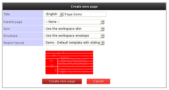
Page title.
Parent page: Pages are organized in a hierarchical way. This is the parent page.
Skin: This will select and specific look'n'feel and CSS stylesheet for this page. You can leave the default value.
Envelope: Defines which kind of HTML template will be placed around the page layout.
Region layout: This is the template, that is, how regions are organized to place the panels inside the page. We can choose any of the installed types, for example, "Demo - Default template with sliding".
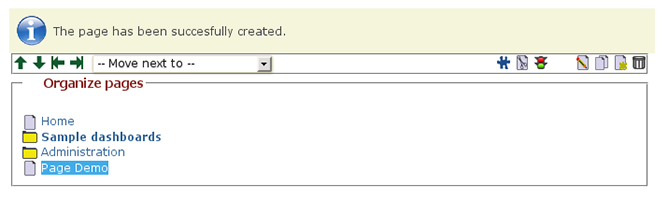
Most of these properties will be discussed in the chapter about 'Customing look'n'feel'. After creating the page, you might realize the page is still not accessible from the left menu but you can see it in the combo list in the administration toolbar:
If you want this page to be shown in the left menu, you can click on 'Edit content' and then add the newly created page to the list of options displayed in the menu.
 |
 |
 |
Repeat until the page has all the content and panels required. After dropping the panels into the right regions and configuring them, you might be able to create dashboards that look like the following one:
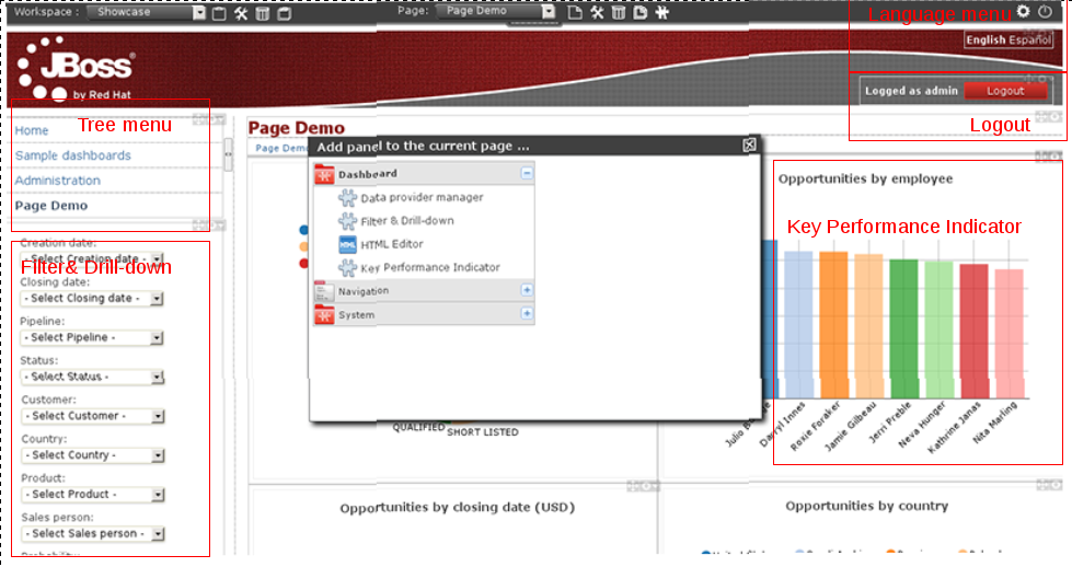
As you can see, a dashboard is usually composed by one or more instances of the following panel types:
Dashboard > Key Performance Indicator
Dashboard > Filter & Drill-down
Navigation > Tree menu
Navigation > Language menu
Navigation > Logout panel
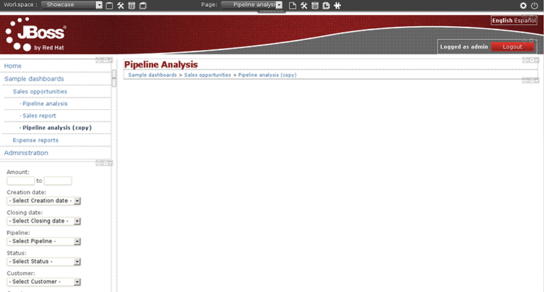
As mentioned earlier, another way to create new pages is to copy an existing one. We can do that via the 'Duplicate current page' icon which is a much faster way to create pages. After clicking on the clone icon located at the toolbar, a page similar to the image below will be shown. From there we can select those instances we want to duplicate and those we want to keep as is (to reuse).
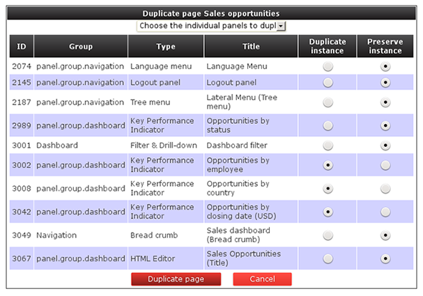
Once finished, press the 'Duplicate page' button and a brand new page will be created with the same name as the original one but starting with the prefix 'Copy of'. Notice that if a panel instance is reused then any changes made to it will be reflected on all the pages where such instance is being used. this is a cool feature when we are defining for instance our navigation menus since we can define a single'Tree menu'panel and then configure all the pages to display the same menu instance.
The 'Filter & Drill-down' panel allows for the quick definition of dynamic forms that will allow us to navigate troughout the data displayed by the dashboard. Once an instance of the 'Filter & Drill-down' panel is dropped on the oage we just have to select the 'Edit content' option from the panel menu. After that, a popup window similar to the following will be displayed:
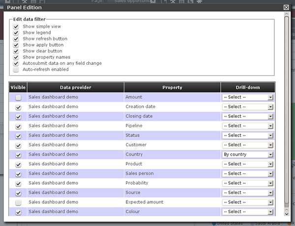
This is a filter configuration panel where we can set the filter behaviour. Let's focus first on the middle bottom part of the screen: the Data provider's property table, which lists the properties of ALL the data providers referred by the KPIs on the page. For example, if we are building a sales dashboard and all its KPIs are built on top of the same data provider called 'Sales dasboard demo' then the system lists all the data properties of the 'Sales dashboard demo ' provider. Hence, only the properties we select as 'Visible' will be part of the filter form. Aditionally, we can enable the drill-down feature for each property. If enabled then the system will redirect to the target page when the property is selected on the filter form. Below is an screenshot of the filter panel of the 'Sales dashboard demo'.
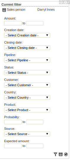
As you can see the form is composed by all the visible properties selected. For each property the system reads its configuration by asking the underlying data provider. For label type properties a drop-down list is displayed, containing as options all the disctinct values of the data provider's column. When the user submits a change on the filter form then the following operations are carried out by the dashboard visualization engine:
It reads the data sets for the target data providers. A data provider is in the target set if it contains the selected filter property.
It applies a filtering algorithm in memory on the target data.
If drill-down is enabled for the selected property then the target page is set as current and the steps #1 and #2 are repeated again.
Finally, after filtering, all the sensible KPIs are updated in order to display the filtered data. By sensible, we mean a KPI which is displaying data that is being filtered.
When we talk about security we refer to the ability to define authorization policies in order to grant or deny users access to a given resource. Therefore, we first have to define who are the target users and what are the resources we want to protect. As resources we have the following:
Workspace: A set of pages with a shared look and feel. It may contain one or more dashboards.
Page: A combination of panels spread all over the screen and tidy up according to a given layout. A dashboard is basically a page used for monitoring a set of indicators.
Panel: A reusable and configurable graphical component ready to be embedded and used. f.i: a KPI panel, a tree menu panel or an HTML panel.
As of users, the application doesn't own a user repository. Users are managed outside the application. This means the login itself is delegated to the application server. After login, the application server pass to the application both the id of the user and the roles he/she has. The full list of available roles are defined into the application's WEB-INF/web.xml file.
Let's see next how to define custom authorization policies to grant/deny access to a workspaces, pages or panels instances per role.
Below is a screenshot of the permission management screen for a given workspace:
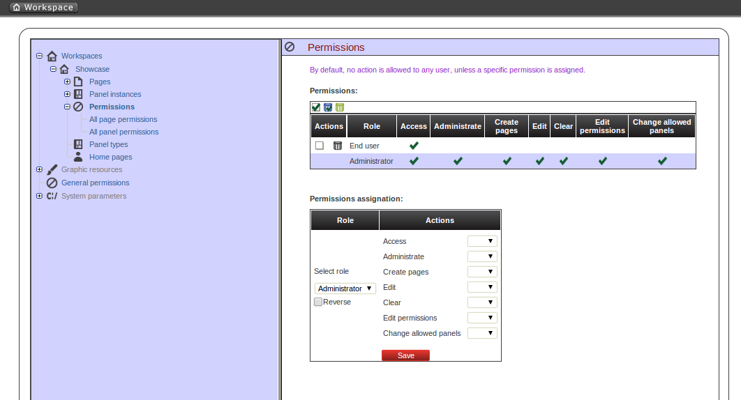
The list of allowed actions are:
Access: login into the application.
Administrate: access to the toolbar and hence to the whole system configuration features.
Create pages
Edit: change the workspace properties.
Clear: ability to delete the workspace.
Edit permissions: ability to grant/deny permissions.
Change allowed panels: restrict the type of panels that can be used in this workspace.
To assign a permission you must select the target role and the list of actions allowed over the selected resource.
Target roles (who): What user will be granted/denied with the permissions defined.
Allowed actions: depending on the type of the resource we can enable/disable what the user can do on this resource.
Reverse (optional): very useful when we have a set of roles and we want to grant/deny a permission to all the roles but one.
The above description is the common way to specify a permission regardless of its type. It applies to the definition of permissions for workspaces, pages and panels.
As you can see in the previous figure, the system grants by default the full set of permissions to the role 'admin'. That way it becomes very easy to create a user that can do everything as long as the role admin is assigned.
Below is a screenshot of the permission management screen for a given page:
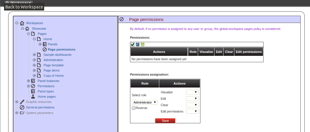
The list of allowed actions are:
Visualize: make the page visible.
Edit: change the page properties.
Clear: Ability to delete the page.
Edit permissions: ability to grant/deny permissions for this page.
Below is a screenshot of the permission management screen for a given panel:
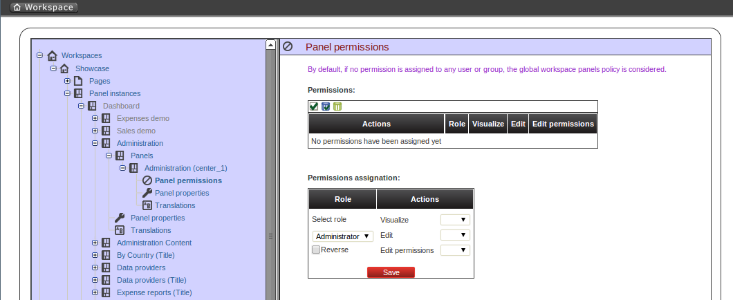
The list of allowed actions are:
Visualize: make the panel visible.
Edit: change the panel properties.
Edit permissions: ability to grant/deny permissions for this panel.
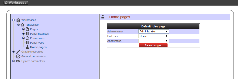
The home page is the page the user will be redirected after initializing its session. In order to get the appropriate home page for the user the security subsystem carries out the following tasks:
Just after login the security subsystem get the roles of the users and evaluates what workspaces the user is allowed to enter ('Access' action granted)
Once the list of workspace is calculated then the system selects the workspace identified as default (see workspace properties), if any then get the first in the list.
The home page settings are read for the target role and workspace. The system evaluates if the specified home page is visible for the user ('View' action granted). If not then the system takes the first visible page from the full list of pages in the workspace. The following screenshot shows the home page configuration screen.
To wrap up, it's worth to mention that thanks to the permission system we can build a workspace structure with several pages, menus and panels and start defining what pages and panels within a page will be visible for each role. We can also define special kind of users and give them restricted access to certain tooling features or even restricted access to a page subset. The chances here are infinite.
There exist three types of graphic resources.
Skin: CSS style sheet, images and action icons that serve to change the overall look and feel of the workspace.
Layout: JSP page template composed by predefined regions, where each region is intended to hold a panel.
Envelope: JSP page template which defines the content that will wrap the whole page.
You can handle all these components from the administration console, under the node 'Graphic resources' and create/modify them in order to fully customize the look and feel of your dashboards.
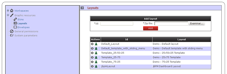
Each graphic resource is packaged in a file. Zip file which content varies depending on the type of component. Nonetheless, the structure of the management screen is the same regardless of the type of the resource being handled. As we can see on the screen, the upload form is composed by two fields:
ID: a unique identifier. If you just want to update existing resource you just have to copy its id.
Zip file: file coming from the user local file system containing the definition of the component and its resources.
Each zip comes with a definition file which name varies depending on the type:envelope.properties, skin.properties or layout.properties. This property file have two distinct parts:
Name of the item in different languages, to which is added a line in the following format:
name.<idiom abbreviation(es, en, ca)> = Name of the resource in that language
List of static resources associated with the component:
resource.<resource_id>= Path relative to the zip file.
Example 4.1. Example of a skin.properties descriptor
      # Name
      name.en=Default skin
      name.es=Skin por defecto

      # CSS
      resource.CSS=styles/default.css

      # Icons
      resource.BULLET=images/bullet.gif
      resource.CLOSE=images/close.gif
      resource.DOWN=images/down.gif
      resource.EDIT_MODE=images/edit_mode.gif
      resource.HEADER_BG=images/header_bg.gif
      resource.HEADER_LEFT=images/header_left.gif
      resource.HEADER_RIGHT=images/header_right.gif
      resource.ICO_HELP=images/ayuda.gif
      resource.LEFT=images/left.gif
      resource.MAXIMIZE=images/maximice.gif
      resource.MINIMIZE=images/minimice.gif
      resource.PROPERTIES=images/properties.gif
      resource.REFRESH=images/refresh.gif
      resource.RESOURCES_MODE=images/resources_mode.gif
      resource.RESTORE=images/restore.gif
      resource.RIGHT=images/right.gif
      resource.SHOW=images/show.gif
      resource.UP=images/up.gif
The easiest way to create a brand new skin, envelope or page layout is to download an existing one, unzip/modify it and finally upload the new zip as a new resource. The management of graphic resources can be carried out by a graphical designer who shall not require the presence of a technician to do their job.
Despite Dashbuilder is an standalone dashboard composition tooling, integration with external systems might be required. For instance:
Imagine a third-party web app which relies on Dashbuilder to provide the monitoring capabilities. The web app requires to embed a chart into one of its pages. This would be an example of content syndication.
Imagine also another application which want to push/pull data from Dashbuilder. A SAP system, for instance, which want to push a new purchase order to an specific Dashbuilder data provider, or a external alert management system which requires to evaluate the current value for a given KPI.
These and many others are examples of integration uses cases. This chapter walks through the different mechanisms that Dashbuilder provides in that direction.
Dashbuilder provides the ability to embed dashboard charts into your own web app via a lightweight easy to use JavaScript API. Once a dashboard is built, it's possible to pick up any KPI and paste it into any web application.
The following HTML sample page shows how to achieve so.And this is how the HTML looks after being processed by the browser:
    <html>

      <head>

        <title>Dashbuilder Javascript API</title>

        <script src="http://localhost:8080/dashbuilder/js-api/dashbuilder-1.0.0.js"></script>

        <style type="text/css">

          .code {

            padding:10px;

            background-color: rgb(248, 248, 248);

            border-color: rgb(221, 221, 221);

            border-radius: 3px;

            border-style: solid;

            box-sizing: border-box;

            color: rgb(51, 51, 51);

            font-weight: normal;

          }

        </style>

      </head>

      <body onload="embedCharts();">

        <h1>How to embed KPIs in your own application</h1>

        This is a very simple layout that demonstrates how charts can be embedded with the following Javascript code:

        <br/><br/>

        <span class="code">dashbuilder_embed_chart('chart1', 'http://localhost:8080/dashbuilder', 'kpi_30011353503663716', 600, 350);</span>

        <br/><br/><br/>


        <!-- Very simple layout with charts -->

        <table border="0" cellpadding="5" >

          <tr>

            <td id="chart1"></td>

            <td id="chart2"></td>

          </tr>

          <tr>

            <td id="chart3"></td>

            <td id="chart4"></td>

          </tr>

        </table>

        <!-- End of charts -->


        Click <a href="#" onclick="embedCharts(); return false;">here</a> to reset the current filter criteria.


        <script type="text/javascript">

          function embedCharts() {

            var dashbuilderUrl = 'http://localhost:8080/dashbuilder';

            dashbuilder_embed_chart('chart1', dashbuilderUrl, 'kpi_30301353506280659', 600, 350);

            dashbuilder_embed_chart('chart2', dashbuilderUrl, 'kpi_30041353504912610', 600, 350);

            dashbuilder_embed_chart('chart3', dashbuilderUrl, 'kpi_30441353507392054', 600, 350);

            dashbuilder_embed_chart('chart4', dashbuilderUrl, 'kpi_30251353675275870', 600, 350);

          }

        </script>

      </body>

    </html>

As you can see in the source code of the example, all the KPIs are embedded using the following API call:
dashbuilder_embed_chart(chartId, dashbuilderUrl, kpiId, width, height);
chartId: It's the id of the HTML element where the KPI will be inserted.
dashbuilderUrl: The fully qualified URL of the Dashbuilder app.
kpiId: The identifier of the KPI (provided by the Dashbuilder app). It can be obtained by editing the KPI panel from the Dashbuilder UI. Just go to the dashboard where the KPI is placed, edit the panel (admin rights required) and copy & paste the KPI id (see the image below).
width/height: The total size of the display area used to render the KPI.

Dashbuilder provides import and export functionality in order to move application assets between environments.
These assets can be:
Workspaces: By exporting and importing workspaces you can move your set of pages with a given look and feel between installations.
Key performance indicators and data providers:: By exporting and importing KPIs you can move your indicators and its data providers between installations.
Data sources: By exporting and importing data sources you can move your external connection configurations between installations.
In general, asset exportation must be done using the Web User Interface. There exist a panel for exporting each type of asset.
On the other hand, asset importation can be done in two ways:
Using the Web User Interface.
There exist panels for importing each type of asset.
Using the Deployment Scanner.
It allows to place your exported assets in a given folder inside the web application. Once application is starting, it scans the deployment folder and import the assets found.
Using the Deployment Scanner allows for the automatic deployment of assets on application start up time and does not requires the user intervention either.
It's important to note that assets are imported only at deploy time, not during application runtime.
The following sections describe how to perform import and export for each kind of asset.
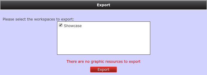
Workspace import & export allows you to move one or more workspaces to other JBoss Dashbuilder installations.
The import & export of a given workspace implies moving:
Envelope: The envelope currently used by the workspace.
Sections: All the sections that compose the workspace.
Panels: All the panels used in the workspace sections.
In order to export a workspace there exist a panel named Export workspaces.
It lists all the existing workspaces in the application and allows to export one or more workspace definitions in a single XML file. Note that for versions previous to 6.2.0 the workspaces were exported in ZIP format.
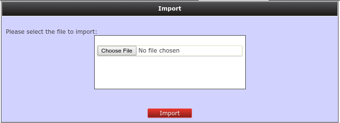
In order to import a workspace you can do it in two ways:
Using the Web User Interface.
It allows to upload a XML file that contain one or more workspace definitions. A ZIP file containing some workspace definitions in XML format is allowed too for backwards compatibility.
Using the Deployment Scanner.
Just by dropping the workspace definition files into the folder WEB-INF/deployments. Once application is starting, it scans ths deployment folder and import all the workspaces found.
Some important notes about automatic workspace importation using the deployment scanner:
Workspaces are imported once and only at deploy time, not during application runtime
The XML workspace definition file must have extension workspace. Eg: my-workspace.workspace
If the workspace to import already exists (same workspace logic identifier), it will be overwritten.
You can overwrite existing workspaces by adding a workspace definition file in the deployment folder with a different name that the initial one. For example, initially you deploy a my-workspace.workspace file into the system, which contains a workspace with my-workspace as identifier. Then if you want to overwrite it, you can place a new file in the deployment folder named my-workspace-v2.workspace using same my-workspace identifier.
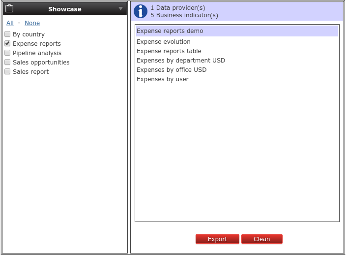
Workspace import & export allows you to move your KPI and its data providers to other JBoss Dashbuilder installations.
The import & export of a given KPI implies moving:
KPI definition: The type of KPI, its columns and its display configuration.
Data provider: The data provider definition that is used in the KPI.
In order to export a KPI there exist a panel named Export dashboards.
It lists all the existing KPI in the application and allows you to export one or more KPI definitions in a single XML file.
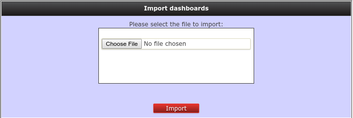
In order to import a KPI you can do it in two ways:
Using the Web User Interface.
It allows to upload a XML file that contain one or more KPI definitions.
Using the Deployment Scanner.
Just by dropping the exported KPI definition files into the folder WEB-INF/deployments. Once the application starts, it will scan the deployment folder and will import all the KPIs files found.
Some important notes about automatic KPI importation using the Deployment Scanner:
KPI and data providers are imported once and only at deploy time, not during application runtime
The XML KPI definition file must have the extension kpis. Eg: my-kpis.kpis
If the KPI or data provider definitions to import already exist (same logic identifier), they will be overwritten.
You can overwrite existing KPI or data provider by adding a new definition file in the deployment folder with a different name that the initial one. For example, initially you deploy a my-kpi.kpis file into the system, which contains a KPI with my-kpi as identifier. Then if you want to overwrite it, you can place a new file in the deployment folder named my-kpi-v2.kpis using same my-kpi identifier.
Data source import export allows you to import one or more data source connection definitions into a JBoss Dashbuilder installation.
Data source exportation is not supported yet, there is no panel for exporting them.
In order to import a data source you can do it in two ways:
Manually using the Web User Interface.
Data source definitions are composed by not so many attributes, so an option is to create them in your target environment manually by using the Data source manager panel.
Using the Deployment Scanner.
Just by dropping the data source definition files into the folder WEB-INF/deployments. Once application is starting, it scans ths deployment folder and import all the workspaces found.
Data source definition files are property files with the following supported properties:
Common properties for all kind of data sources.
type: The type of the data source. It can be JNDI or JDBC.
name: The data source name.
testQuery: Defines a query for testing the data source when instantiated.
Properties for a JDBC data source.
jdbcUrl: The JDBC URL for the connection.
driverClass: The fully qualified class name of the driver to use.
user: The connection username.
password: The connection password.
Example 6.1. Example of a JDBC data source descriptor
              type=JDBC
              name=myCompanyDataSource
              testQuery=SELECT count(*) FROM CUSTOMER
              jdbcUrl=jdbc:postgresql://mydomain.com:5432/mycompany
              driverClass=org.postgresorg.postgresql.Driver
              user=system
              password=dba
Properties for a JNDI data source.
jndiPath: The JNDI path for the data source bean.
Example 6.2. Example of a JNDI data source descriptor
              type=JNDI
              name=myCompanyDataSource
              testQuery=SELECT count(*) FROM CUSTOMER
              jndiPath=java:comp/env/jdbc/mycompany
Some important notes about automatic data source importation using the deployment scanner:
Data sources are imported once and only at deploy time, not during application runtime
The properties data source definition file must have extension datasource. Eg: my-datasource.datasource
If the data source definition to import already exist (same name), it will be overwritten.
You can overwrite existing data sources by adding a new definition file in the deployment folder with a different name that the initial one. For example, initially you deploy a my-datasource.datasource file into the system, which contains a data source with my-datasource as name. Then if you want to overwrite it, you can place a new file in the deployment folder named my-datasource-v2.datasource using same my-datasource identifier.