Create new RichFaces Documentation Jira issue

This will launch the RichFaces Jira page - to complete your feedback please login if needed, and submit the Jira.
JBoss.orgCommunity Documentation
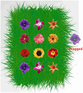
This component defines a subtree of the component tree as draggable for drag-and-drop operations. Within such a "drag zone," you can click the mouse button on an item and drag it to any component that supports drop operations (a "drop zone"). It encodes all the necessary JavaScript for supporting drag-and-drop operations.
Encodes all necessary JavaScript to perform drag actions
Can be used within any component type that provides the required properties for drag operations
Supports drag-and-drop between different forms
The dragSupport tag inside a component completely specifies the events and JavaScript required to use the component and it's children for dragging as part of a drag-and-drop operation. In order to work, though, dragSupport must be placed inside a wrapper component that outputs child components and that has the right events defined on it. Thus, this example won't work, because the <h:column> tag doesn't provide the necessary properties for redefining events on the client:
Example:
...

<h:column>

        <rich:dragSupport dragIndicator=":form:iii" dragType="text">

                <a4j:actionparam value="#{caps.name}" name="name"/>

        </rich:dragSupport>

        <h:outputText value="#{caps.name}"/>

</h:column>

...
However, using a4j:outputPanel as a wrapper inside <h:column> , the following code could be used successfully:
Example:
...

<h:column>

        <a4j:outputPanel>

                <rich:dragSupport dragIndicator=":form:iii" dragType="text">

                        <a4j:actionparam value="#{caps.name}" name="name"/>

                </rich:dragSupport>

                <h:outputText value="#{caps.name}"/>

        </a4j:outputPanel>

</h:column>

...
This code makes all rows of this column draggable.
One of the main attributes for dragSupport is "dragType" , which associates a name with the drag zone. Only drop zones with this name as an acceptable type can be used in drag-and-drop operations. Here is an example:
Example:
...

<h:panelGrid id="drag1">

        <rich:dragSupport dragType="singleItems" .../>

        <!--Some content to be dragged-->

</h:panelGrid>

...

<h:panelGrid id="drag2">

        <rich:dragSupport dragType="groups" .../>

        <!--Some content to be dragged-->

</h:panelGrid>

...

<h:panelGrid id="drop1">

        <rich:dropSupport acceptedTypes="singleItems" .../>

        <!--Drop zone content-->

</h:panelGrid>

...
In this example, the
drop1
panel grid is a drop zone that invokes drag-and-drop for
drops of items from the first
drag1
panel grid, but not the second
drag2
panel grid. In the section about
dropSupport
, you will find an example that shows more detailed
information about moving data between tables with drag and
drop.
The dragSupport component also has a "value" attribute for passing data into the processing after a drop event.
One more important attribute for <rich:dragSupport> is the "dragIndicator" attribute that point to the component id of the <rich:dragIndicator> component to be used for dragged items from this drag zone. If it isn't defined, a default indicator for drag operations is used.
Finally, the component has the following extra attributes for event processing on the client:
"ondragstart"
"ondragend"
You can use your own custom JavaScript functions to handle these events.
If you define width for a outputPanel, in Internet Explorer 6 you can perform a drag and drop operation, placing the mouse cursor on the text in the outputPanel only.
Table of <rich:dragSupport> attributes.
Table 6.69. Component Identification Parameters
| Name | Value |
|---|---|
| component-type | org.richfaces.DragSupport |
| component-class | org.richfaces.component.html.HtmlDragSupport |
| component-family | org.richfaces.DragSupport |
| renderer-type | org.richfaces.DragSupportRenderer |
| tag-class | org.richfaces.taglib.DragSupportTag |
On the component Live Demo page you can see the example of <rich:dragSupport> usage and sources for the given example.