When creating a site to be responsive, it is important to configure a couple of important options in order for it to work properly:
Portal Skin
The portal skin must be a skin which does not have a fixed width. If the skin uses a fixed width, like the classic skin, it will not adapt to the browser size. The 'Responsive Skin' included in GateIn Portal uses a fluid width and adapts to the portal. This skin also includes updated css to make many of the various portal components responsive as well. It is recommended to use this skin or to base a custom skin off of the 'Responsive Skin'. 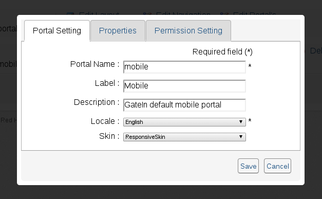
Viewport
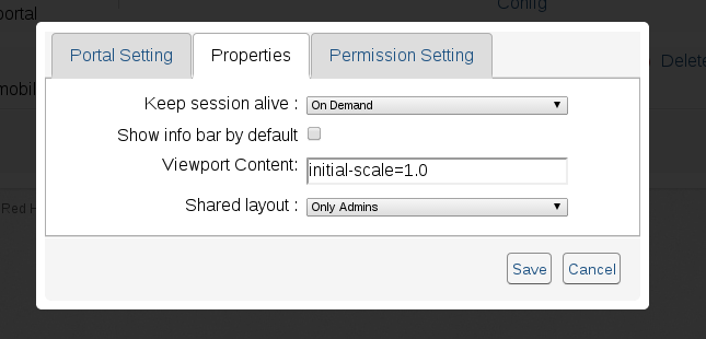
Setting the viewport allows for the site to specify how the site should be loaded in a mobile browser. Among other things it specifies things like the site's width/height, initial zoom level and what zoom levels are permitted. By not specifying the viewport, the site may be rendered at a fixed width instead of adapting to the screen size. The default value used in the 'Mobile' site is 'initial-scale=1.0' which specifies that the page should be rendered to its screen size while still allowing the user to zoom into the page if needed.
The viewport is specified as the portal property 'Viewport Content', the value specified here will set the viewport meta tag for the site.
Mobile Template
If you wish to pre-populate your site with the same layout and portlets that are available on the mobile site, this can be accomplished by using the 'mobile portal template' when you create the portal. 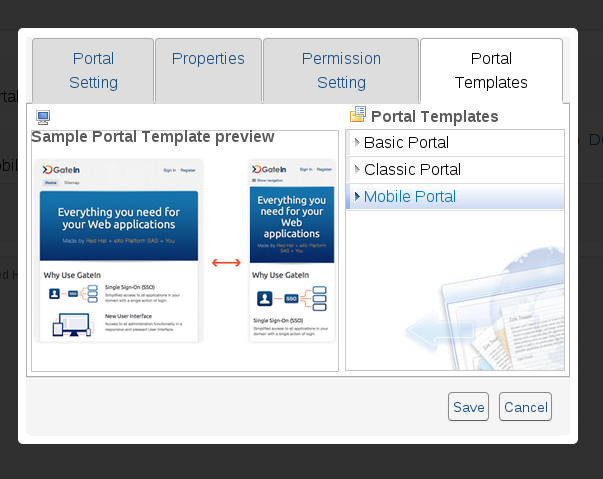
Responsive Portlets
In order to have a properly responsive site, your site is going to have to use responsive portlets. This includes using the responsive portlets which are included with GateIn as well as ensuring that any custom or thirdparty portlets are also responsive and will work with a non-fixed width layout. The next section explains how to create responsive portlets.
Portlet Layout
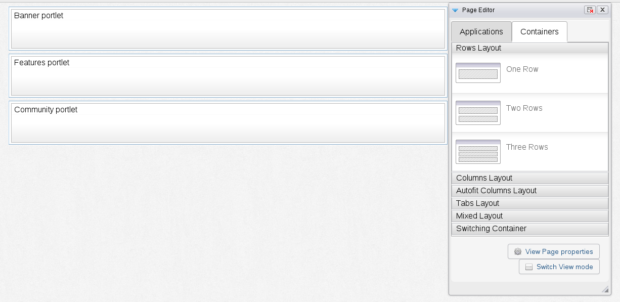
The only containers which will work with responsive portlets properly are the row layouts. This allows one portlet per line and allows the portlet to more easily adapt to the width of the browser.