NOTE: since this page was written, we have adopted the d3 charting library. More detail available at :d3 Charts
We have a few options on chart libraries to use with the new GWT UI. I've already done the basic integration with GFlot (uses flot underneath). This gives us charts that are drawn on the browser with javascript on a browser canvas and even let's me do real-time graphing of live metrics (last 60 seconds updated every second). The nice thing is that they load quick and their interactive. This gives you mouse over's that show you the value for a given point. I really like being able to get specific values. Flot maintains very good browser backward compatibility because they utilize iecanavas as well.
Requirements
-
Load and render fast
-
Interactive mouse overs to get specific data points
-
Multiple series per graph
-
Good time series display
-
Proper value formatting integration
-
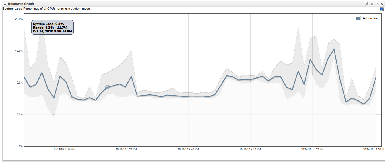
Display of value ranges (hi-low charts or range charts)
-
In summary charts, its very useful to see the, on a per time slice basis, the hi-lo bar with the "dot" in the middle for the average. Would like similar functionality.
GFlot - http://delicias.dia.fi.upm.es/~aleon/gflot-demo/GFlotDemo.html
GFlot is ok, but it doesn't have hi-lo charts nor range charts...
Does have dynamic charts
OpenFlashCharts - http://teethgrinder.co.uk/open-flash-chart-2/line-charts-menu.php
OpenFlashCharts is nice, interactive, even animated... but given the choice these days I'd prefer javascript canvases over flash.
Dygraphs - http://www.danvk.org/dygraphs/
Nice, but no current gwt wrapper
Nice range charts with translucent areas for the ranges
gRaphael - http://g.raphaeljs.com/
Nice line charts
Would be interested in the punchcard chart for event or other data
JavaScript InfoVis - http://thejit.org/demos/
Not for our primary charts... but some nice visualizations for other things perhaps
Protovis - http://vis.stanford.edu/protovis/ex/
Some very interesting visualizations and graphs as well
A case against candlestick charts
We have a couple of problems with our usage of candlestick charts. We use them as a mechanism to show summarized data indicating the average, min and max for a period of time. We do this because charting too many points is not useful to visual understanding, but we don't want to lose out on the top and bottom range information. Our metrics are often not continuous metrics (i.e. the sequence of data is not important, but the ranges and averages are)
Candlestick charts, on the other hand, are really designed to show information about continuous metrics. A candlestick chart that everyone is used to seeing shows stock price values and includes the starting value, max value, min value and ending value for a particular range. While it is also an attempt to summarize data over a period, the sequence of values *is* important.
The other main problem is that our time "buckets" are arbitrary periods dependent on when someone is looking at the data. If I look at the last 60 minutes of data and want 60 buckets, then my time periods start from the request of data and go backward. If I then request the same chart 30 seconds later, my buckets will be on the half minute interval compared to the previous chart. This can lead to the same data effectively "looking" different depending on when i request the chart and look at the data. It can lead to wild swings in the bucket interval ranges even though the same data is being presented.
For the above reasons, I propose that range charts are a more accurate model for display summarized timeseries datasets of our typical metric data. While there isn't much in the way of nice gwt-integrated charting that can do this, dygraphs above could be jsni integrated or i've built a version of this using gflot that you can see below. 