Core UI Changes
Introduction
This page is here to evaluate the current rhq UI as it serves the goals of the Perspectives Subsystem. The below are some changes that should be made to ensure a better default user experience and to accommodate the experience we hope the Perspectives Service will provide. This is by no means a canonical list of improvements that could be made to rhq, but rather a short list of some high priority changes that will help the current UI given current schedules and resources.
A more rhq-specific evaluation from March 2009 is available here: http://productdesign.usersys.redhat.com/wiki/JON_Usability_Review
This is page is still a work in progress.
Additions
The following are UI elements that are currently missing from the rhq UI:
Right panel (See A more detailed spec )
-
In order to encourage a more tasked-based workflow, it is necessary to have some space on the page for tasks to live. A right panel is a helpful place to put things like basic tasks or other shortcuts. These could change page to page, or remain consistent across the interface, tailored instead to an individual perspective. Regarding real estate, there would be a sacrifice in horizontal space, but this problem could be solved if we removed the tree menu or made it collapsible.
-
Example right panel use from Fedora: http://admin.fedoraproject.org/community
-
Example right panel use from the outside world: http://www.facebook.com
-
Notice here how facebook uses both left and right panels and still has enough space for a lot of content in the middle
-
Example right panel in competitive product: Microsoft System Center
-
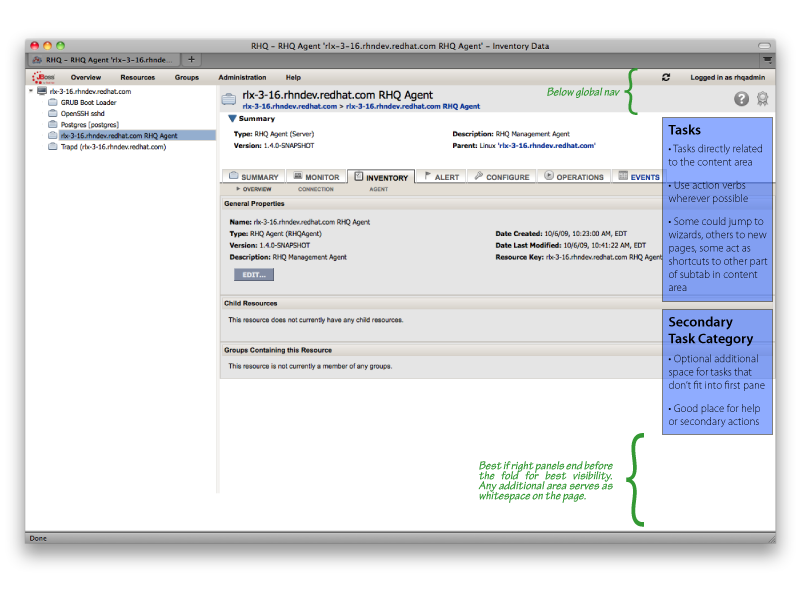
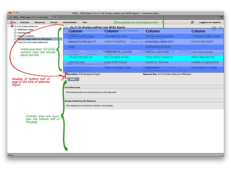
Table module that can integrate into a larger page
-
Given that a user could potentially be dealing with very large collections of objects, tables become very important. Right now, list views are not something rhq does particularly well. The page that comes to mind is the Resources view, which throws the user out of context by forcing him to find his object of interest on a separate page from the place where he will perform actions. In order to keep tasks in focus, it is important to be able to list large groups of objects with details in the context in which they will be manipulated. A select-detail model should really help users run through actions and objects quickly.
-
Example list view use from Red Hat (draft copy): http://productdesign.usersys.redhat.com/wiki/Image:Host_network.jpg
-
Example list view use from the outside world: Think of any desktop mail client (tbird, evo, Outlook, etc)
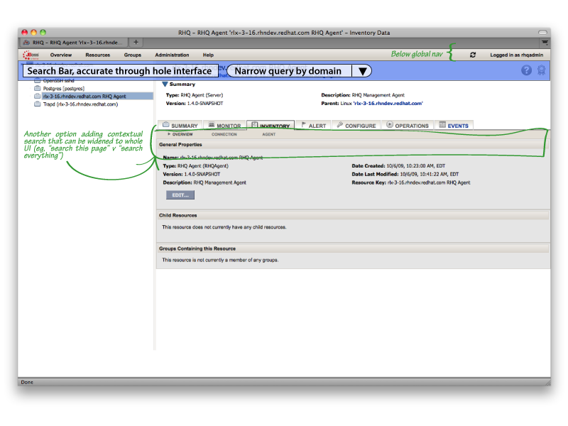
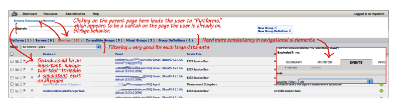
Powerful search capability
-
Given the complexity of this product(s), It is important to give the user the tools to quickly sort through a lot of data. RHEV-M has used a powerful search-based interface to great success, and some similar search elements would likely prove equally successful in the new RHQ interface. The diagram shows two options, a global search and a more local one. It is imoportant to view these as either/or options; no one wants to choose between several search boxes on the same screen. My leaning at the moment is for a full-on global search.
-
Example search use from Red Hat: RHEV-M
-
Example search use from the outside world: http://www.barnesandnoble.com
-
Existing Weak Points
The following are existent UI elements in rhq that need significant improvement in order for the default experience to be satisfactory:
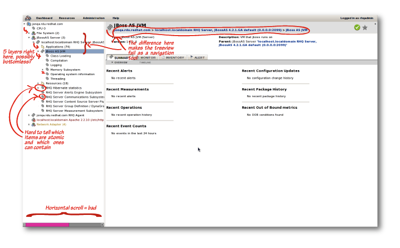
Treeview (See A more detailed spec )
-
The Treeview panel on the left side of the rhq UI currently acts more as an obstacle than an aid to a new user. It has a lot of extra noise the user has to sort through, suggests hierarchy relationships that are not mirrored in the breadcrumbs, has small hit areas on the entries, and generally acts as an obstacle for the user to overcome. For the default experience on the Core UI to be acceptable for future use cases, this element needs to undergo some improvements, if not get removed entirely.
-
A few possible improvements
-
Replace entirely
-
Reorder or categorize better
-
Put a cap on the tree depth (preferably <3)
-
Trim down contents to things a user would actually manipulate
-
More consistent iconography: make clearer which object types can contain others and which are atomic units, better delineate object types, etc
-
-
More comments on the Treeview from the 3/09 UX review: http://productdesign.usersys.redhat.com/wiki/JON_Usability_Review/Areas_of_Need/Treeview
Dashboard - the Default Landing Page
What is a dashboard and why do we need it?
-
A dashboard offers a single view of complexity. For example, a page that provides an at-a-glance summary of the health/activity of all the systems the user is interested in.
-
For most users, the most important element of a dashboard is alerts, since responding to problems is usually the most important task for a user. Highest priority alerts should be elevated, not lost in a huge log. The user should have an immediate idea of what systems or applications need attention and an immediate way to navigate to more details.
-
Navigation from a Dashboard should be offered in many places via drilldowns, which are simply links to more detail about an item.
-
It should suggest to the user where he might wish to go next, what actions should be performed next
-
It should be highly customizable so that it can serve the needs of diverse users with highly specific domain needs.
-
The dashboard should be the first page the user lands on after login
dashboard.do in the current RHQ UI (navigate to this page via the Overview menu.)
-
Dashboard.do is the closest thing to a useful dashboard in the existing RHQ ui, however it is not used frequently in the current rhq and adds little value becasue
-
it is not the default landing page - it is not immediately accessible and is somewhat hidden under the Overview menu
-
less critically, It doesn't quite show the right information
-
More comments on the dashboard from the 3/09 UX review: http://productdesign.usersys.redhat.com/wiki/JON_Usability_Review/Areas_of_Need/Dashboard
-
-
Functionally, the existing page has the right structure and reasonable customizability (user can move things around, remove things, configure things). It is a little unclear how to add things but presumably this is possible.
-
It seems reasonable that we can base the new dashboard on Dashborad.do. If not, the improved dashboard should at least replace it.
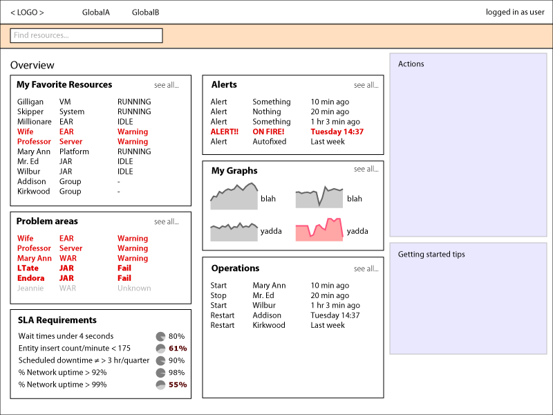
New Dashboard
As a user of any type, I want to arrive at the dashboard and get a good feel for the health of my objects of interest after a cursory look at the page.
Some example information helpful to have on a dashboard
-
More graphs than words (this should be at-a-glance info)
-
Shortcuts to key actions for the application (see Right panel, above)
-
Summary of applications on rhq and their respective health
-
Summary of recent alerts activated, prioritizing the most important ones
-
Maybe some sort of summary of systems, or recent operations to the eap instance, or any other summary of managed data
-
All content narrowed down by user access/role
-
While there should be affordance for some customization on the end user's part ("Add to my dashboard"), this need not be the core of the dashboard experience, which needs to survive on sensible defaults, based on the user role.
Structurally, the dashboard is a layout of boxes or portlets. Each box can be a discrete part and can show some relevant information about one or more items. For example a box may show a graph for one machine I really care about, another lists all alerts for my clusters. The current Dashboard.do page generally succeeds at this pattern.
Boxes seem like an obvious extension point. Thus perspectives could provide any number of boxes to the dashboard page directly, or define available boxes. For example, the user opens a picker to choose which boxes they want to add to the Dashboard. Boxes available to add would depend on thier role (via perspectives).
Below is an example of the new dashboard page. In the main content area is a number of boxes, showing different types of summaries, graphs, alerts. The exact boxes and the contents of these boxes are determined by what the user has access to, what kind of info they care about, all determined by any number of perspectives taht together contribute to build this view. On the right pane there are areas for high level global actions and some links to user assistance.
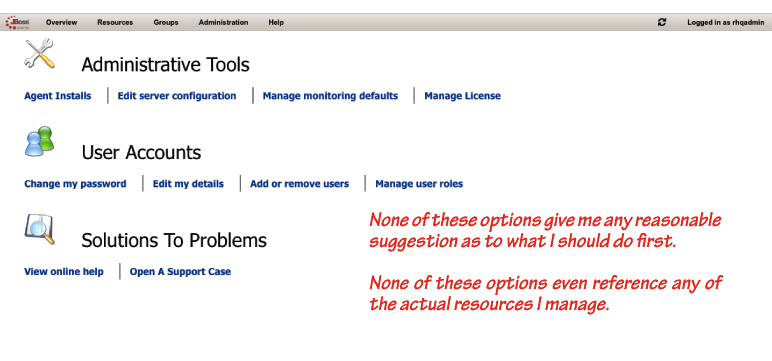
Notes on the existing default landing page
This page adds little value and at best is annoying; at worst it adds confusion about what to do next. The first page the user sees should at least suggest a helpful direction for the user to go to. This page should be replaced by the redesigned dashboard described above. Some of that tasks listed here may make their appearance in the right panel in the updated Dashboard. More comments on the landing page from the 3/09 UX review: http://productdesign.usersys.redhat.com/wiki/JON_Usability_Review/Areas_of_Need/Landing_Page
FIXME Breadcrumbs/Navigation
-
Given that the navigation bits, both global and secondary, are going to be crucially important to the Perspectives subsystem, it has to be right. The current rhq UI likely has usable structure (provided we discount the tree as a nav tool), but the core global navigation points will need to be addressed. The specific changes that need to be made to the global navigation for the core UI will depend on how we decide to realize products in context of perspectives. That is, are the global navigation points map to larger product functions, or will it be okay to map them to primary action or object types?
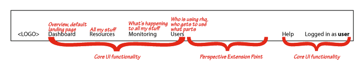
-
The above diagram is a proposal for the default global navigation bar in the core UI
-
The ordering of the core ui nav elements in relation to those of the perspective could change
-
This is a best practice suggestion to be used if at all possible
-
EX, If there were an additional tab called "Foo" in a given perspective, the nav could be: Dash | Resources | Monitoring | Foo | Users, but we suggest that Foo instead go to the right of all of the core ui tabs unless there's very good reason not to
-
The default should always be perspective nav tabs to the right of the core ui tabs
-
-
Of all of the core UI tabs, only the Dashboard (overview) is absolutely mandatory**** Dashboard is the one tab that cannot be removed
-
Dashboard is the one tab that will always be on the far left of the navigation bar
-
-
-
More comments on the navigation from the 3/09 UX review: http://productdesign.usersys.redhat.com/wiki/JON_Usability_Review/Areas_of_Need/Navigation