Description and problems with existing tree
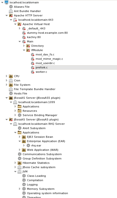
The left navigator or tree is used today as a way to explore the monitored elements of a platform or in some cases, multiple platforms. While this gives the user a way to access tons of information, the current organization of the tree has some unexpected behaviors and creates tedious navigation in some cases, obscuring the most important or frequently accessed information. The primary issues can be summarized:
-
Since the current tree only sorts alphabetical , hardware and software resources are mixed. For the user this lack of a little more organization by "type" creates a bit of chaos.
-
Some nodes present an error when clicked
-
Inconsistent treatment due to current autogrouping behavior. Since autogrouping happens when there is more than one of a resource, its never predictable to a user that a given resource will be in a folder or not.
-
Right click behavior is not discoverable
More drastic designs which take the emphasis off the platform and put it more on applications have been proposed and are still in favor. As a reference, see the archive of this page which discusses an application-centric view of the navigation, and a previous UX analysis of the tree with alternative design ideas
Tree interaction cleanup
As a user expected standard, the behavior of the tree should match the behavior and functionality of the tree in Windows Explorer, which is probably the most common tree widget in the world. In particular, these best practices should be followed:
-
All nodes in the tree are navigable - can be clicked at any time and show some kind of information in the content area
-
Tree nodes can be opened and closed by the user at any time without restriction done
Other JON-specific change recommendations, generally in order of urgency:
-
Remove redundant naming on the nodes, simplify all labels as much as possible. Specifically doing this in the tree should not mean removing that context elsewhere where it might be helpful. done
-
Singleton resources not autogrouped, all other resources contained in an autogroup even if a single resource of the type exists under the parent.
-
Use different icons for platform, servers and services.
-
Autogroups have a folder icon with a badge indicating the type of the resources underneath.
-
The availability badge is pushed up only to the nearest autogroup/subcategory parent. I.e. the JBoss AS Server appears as UP even though some of its applications are DOWN. The "Web Application (WAR)" autogroup would have a unavailability badge because a WAR underneath it would be unavailable.
-
Remove child count numbers in parentheses on folders done
-
Pluralize all folders - eg. CPUs
-
Add a hint to users that right-click is available for actions on a node done
-
Removing color coding on text labels - users should be able to troubleshoot via icons or status displayed other parts of the UI, without relying on the tree as the single source of alert information. done
-
Improve the expand/collapse arrows so they are more legible and easier to click. done
-
Remove tree 'connectors' imagery done
-
Group all hardware resources under a folder called "Hardware" and position this at the top of the tree
Tree layout
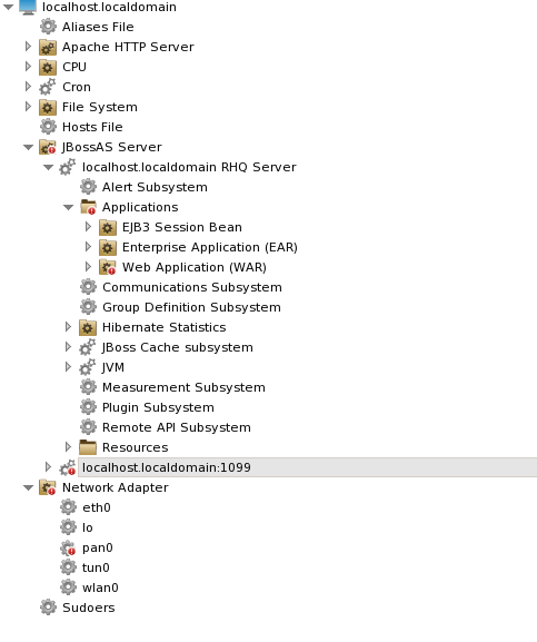
Given the changes above a new tree layout would appear as follows:
Platform
New Visuals
This is a screenshot of the new icon set in the navigation tree.

Second iteration:
