Why a right panel?
The right panel adds a predictable place to hang actions and user assistance links in the UI. The contents of the right panel are dynamic and should be directly related to the main content area and to the user's general context (tasks at hand.) The goal is to improve usability by offering a patterned location for actions, peripheral information, and even user assistance for the task at hand.
The content of the right panel is ultimately defined by perspectives, and at any time is determined by
- what is being viewed - the type of resource for example, and in some cases the specific resource.
- the users role - what do you have permission to do, what actions are most important for a particular user.
Placement and size
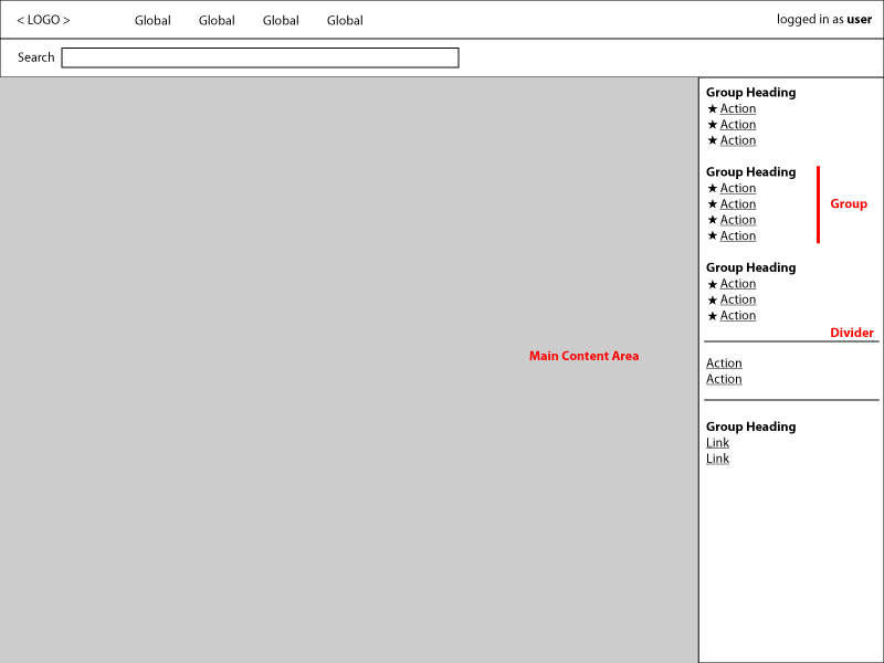
The right panel shares the area below the global navigation with the main content area. It is meant to be a fixed peripheral element, positioned on the right side (for most languages). A recommended width for the right panel is 250 pixels (this should be evaluated as we go).
It is not desirable for the panel to be collapsible, as this obscures major tasks in the UI. If collapsed, it is too easy for users to forget about the panel. Instead of being treated as an optional element, the panel should be leveraged as a key part of the interface and should add considerable value on any given page.
Layout of the right panel
As part of the core UI, the right panel will need to use extension points to allow perspective authors to take advantage of the layout options.
Proposed design
The right panel is similar to a menu you might see in a desktop application. Actions or links are grouped by function and may have headings to denote their association. In some cases we may want to include an icon before certain groups of links, for example, to visually call out an important group of actions.
The content of the right panel is intended to be limited to actions and user assistance. Actions may be defined broadly and can include terse operations (Stop Server) or more general entry points to a guided interface (multi-page wizard to set up something for the first time).
Grouping and dividers - We may group actions by type of operation - like all create tasks listed under the heading Create, all manage tasks under the heading Manage. In other cases a heading for a group might not be desired and can be omitted. Dividers can be used to further delineate the right panel, for example, to separate actions from user assistance links.
General order (proposed)
From the top, the right panel should display actions from most to least specific:
-
Local actions that apply to a specific selection of one or more items in the main content area. For example, two resources are selected in the table in the main content area. In this case the actions list shows actions that the user can perform on these resources. As a best practice, we should encourage bulk actions and gracefully degrade when they are not possible on all selected items. When an action can only be applied to one resource at a time, we should disable ("gray out") the actions.
-
General context actions that do not depend on direct or implicit selection - for example, Creating a new resource.
-
Global actions that are relevant
Design details to flesh out over time
 We will be concerned about minimizing the amount of disorienting changes in the action list as the user navigates. For example, while navigating resources of one type, the global actions presented for all resources of this type should remain the same, while actions pertaining to a selected specifc resource will neccesarily adjust per the user's permission and the state of the resource.
We need to think about whether there is any tension in grouping actions by verb (create) versus grouping by context (actions on this specific thing, actions on all things)