RHQ 4.9
RHQ Charting
The newest iteration of RHQ charting uses the D3 javascript charting library to render charts in modern browsers that are SVG capable. d3 stands for Data Driven Documents and is much more than a charting library. d3 is a collection of data visualation tools that allow the joining of data (via json, xml, csv, and tsv) to javascript elements such as Html div tag or SVG rect tag. It is low level enough that the developer needs to determine the output rendering technology such as HTML, SVG, Canvas or WebGL. And then using the shape elements provided in the output technology, the developer draws (or maps) the shapes to the target coordinate system, sizing the shapes proportionately to make a proper looking chart. This, low level rendering toolkit is what makes D3 both powerful and also more cumbersome than a traditional charting API.
Availability Chart
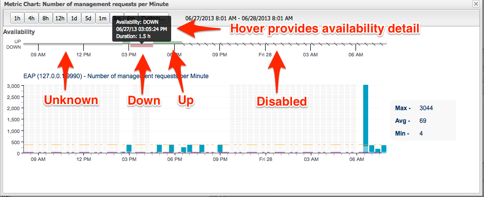
The new availability graph provides an x-axis that is kept in sync with the charts displayed, giving further insight into the status of a resource or group of resources. The possible states for availability are:
-
Unknown
-
Up
-
Down
-
Disabled
-
Mixed (or 'Warn') this is only available to groups where at least one resource is not up
For a more complete explanation of availability please see RHQ Availability
Chart Types
For representing data coming from RHQ resources we have chosen a Stacked Bar Graph that represents the discontinuous, interval nature of the RHQ data with a line graph connecting the averages to show trendiness of data. Many real-time systems use continuous area charts to show the streaming data. As RHQ/JON is not intended as a real-time monitoring charting application, the data being pulled from the metrics engine is queried from its aggregated buckets depending on the time interval requested.
Aggregate Chart Type
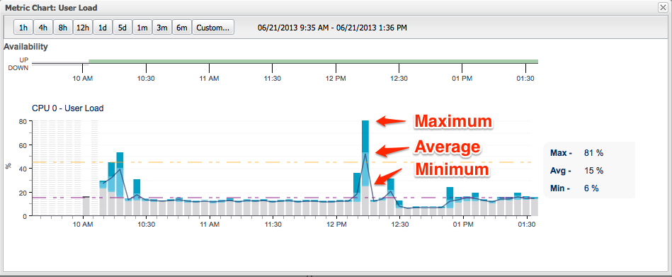
Aggregate bars like the ones shown above represent buckets of time from which data is sampled at various intervals and represented by its Maximum, Average and Minimum.
Chart Legend
-
Dark Blue segment shows Average to Peak values for the bar interval
-
Light Blue segment shows Minimum to Average values for the bar interval
-
Grey Bar segment leading up to the Minimum is just filler (a leader bar)
-
Black Line runs through the averages helping to visualize Trendiness
Availability:
-
Red Vertical Bars Horizontal Stripes: Resource is Down from availability data
-
Blue Vertical Bars Horizontal Stripes: Resource is Unknown from availability data
-
Grey Vertical Bars Horizontal Stripes: No Data (we receive a record with a timestamp from the metrics database but no values)
Out-of-Bounds Data (OOB)
-
Purple Dashed Line: Min Baseline from OOB
-
Orange Dashed Line: Max Baseline from OOB
Single Value Charts (Non-aggregate)
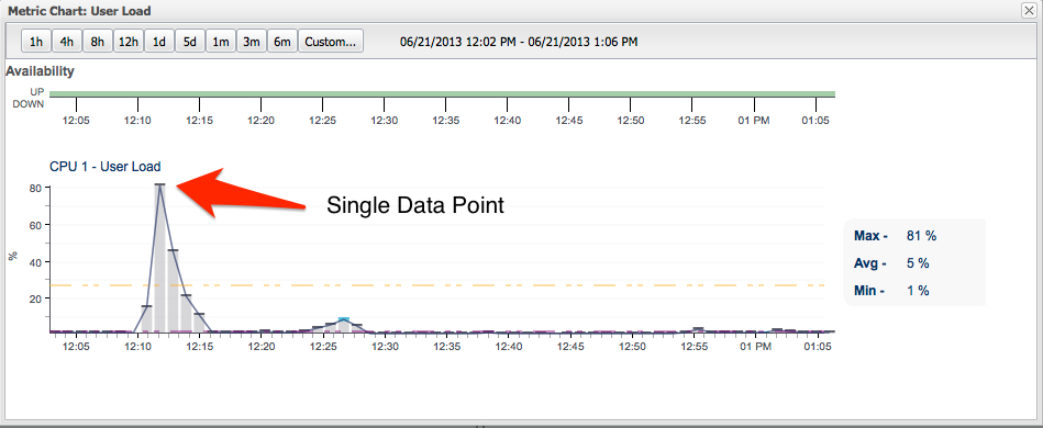
The above chart represents 4 minute bars which are not aggregates because at this granularity only a single value is collected. Meaning there is no Peak, Avg or Min values just a single value shown by the heavier cap over the bar. The light and dark blue regions of the aggregate stacked bar don't exist because there is only one value (not an average but an actual value). For clarity, the connecting average line has also been removed just to highlight the individual values.
Multi-Resource Chart
The multi-resource chart above shows User Load measurement across multiple resources (CPUs). The graph type here is a line graph as opposed to our normal stacked bar graph due to the fact that multiple resources would produce a chaotic looking graph with anything other than the line graph.
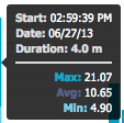
Chart Detail Through Hovers
Another aspect to the interactiveness of the d3 charts is though hovers. Hovers give us closer inspection of the underlying data in the chart.
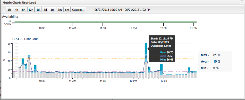
As depicted in the above screenshot, the hover shows for the aggregated interval:
-
Date/Time of the start of the interval for the bar
-
The bar duration
-
The metrics for the bar: Peak, Avg, Min
A hover over a single value data point (non-aggregate) shows only the following information:
-
Date/Time of the start of the interval for the bar
-
The actual value of the data point
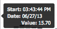
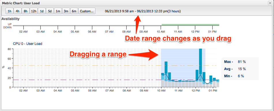
Chart Drilldown
It is now possible to drill into the charts around areas of interest by simply dragging over the chart for a range. This adds additional interactivity that date ranges can defined by dragging between the bars to select a range. The date range is shown in the header above and changes dynamically to show the range during dragging. When the mouse is positioned over whitespace (between bars) the cursor will turn to crosshair (as opposed to the pointer when hovering over a bar). At this point dragging can begin. A light blue selection selection under the bars visually denotes a selected range.