Create new RichFaces Documentation Jira issue

This will launch the RichFaces Jira page - to complete your feedback please login if needed, and submit the Jira.
JBoss.orgCommunity Documentation
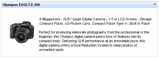
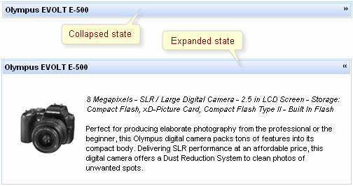
A collapsible panel, which content shows/hides after activating a header control.
Highly customizable look and feel
Support for any content inside
Collapsing expanding content
Three modes of collapsing/expanding
Server
Client
Ajax
The component is a simplified version of toggle panel that initially has a defined layout as a panel with a header playing a role of a mode switching control. On a component header element, it's possible to define a label using an attribute with the same name.
Switching mode could be defined with the "switchType" attribute with three possible parameters.
Server (DEFAULT)
The common submission is performed around simpleTogglePanel and a page is completely rendered on a called panel. Only one at a time panel is uploaded onto the client side.
Ajax
AJAX form submission is performed around the panel, content of the called panel is uploaded on Ajax request and additionally specified elements in the "reRender" attribute are rendered. Only one at a time panel is uploaded on the client side.
Client
All panels are uploaded on the client side. Switching from the active to the hidden panel is performed with client JavaScript.
The <rich:simpleTogglePanel> component also has an "opened" attribute responsible for keeping a panel state. It gives an opportunity to manage state of the component from a model. If the value of this attribute is"true" the component is expanded.
"onmouseover "
"onclick "
"onmouseout "
etc.
With help of "openMarker" and "closeMarker" facets you can set toggle icon for simpleTogglePanel .
Information about the "process" attribute usage you can find " Decide what to process " guide section.
Table of <rich:simpleTogglePanel> attributes.
Table 6.138. Component Identification Parameters
| Name | Value |
|---|---|
| component-type | org.richfaces.SimpleTogglePanel |
| component-class | org.richfaces.component.html.HtmlSimpleTogglePanel |
| component-family | org.richfaces.SimpleTogglePanel |
| renderer-type | org.richfaces.SimpleTogglePanelRenderer |
| tag-class | org.richfaces.taglib.SimpleTogglePanelTag |
Table 6.139. Facets
| Facet name | Description |
|---|---|
| openMarker | Redefines the icon for expanding the panel |
| closeMarker | Redefines the icon for collapsing the panel |
Table 6.140. Classes names that define a component appearance
| Class name | Class description |
|---|---|
| rich-stglpanel | Defines styles for a wrapper <div> element of a component |
| rich-stglpanel-header | Defines styles for header element of a component |
| rich-stglpnl-marker | Defines styles for a wrapper <div> element of a marker |
| rich-stglpanel-body | Defines styles for a component content |
Table 6.141. Style component classes
| Class name | Class description |
|---|---|
| styleClass | The class defines panel common style. It's used in the outside <div> element |
| bodyClass | applicable to panels body elements |
| headerClass | applicable to header elements |
On the component LiveDemo page you can see the example of <rich:simpleTogglePanel> usage and sources for the given example.