Read this chapter for details on components that display messages and other feedback to the user.
The <rich:message> component renders a single FacesMessage message instance added for the component. The appearance of the message can be customized, and tool-tips can be used for further information about the message.
The <rich:message> component is rendered in the same way as the standard <h:message> component, but allows separate styling of the message summary and detail. It allows unified icons to be set using background images in predefined classes.
The <rich:message> component needs the for attribute to point to the id identifier of the related component. The message is displayed after the FacesMessage message instance is created and added for the client identifier of the related component.
The <rich:message> component is automatically rendered after an Ajax request. This occurs without the use of an <a4j:outputPanel> component or a specific reference through the render attribute of the Ajax request source.
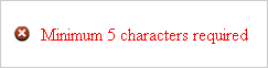
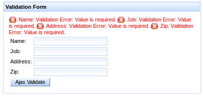
Example 13.1. rich:message example
<h:outputText value="Zip:" />

<h:inputText label="Zip" id="zip" required="true"

             value="#{userBean.zip}">

   <f:validateLength minimum="4" maximum="9" />

</h:inputText>

<rich:message for="zip" ajaxRendered="true"/>
The example contains a text input for zip codes. The simple validation requires the entered zip code to be between 4 and 9 characters long. The <rich:message> component references the input box, and reports any messages relating to the input validation.
The showSummary attribute specifies whether to display only a summary of the full message. The full message can be displayed in a tool-tip when hovering the mouse over the summary.
Use CSS (Cascading Style Sheets) to customize the appearance and icon for the <rich:message> component. To use a custom icon, set the background-image property to the icon graphic, as shown in Example 13.2, “Message icons”. Refer to Section 13.1.4, “Style classes and skin parameters” for a complete list of style classes for the <rich:message> component.
Example 13.2. Message icons
.rf-msg-err{
   background-image: url('#{facesContext.externalContext.requestContextPath}/images/icons/error.gif');
}
The example demonstrates how an icon for an error message could be added using CSS.
component-type:org.richfaces.RichMessagecomponent-class:org.richfaces.component.UIRichMessagecomponent-family:javax.faces.Messagerenderer-type:org.richfaces.MessageRenderer
Table 13.1. Style classes (selectors) and corresponding skin parameters
| Class (selector) | Skin Parameters | Mapped CSS properties |
|---|---|---|
|
| font-family |
| font-size | |
|
| color |
|
| color |
|
| color |
|
| color |
|
| color |
| No skin parameters. | |
The <rich:messages> components works similarly to the <rich:message> component, but can display all the validation messages added for the current view instead of just a single message. Refer to Section 13.1, “<rich:message>” for details on the <rich:message> component.
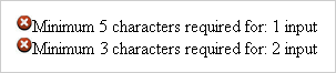
The <rich:messages> component doesn't require any extra attributes for basic usage. It displays all messages relating to requests from components.
To limit the messages to a specific component, use the for attribute to reference the component's identifier.
To show only those messages that are not attached to specific components, set globalOnly="true".
The <rich:messages> component is automatically rendered after an Ajax request. This occurs without the use of an <a4j:outputPanel> component or a specific reference through the render attribute of the Ajax request source.
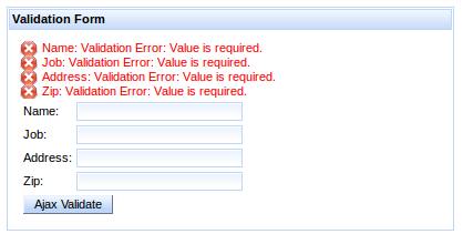
The <rich:messages> component displays error messages for each validating component in the same container.
The <rich:messages> component can be further styled through CSS, the same as for the <rich:message> component. Refer to Section 13.1.2, “Appearance” for an example of message styling, and refer to Section 13.2.4, “Style classes and skin parameters” for a complete list of style classes for the <rich:message> component.
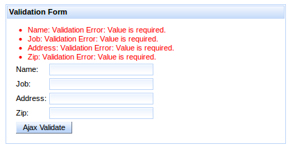
The layout of the messages can also be customized through CSS. By default, the messages are arranged in a block as shown in Figure 13.3, “Messages in a block”.
Override the display property for all CSS message classes to customize the layout as follows:
- Display messages in a list with no icons
To display the messages in a list format without the default icons, override the message styles as follows:
.rf-msg-err, .rf-msgs-err, .rf-msg-ftl, .rf-msgs-ftl, .rf-msg-inf, .rf-msgs-inf, .rf-msg-wrn, .rf-msgs-wrn, .rf-msg-ok, .rf-msgs-ok { display: list-item; margin-left: 20px; padding-left: 0px; } .rf-msg-err, .rf-msgs-err{ background-image:none; }- Display in-line messages
To display the messages in line with text, override the message styles as follows:
.rf-msg-err, .rf-msgs-err, .rf-msg-ftl, .rf-msgs-ftl, .rf-msg-inf,
.rf-msgs-inf, .rf-msg-wrn, .rf-msgs-wrn, .rf-msg-ok, .rf-msgs-ok { display:inline; }
component-type:org.richfaces.RichMessagescomponent-class:org.richfaces.component.UIRichMessagescomponent-family:javax.faces.Messagesrenderer-type:org.richfaces.MessagesRenderer
Table 13.2. Style classes (selectors) and corresponding skin parameters
| Class (selector) | Skin Parameters | Mapped CSS properties |
|---|---|---|
|
| font-family |
| font-size | |
|
| color |
|
| color |
|
| color |
|
| color |
|
| color |
| No skin parameters. | |
The <rich:progressBar> component displays a progress bar to indicate the status of a process to the user. It can update either through Ajax or on the client side, and the look and feel can be fully customized.

Basic usage of the <rich:progressBar> component requires the value attribute, which points to the property that holds the current progress value. When the value is greater than or equal to the minimum value (0 by default), the progress bar becomes active, and starts sending Ajax requests if in ajax mode.
By default, the minimum value of the progress bar is 0 and the maximum value of the progress bar is 100. These values can be customized using the minValue and maxValue attributes respectively.
The progress bar can be labeled in one of two ways:
- Using the
labelattribute The content of the
labelattribute is displayed over the progress bar.Example 13.4. Using the
labelattribute<rich:progressBar value="#{bean.incValue}" id="progrs" label="#{bean.incValue} % complete"/>
- Using nested child components
Child components, such as the JSF
<h:outputText>component, can be nested in the<rich:progressBar>component to display over the progress bar.Example 13.5. Using nested child components
<rich:progressBar value="#{bean.incValue}">

    <h:outputText value="#{bean.incValue} % complete"/>

</rich:progressBar>
Define the initial and finish facets to customize the progress bar's appearance before progress has started and after progress has finished. When the current progress bar value is less than the minimum value, the initial facet is displayed. When the current progress bar is greater than the maximum value, the finish facet is displayed.
Example 13.6. Initial and finished states
<rich:progressBar value="#{bean.incValue1}">

    <f:facet name="initial">

        <h:outputText value="Process has not started"/>

    </f:facet>

    <f:facet name="finish">

        <h:outputText value="Process has completed"/>

    </f:facet>

</rich:progressBar>
The mode for updating the progress bar is determined by the mode attribute, which can have one of the following values:
ajaxThe progress bar updates in the same way as the
<a4j:poll>component. The<rich:progressBar>component repeatedly polls the server for the current progress value.clientThe progress bar must be explicitly updated on the client side through the JavaScript API.
The <rich:progressBar> component can be set to constantly poll for updates at a constant interval. Use the interval component to set the interval in milliseconds. The progress bar is updated whenever the polled value changes. Polling is only active when the enabled attribute is set to true.
Example 13.7. Using set intervals
<rich:progressBar value="#{bean.incValue1}" id="progress" interval="900" enabled="#{bean.enabled1}"/>
The <rich:progressBar> component can be controlled through the JavaScript API. The JavaScript API provides the following functions:
getValue()Return the current value displayed on the progress bar.
setValue()Set the current value to display on the progress bar.
getMinValue()Return the minimum value for the progress bar.
getMaxValue()Return the maximum value for the progress bar.
disable()Disables the progress bar.
enable()Enables the progress bar.
isEnabled()Returns a boolean value indicating whether the progress bar is enabled.
component-type:org.richfaces.ProgressBarcomponent-class:org.richfaces.component.UIProgressBarcomponent-family:org.richfaces.ProgressBarrenderer-type:org.richfaces.ProgressBarRenderer
Table 13.3. Style classes (selectors) and corresponding skin parameters
| Class (selector) | Skin Parameters | Mapped CSS properties |
|---|---|---|
| No skin parameters. | |
|
| border-color |
| background-color | |
|
| color |
| font-family | |
| font-size | |
The <rich:tooltip> component provides an informational tool-tip. The tool-tip can be attached to any control and is displayed when hovering the mouse cursor over the control.
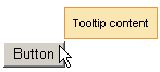
For basic usage, define the tool-tip text using the value attribute. The <rich:tooltip> component is then automatically attached to the parent element, and is usually shown when the mouse cursor hovers.
Alternatively, the content of the tool-tip can be defined inside the <rich:tooltip> tags, and the value attribute is not used. This allows HTML tags to be used to define the content, and provides for rich content such as images, links, buttons, and other RichFaces components.
Example 13.8. Defining tool-tip content
- Basic content
<rich:panel>

    <rich:toolTip value="This is a tool-tip."/>

</rich:panel>
- Rich content
<rich:panel>

    <rich:toolTip>

        This is a <b>tool-tip</b>.

    </rich:toolTip>

</rich:panel>
If not otherwise specified, the tool-tip is attached to the parent element in which it is defined. The target attribute is used to attach the tool-tip to another component, pointing to the target component's id identifier. This allows the <rich:tooltip> component to be specified outside the target element. This approach is demonstrated in Example 13.9, “Attaching the tool-tip”.
Example 13.9. Attaching the tool-tip
<rich:panel id="panelId">

...

</rich:panel>


<rich:toolTip value="This is a tool-tip." target="panelId"/>
The <rich:tooltip> component can alternatively be left unattached, and is instead invoked through an event handler on the target component. To leave the <rich:tooltip> component unattached, set attached="false", and define the event handler to trigger the tool-tip on the target component. This approach is demonstrated in Example 13.10, “Unattached tool-tips”. When leaving the <rich:tooltip> component unattached, ensure it has an id identifier defined. If it is defined outside the target element, it must be nested in an <a4j:form> component.
Example 13.10. Unattached tool-tips
<rich:panel id="panelId" onclick="#{rich:component("tooltipId")}.show(event);" />


<a4j:form>

    <rich:toolTip id="toolTipId" attached="false" value="This is a tool-tip."/>

</a4j:form>
By default, the <rich:tooltip> component is positioned intelligently based on the position of the mouse cursor. Use the jointPoint attribute to specify a corner of the target component at which to display the tool-tip instead, and use the direction attribute to specify the direction the tool-tip will appear relative to that corner. Possible values for both attributes are top-left, top-right, bottom-left, and bottom-right. Use the horizontalOffset and verticalOffset attributes to specify the horizontal offset and vertical offset at which to display the tool-tip.
Use the showEvent attribute to specify when the tool-tip is shown. By default it appears when the attached component is hovered-over with the mouse. Use the hideEvent attribute to specify when the tool-tip is hidden. The default value is none, so the tool-tip remains shown. However, it can be linked to an event on the target component, such as the mouseout event.
Set followMouse="true" to cause the tool-tip to follow the user's mouse movements.
Advanced appearance features are demonstrated in Example 13.11, “Advanced tool-tip usage”.
The mode for updating the tool-tip is determined by the mode attribute, which can have one of the following values:
ajaxThe tool-tip content is requested from the server with every activation.
clientThe tool-tip content is rendered once on the server. An external submit causes the content to re-render.
When using mode="ajax", define the defaultContent facet. The tool-tip displays the content of the defaultContent facet while loading the actual content from the server.
Example 13.11. Advanced tool-tip usage
<h:commandLink value="Simple Link" id="link">

    <rich:toolTip followMouse="true" direction="top-right" mode="ajax" value="#{bean.toolTipContent}"

                  horizontalOffset="5" verticalOffset="5" layout="block">

        <f:facet name="defaultContent">

            <f:verbatim>Loading...</f:verbatim>

        </f:facet>

    </rich:toolTip>

</h:commandLink>
The <rich:tooltip> component supports the following client-side events:
clickThis event is activated when the tool-tip is clicked with the mouse.
dblclickThis event is activated when the tool-tip is double-clicked with the mouse.
mouseoutThis event is activated when the mouse cursor leaves the tool-tip.
mousemoveThis event is activated when the mouse cursor moves over the tool-tip.
mouseoverThis event is activated when the mouse cursor hovers over the tool-tip.
showThis event is activated when the tool-tip is shown.
completeThis event is activated when the tool-tip is completed.
hideThis event is activated when the tool-tip is hidden.
The <rich:tooltip> component can be controlled through the JavaScript API. The JavaScript API provides the following functions:
show(event)Show the tool-tip.
hide()Hide the tool-tip.
component-type:org.richfaces.Tooltipcomponent-class:org.richfaces.component.UITooltipcomponent-family:org.richfaces.Tooltiprenderer-type:org.richfaces.TooltipRenderer
Table 13.4. Style classes (selectors) and corresponding skin parameters
| Class (selector) | Skin Parameters | Mapped CSS properties |
|---|---|---|
| No skin parameters. | |
| No skin parameters. | |
| No skin parameters. | |
|
| border-color |
| font-family | |
| font-size | |