The purpose of this chapter is NOT to provide a full detailed explanation of the tooling, but to guide you through the key steps to get your first dashboards created. The following section will provide basic information about how to configure the system to retrieve information from existing databases or files, create new indicators and manage different dashboards.
For this guide, it's assumed the simple installation has been done, with the standard set of examples and user and role configuration. It's important to notice this configuration MUST NOT be used in production, since it provides default security credentials.
Note
Please, read the previous chapters to figure out how to get the application up and running
The procedure to create a brand new dashboard is pretty simple as we will see in the following sections. That procedure is composed of 3 main stages:
Get the data we want to manipulate.
Create key performance indicators on top of such data.
Create a new dashboard and drag&drop the new KPIs on it.
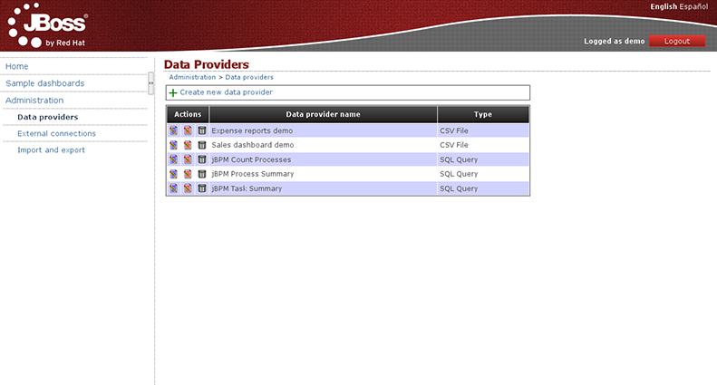
The first thing to do, after you have accessed the web application, is to create a data provider. On the left menu, go to 'Administration > Data providers' and once there, select the option 'Create new data provider'.
The purpose of data providers is to gather information from any system, either a database, a file or any other, and transform it to the internal in-memory representation for building dashboards. As you may guess there exists different data sources and therefore different ways to retrieve as we're going to see next.
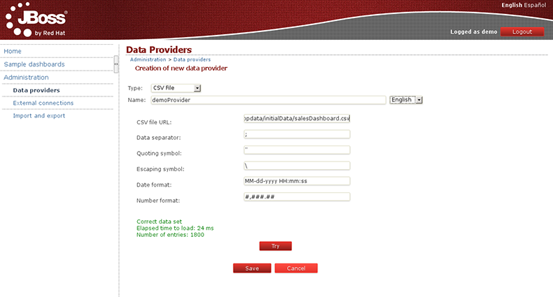
Click on 'Create new data provider'. The following fields will be shown in the form, with some sensible defaults:
Type: in this case - choose the CSV File
Name: Write the name you want to give to our data provider (this field is multi-language).
CSV file URL: Here write the URL where oyur CSV file is located.
As an example you can grab the CSV file used by the Sales Dashboard, just copy & paste the following URL:
https://raw.github.com/droolsjbpm/dashboard-builder/master/modules/dashboard-samples/src/main/webapp/WEB-INF/etc/appdata/initialData/expenseReports.csvData separator: Left as is.
Quoting symbol: Left as is.
Date format: Where we can define different date formats or even hour.
Number format: Where we can define the number format.
Once you have filled all the fields, click on 'Try', to check that everything works properly. The application will give you a message 'Correct data set ...' and we continue by pressing 'Save'.
Next, a screen is shown with all the fields found after parsing the file, giving us the option to change the name of each field. For numeric fields it gives us the option to specify if we want numeric values to be treated as labels by the dashboard engine. This is something really useful when dealing with numbers which actually behave as labels, f.i: the numeric reference code of a product item.
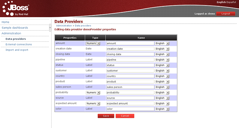
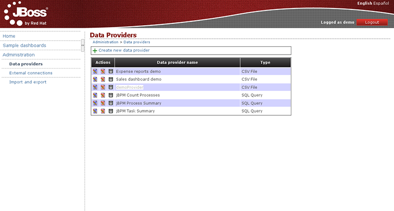
After this last step, you can save and finish the creation of your new data provider.
You can create a data provider to query a relational database. Go to Administration > Data providersand click on 'Create new data provider'. Choose the 'SQL Query' option and fill the form with the data provider name and the SQL query that will retrieve the data.
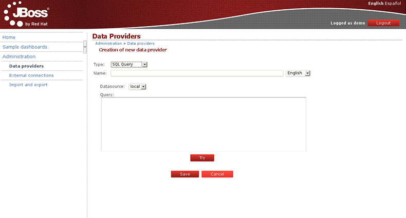
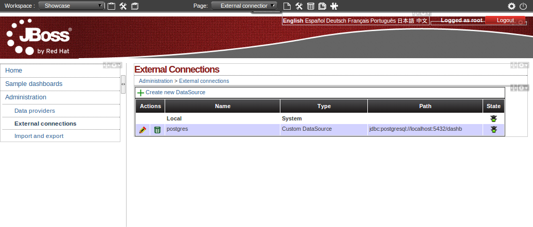
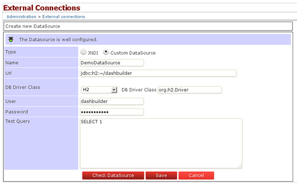
In this form you have the ability to select the data source where the data comes from. By default the local data source is selected but you can define new connections to external data sources. To do this you should go to the 'Administration > External connections' section and from there you can create a new data source connection.
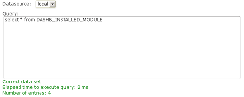
Let's get back to the creation of our SQL data provider. Once the data source has been selected and the query is typed in, you can click on the 'Try' button, and if the query is successful you will get the following message.
After that, you can rename the name of the properties to provide a more user friendly name.
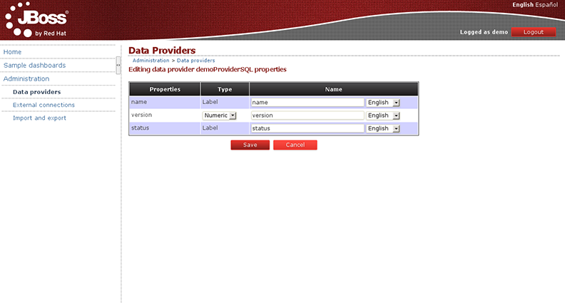
Finally, just click the 'Save' button to confirm the creation of the data provider:
The previous sections showed how data could be loaded from plain text like CSV files or query from a database connection. When data is small enough, Dashbuilder can handle pretty well the small data sets in memory as far as it doesn't exceed the 2MB size limit. However, must of the time, our data sets are bigger and we can't upload all the data for Dashbuilder to handle it by its own. Is in these cases where database backed queries can help us to implement nice drill down reports and charts without preloading all the data.
Imagine a database containing two tables:
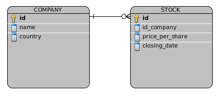
Now, let's take as an example a very simple example of a stock exchange dashboard which is fed from the two tables above. The dashboard displays some indicators about several companies from several countries selling their shares at a given price on every day closing date. The dashboard displays 4 KPIs as you can see in the following screenshot:
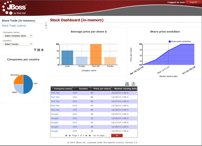
All the indicators are displaying data coming from the two database tables defined above.
Bar chart - Average price per company
Area chart - Sales price evolution
Pie chart - Companies per country
Table report - Stock prices at closing date
What we're going to start discussing next is the two strategies we can use for building a dashboard. This is an important aspect to consider, specially if we're facing big data scenarios.
This strategy consists in creating a data provider which load all the data set rows by executing a single SQL query over the two tables.
    SELECT C.NAME, C.COUNTRY, S.PRICE_PER_SHARE, S.CLOSING_DATE
    FROM COMPANY C JOIN STOCK S ON (C.ID=S.ID_COMPANY)
Every single indicator on the dashboard share the same data set. When filters are executed from the UI no further SQLs are executed since all the calculations are done over the data set in memory.
Pros:
Data integration logic keeps very simple
Only a single data provider is needed
Faster configuration of KPIs since all the data set properties are available at design time
Multiple indicators from a single data provider
Cons:
Can't be applied on medium/large data sets due to poor performance
The native approach consists in having a data provider for every indicator in the dashboard instead of loading an handling all the data set in memory. Every KPI is told what data has to display. Every time the user filters on the dashboard, the SQLs are parsed, injected with the filter values and re-executed. No data is hold in memory, the dashboard is always asking the DB for the data.
The SQL data providers are the following:
Bar chart - Average price per company
          SELECT C.NAME, AVG(S.PRICE_PER_SHARE)
          FROM COMPANY C JOIN STOCK S ON (C.ID=S.ID_COMPANY)
          WHERE {sql_condition, optional, c.country, country}
          AND {sql_condition, optional, c.name, name}
          GROUP BY C.NAME
Area chart - Sales price evolution
          SELECT S.CLOSING_DATE, AVG(S.PRICE_PER_SHARE)
          FROM COMPANY C JOIN STOCK S ON (C.ID=S.ID_COMPANY)
          WHERE {sql_condition, optional, c.country, country}
          AND {sql_condition, optional, c.name, name}
          GROUP BY CLOSING_DATE
Pie chart - Companies per country
          SELECT COUNTRY, COUNT(ID)
          FROM COMPANY
          WHERE {sql_condition, optional, country, country}
          AND {sql_condition, optional, name, name}
          GROUP BY COUNTRY
Table report
          SELECT C.NAME, C.COUNTRY, S.PRICE_PER_SHARE, S.CLOSING_DATE
          FROM COMPANY C JOIN STOCK S ON (C.ID=S.ID_COMPANY)
          WHERE {sql_condition, optional, c.country, country}
          AND {sql_condition, optional, c.name, name}
As you can see every KPI is delegating the filter & group by operations to the database. The filter magic happens thanks to the {sql_condition} statements. Every time a filter occurs in the UI the dashbuilder core gets all the SQL data providers referenced by the KPIs and it parses/injects into those SQLs the current filter selections made by the user. The signature of the sql_condition clause is the following:
{sql_condition, [optional | required], [db column], [filter property]}
where:
- optional: if no filter exists for the given property then the condition is ignored.
- required: if no filter is present then the SQL returns no data.
- db column: the db column where the current filter is applied.
- filter property: the UI property which selected values are taken.
Pros:
- Support for high volumes of data. The database tables need to be properly indexed though.
Cons:
- The set up of the data providers is a little bit more tricky as it requires to create SQL queries with the required filter, group by and sort operations for every KPI.
When designing a dashboard never forget of thinking thoroughly about the origin, type and the volume of the data we want to display in order to go for the right strategy.
Once the necessary data providers have been created, you can continue by adding a new Key Performance Indicator to an existing page. All dashboards are created by adding indicators and other types of panels to pages. A dashboard is a page with a mixture of different kind of panels placed into it. The following screenshot shows an example of a Sales Dashboard:
Pages can be created from scratch, or duplicating an existing one. Both options are explained in the following sections. Meanwhile we will assume the page already exists and we only want to add an indicator.
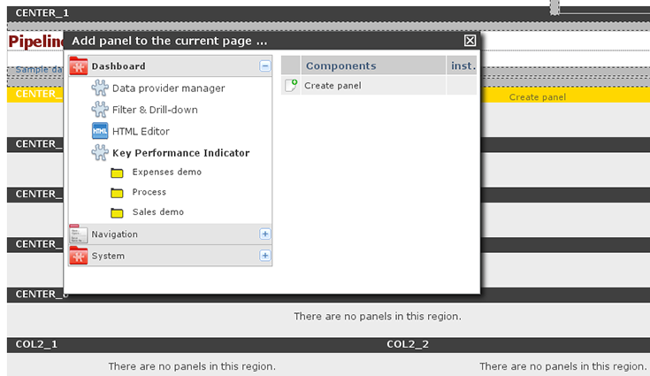
Indicators are a special type of panels, which are the widgets that can be placed within the page. To add a panel or indicator just click on the toolbar icon 'Add panel to the current page':

This will make a popup be shown with all the available panels:
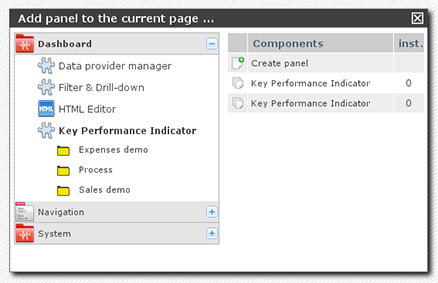
To add a new 'Key Performance Indicator', click onDashboard > Key Perfomance Indicator. Drag the 'Create panel' option and drop it into any of the page regions. You will see that they are being highlighted while you move the mouse over them, then simply drop the panel.
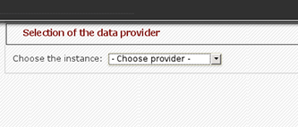
Once dropped, the first step is to select the Data Provider you need to use, as configured before, to feed the charts and reports with data. Select any of the data providers and then you can start creating a new indicator.
Now, you must see the chart edition panel. It's an intuitive environment which helps you configure different type of charts and reports...
|
|
    |
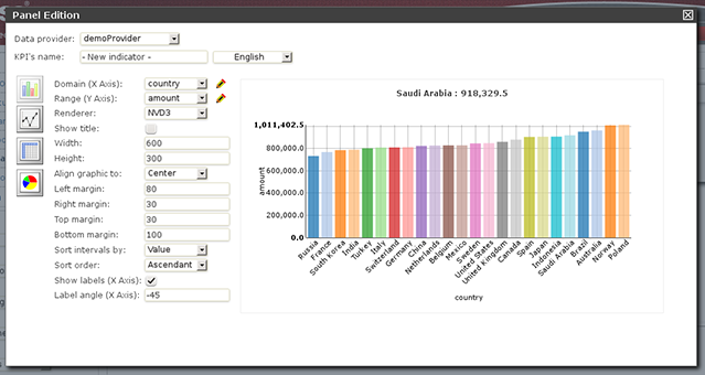
Domain (X Axis): The data column that is taken as the X axis. In this example, we choose the property 'Country'.
Range (Y Axis): Information to be grouped and aggregated for every domain interval. For example: 'Amount'.
Renderer: The rendering library to use. Each one provides different features and visualization style. By default 'NVD3'.
Sort intervals by: It's how the domain values can be sorted, for example, according to its range value.
Sort order: It can be ascending or descending.
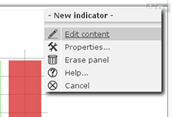
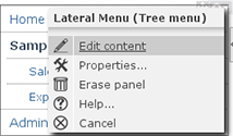
To finish the panel edition just close the panel edition window. If you want to get back again, just click on the right upper corner of the panel area and select the 'Edit content' menu option.
The system provides you with 3 types of chart displayers: bar, pie and line, and a special table displayer very useful to create tabular reports. The system also comes with 2 rendering engines: NVD3 (pure HTML5/SVG technology) and a Flash based one, Open Flash Chart 2. Each renderer has its own available features, so depending on the type of chart and renderer choosen you can end up with some display features enabled or disabled depending the case. For instance, the 'Paint area' feature is not available for OFC2 line charts.
A dashboard is basically a page with some KPIs placed on it (plus some other additional widgets as we will see later on). There are two different ways of creating a page:
Starting as a blank page:

Duplicating an existing page:

You will find these icons at the top of the page, in the administration bar:

To create a new page, click on the 'Create new page' icon:
A form will be shown to fill in some parameters:
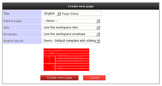
Page title.
Parent page: Pages are organized in a hierarchical way. This is the parent page.
Skin: This will select and specific look'n'feel and CSS stylesheet for this page. You can leave the default value.
Envelope: Defines which kind of HTML template will be placed around the page layout.
Region layout: This is the template, that is, how regions are organized to place the panels inside the page. We can choose any of the installed types, for example, "Demo - Default template with sliding".
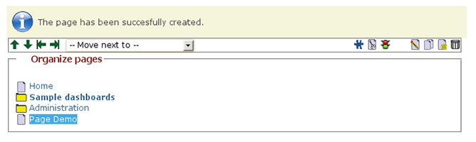
Most of these properties will be discussed in the chapter about 'Customing look'n'feel'. After creating the page, you might realize the page is still not accessible from the left menu but you can see it in the combo list in the administration toolbar:
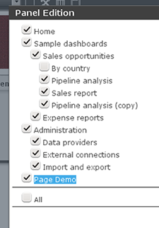
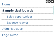
If you want this page to be shown in the left menu, you can click on 'Edit content' and then add the newly created page to the list of options displayed in the menu.
 |
 |
 |
Repeat until the page has all the content and panels required. After dropping the panels into the right regions and configuring them, you might be able to create dashboards that look like the following one:
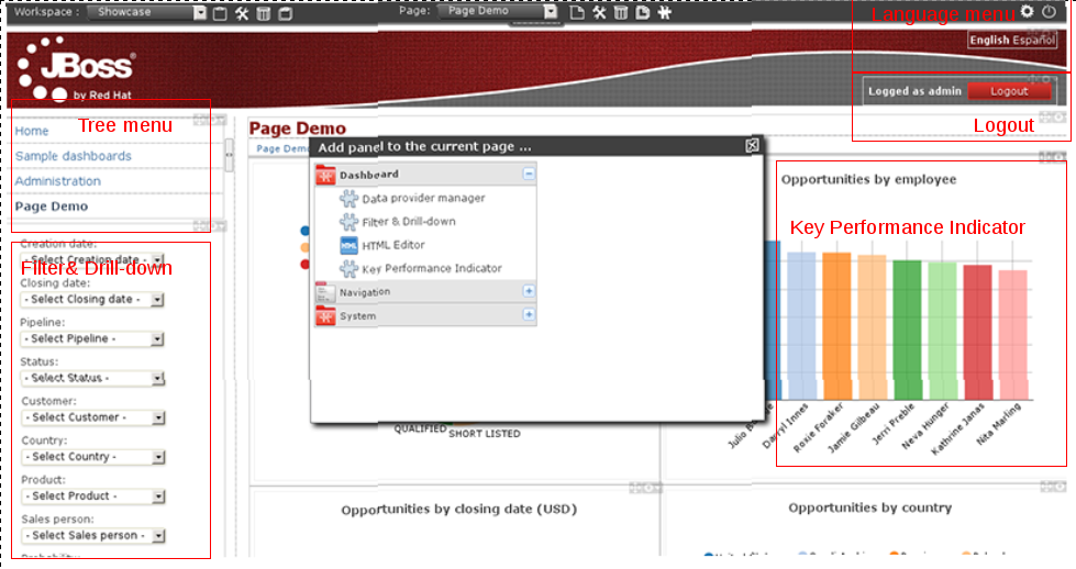
As you can see, a dashboard is usually composed by one or more instances of the following panel types:
Dashboard > Key Performance Indicator
Dashboard > Filter & Drill-down
Navigation > Tree menu
Navigation > Language menu
Navigation > Logout panel
As mentioned earlier, another way to create new pages is to copy an existing one. We can do that via the 'Duplicate current page' icon which is a much faster way to create pages. After clicking on the clone icon located at the toolbar, a page similar to the image below will be shown. From there we can select those instances we want to duplicate and those we want to keep as is (to reuse).
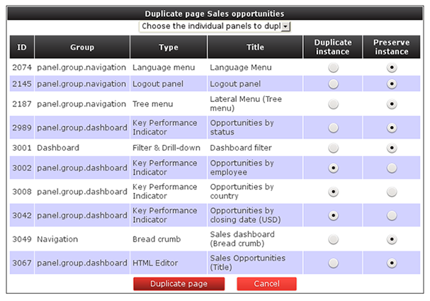
Once finished, press the 'Duplicate page' button and a brand new page will be created with the same name as the original one but starting with the prefix 'Copy of'. Notice that if a panel instance is reused then any changes made to it will be reflected on all the pages where such instance is being used. this is a cool feature when we are defining for instance our navigation menus since we can define a single'Tree menu'panel and then configure all the pages to display the same menu instance.
The 'Filter & Drill-down' panel allows for the quick definition of dynamic forms that will allow us to navigate troughout the data displayed by the dashboard. Once an instance of the 'Filter & Drill-down' panel is dropped on the oage we just have to select the 'Edit content' option from the panel menu. After that, a popup window similar to the following will be displayed:
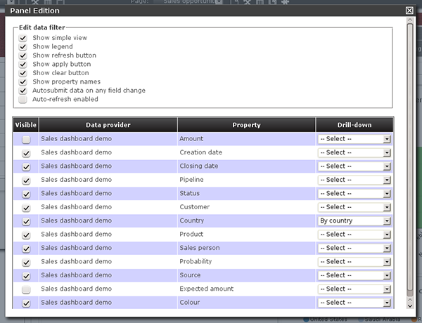
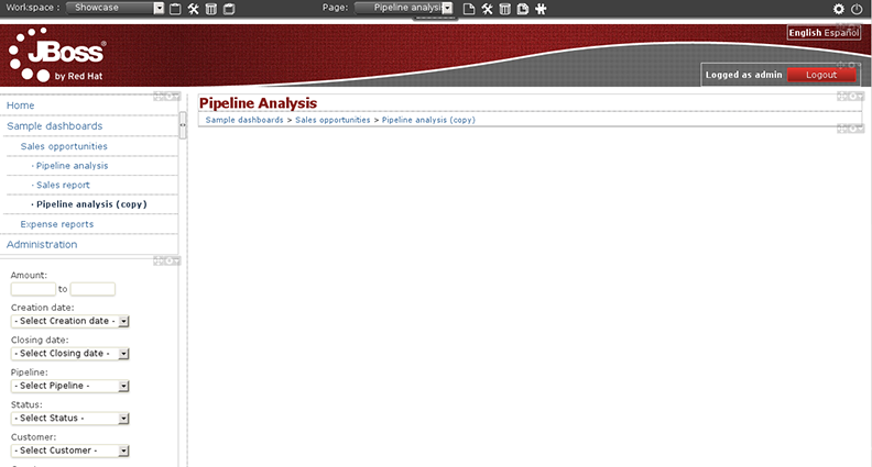
This is a filter configuration panel where we can set the filter behaviour. Let's focus first on the middle bottom part of the screen: the Data provider's property table, which lists the properties of ALL the data providers referred by the KPIs on the page. For example, if we are building a sales dashboard and all its KPIs are built on top of the same data provider called 'Sales dasboard demo' then the system lists all the data properties of the 'Sales dashboard demo ' provider. Hence, only the properties we select as 'Visible' will be part of the filter form. Aditionally, we can enable the drill-down feature for each property. If enabled then the system will redirect to the target page when the property is selected on the filter form. Below is an screenshot of the filter panel of the 'Sales dashboard demo'.
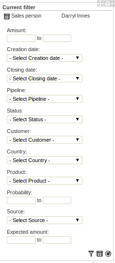
As you can see the form is composed by all the visible properties selected. For each property the system reads its configuration by asking the underlying data provider. For label type properties a drop-down list is displayed, containing as options all the disctinct values of the data provider's column. When the user submits a change on the filter form then the following operations are carried out by the dashboard visualization engine:
It reads the data sets for the target data providers. A data provider is in the target set if it contains the selected filter property.
It applies a filtering algorithm in memory on the target data.
If drill-down is enabled for the selected property then the target page is set as current and the steps #1 and #2 are repeated again.
Finally, after filtering, all the sensible KPIs are updated in order to display the filtered data. By sensible, we mean a KPI which is displaying data that is being filtered.