Note
Viewing the Management Portlet is accomplished by logging in as an admin (admin/admin) and navigating to the Admin portal (see Section 1.4, “Admin Portal”).
The concept of dynamicity refers to the fact all portal objects can be dynamically modified at runtime, eliminating the need to struggle with large xml files, or restarting the application server for changes to take effect. In the scope of dynamicity, Portal objects are defined and can be altered as follows:
Portal Instances: Multiple Portal instances can be launched at any time, secured, and skinned.
Pages: Multiple pages, composed of windows, can coexist inside a portal instance, secured and each could have its own theme applied, if desired.
Portlets: Can be hot-deployed and will instantly register with the portal, appearing in the management portlet.
Portlet Instances: Instances can be created/destroyed. Their preference variables can be modified at runtime, instances assigned to windows and secured.
Windows: Windows can be secured, created/destroyed, and assigned to specific pages.
Themes/Layouts: Can be hot-deployed and will register with the portal, appearing the management portlet, allowing for dynamic customization of any of the above components.
Note
For the remainder of this chapter, the term object will be used to mean Portal, Page, Portlet, or Window indifferently.
The management portlet provides a two-part interface: tabs, at the top, corresponding to the different sections that can be managed; and the main area under it, displaying the current information for the selected tab.
The tabs are:
Portal Objects gathering operations pertaining to managing portal objects (portal instances, pages, windows and their respective configuration information). This is the most complex part of the interface.
Portlet Instances giving access to all the Portlet instances that have been configured.
Portlet Definitions giving access to the currently available portlet providers as well as the Portlets that each provider publishes.
Dashboards allowing administrators to configure how Dashboards should behave.
We will look at each of these tabs and their functionality in the following sections.
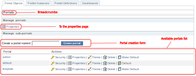
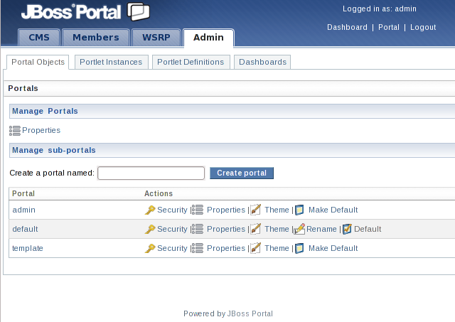
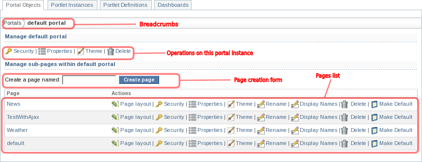
The Portal Objects brings the administrator to a page showing the list of the
available portal instances defined for this Portal server. Several points are of particular interest. First, a
navigation indicator or "breadcrumbs" is located right beneath the tabs. This provides context as to
where in the hierarchy of portal objects the current screen is located as some of the screens can be
found at several levels of the hierarchy. If you are lost, take a look at the breadcrumbs for context!
When you first click on the Portal Objects tab, the context is the list of portals
as shown in the picture above.
A link to access server-wide portal properties is located right beneath the breadcrumbs. This allows the administrator to set server-wide property and configure how errors should be handled:
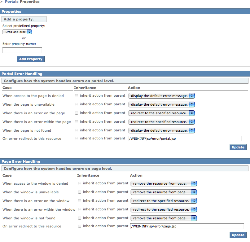
Please refer to the Error handling chapter of the Reference Guide for more information on this point.
A form allowing administrator to create new portal instances is located beneath the
Properties link. Enter the name of the new portal (which, of course, should be
different from any of the already existing one) and click on Create portal and the
portal instances list will be refreshed to display the newly created portal instance.
The last element at this level is a table listing
all the available portal instances along with possible actions on them. Clicking on the portal name
will display a screen showing the information for this given portal instance, thus drilling down the
hierarchy of available portal objects. Clicking on an action name will execute the specified action
on the associated portal instance. These actions are available on each individual portal screen as we
shall see. The notable exception is the Make Default/Default action which is only
available in this listing as it is more of an action across portals than specific to a portal thus
benefiting from being seen at this level. This action allows users to specify which portal instance
is displayed when Portal is first being accessed. Clicking on Make Default will
specify that the associated portal will be displayed to users by default. The portal list will be
refreshed and the selected portal status will be refreshed, its action now showing its
Default status.
In the next sections we will demonstrate the functionality of the management portlet by drilling progressively further down this hierarchy to look at the default portal, one of its pages, show how to configure content on a page and, finally, look at a specific window information.
If you click on the default portal in the list of available portal instances on the
top-level Portal Objects page, you'll be taken to a page showing the information
for the portal instance named "default", as shown below:
Note the breadcrumbs at the top of the screen indicating where in the hierachy you currently are.
In this case, we are looking at the default portal.
Links to more information and operations that
affect this portal instance are located beneath the breadcrumbs. We will look at them in turn later,
excluding the Destroy operation, which as its name implies, allows an
administrator to destroy the current portal instance. Note that these links mirror the links that were
available in the portal instances list on the top level page, Make Default/Default
excepted.
It is possible to create new pages using the page creation form located under the portal-wide
operation links. Enter the new page name and click on Create page and the new page
will appear in the pages list, ready to be configured.
Finally, a table displaying the list of available pages for this portal instance is located at the
bottom of this screen. The first column shows the page name, which you can click to drill down the
hierachy and display the information specific to that particular page. The second column, on the other
hand, provides a list of action links on the associated page. These links
will be also appearing on individual page screens, as we shall see, just like portal action links
appearing in the portal instances list also appeared on individual portal pages. Once again, the
Make Default/Default action, which behaves as its portal counterpart, only appears
in this list: this is where you specify which page should be the default one when users first access
the portal instance.
Let's now look at the default portal's Security information screen. This can be
accessed by clicking the Security action link on the portal page. Here, an
administrator can configure the default policy for security on objects for this portal instance:
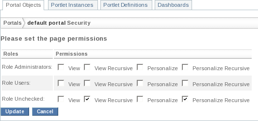
Please refer to the Security chapter of the Reference Guide for more information about how to secure portal objects.
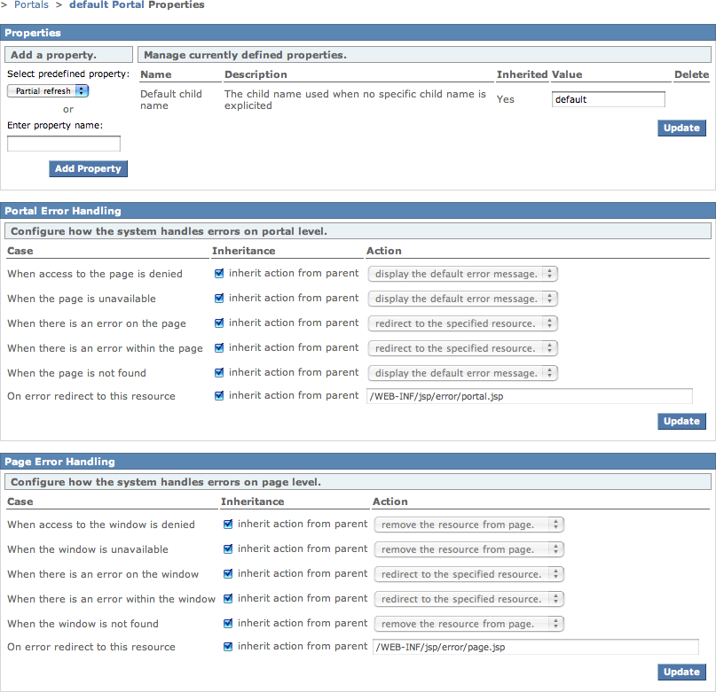
The Properties action link displays the currently configured properties for this
portal instance and allows you to modify them, as well as configure the error handling strategy:
The Theme action link displays a screen where the administrator can configure theme,
layout and render set for this portal instance:
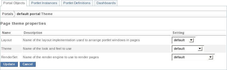
Please refer to the Layouts and Themes chapter of the Reference Guide for more information about themes and layouts.
The Display Name action link displays a screen where the administrator can configure
different names for different languages:
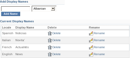
The different names will be used as page display names for the preferred locale of the logged-in user. This is used by the default tab navigation of the default layouts.
Now that we have looked at portal level information, let's drill down the hierachy again and look at
a page, more precisely the default page, by clicking its name in the pages list.
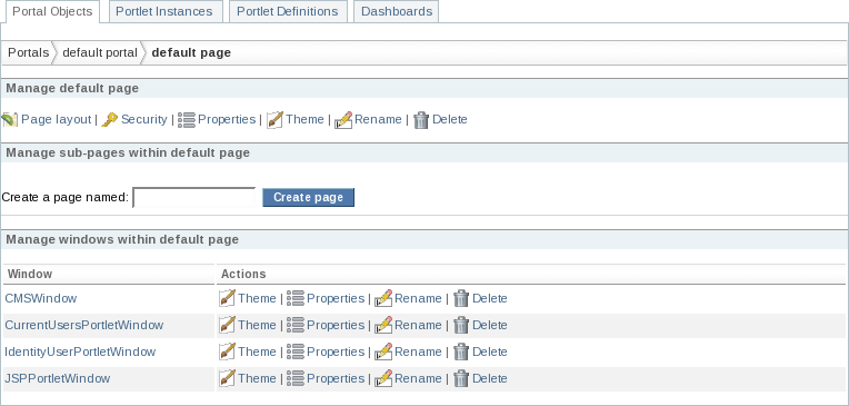
The layout of this screen should start feeling familiar. The information for a page looks a lot like the information for a portal instance. Note the breadcrumbs indicating that you are indeed looking at a page. Again, we find the action links at the top of the page, mirroring the ones that were available for each page in the pages list of the portal instance screen. Once again, you can configure the page's security, theme and properties. You can also destroy it if so desired.
Similarly to other screens in the portal objects hierarchy, a page configuration screen also provides a list of all windows for that page. This list contains two columns: the first one contains the name of the window, while the second one provides a list of action links for that specific window. As usual, clicking on a window name will display information about that window.
Just like a portal instance can contain several pages, a page can contain several subpages. As such a page defines means to create subpages and set which subpage to display when a user is first directed to the page. These operations work similarly to the same operations at the portal instance level.
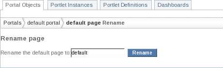
You can also rename the page if desired:
Of specific interest, though, is the Page Layout link. This is where you need to
go to configure which portlet instance will be displayed in which window on which region on the page.
Let's take a look at this screen and how it works:
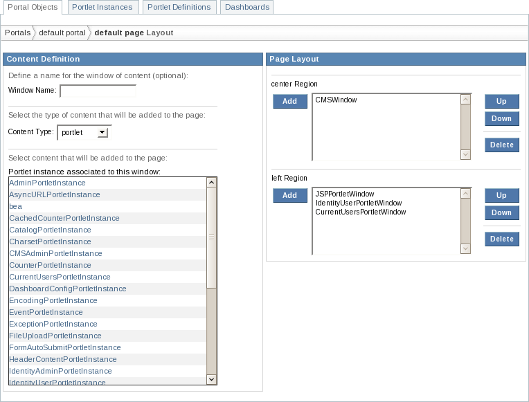
This screen is structured in two parts, flowing from left to right, following the natural process
involved in displaying content on a page. First, you need to identify which content you want to
display: this is what the Content Definition section is for. Then, you need to
figure out where on the page should this content be displayed, hence the Page Layout
section.
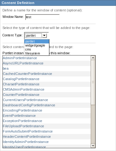
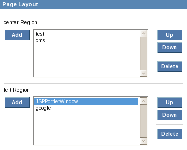
Let's add a window named test displaying the content of the portlet instance
named NewsPortletInstance to the center region, beneath the already existing
CMSWindow.
First, we need to enter our new window name in the Window name field and select
the portlet content type from the drop down menu:
Once this is done, we can select the portlet instance by clicking its name in the instances list:
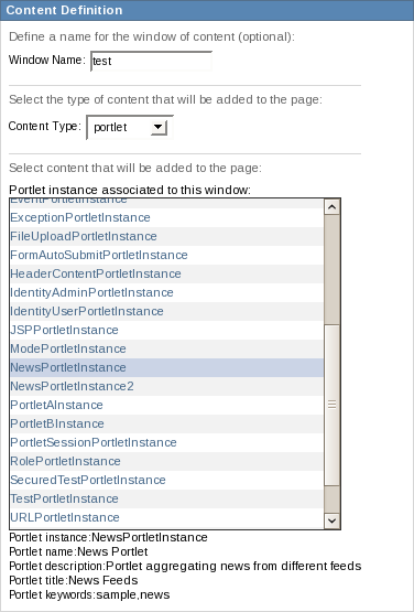
Note that this displays some information about the portlet instance.
Finally, we can add our window to the center region of the page by clicking on Add
button located left to the windows list for the region:
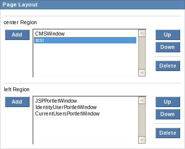
Note that we could move the window up or down in the region by selecting it in the list and using the button to the right of the list, or even destroy it if desired.
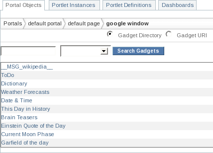
We can repeat this process to add content of different types. Let's add a window using a Google widget
game. First, give a name to your window (we'll use "google" here)
and select widget/google from the content type drop-down menu:
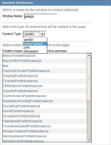
Note how the instances list is replaced by a list of Google widgets. The widget we want to use is
located in the Fun & Games category, so select it from the category drop-down menu:
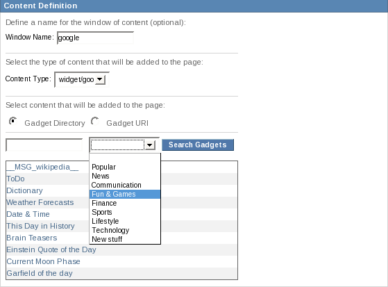
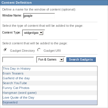
Press Search Gadgets and the widget list will be refreshed. The widget we want is
Bejeweled:
You can now add the new window to the desired region.
Let's repeat this process again, this time with content from CMS. Enter a new window name (we'll
use "cms" here) and select cms from the content type drop-down menu:
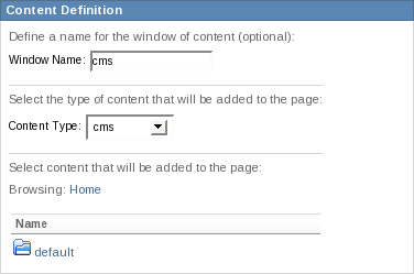
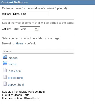
Once again, the instances list was replaced by a directory listing showing the available content roots.
Click on default and select project.html:
You can now add the window to the desired region.
We've added three new windows to the default page using different content types. We added a window
displaying the content of a portlet (displaying the content of an RSS feed in this case). Another one
displaying a Google widget and yet another one some CMS-issued content. We decided to remove the
existing CMSWindow, add the cms window below the
test one in the center region, while the window showing the Google widget was added
to the left region, below the existing content:
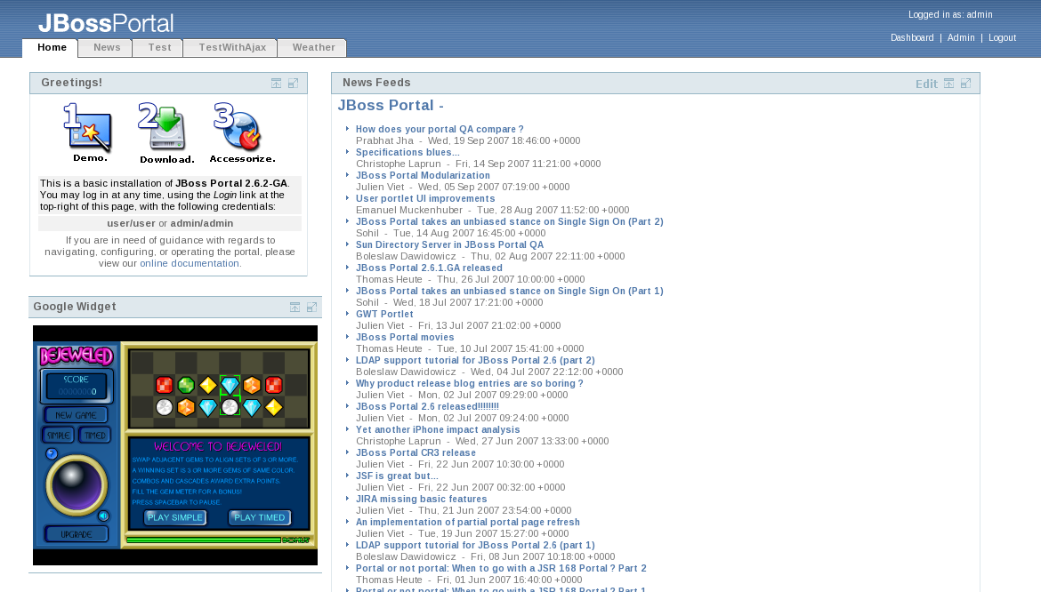
If all went well, logging out of the Admin portal, you should see:
You can read more about Content Integration in the Reference Guide. More details on how to setup content roots in CMS are available in Section 3.1, “Introduction”.
Window operations are similar to the same operations at other level of the hierachy of portal objects.
The only information displayed when a window name is clicked in the windows list of a portal page
information screen is information about the content, similar to the one that is displayed in the
page layout screen. Thus, for the google window that we created in the previous
section:
Note, once again, the breadcrumbs... :)
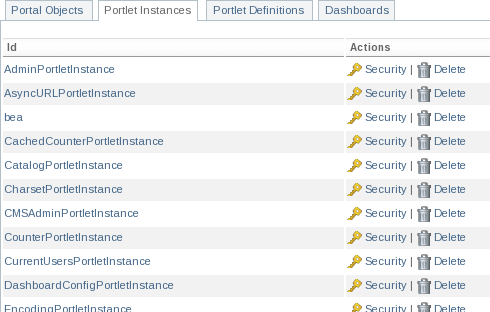
The Portlet Instances tab brings the administrator to the list of instances created
in the running portal. On this page, the user can either modify the security constraints for the portlet
(to grant access only to certain roles), destroy an instance or override the portlet definition preferences
for a specific instance if there is any overridable preference.
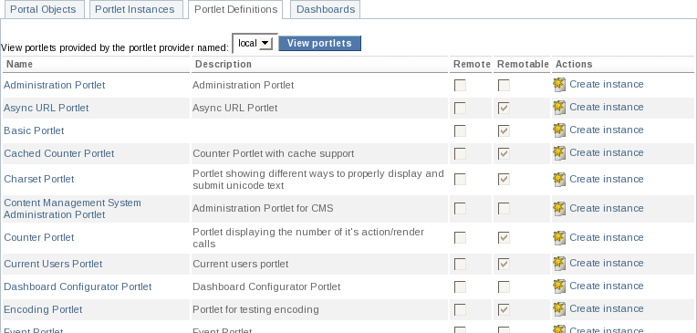
The Portlet Definitions tab brings the administrator to the list of portlet
definitions, formatted as a table displaying name, description, whether the portlet is remote (i.e. accessed
via WSRP from a remote producer) or if it is remotable (i.e. if it is exposed to WSRP consumers by Portal's
producer).
Portlet definitions can be made available by different providers. You can select the provider you want to
browse by selecting it in the drop-down menu and clicking View portlets.
By default, two providers are available:
local: this is Portal's portlet container. Any successfully deployed portlet will appear in the list of available portlet definitions for this provider.
self: this is Portal's default WSRP consumer configured to consume portlets published by Portal's own WSRP producer. This doesn't have much practical interest apart from allowing a quick test of the WSRP functionality of Portal.
More providers can be added to this list. In particular, any active, properly configured WSRP consumer will also appear in the drop-down menu. Please refer to the Consuming remote WSRP portlets in JBoss Portal chapter of the Reference Guide for more information on this topic.
Clicking on a portlet name in the list will display the portlet definition title, description, supported languages and keywords.
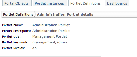
The Preferences action (when available) is used to edit preferences at the portlet
definition level as explained in the JSR-168 specification.
The Dashboards tab allows the administrator to configure parameters for all user dashboards.
It also allows her to configure the error pages and theme properties as for the other portal objects.
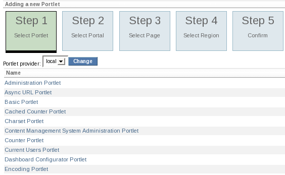
The wizard mode is a fast and easy way to create a new window on a page backed by a portlet instance. The user just needs to define which portlet definition to use, where should the instance be located (portal / page / location on the page) and the wizard will automatically create a new instance of the portlet, create a window for it and add that window to the specified region on the page defined by the user.