Create new RichFaces Documentation Jira issue

This will launch the RichFaces Jira page - to complete your feedback please login if needed, and submit the Jira.
JBoss.orgCommunity Documentation
The component for tables extending standard component <rich:dataTable> .
Possibility to scroll data
Possibility to add an attribute to set the kind of selection (none, single line or multiple lines)
Possibility to change the sequence of the displayed columns by dragging the column-header to another position
Possibility to show or hide columns by selecting or deselecting them in a context menu
Possibility to save the current settings (visible columns, column width, sequence of the columns) to be reused the next time the page will be shown
Possibility to combine rows to groups
Table 6.106. rich : extendedDataTable attributes
| Attribute Name |
Description

|
|---|---|
| activeClass | Assigns one or more space-separated CSS class names to the component active row |
| activeRowKey | Request scope attribute under which the activeRowKey will be accessible |
| ajaxKeys | This attribute defines row keys that are updated after an AJAX request |
| align | Deprecated. This attribute specifies the position of the table with respect to the document. The possible values are "left", "center" and "right". The default value is "left". |
| bgcolor | Deprecated. This attribute sets the background color for the document body or table cells. This attribute sets the background color of the canvas for the document body (the BODY element) or for tables (the TABLE, TR, TH, and TD elements). Additional attributes for specifying text color can be used with the BODY element. This attribute has been deprecated in favor of style sheets for specifying background color information |
| binding | JSF: The attribute takes a value-binding expression for a component property of a backing bean |
| border | HTML: This attributes specifies the width of the frame around a component. Default value is "0" |
| captionClass | Assigns one or more space-separated CSS class names to the component caption |
| captionStyle | CSS style rules to be applied to the component caption |
| cellpadding | This attribute specifies the amount of space between the border of the cell and its contents. Default value is "0" |
| cellspacing | The cellspacing attribute specifies the space between cells. Default value is "0" |
| columnClasses | JSF: Assigns one or more space-separated CSS class names to the columns of the table. If the CSS class names are comma-separated, each class will be assigned to a particular column in the order they follow in the attribute. If you have less class names than columns, the class will be applied to every n-fold column where n is the order in which the class is listed in the attribute. If there are more class names than columns, the overflow ones are ignored. |
| componentState | It defines EL-binding for a component state for saving or redefinition |
| dir | HTML: Direction indication for text that does not inherit directionality. Valid values are "LTR" (left-to-right) and "RTL" (right-to-left) |
| enableContextMenu | If set to true, table header context menu will be enabled |
| first | A zero-relative row number of the first row to display |
| footerClass | Assigns one or more space-separated CSS class names to the component footer |
| frame | This attribute specifies which sides of the frame surrounding a table will be visible. Possible values: "void", "above", "below", "hsides", "lhs", "rhs", "vsides", "box" and "border". The default value is "void". |
| groupingColumn | Defines an id of column which the data is grouped by. |
| headerClass | Assigns one or more space-separated CSS class names to the component header |
| height | Defines a height of the component. Default value is "500px" |
| id | JSF: Every component may have a unique id that is automatically created if omitted |
| lang | HTML: Code describing the language used in the generated markup for this component |
| noDataLabel | Defines label to be displayed in case there are no data rows. |
| onclick | DHTML: The client-side script method to be called when the element is clicked |
| ondblclick | DHTML: The client-side script method to be called when the element is double-clicked |
| onkeydown | DHTML: The client-side script method to be called when a key is pressed down over the element |
| onkeypress | DHTML: The client-side script method to be called when a key is pressed over the element and released |
| onkeyup | DHTML: The client-side script method to be called when a key is released |
| onmousedown | DHTML: The client-side script method to be called when a mouse button is pressed down over the element |
| onmousemove | DHTML: The client-side script method to be called when a pointer is moved within the element |
| onmouseout | DHTML: The client-side script method to be called when a pointer is moved away from the element |
| onmouseover | DHTML: The client-side script method to be called when a pointer is moved onto the element |
| onmouseup | DHTML: The client-side script method to be called when a mouse button is released |
| onRowClick | The client-side script method to be called when the row is clicked |
| onRowDblClick | The client-side script method to be called when the row is double-clicked |
| onRowMouseDown | The client-side script method to be called when a mouse button is pressed down over the row |
| onRowMouseMove | The client-side script method to be called when a pointer is moved within the row |
| onRowMouseOut | The client-side script method to be called when a pointer is moved away from the row |
| onRowMouseOver | The client-side script method to be called when a pointer is moved onto the rows |
| onRowMouseUp | The client-side script method to be called when a pointer is released over the row |
| onselectionchange | The client-side script method to be called when a selected row is changed |
| rendered | JSF: If "false", this component is not rendered |
| reRender | Id['s] (in format of call UIComponent.findComponent()) of components, rendered in case of AjaxRequest caused by this component. Can be single id, comma-separated list of Id's, or EL Expression with array or Collection |
| rowClasses | JSF: Assigns one or more space-separated CSS class names to the rows of the table. If the CSS class names are comma-separated, each class will be assigned to a particular row in the order they follow in the attribute. If you have less class names than rows, the class will be applied to every n-fold row where n is the order in which the class is listed in the attribute. If there are more class names than rows, the overflow ones are ignored. |
| rowKeyConverter | Converter for a row key object |
| rowKeyVar | The attribute provides access to a row key in a Request scope |
| rows | HTML: A number of rows to display, or zero for all remaining rows in the table |
| rules | This attribute specifies which rules will appear between cells within a table. The rendering of rules is user agent dependent. Possible values: * none: No rules. This is the default value. * groups: Rules will appear between row groups (see THEAD, TFOOT, and TBODY) and column groups (see COLGROUP and COL) only. * rows: Rules will appear between rows only. * cols: Rules will appear between columns only. * all: Rules will appear between all rows and columns |
| selectedClass | Assigns one or more space-separated CSS class names to the component rows selected |
| selection | Value binding representing selected rows |
| selectionMode | Single row can be selected. multi: Multiple rows can be selected. none: no rows can be selected. Default value is "single" |
| sortMode | Defines mode of sorting. Possible values are 'single' for sorting of one column and 'multi' for some. |
| sortPriority | Defines a set of column ids in the order the columns could be set |
| stateVar | The attribute provides access to a component state on the client side |
| style | HTML: CSS style rules to be applied to the component |
| styleClass | JSF: Assigns one or more CSS class names to the component. Corresponds to the HTML "class" attribute. |
| tableState | ValueBinding pointing at a property of a String to hold table state |
| title | HTML: Advisory title information about markup elements generated for this component |
| value | JSF: The current value for this component |
| var | A request-scope attribute via which the data object for the current row will be used when iterating |
| width | HTML: This attribute specifies the desired width of the entire table and is intended for visual user agents. When the value is percentage value, the value is relative to the user agent's available horizontal space. In the absence of any width specification, table width is determined by the user agent |
Table 6.107. Component identification parameters
| Name | Value |
|---|---|
| component-type | org.richfaces.ExtendedDataTable |
| component-class | org.richfaces.component.html.HtmlExtendedDataTable |
| component-family | org.richfaces.ExtendedDataTable |
| renderer-type | org.richfaces.ExtendedDataTableRenderer |
| tag-class | org.richfaces.taglib.ExtendedDataTableTag |
Here is a simple example as it could be used on a page:
Example:
...

<rich:extendedDataTable value="#{extendedDT.dataModel}" var="edt">

       <rich:column>

         ...

       </rich:column>

</rich:extendedDataTable>

...
Example:
import org.richfaces.component.html.HtmlExtendedDataTable;

...

HtmlExtendedDataTable myTable = new HtmlExtendedDataTable();

...
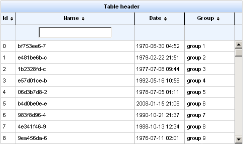
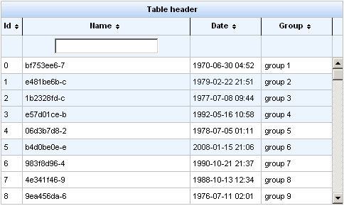
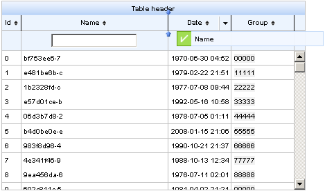
The <rich:extendedDataTable> component is similar to the <rich:dataTable> . The data in component is scrollable. You can also set the type of selection ( "none", "single" or "multi" lines). Selection of multiple lines is possible using Shift and Ctrl keys.
Here is an example:
Example:
...

<rich:extendedDataTable id="edt" value="#{extendedDT.dataModel}" var="edt" width="500px" height="500px" selectedClass="dataTableSelectedRow" sortMode="single" selectionMode="multi" selection="#{extendedDT.selection}" rowKeyVar="rkvar" tableState="#{extendedDT.tableState}">

       <rich:column id="id" headerClass="dataTableHeader" width="50" label="Id" sortable="true" sortBy="#{edt.id}" sortIconAscending="dataTableAscIcon" sortIconDescending="dataTableDescIcon">

              <f:facet name="header">

                     <h:outputText value="Id" />

              </f:facet>

              <h:outputText value="#{edt.id}" />

       </rich:column>

       <rich:column id="name" width="300" headerClass="dataTableHeader" label="Name" sortable="true" sortBy="#{edt.name}" sortIconAscending="dataTableAscIcon" sortIconDescending="dataTableDescIcon" filterBy="#{edt.name}" filterEvent="onkeyup" visible="false">

              <f:facet name="header">

                     <h:outputText value="Name" />

              </f:facet>

              <h:outputText value="#{edt.name}" />

       </rich:column>

       <rich:column id="date" width="100" headerClass="dataTableHeader" label="Date" sortable="true" comparator="#{extendedDT.dateComparator}" sortIconAscending="dataTableAscIcon" sortIconDescending="dataTableDescIcon">

              <f:facet name="header">

                     <h:outputText value="Date" />

              </f:facet>

              <h:outputText value="#{edt.date}"><f:convertDateTime pattern="yyyy-MM-dd HH:mm:ss" />

              </h:outputText>

       </rich:column>

       <rich:column id="group" width="50" headerClass="dataTableHeader" label="Group" sortable="true" sortBy="#{edt.group}" sortIconAscending="dataTableAscIcon" sortIconDescending="dataTableDescIcon">

              <f:facet name="header">

                     <h:outputText value="Group" />

              </f:facet>

              <h:outputText value="#{edt.group}" />

       </rich:column>

</rich:extendedDataTable>

...
Information about sorting and filtering can be found in RichFaces Developer Guide section on sorting.
For external filtering <rich:extendedDataTable> component supports "filter" facet for <rich:column> component. In this facet you can define your own controls for filtering which will be positioned like built-in filter controls. Rest of the filter scenario is the same as described RichFaces Developer Guide section on filtering.
In the example "selection" attribute contains object with selected rows.
Attribute "height" is mandatory. The default value is "500px" .
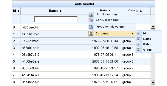
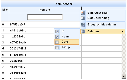
Menu on the right side of the column header is used to perform action: sorting, grouping, hiding columns.
This is an example:
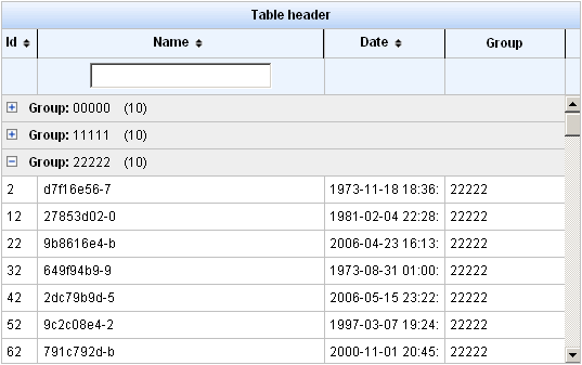
After selecting a "Group by this column" option, you can see the data grouped. You can collapse and expand groups by clicking on a group header.
This is an example:
The "label" attribute in <rich:column> sets the name of the column, which is used when dragging columns (in drag window) and in context menu, in "Columns" submenu.
Example:
...

<rich:column id="name" label="#{msg['name']}"

...
In the component <rich:extendedDataTable> columns can hidden:
"tableState" attribute can be used to bind state of the table (column width, column position, visible, sequence, grouping...) to a backing-bean string property, for a later used. This state can be for example saved to a database, and it is different form standard JSF state saving mechanisms.
Example:
...

<rich:extendedDataTable tableState="#{extendedDT.tableState}">

...
Table 6.108. Facets
| Facet | Description |
|---|---|
| header | Redefines the header content |
| footer | Redefines the footer content |
| caption | Redefines the caption content |
For skinnability implementation, the components use a style class redefinition method. Default style classes are mapped on skin parameters.
There are two ways to redefine the appearance of all <rich:extendedDataTable> components at once:
Redefine the corresponding skin parameters
Add to your style sheets style classes used by a <rich:extendedDataTable> component
Table 6.109. Skin parameters redefinition for a table
| Skin parameters | CSS properties |
|---|---|
| tableBackgroundColor | background-color |
Table 6.110. Skin parameters redefinition for a header
| Skin parameters | CSS properties |
|---|---|
| headerBackgroundColor | background-color |
Table 6.111. Skin parameters redefinition for a footer
| Skin parameters | CSS properties |
|---|---|
| tableFooterBackgroundColor | background-color |
Table 6.112. Skin parameters redefinition for a column header
| Skin parameters | CSS properties |
|---|---|
| additionalBackgroundColor | background-color |
Table 6.113. Skin parameters redefinition for a column footer
| Skin parameters | CSS properties |
|---|---|
| tableSubfooterBackgroundColor | background-color |
Table 6.114. Skin parameters redefinition for cells
| Skin parameters | CSS properties |
|---|---|
| generalSizeFont | font-size |
| generalTextColor | color |
| generalFamilyFont | font-family |
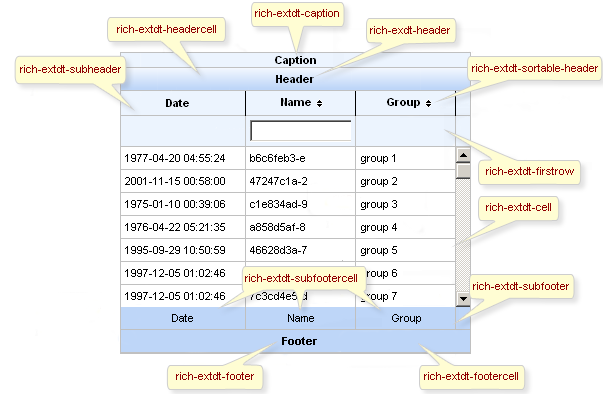
On the screenshot there are classes names that define styles for component elements.
Table 6.115. Classes names that define a whole component appearance
| Class name | Description |
|---|---|
| rich-extdt | Defines styles for all table |
| rich-extdt-caption | Defines styles for a "caption" facet element |
Table 6.116. Classes names that define header and footer elements
| Class name | Description |
|---|---|
| rich-extdt-header | Defines styles for a table header row |
| rich-extdt-header-continue | Defines styles for all header lines after the first |
| rich-extdt-subheader | Defines styles for a column header |
| rich-extdt-footer | Defines styles for a footer row |
| rich-extdt-footer-continue | Defines styles for all footer lines after the first |
| rich-extdt-subfooter | Defines styles for a column footer |
Table 6.117. Classes names that define rows and cells of a table
| Class name | Description |
|---|---|
| rich-extdt-headercell | Defines styles for a header cell |
| rich-extdt-subheadercell | Defines styles for a column header cell |
| rich-extdt-cell | Defines styles for a table cell |
| rich-extdt-row | Defines styles for a table row |
| rich-extdt-firstrow | Defines styles for a table start row |
| rich-extdt-footercell | Defines styles for a footer cell |
| rich-extdt-subfootercell | Defines styles for a column footer cell |
| rich-extdt-group-cell | Defines styles for a grouping row cell |
An example of use the styles for component <rich:extendedDataTable> is similar to <rich:dataTable>
Some additional information about usage of component can be found on its LiveDemo page.