Create new RichFaces Documentation Jira issue

This will launch the RichFaces Jira page - to complete your feedback please login if needed, and submit the Jira.
JBoss.orgCommunity Documentation
The component for row rendering for a UIData component.
Completely skinned table rows and child elements
Possibility to combine columns with the help of "colspan"
Possibility to combine rows with the help of "rowspan" and "breakBefore"
Table 6.56. rich : column attributes
| Attribute Name |
Description

|
|---|---|
| binding | JSF: The attribute takes a value-binding expression for a component property of a backing bean |
| breakBefore | if "true" next column begins from the first row |
| colspan | Corresponds to the HTML colspan attribute |
| comparator | Defines value binding to the comparator that is used to compare the values |
| dir | HTML: Direction indication for text that does not inherit directionality. Valid values are "LTR" (left-to-right) and "RTL" (right-to-left) |
| filterBy | Defines iterable object property which is used when filtering performed. |
| filterEvent | Event for filter input that forces the filtration (default value is "onchange") |
| filterExpression | Attribute defines a bean property which is used for filtering of a column |
| filterMethod | This attribute is defined with method binding. This method accepts on Object parameter and return boolean value |
| filterValue | Defines current filtering value |
| footerClass | Assigns one or more space-separated CSS class names to any footer generated for this component |
| headerClass | Assigns one or more space-separated CSS class names to any header generated for this component |
| id | JSF: Every component may have a unique id that is automatically created if omitted |
| label | Column label for drag indicator. Usable only for extendedDataTable component |
| lang | HTML: Code describing the language used in the generated markup for this component |
| rendered | JSF: If "false", this component is not rendered |
| rowspan | Corresponds to the HTML rowspan attribute |
| selfSorted | Manages if the header of the column is clickable, icons rendered and sorting is fired after click on the header. You need to define this attribute inside <rich:dataTable> component. Default value is "true" |
| sortable | Boolean attribute. If "true" it's possible to sort the column content after click on the header. Default value is "true" |
| sortBy | Defines a bean property which is used for sorting of a column. This attribute used with <rich:dataTable> |
| sortExpression | Defines a bean property which is used for sorting of a column and used only with <rich:scrollableDataTable>. |
| sortIcon | Defines sort icon. The value for the attribute is context related. |
| sortIconAscending | Defines sort icon for ascending order. The value for the attribute is context related. |
| sortIconDescending | Defines sort icon for descending order. The value for the attribute is context related. |
| sortOrder | SortOrder is an enumeration of the possible sort orderings. Default value is "UNSORTED" |
| style | HTML: CSS style rules to be applied to the component |
| styleClass | JSF: Assigns one or more CSS class names to the component. Corresponds to the HTML "class" attribute. |
| title | HTML: Advisory title information about markup elements generated for this component |
| visible | The attribute is used to define whether the component is visible or not. The default value is "true". |
| width | HTML: Attribute defines width of column. |
Table 6.57. Component identification parameters
| Name | Value |
|---|---|
| component-type | org.richfaces.Column |
| component-class | org.richfaces.component.html.HtmlColumn |
| component-family | org.richfaces.Column |
| renderer-type | org.richfaces.ColumnRenderer |
| tag-class | org.richfaces.taglib.ColumnTag |
To create the simplest variant of column on a page, use the following syntax:
Example:
...

<rich:dataTable var="set">

     <rich:column>

          <h:outputText value="#{set.property1}"/>

     </rich:column>

     <!--Set of another columns and header/footer facets-->

</rich:dataTable>

...
Example:
import org.richfaces.component.html.HtmlColumn;

...

HtmlColumn myColumn = new HtmlColumn();

...
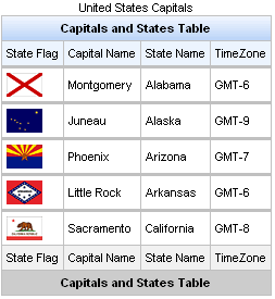
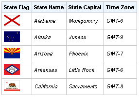
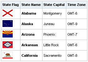
To output a simple table, the <rich:column> component is used the same way as the standard <h:column> , i.e. the following code on a page is used:
Example:
...

<rich:dataTable value="#{capitalsBean.capitals}" var="cap" rows="5">

     <rich:column>

          <f:facet name="header">State Flag</f:facet>

          <h:graphicImage value="#{cap.stateFlag}"/>

     </rich:column>

     <rich:column>

           <f:facet name="header">State Name</f:facet>

           <h:outputText value="#{cap.state}"/>

     </rich:column>

     <rich:column >

          <f:facet name="header">State Capital</f:facet>

          <h:outputText value="#{cap.name}"/>

     </rich:column>

     <rich:column>

          <f:facet name="header">Time Zone</f:facet>

          <h:outputText value="#{cap.timeZone}"/>

     </rich:column>

</rich:dataTable>

...
The result is:
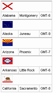
Now, in order to group columns with text information into one row in one
column with a flag, use the
"colspan"
attribute, which is similar to an HTML one, specifying
that the first column contains 3 columns. In addition, it's
necessary to specify that the next column begins from the first row
with the help of the
breakBefore="true".
Example:
...

<rich:dataTable value="#{capitalsBean.capitals}" var="cap" rows="5">

     <rich:column colspan="3">

          <h:graphicImage value="#{cap.stateFlag}"/>

     </rich:column>

     <rich:column breakBefore="true">

          <h:outputText value="#{cap.state}"/>

     </rich:column>

     <rich:column >

          <h:outputText value="#{cap.name}"/>

     </rich:column>

     <rich:column>

          <h:outputText value="#{cap.timeZone}"/>

     </rich:column>

</rich:dataTable>

...
As a result the following structure is rendered:
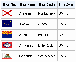
The same way is used for columns grouping with the "rowspan" attribute that is similar to an HTML one responsible for rows quantity definition occupied with the current one. The only thing to add in the example is an instruction to move onto the next row for each next after the second column.
Example:
...

<rich:dataTable value="#{capitalsBean.capitals}" var="cap" rows="5">

     <rich:column rowspan="3">

          <f:facet name="header">State Flag</f:facet>

          <h:graphicImage value="#{cap.stateFlag}"/>

     </rich:column>

     <rich:column>

          <f:facet name="header">State Info</f:facet>

          <h:outputText value="#{cap.state}"/>

     </rich:column>

     <rich:column breakBefore="true">

          <h:outputText value="#{cap.name}"/>

     </rich:column>

     <rich:column breakBefore="true">

          <h:outputText value="#{cap.timeZone}"/>

     </rich:column>

</rich:dataTable>

...
As a result:
Hence, additionally to a standard output of a particular row provided with the <h:column> component, it becomes possible to group easily the rows with special HTML attribute.
The columns also could be grouped in a particular way with the help of the <h:columnGroup> component that is described in the following chapter.
In the Dynamic Columns Wiki article you can find additional information about dynamic columns.
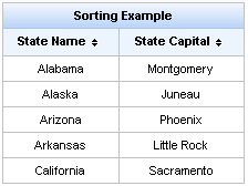
In order to sort the columns you should use "sortBy" attribute that indicates what values to be sorted.This attribute can be used only with the <rich:dataTable> component. In order to sort the column you should click on its header. See the following example.
Example:
...

<h:form>

    <rich:dataTable value="#{capitalsBean.capitals}" var="cap" width="300px">

        <f:facet name="header">

            <h:outputText value="Sorting Example"/>

        </f:facet>

        <rich:column sortBy="#{cap.state}">

            <f:facet name="header">

                <h:outputText value="State Name"/>

            </f:facet>

            <h:outputText value="#{cap.state}"/>

        </rich:column>

        <rich:column sortBy="#{cap.name}">

            <f:facet name="header">

                <h:outputText value="State Capital"/>

            </f:facet>

            <h:outputText value="#{cap.name}"/>

        </rich:column>

    </rich:dataTable>

</h:form>

...
This is result:
The "sortExpression" attribute defines a bean property which is used for sorting of a column. This attribute can be used only with the <rich:scrollableDataTable> component. The following example is a example of the attribute usage.
Example:
...

<rich:scrollableDataTable id="carList"

        value="#{dataTableScrollerBean.allCars}" sortMode="single"

        binding="#{dataTableScrollerBean.table}">

        <rich:column id="make" sortExpression="#{cap.make}">

            <f:facet name="header">

                <h:outputText styleClass="headerText" value="Make" />

            </f:facet>

            <h:outputText value="#{category.make}" />

        </rich:column>

        <rich:column id="model">

            <f:facet name="header">

                <h:outputText styleClass="headerText" value="Model" />

            </f:facet>

            <h:outputText value="#{category.model}" />

        </rich:column>

        <rich:column id="price">

            <f:facet name="header">

                <h:outputText styleClass="headerText" value="Price" />

            </f:facet>

            <h:outputText value="#{category.price}" />

        </rich:column>

</rich:scrollableDataTable>

...
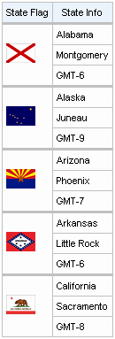
The "selfSorted" attribute that would add the possibility of automatic sorting by clicking the column header. Default value is "true". In the example below the second column is unavailable for sorting.
Example:
...

<rich:dataTable value="#{capitalsBean.capitals}" var="cap">

        <rich:column>

                <f:facet name="header">

                        <h:outputText value="State Flag"/>

                </f:facet>

                <h:graphicImage value="#{cap.stateFlag}"/>

        </rich:column>

        <rich:column sortBy="#{cap.state}" selfSorted="false">

                <f:facet name="header">

                        <h:outputText value="State Name"/>

                </f:facet>

                <h:outputText value="#{cap.state}"/>

        </rich:column>

</rich:dataTable>

...
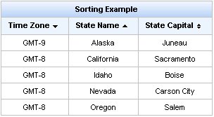
"sortOrder" attribute is used for changing the sorting of columns by means of external controls.
Possible values are:
"ASCENDING" - column is sorted in ascending
"DESCENDING" - column is sorted in descending
"UNSORTED" - column isn't sorted
Example:
...

<h:form>

    <rich:dataTable value="#{capitalsBean.capitals}" var="cap" width="300px">

        <f:facet name="header">

            <h:outputText value="Sorting Example"/>

        </f:facet>

        <rich:column sortBy="#{cap.state}" sortOrder="ASCENDING">

            <f:facet name="header">

                <h:outputText value="State Name"/>

            </f:facet>

            <h:outputText value="#{cap.state}"/>

        </rich:column>

        <rich:column sortBy="#{cap.name}" sortOrder="DESCENDING">

            <f:facet name="header">

                <h:outputText value="State Capital"/>

            </f:facet>

            <h:outputText value="#{cap.name}"/>

        </rich:column>

    </rich:dataTable>

</h:form>

...
Below you can see the result:
In the example above the first column is sorted in descending order. But if recurring rows appear in the table the relative second column are sorted in ascending order.
If the values of the columns are complex, the "sortOrder" attribute should point to a bean property containing the sort order. See how it's done in the LiveDemo for <rich:columns> .
You can customize the sorting's icon element using "rich-sort-icon" class.
In order to sort a column with the values not in English you can add the org.richfaces.datatableUsesViewLocale context parameter in your web.xml.
Its value should be "true".
The "sortBy" and the "selfSorted" attributes used with the <rich:dataTable> component. Also the "selfSorted" can be used with the <rich:extendedDataTable> .
The "sortable" and the "sortExpression" attributes used with the <rich:scrollableDataTable> component.
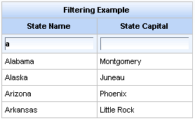
There are two ways to filter the column value:
Using built-in filtering. It uses
startsWith()
function to make filtering. In this case
you need to define
"filterBy"
attribute at column you want
to be filterable. This attribute defines
iterable object property which is used
when filtering performed.
The "filterValue" attribute is used to get or change current filtering value. It could be defined with initial filtering value on the page or as value binding to get/change it on server. If the "filterValue" attribute isn't empty from the beginning table is filtered on the first rendering.
You can customize the input form using "rich-filter-input" CSS class.
In order to change filter event you could use "filterEvent" attribute on column, e.g. "onblur"(default value).
Below you can see the example:
Example:
...

<rich:dataTable value="#{capitalsBean.capitals}" var="cap" width="500px">

        <rich:column filterBy="#{cap.state}" filterValue="#{filterName.filterBean}" filterEvent="onkeyup">

                <h:outputText value="#{cap.state}"/>

        </rich:column>

        <rich:column filterBy="#{cap.name}" filterEvent="onkeyup">

                <h:outputText value="#{cap.name}"/>

        </rich:column>

</rich:dataTable>

...
This is the result:
Using external filtering. In this case you need to write your custom filtering function or expression and define controls.
The "filterExpression" attribute is used to define expression evaluated to boolean value. This expression checks if the object satisfies filtering condition.
The "filterMethod" attribute is defined with method binding. This method accepts on Object parameter and return boolean value. So, this method also could be used to check if the object satisfies filtering condition. The usage of this attribute is the best way for implementing your own complex business logic.
See the following example:
Example:
...

<rich:dataTable value="#{capitalsBean.capitals}" var="cap" id="table">

        <rich:column filterMethod="#{filteringBean.filterStates}">

                <f:facet name="header">

                        <h:inputText value="#{filteringBean.filterValue}" id="input">

                                <a4j:support event="onkeyup" reRender="table"

                                                     ignoreDupResponses="true" requestDelay="700" focus="input" />

                        </h:inputText>

                </f:facet>

                <h:outputText value="#{cap.state}" />

        </rich:column>

        <rich:column filterExpression="#{fn:containsIgnoreCase(cap.timeZone, filteringBean.filterZone)}">

                <f:facet name="header">

                        <h:selectOneMenu value="#{filteringBean.filterZone}">

                                <f:selectItems value="#{filteringBean.filterZones}" />

                                <a4j:support event="onchange" reRender="table" />

                        </h:selectOneMenu>

                </f:facet>

                <h:outputText value="#{cap.timeZone}" />

        </rich:column>

</rich:dataTable>

...
Table 6.58. Facets
| Facet name | Description |
|---|---|
| header | Defines the header content |
| footer | Defines the footer content |
For skinnability implementation, the components use a style class redefinition method. Default style classes are mapped on skin parameters.
There are two ways to redefine the appearance of all <rich:column> components at once:
Redefine the corresponding skin parameters
Add to your style sheets style classes used by a <rich:column> component
Skin parameters redefinition for <rich:column> are the same as for the <rich:dataTable> component.
Custom style classes for <rich:column> are the same as for the <rich:dataTable> component.
In order to redefine styles for all <rich:column> components on a page using CSS, it's enough to create classes with the same names (possible classes could be found in the tables above) and define necessary properties in them.
Example:
...

.rich-table-cell{

        font-style: italic;

}

...
This is a result:
In the example cells font style was changed.
Also it's possible to change styles of particular <rich:column> component. In this case you should create own style classes and use them in corresponding <rich:column> styleClass attributes. An example is placed below:
Example:
...

.myClass{

        font-weight: bolder;

}

...
The "styleClass" attribute for <rich:column> is defined as it's shown in the example below:
Example:
<rich:column styleClass="myClass">
This is a result:
As it could be seen on the picture above, the font weight for second column was changed.
Vizit Column page at RichFaces live demo for examples of component usage and their sources.
" Using the "rendered" attribute of <rich:column>" article in RichFaces cookbook at JBoss portal gives an example of code of the component usage case.