Create new RichFaces Documentation Jira issue

This will launch the RichFaces Jira page - to complete your feedback please login if needed, and submit the Jira.
JBoss.orgCommunity Documentation
The <rich:inplaceInput> is an input component used for displaying and editing data inputted.
View/changed/edit states highly customizable representations
Changing state event customization
Possibility to call custom JavaScript function on state changes
Optional "inline" or "block" element rendering on a page
Edit mode activation when the component gets focus with the "Tab"
Sizes synchronizations between modes
Controls customization
Table 6.426. rich : inplaceInput attributes
| Attribute Name |
Description

|
|---|---|
| binding | JSF: The attribute takes a value-binding expression for a component property of a backing bean |
| cancelControlIcon | Defines custom cancel icon |
| changedClass | Assigns one or more space-separated CSS class names to the component in the changed state |
| changedHoverClass | Assigns one or more space-separated CSS class names to the component hovered in the changed state |
| controlClass | Assigns one or more space-separated CSS class names to the component controls |
| controlHoverClass | Assigns one or more space-separated CSS class names to the component control hovered |
| controlPressedClass | Assigns one or more space-separated CSS class names to the component control pressed |
| controlsHorizontalPosition | Positions the controls horizontally. Possible values are "left", "center", "right". Default value is "right". |
| controlsVerticalPosition | Positions the controls vertically. Possible values are "bottom","center" and "top". Default value is "center" |
| converter | JSF: Id of Converter to be used or reference to a Converter |
| converterMessage | A ValueExpression enabled attribute that, if present, will be used as the text of the converter message, replacing any message that comes from the converter |
| defaultLabel | The attribute is used to display text while value is undefined |
| editClass | Assigns one or more space-separated CSS class names to the component in the edit state |
| editEvent | Provides an option to assign an JavaScript action that initiates the change of the state. Default value is "onclick". |
| id | JSF: Every component may have a unique id that is automatically created if omitted |
| immediate | A flag indicating that this component value must be converted and validated immediately (that is, during Apply Request Values phase), rather than waiting until a Process Validations phase |
| inputWidth | Sets width of the input field |
| label | A localized user presentable name for this component. |
| layout | Defines how the component is displayed in the layout. Possible values are "block", "inline". Default value is "inline". |
| maxInputWidth | Sets the maximum width of the input field. Default value is "500px". |
| maxlength | HTML: Specifies the maximum number of digits that could be entered into the input field. The maximum number is unlimited by default. |
| minInputWidth | Sets the minimum width of the input field. Default value is "40px". |
| onblur | DHTML: The client-side script method to be called when the component loses the focus |
| onchange | DHTML: The client-side script method to be called when the component value is changed |
| onclick | DHTML: The client-side script method to be called when the element is clicked |
| ondblclick | DHTML: The client-side script method to be called when the element is double-clicked |
| oneditactivated | The client-side script method to be called when the component edit state is activated |
| oneditactivation | The client-side script method to be called before the component edit state is activated |
| onfocus | DHTML: The client-side script method to be called when the component gets the focus |
| oninputclick | The client-side script method to be called when the input field is clicked |
| oninputdblclick | The client-side script method to be called when the input field is double-clicked |
| oninputkeydown | The client-side script method to be called when a key is pressed down in the input field |
| oninputkeypress | The client-side script method to be called when a key is pressed and released in the input field |
| oninputkeyup | The client-side script method to be called when a key is released in the input field |
| oninputmousedown | The client-side script method to be called when a mouse button is pressed down in the input field |
| oninputmousemove | The client-side script method to be called when a pointer is moved within the input field |
| oninputmouseout | The client-side script method to be called when a pointer is moved away from the input field |
| oninputmouseover | The client-side script method to be called when a pointer is moved onto the input field |
| oninputmouseup | The client-side script method to be called when a mouse button is released in the input field |
| onkeydown | DHTML: The client-side script method to be called when a key is pressed down over the element |
| onkeypress | DHTML: The client-side script method to be called when a key is pressed over the element and released |
| onkeyup | DHTML: The client-side script method to be called when a key is released |
| onmousedown | DHTML: The client-side script method to be called when a mouse button is pressed down over the element |
| onmousemove | DHTML: The client-side script method to be called when a pointer is moved within the element |
| onmouseout | DHTML: The client-side script method to be called when a pointer is moved away from the element |
| onmouseover | DHTML: The client-side script method to be called when a pointer is moved onto the element |
| onmouseup | DHTML: The client-side script method to be called when a mouse button is released |
| onselect | DHTML: The client-side script method to be called when some text is selected in the input field |
| onviewactivated | The client-side script method to be called when the component view state is activated |
| onviewactivation | The client-side script method to be called before the component view state is activated |
| rendered | JSF: If "false", this component is not rendered |
| required | JSF: If "true", this component is checked for non-empty input |
| requiredMessage | A ValueExpression enabled attribute which defines text of validation message to show, if a required field is missing |
| saveControlIcon | Defines custom save icon |
| selectOnEdit | Makes the input field select when switched to edit state. Default value is "false" |
| showControls | Serves to display "save" and "cancel" controls. Default value is "false". |
| styleClass | JSF: Assigns one or more space-separated CSS class names to the component. Corresponds to the HTML "class" attribute. |
| tabindex | HTML: Serves to define the tabbing order |
| validator | JSF: MethodBinding pointing at a method that is called during Process Validations phase of the request processing lifecycle, to validate the current value of this component |
| validatorMessage | A ValueExpression enabled attribute that, if present, will be used as the text of the validator message, replacing any message that comes from the validator |
| value | JSF: The current value of this component |
| valueChangeListener | JSF: Listener for value changes |
| viewClass | Assigns one or more space-separated CSS class names to the component in the view state |
| viewHoverClass | Assigns one or more space-separated CSS class names to the component hovered in the view state |
Table 6.427. Component identification parameters
| Name | Value |
|---|---|
| component-type | org.richfaces.inplaceInput |
| component-class | org.richfaces.component.html.HtmlInplaceInput |
| component-family | org.richfaces.inplaceInput |
| renderer-type | org.richfaces.renderkit.inplaceInputRenderer |
| tag-class | org.richfaces.taglib.inplaceInputTag |
Here is a simple example of how the component can be used on a page:
Example:
...

<rich:inplaceInput value="#{bean.value}"/>

...
Example:
import org.richfaces.component.html.inplaceInput;

...

HtmlInpaceInput myInplaceInput = new InplaceInput();

...
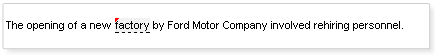
The <rich:inplaceInput> component was designed to facilitate displaying and inputting(editing) some data.
The "value" attribute is a value-binding expression for the current value of the component.
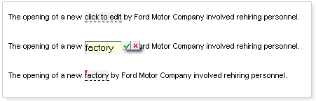
The component has three functional states:
View state displays default label with the value taken from "value" or "defaultLabel" attributes.
If the initial value of the "value" attribute is "null" or empty string the "defaultLabel" attribute is used to define default label.
Example:
...

<rich:inplaceInput value="#{bean.value}" defaultLabel="click to edit"/>

...
In the example above the
"value"
attribute is not initialized
therefore "click to edit" text, that
"defaultLabel"
, contains is displayed.
This is the result:
Edit state - input representation to allow value edit
Changed state - value representation after it was changed
The "editEvent" attribute provides an option to assign a JavaScript action to initiate the change of the state from view/changed to edit. The default value is "onclick".
Example:
...

<rich:inplaceInput value="#{bean.value}" editEvent="ondblclick"/>

...
The <rich:inplaceInput> component provides specific event attributes:
"oneditactivation" which is fired on edit state activation
"oneditactivated" which is fired when edit state is activated
"onviewactivation" which is fired on view state activation
"onviewactivated" which is fired after the component is changed to representation state
Example:
...

<rich:inplaceInput value="#{bean.value}" oneditactivation="if (!confirm('Are you sure you want to change the value?')){return false;}" />

...
The given code illustrates how
"oneditactivation"
attribute works,
namely when the state is being changed from view to edit,
a confirmation window with a message "Are you sure you want to change value?" comes up.
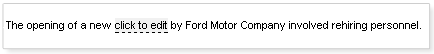
Using the boolean "selectOnEdit" attribute set to true, the text in the input field will be selected when the change from view/changed state to edit occurs.
This is the result:
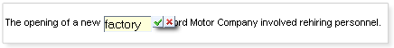
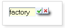
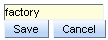
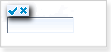
If the <rich:inplaceInput> loses focus, input data is saved automatically and the component displays a new value. Additionally, the data is saved when "Enter" is pressed. Nevertheless, you can use the "showControls" attribute, which makes "Save" and "Cancel" buttons appear next to the input field. If the controls are used, data is not saved automatically when the form loses focus: user has to confirm that he/she wants to save/discard the data explicitly. In both cases(with controls or without them) the input data can be discarded by pressing "Esc" key.
Example:
...

<rich:inplaceInput value="#{bean.value}" showControls="true"/>

...
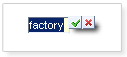
You can also position the controls relatively to the input field, by means of
The "controlsHorizontalPosition" attribute with "left", "right" and "center" definitions
The "controlsVerticalPosition " attribute with "bottom", "center" and "top" definitions
Example:
...

<rich:inplaceInput value="#{bean.value}" showControls="true" controlsVerticalPosition="bottom" controlsHorizontalPosition="left"/>

...
This is the result:
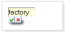
It is also possible to use "controls" facet in order to replace the default controls with facets content. See the example below.
Example:
...

<rich:inplaceInput defaultLabel="Click here to edit" showControls="true" controlsHorizontalPosition="left" controlsVerticalPosition="bottom" id="inplaceInput">

    <f:facet name="controls">

        <h:commandButton value="Save" onclick="#{rich:component('inplaceInput')}.save();" type="button" />

        <h:commandButton value="Cancel" onclick="#{rich:component('inplaceInput')}.cancel();" type="button" />

    </f:facet>

</rich:inplaceInput>

...
This is the result:
The "controls" facet also implies using "showControls" attribute and it has to be defined as "true".
Redefinition of the "save" and "cancel" icons can be performed using "saveControlIcon" and "cancelControlIcon" attributes. You need to define the path to where your images are located.
Example:
...

<rich:inplaceInput value="#{bean.value}" defaultLabel='click to edit'

    showControls="true"

    controlsHorizontalPosition="left"

    controlsVerticalPosition="top"

    saveControlIcon="/images/cancel.gif"

    cancelControlIcon="/images/save.gif"/>

    ...
The <rich:inplaceInput> component could be rendered with <span> or <div> elements to display its value. In order to change default <span> output, use "layout" attribute with "block" value.
The <rich:inplaceInput> component supports standard "tabindex" attribute. When the component gets focus the edit mode is activated.
The "inputWidth" , "minInputWidth" , "maxInputWidth" attributes are provided to specify the width, minimal width and maximal width for the input element respectively.
Table 6.428. Keyboard usage
| Keys and combinations | Description |
|---|---|
| ENTER | Saves the input data, and changes the state from edit to changed |
| ESC | Changes the state from edit to view or changed, value is not affected |
| TAB | Switches between the components |
Table 6.429. JavaScript API
| Function | Description |
|---|---|
| edit() | Changes the state to edit |
| cancel() | Changes its state to the previous one before editing (changed or view) |
| save() | Changes its state to changed with a new value |
| getValue() | Gets the current value |
| setValue(newValue) | Sets the current value (to be implemented) |
Table 6.430. Facets
| Facet name | Description |
|---|---|
| controls | Defines the contols contents. Related attributes are "saveControlIcon" and "cancelControlIcon" |
For skinnability implementation, the components use a style class redefinition method. Default style classes are mapped on skin parameters.
There are two ways to redefine the appearance of all <rich:inplaceInput> components at once:
Redefine the corresponding skin parameters
Add to your style sheets style classes used by a <rich:inplaceInput> component
Table 6.431. Skin parameters redefinition for "save" and "cancel" controls
| Skin parameters | CSS properties |
|---|---|
| tabBackgroundColor | background-color |
| panelBorderColor | border-color |
Table 6.432. Skin parameters redefinition for view state
| Skin parameters | CSS properties |
|---|---|
| editorBackgroundColor | background-color |
| generalTextColor | border-bottom-color |
Table 6.433. Skin parameters redefinition for "Changed" state
| Skin parameters | CSS properties |
|---|---|
| editorBackgroundColor | background-color |
| generalTextColo | border-bottom-color |
Table 6.434. Classes names that define input field look and feel in edit state
| Skin parameters | CSS properties |
|---|---|
| editBackgroundColor | background-color |
| panelBorderColor | border-color |
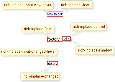
On the screenshot there are classes names that define styles for component elements.
Table 6.435. Classes names that define a component appearance
| Class name | Description |
|---|---|
| rich-inplace | Defines styles for a wrapper <span> (or <div>) element of a component |
| rich-inplace-input | Defines styles for the component input field |
Table 6.436. Class name for the view state
| Class name | Description |
|---|---|
| rich-inplace-view | Defines styles for the view state |
| rich-inplace-input-view-hover | Defines styles for hovered text in the view state |
Table 6.437. Class name for the input field in edit state
| Class name | Description |
|---|---|
| rich-inplace-field | Defines styles for the input field look and feel in edit state |
Table 6.438. Class name for the "Changed" state
| Class name | Description |
|---|---|
| rich-inplace-changed | Defines styles for the "Changed" state |
| rich-inplace-input-changed-hover | Defines styles for the hovered text in the "Changed" state |
Table 6.439. Classes names for "save" and "cancel" controls in Edit state
| Class name | Description |
|---|---|
| rich-inplace-control | Defines styles for the controls |
| rich-inplace-control-press | Defines styles for the controls when either of the buttons is pressed |
| rich-inplace-shadow-size | Defines size of the shadow |
| rich-inplace-shadow-tl | Defines styles for the shadow in the top left corner |
| rich-inplace-shadow-tr | Defines styles for the shadow in the top right corner |
| rich-inplace-shadow-bl | Defines styles for the shadow in the bottom left corner |
| rich-inplace-shadow-br | Defines styles for the shadow in the bottom right corner |
In order to redefine styles for all <rich:inplaceInput> components on a page using CSS, it's enough to create classes with the same names (possible classes could be found in the tables above) and define necessary properties in them.
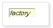
Example:
...

.rich-inplace-field {

      font-style: italic;

}

...
This is the result:
In the shown example the font in edit state is changed to bold.
It's aslo possible to change styles of a particular <rich:inplaceInput> component. In this case you should create own style classes and use them in corresponding <rich:inplaceInput> styleClass attributes. An example is placed below:
Example:
...

.myClass {

    color:  #008cca;

}

...
The "viewClass" attribute for the <rich:inplaceInput> is defined as it's shown in the example below:
Example:
<rich:inplaceInput value="click to edit" styleClass="myClass"/>
This is a result:
As it could be seen on the picture above, the font color of the text on the component was changed.
On the component Live Demo page you can see the example of <rich:inplaceIput> usage and sources for the given example.