Create new RichFaces Documentation Jira issue

This will launch the RichFaces Jira page - to complete your feedback please login if needed, and submit the Jira.
JBoss.orgCommunity Documentation
The <rich:listShuttle> component is used for moving chosen items from one list into another with their optional reordering there.
Highly customizable look and feel
Reordering possibility for lists items
Multiple selection of lists items
Keyboard support
Table 6.477. rich : listShuttle attributes
| Attribute Name |
Description

|
|---|---|
| activeItem | Stores active item |
| ajaxKeys | Defines row keys that are updated after an Ajax request |
| binding | JSF: The attribute takes a value-binding expression for a component property of a backing bean |
| bottomControlClass | Assigns one or more space-separated CSS class names to the 'Bottom' button |
| bottomControlLabel | Defines a label for a bottom control |
| bottomTitle | HTML: alt for the last button |
| columnClasses | JSF: Assigns one or more space-separated CSS class names to the columns. If the CSS class names are comma-separated, each class will be assigned to a particular column in the order they follow in the attribute. If you have less class names than columns, the class will be applied to every n-fold column where n is the order in which the class is listed in the attribute. If there are more class names than columns, the overflow ones are ignored. |
| componentState | It defines EL-binding for a component state for saving or redefinition |
| controlsType | Defines type of a control: button or none. Default value is "button". |
| controlsVerticalAlign | Customizes vertically a position of move/copy and order controls relatively to lists. Default value is "middle" |
| converter | JSF: Id of Converter to be used or reference to a Converter |
| converterMessage | A ValueExpression enabled attribute that, if present, will be used as the text of the converter message, replacing any message that comes from the converter |
| copyAllControlClass | Assigns one or more space-separated CSS class names to the 'Copy all' button |
| copyAllControlLabel | Defines a label for a "Copy all" control |
| copyAllTitle | HTML: alt for "Copy all" button |
| copyControlClass | Assigns one or more space-separated CSS class names to the 'Copy' button |
| copyControlLabel | Defines a label for a "Copy" control |
| copyTitle | HTML: alt for a "Copy" button |
| disabledControlClass | Assigns one or more space-separated CSS class names to the component disabled controls |
| downControlClass | Assigns one or more space-separated CSS class names to the 'Down' button |
| downControlLabel | Defines a label for a down control |
| downTitle | HTML: alt for bottom button |
| fastMoveControlsVisible | If "false", 'Copy All' and 'Remove All' controls aren't displayed. Default value is "true". |
| fastOrderControlsVisible | If "false", 'Top' and 'Bottom' controls aren't displayed. Default value is "true". |
| id | JSF: Every component may have a unique id that is automatically created if omitted |
| immediate | A flag indicating that this component value must be converted and validated immediately (that is, during Apply Request Values phase), rather than waiting until a Process Validations phase |
| label | A localized user presentable name for this component. |
| listClass | Assigns one or more space-separated CSS class names to the component lists |
| listsHeight | Defines height of the list. Default value is "140". |
| moveControlsVisible | If "false", 'Copy' and 'Remove' controls aren't displayed. Default value is "true". |
| onblur | DHTML: The client-side script method to be called when the component loses the focus |
| onbottomclick | The client-side script method to be called when the 'Bottom' button is clicked |
| onclick | DHTML: The client-side script method to be called when the component is clicked |
| oncopyallclick | The client-side script method to be called when the 'Copy All' button is clicked |
| oncopyclick | The client-side script method to be called when the 'Copy' button is clicked |
| ondblclick | DHTML: The client-side script method to be called when the component is double-clicked |
| ondownclick | The client-side script method to be called when the 'Down' button is clicked |
| onfocus | DHTML: The client-side script method to be called when the component gets the focus |
| onlistchange | The client-side script method to be called before the list is changed |
| onlistchanged | The client-side script method to be called when the list is changed |
| onmousemove | DHTML: The client-side script method to be called when a pointer is moved within the component |
| onmouseout | DHTML: The client-side script method to be called when a pointer is moved away from the component |
| onmouseover | DHTML: The client-side script method to be called when a pointer is moved onto the component |
| onorderchange | The client-side script method to be called before the list order is changed |
| onorderchanged | The client-side script method to be called when the list order is changed |
| onremoveallclick | The client-side script method to be called when the 'Remove All' button is clicked |
| onremoveclick | The client-side script method to be called when the 'Remove' button is clicked |
| ontopclick | The client-side script method to be called when the 'Top' button is clicked |
| onupclick | The client-side script method to be called when the 'Up' button is clicked |
| orderControlsVisible | If "false", 'Up' and 'Down' controls aren't displayed. Default value is "true". |
| removeAllControlClass | Assigns one or more space-separated CSS class names to the 'Remove all' button |
| removeAllControlLabel | Defines a label for a "Remove all" control |
| removeAllTitle | HTML: alt for "Remove all" button |
| removeControlClass | Assigns one or more space-separated CSS class names to the 'Remove' button |
| removeControlLabel | Defines a label for a "Remove" control |
| removeTitle | HTML: alt for a "Remove" button |
| rendered | JSF: If "false", this component is not rendered |
| requiredMessage | A ValueExpression enabled attribute which defines text of validation message to show, if a required field is missing |
| rowClasses | JSF: Assigns one or more space-separated CSS class names to the rows. If the CSS class names are comma-separated, each class will be assigned to a particular row in the order they follow in the attribute. If you have less class names than rows, the class will be applied to every n-fold row where n is the order in which the class is listed in the attribute. If there are more class names than rows, the overflow ones are ignored. |
| rowKeyConverter | Converter for a row key object |
| rowKeyVar | The attribute provides access to a row key in a Request scope |
| showButtonLabels | Shows a label for a button. Default value is "true". |
| sourceCaptionLabel | Defines source list caption representation text |
| sourceListWidth | Defines width of a source list. Default value is "140". |
| sourceRequired | Defines the case when source value is being validated. If the value is "true", there should be at least one item in the source list |
| sourceSelection | Manages selection in a source list from the server side |
| sourceValue | Defines a List or Array of items to be shown in a source list |
| style | HTML: CSS style rules to be applied to the component |
| styleClass | JSF: Assigns one or more CSS class names to the component. Corresponds to the HTML "class" attribute. |
| switchByClick | If "true", dragging between lists realized by click |
| switchByDblClick | If "true", items can be moved between the lists by double-clicking on them. Default value is "true". |
| targetCaptionLabel | Defines target list caption representation text |
| targetListWidth | Defines width of a target list. Default value is "140". |
| targetRequired | Defines the case when target value is being validated. If the value is "true", there should be at least one item in the target list |
| targetSelection | Manages selection in a target list from the server side |
| targetValue | Defines a List or Array of items to be shown in a target list |
| topControlClass | Assigns one or more space-separated CSS class names to the 'Top' button |
| topControlLabel | Defines a label for a "Top" control |
| topTitle | HTML: alt for the first button |
| upControlClass | Assigns one or more space-separated CSS class names to the 'Up' button |
| upControlLabel | Defines a label for an "Up" control |
| upTitle | HTML: alt for top button |
| validator | JSF: MethodBinding pointing at a method that is called during Process Validations phase of the request processing lifecycle, to validate the current value of this component |
| validatorMessage | A ValueExpression enabled attribute that, if present, will be used as the text of the validator message, replacing any message that comes from the validator |
| valueChangeListener | JSF: Listener for value changes |
| var | Defines a list on the page |
To create the simplest variant on a page use the following syntax:
Example:
...

<rich:listShuttle var="item" sourceValue="#{bean.source}" targetValue="#{bean.target}" converter="listShuttleconverter">

        <h:column>

                <f:facet name="header">

                        <h:outputText value="Cars" />

                </f:facet>

                <h:outputText value="#{item.name}" />

        </h:column>

</rich:listShuttle>

...
Example:
import org.richfaces.component.html.HtmlListShuttle;

...

HtmlListShuttle myListShuttle = new HtmlListShuttle();

...
The <rich:listShuttle> component consists of the following parts:
two item lists (source and target). List consists of items. Each item has three different representations: common, selected, active
optional caption element
optional ordering controls set is a set of controls that performs reordering
move controls set is a set of controls, which performs moving items between lists
Now the listener can not be called from the column facet. This is a temporary limitation. The additional information can be found in RichFaces Jira.
The "sourceValue" attribute defines a List or Array of items to be shown in the source list.
The "targetValue" attribute defines a List or Array of items to be shown in the target list.
The "var" attribute could be shared between both Lists or Arrays to define lists on the page.
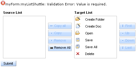
The "sourceRequired" and "targetRequired" attributes define the case when source and target values are being validated. If the value of both attributes is "true" there should be at least one item in source and target lists. Otherwise validation fails.
Example:
...

<h:form id="myForm">

        <rich:messages>

                <f:facet name="errorMarker">

                        <h:graphicImage value="/images/ajax/error.gif" />

                </f:facet>

        </rich:messages>

        <rich:listShuttle id="myListShuttle" sourceValue="#{toolBar.freeItems}" targetValue="#{toolBar.items}"

                                sourceRequired = "true" targetRequired = "true" var="items" converter="listShuttleconverter"

                                sourceCaptionLabel="Source List" targetCaptionLabel="Target List">

                <rich:column>

                        <h:graphicImage value="#{items.iconURI}" />

                </rich:column>

                <rich:column>

                        <h:outputText value="#{items.label}" />

                </rich:column>

        </rich:listShuttle>

        <a4j:commandButton value="Submit" />

</h:form>

...
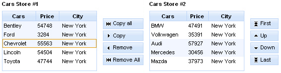
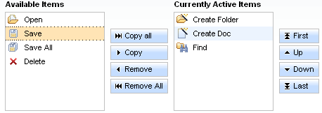
In the example above the source list is empty. If you submit the form validation fails and error message appears on a page.
This is the result:
The "converter" attribute is used to convert component data to a particular component's value. For example, when you select items in a list, a converter is used to format a set of objects to a strings to be displayed.
The "converter" attribute and the "equals" and "hashCode" methods should be defined only in your own class.
The "sourceSelection" attribute stores the collection of items selected by you in the source list. The "targetSelection" attribute stores the collection of items selected by you in the target list.
Captions could be added to a list only after it was defined as a "sourceCaption" and "targetCaption" named facets inside the component or defined with the "sourceCaptionLabel" and "targetCaptionLabel" attribute.
...

<rich:listShuttle var="item" sourceValue="#{bean.source}" targetValue="#{bean.target}" sourceSelection="#{bean.sourceSelection}"

                        targetSelection="#{bean.targetSelection}" converter="listShuttleconverter">

        <f:facet name="sourceCaption">

                <h:outputText value="Cars Store #1" />

        </f:facet>

        <f:facet name="targetCaption">

                <h:outputText value="Cars Store #2" />

        </f:facet>

        <rich:column>

                <h:outputText value="#{items.name}" />

        </rich:column>

</rich:listShuttle>

...
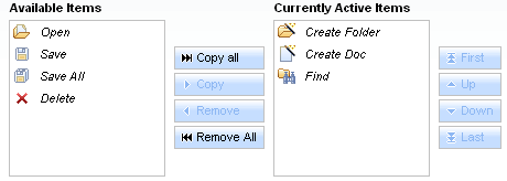
The <rich:listShuttle> component provides the possibility to use ordering controls set, which performs reordering in the target item list. Every control has possibility to be disabled.
An ordering controls set could be defined with "topControlLabel" , "bottomControlLabel" , "upControlLabel" , "downControlLabel" attributes.
It is also possible to use "topControl" , "topControlDisabled" , "bottomControl" , "bottomControlDisabled" , "upControl" , "upControlDisabled" , "downControl" , "downControlDisabled" facets in order to replace the default controls with facets content.
Example:
...

<rich:listShuttle var="item" sourceValue="#{bean.source}" targetValue="#{bean.target}" converter="listShuttleconverter">

        ...

        <f:facet name="topControl">

                <h:outputText value="Move to top" />

        </f:facet>

        <f:facet name="upControl">

                <h:outputText value="Move up" />

        </f:facet>

        <f:facet name="downControl">

                <h:outputText value="Move down" />

        </f:facet>

        <f:facet name="bottomControl">

                <h:outputText value="Move to bottom" />

        </f:facet>

</rich:listShuttle>

...
The <rich:listShuttle> component also provides 4 predefined controls in move controls set for moving items between source and target lists. Every control has possibility to be disabled.
A move controls set could be defined with "copyControlLabel" , "removeControlLabel" , "copyAllControlLabel" , "removeAllControlLabel" attributes.
It is also possible to use "copyControl" , "removeControl" , "copyAllControl" , "removeAllControl" facets in order to replace the default controls with facets content.
...

<rich:listShuttle var="item" sourceValue="#{bean.source}" targetValue="#{bean.target}" converter="listShuttleconverter"

                        copyControlLabel="Copy" removeControlLabel="Remove"

                        copyAllControlLabel="Copy all" removeAllControlLabel="Remove all">

        <h:column>

                <f:facet name="header">

                        <h:outputText value="Cars" />

                </f:facet>

                <h:outputText value="#{item.name}" />

        </h:column>

</rich:listShuttle>

...
Controls rendering is based on the "controlsType" attribute. Possible types are button and none.
Currently the button controls type is based on <div> element.
The
<rich:listShuttle>
component allows to use internationalization method
to redefine and localize the labels. You could use application resource bundle and define
RICH_SHUTTLES_TOP_LABEL,
RICH_SHUTTLES_BOTTOM_LABEL,
RICH_SHUTTLES_UP_LABEL,
RICH_SHUTTLES_DOWN_LABEL
RICH_LIST_SHUTTLE_COPY_ALL_LABEL,
RICH_LIST_SHUTTLE_COPY_LABEL,
RICH_LIST_SHUTTLE_REMOVE_ALL_LABEL,
RICH_LIST_SHUTTLE_REMOVE_LABEL there.
You could also pack org.richfaces.renderkit.listShuttle resource bundle with your JARs defining the same properties.
Table 6.478. Keyboard usage for elements selection
| Keys and combinations | Description |
|---|---|
| CTRL+click | Inverts selection for an item |
| SHIFT+click | Selects all rows from active one to a clicked row if they differ, else select the actve row. All other selections are cleared |
| CTRL+A | Selects all elements inside the list if some active element is already present in a list |
| Up, Down arrows | Changes the active element to the next or previous in a list and make it the only selected. Scroll follows the selection to keep it visible |
Table 6.479. Keyboard usage for elements reordering
| Keys and combinations | Description |
|---|---|
| Home | Moves selected set to the top of a list (for target list only) |
| End | Moves selected set to the bottom of a list (for target list only) |
| CTRL+Up arrow | Moves selected item to one position upper |
| CTRL+Down arrow | Moves selected item to one position lower |
Table 6.480. JavaScript API
| Function | Description |
|---|---|
| enable() | Enables ordering control (to be implemented) |
| disable() | Disables ordering control (to be implemented) |
| isEnabled() | Checks if current control is enabled (to be implemented) |
| up() | Moves up selected item in the list |
| down() | Moves down selected item in the list |
| top() | Moves top selected item in the list |
| bottom() | Moves bottom selected item in the list |
| copy() | Copies selected item from the source list to the target list |
| remove() | Removes selected item from the target list to the source list |
| copyAll() | Copies all items from the source list to the target list |
| removeAll() | Removes all items from the target list to the source list |
| getSelection() | Returns currently selected item (to be implemented) |
| getItems() | Returns the collection of all items (to be implemented) |
Table 6.481. Facets
| Facet | Description |
|---|---|
| copyAllControl | Redefines the label content for the "copyAll" control. Related attribute is "copyAllControlLabel" |
| removeAllControl | Redefines the label content for the "removeAll" control. Related attribute is "removeAllControlLabel" |
| copyControl | Redefines the label content for the "copy" control. Related attribute is "copyControlLabel" |
| removeControl | Redefines the label content for the "remove" control. Related attribute is "removeControlLabel" |
| copyAllControlDisabled | Redefines the disabled label content for the "copyAll" control |
| removeAllControlDisabled | Redefines the disabled label content for the "removeAll" control |
| caption | Redefines the caption control |
| sourceCaption | Defines source list caption representation text. Related attribute is "sourceCaptionLabel" |
| targetCaption | Defines source list target representation text. Related attribute is "targetCaptionLabel" |
For skinnability implementation, the components use a style class redefinition method. Default style classes are mapped on skin parameters.
There are two ways to redefine the appearance of all <rich:listShuttle> components at once:
Redefine the corresponding skin parameters
Add to your style sheets style classes used by a <rich:listShuttle> component
Table 6.482. Skin parameters redefinition for items in the source and target lists
| Skin parameters | CSS properties |
|---|---|
| generalBackgroundColor | background-color |
| tableBorderColor | border-color |
| tableBorderWidth | border-width |
Table 6.483. Skin parameters redefinition for caption in the source and target lists
| Skin parameters | CSS properties |
|---|---|
| headerFamilyFont | font-family |
| headerSizeFont | font-size |
| headerWeightFont | font-weight |
Table 6.484. Skin parameters redefinition for a selected rows in the source and target lists
| Skin parameters | CSS properties |
|---|---|
| additionalBackgroundColor | background-color |
Table 6.485. Skin parameters redefinition for a header cell
| Skin parameters | CSS properties |
|---|---|
| headerBackgroundColor | background-color |
| headerTextColor | color |
| headerFamilyFont | font-family |
| headerSizeFont | font-size |
| tableBorderWidth | border-width |
| subBorderColor | border-top-color |
| panelBorderColor | border-bottom-color |
| panelBorderColor | border-right-color |
Table 6.486. Skin parameters redefinition for a selected cell
| Skin parameters | CSS properties |
|---|---|
| generalTextColor | color |
| generalFamilyFont | font-family |
| generalSizeFont | font-size |
Table 6.487. Skin parameters redefinition for an active cell
| Skin parameters | CSS properties |
|---|---|
| generalSizeFont | font-size |
| generalFamilyFont | font-family |
Table 6.488. Skin parameters redefinition for controls
| Skin parameters | CSS properties |
|---|---|
| tableBorderColor | border-color |
Table 6.489. Skin parameters redefinition for a button
| Skin parameters | CSS properties |
|---|---|
| trimColor | background-color |
| generalTextColor | color |
| headerFamilyFont | font-family |
| headerSizeFont | font-size |
Table 6.490. Skin parameters redefinition for a disabled button
| Skin parameters | CSS properties |
|---|---|
| trimColor | background-color |
| tabDisabledTextColor | color |
| headerFamilyFont | font-family |
| headerSizeFont | font-size |
Table 6.491. Skin parameters redefinition for a button highlight
| Skin parameters | CSS properties |
|---|---|
| trimColor | background-color |
| selectControlColor | border-color |
| tableBorderWidth | border-width |
| headerFamilyFont | font-family |
| headerSizeFont | font-size |
| generalTextColor | color |
Table 6.492. Skin parameters redefinition for a pressed button
| Skin parameters | CSS properties |
|---|---|
| additionalBackgroundColor | background-color |
| tableBorderColor | border-color |
| tableBorderWidth | border-width |
| headerFamilyFont | font-family |
| headerSizeFont | font-size |
| generalTextColor | color |
Table 6.493. Skin parameters redefinition for a button content
| Skin parameters | CSS properties |
|---|---|
| headerFamilyFont | font-family |
| headerSizeFont | font-size |
Table 6.494. Skin parameters redefinition for a button selection
| Skin parameters | CSS properties |
|---|---|
| generalTextColor | color |
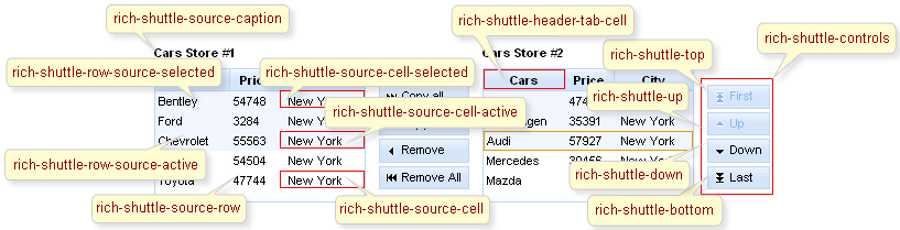
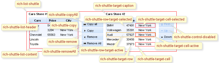
On the screenshot there are classes names that define styles for component elements.
Table 6.495. Classes names that define a list representation
| Class name | Description |
|---|---|
| rich-list-shuttle | Defines styles for a wrapper table element of a listShuttle |
| rich-list-shuttle-caption | Defines styles for a list caption |
| rich-shuttle-body | Defines styles for a list body |
| rich-shuttle-list-content | Defines styles for a list content |
| rich-shuttle-source-items | Defines styles for a wrapper <div> element for source list |
| rich-shuttle-target-items | Defines styles for a wrapper <div> element for target list |
| rich-shuttle-list-header | Defines styles for a lists header |
| rich-shuttle-header-tab-cell | Defines styles for a header cell |
Table 6.496. Classes names that define a caption representations in a source and target lists
| Class name | Description |
|---|---|
| rich-shuttle-source-caption | Defines styles for a caption in a source list |
| rich-shuttle-target-caption | Defines styles for a caption in a target list |
Table 6.497. Classes names that define a rows representations in a source list
| Class name | Description |
|---|---|
| rich-shuttle-source-row | Defines styles for a row in a source list |
| rich-shuttle-source-row-selected | Defines styles for a selected row in a source list |
| rich-shuttle-source-row-active | Defines styles for an active row in a source list |
Table 6.498. Classes names that define a rows representations in a target list
| Class name | Description |
|---|---|
| rich-shuttle-target-row | Defines styles for a row in a target list |
| rich-shuttle-target-row-selected | Defines styles for a selected row in a target list |
| rich-shuttle-target-row-active | Defines styles for an active row in a target list |
Table 6.499. Classes names that define a cells representations in a source list
| Class name | Description |
|---|---|
| rich-shuttle-source-cell | Defines styles for a cell in a source list |
| rich-shuttle-source-cell-selected | Defines styles for a selected cell in a source list |
| rich-shuttle-source-cell-active | Defines styles for an active cell in a source list |
Table 6.500. Classes names that define a cells representations in a target list
| Class name | Description |
|---|---|
| rich-shuttle-target-cell | Defines styles for a cell in a target list |
| rich-shuttle-target-cell-selected | Defines styles for a selected cell in a target list |
| rich-shuttle-target-cell-active | Defines styles for an active cell in a target list |
Table 6.501. Classes names that define controls representations
| Class name | Description |
|---|---|
| rich-shuttle-controls | Defines styles for a controls group |
| rich-shuttle-top | Defines styles for a "Top" control |
| rich-shuttle-bottom | Defines styles for a "Bottom" control |
| rich-shuttle-up | Defines styles for a "Up" control |
| rich-shuttle-down | Defines styles for a "Down" control |
| rich-shuttle-copy | Defines styles for a "Copy" control |
| rich-shuttle-remove | Defines styles for a "Remove" control |
| rich-shuttle-copyAll | Defines styles for a "copyAll" control |
| rich-shuttle-removeAll | Defines styles for a "removeAll" control |
| rich-shuttle-control-disabled | Defines styles for a control in a disabled state |
Table 6.502. Classes names that define a button representation
| Class name | Description |
|---|---|
| rich-list-shuttle-button | Defines styles for a button |
| rich-list-shuttle-button-disabled | Defines styles for a disabled button |
| rich-list-shuttle-button-light | Defines styles for a button highlight |
| rich-list-shuttle-button-press | Defines styles for a pressed button |
| rich-list-shuttle-button-content | Defines styles for a button content |
| rich-list-shuttle-button-selection | Defines styles for a button selection |
In order to redefine styles for all <rich:listShuttle> components on a page using CSS, it's enough to create classes with the same names (possible classes could be found in the tables above) and define necessary properties in them.
Example:
...

.rich-shuttle-source-row-active{

        background-color:#FFE4B5;

}

...
This is a result:
In the example an active row background color in the source list was changed.
Also it's possible to change styles of particular <rich:listShuttle> component. In this case you should create own style classes and use them in corresponding <rich:listShuttle> styleClass attributes. An example is placed below:
Example:
...

.myClass{

        font-style:italic;

}

...
The "rowClasses" attribute for <rich:listShuttle> is defined as it's shown in the example below:
Example:
<rich:listShuttle ... rowClasses="myClass"/>
This is a result:
As it could be seen on the picture above, font style for row items was changed.
On RichFaces LiveDemo page you can see an example of <rich:listShuttle> usage and sources for the given example.