Create new RichFaces Documentation Jira issue

This will launch the RichFaces Jira page - to complete your feedback please login if needed, and submit the Jira.
JBoss.orgCommunity Documentation
The <rich:pickList> component is used for moving selected item(s) from one list into another.
Multiple selection of list items
Keyboard support
Supports standard JSF internationalization
Highly customizable look and feel
Table 6.530. rich : pickList attributes
| Attribute Name |
Description

|
|---|---|
| binding | JSF: The attribute takes a value-binding expression for a component property of a backing bean |
| controlClass | Assigns one or more space-separated CSS class names to the component controls |
| converter | JSF: Id of Converter to be used or reference to a Converter |
| converterMessage | A ValueExpression enabled attribute that, if present, will be used as the text of the converter message, replacing any message that comes from the converter |
| copyAllControlLabel | Defines a label for a "Copy all" control |
| copyAllTitle | HTML: alt for a "Copy all" button |
| copyAllVisible | If "false", the 'Copy All' control will not be displayed. Even if this value is "true", the 'Copy All' control will not be displayed if the "fastMoveControlsVisible" attribute is "false". Default value is "true". |
| copyControlLabel | Defines a label for a "Copy" control |
| copyTitle | HTML: alt for a "Copy" button |
| copyVisible | If "false", the 'Copy' control will not be displayed. Even if this value is "true", the 'Copy' control will not be displayed if the "moveControlsVisible" attribute is "false". Default value is "true". |
| disabled | HTML: If "true", disable this component on page. |
| disabledStyle | CSS style rules to be applied to the component disabled controls |
| disabledStyleClass | Assigns one or more space-separated CSS class names to the component disabled controls |
| enabledStyle | CSS style rules to be applied to the component enabled controls |
| enabledStyleClass | Assigns one or more space-separated CSS class names to the component enabled controls |
| fastMoveControlsVisible | If "false", 'Copy All' and 'Remove All' controls aren't displayed. Even if this value is "true", the 'Copy All' and 'Remove All' controls will not be displayed if the "copyAllVisible" and "removeAllVisible" attribute values are "false". Default value is "true". |
| id | JSF: Every component may have a unique id that is automatically created if omitted |
| immediate | A flag indicating that this component value must be converted and validated immediately (that is, during Apply Request Values phase), rather than waiting until a Process Validations phase |
| label | A localized user presentable name for this component. |
| listClass | Assigns one or more space-separated CSS class names to the component lists |
| listsHeight | Defines height of the list. Default value is "140px" |
| moveControlsVerticalAlign | Customizes vertically a position of move/copy controls relatively to lists. Default value is "center". |
| moveControlsVisible | If "false", 'Copy' and 'Remove' controls aren't displayed. Even if this value is "true", the 'Copy' and 'Remove' controls will not be displayed if the "copyVisible" and "removeVisible" attribute values are "false". Default value is "true". |
| onblur | DHTML: The client-side script method to be called when the component loses the focus |
| onclick | DHTML: The client-side script method to be called when the element is clicked |
| ondblclick | DHTML: The client-side script method to be called when the element is double-clicked |
| onfocus | DHTML: The client-side script method to be called when the component gets the focus |
| onkeydown | DHTML: The client-side script method to be called when a key is pressed down over the element |
| onkeypress | DHTML: The client-side script method to be called when a key is pressed over the element and released |
| onkeyup | DHTML: The client-side script method to be called when a key is released |
| onlistchange | The client-side script method to be called when the list is changed |
| onlistchanged | The client-side script method to be called before the list is changed |
| onmousedown | DHTML: The client-side script method to be called when a mouse button is pressed down over the element |
| onmousemove | DHTML: The client-side script method to be called when a pointer is moved within the element |
| onmouseout | DHTML: The client-side script method to be called when a pointer is moved away from the element |
| onmouseover | DHTML: The client-side script method to be called when a pointer is moved onto the element |
| onmouseup | DHTML: The client-side script method to be called when a mouse button is released |
| removeAllControlLabel | Defines a label for a "Remove all" control |
| removeAllTitle | HTML: alt for a "Remove" all button |
| removeAllVisible | If "false", the 'Remove All' control will not be displayed. Even if this value is "true", the 'Remove All' control will not be displayed if the "fastMoveControlsVisible" attribute is "false". Default value is "true". |
| removeControlLabel | Defines a label for a "Remove" control |
| removeTitle | HTML: alt for a "Remove" button |
| removeVisible | If "false", the 'Remove' control will not be displayed. Even if this value is "true", the 'Remove' control will not be displayed if the "moveControlsVisible" attribute is "false". Default value is "true". |
| rendered | JSF: If "false", this component is not rendered |
| required | JSF: If "true", this component is checked for non-empty input |
| requiredMessage | A ValueExpression enabled attribute which defines text of validation message to show, if a required field is missing |
| showButtonsLabel | Shows a label for a button. Default value is "true" |
| sourceListWidth | Defines width of a source list. Default value is "140px" |
| style | HTML: CSS style rules to be applied to the component |
| styleClass | JSF: Assigns one or more CSS class names to the component. Corresponds to the HTML "class" attribute. |
| switchByClick | If "true", items can be moved between the lists by clicking on them. Default value is "false". |
| switchByDblClick | If "true", items can be moved between the lists by double-clicking on them. Default value is "true". |
| targetListWidth | Defines width of a target list. Default value is "140px" |
| title | HTML: Advisory title information about markup elements generated for this component |
| validator | JSF: MethodBinding pointing at a method that is called during Process Validations phase of the request processing lifecycle, to validate the current value of this component |
| validatorMessage | A ValueExpression enabled attribute that, if present, will be used as the text of the validator message, replacing any message that comes from the validator |
| value | JSF: The current value of this component |
| valueChangeListener | JSF: Listener for value changes |
Table 6.531. Component identification parameters
| Name | Value |
|---|---|
| component-type | org.richfaces.PickList |
| component-class | org.richfaces.component.html.HtmlPickList |
| component-family | org.richfaces.PickList |
| renderer-type | org.richfaces.PickListRenderer |
| tag-class | org.richfaces.taglib.PickListTag |
To create the simplest variant on a page use the following syntax:
Example:
...

<rich:pickList value="#{pickBean.targetValues}">

        <f:selectItem itemValue="Bentley" itemLabel="Bentley"/>

        <f:selectItems value="#{pickBean.sourceValues}"/>

</rich:pickList>

...
Example:
import org.richfaces.component.html.HtmlPickList;

...

HtmlPickList myPickList = new HtmlPickList();

...
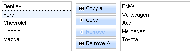
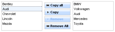
The <rich:pickList> component consists of
2 item lists. Every item has three different representations: common, selected, active. Combination of these states is possible.
Move controls set is a set of controls, which performs moving items between lists.
The "value" attribute is the initial value of this component.
The <f:selectItem /> or <f:selectItems /> facets are used to define the values of a source list.
Example:
...

<rich:pickList value="#{pickBean.listValues}">

        <f:selectItem itemValue="Bentley" itemLabel="Bentley"/>

        <f:selectItem itemValue="Audi" itemLabel="Audi"/>

        <f:selectItems value="#{pickBean.sourceList}"/>

</rich:pickList>

...
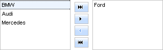
The "switchByClick" attribute provides an option to copy and remove items between lists by one click. Default value of this attribute is "false", so you need a double click to copy, remove items from one list to another.
Lables of the move controls can be defined with "copyAllControlLabel" , "copyControlLabel" , "removeControlLabel" , "removeAllControlLabel" attributes.
Example:
...

<rich:pickList copyAllControlLabel = "#{pickBean.copyAllLabel}" copyControlLabel = "#{pickBean.copyLabel}"

                    removeControlLabel = "#{pickBean.removeLabel}" removeAllControlLabel ="#{pickBean.removeAllLabel}" value="#{pickBean.listValues}">

        <f:selectItem itemValue="Bentley" itemLabel="Bentley"/>

        <f:selectItem itemValue="Audi" itemLabel="Audi"/>

        <f:selectItems value="#{pickBean.sourceList}"/>

</rich:pickList>

...
If you don't want to display labels on the buttons you need to set "showButtonsLabel" to "false".
Alternative to the given attributes are the following facets: "copyAllControl" , "removeAllControl" , "copyControl" , "removeControl" , "copyAllControlDisabled" , "removeAllControlDisabled" , "copyControlDisabled" , "removeControlDisabled" , "caption" .
It is an example of usage of the facets and it is identical to the previous example.
...

<rich:pickList value="#{pickBean.listValues}">

    <f:facet name="copyAllControl">

        <h:commandButton value="#{pickBean.copyAllLabel}" />

    </f:facet>

    <f:facet name="copyControl">

        <h:commandButton value="#{pickBean.copyLabel}" />

    </f:facet>

    <f:facet name="removeControl">

        <h:commandButton value="#{pickBean.removeLabel}" />

    </f:facet>

    <f:facet name="removeAllControl">

        <h:commandButton value="#{pickBean.removeAllLabel}" />

    </f:facet>

    <f:selectItem itemValue="Bentley" itemLabel="Bentley"/>

    <f:selectItem itemValue="Audi" itemLabel="Audi"/>

    <f:selectItems value="#{pickBean.sourceList}"/>

</rich:pickList>

...
With the help of "moveControlsVerticalAlign" attribute you can align move controls vertically.
The possible value for "moveControlsVerticalAlign" are "top", "bottom" and "center" (default value).
The <rich:pickList> component provides resizing of lists by using such attributes as:
"listsHeight" defines height of the lists.
"sourceListWidth" defines width of a source list.
"targetListWidth" defines width of a target list.
Example:
...

<rich:pickList listsHeight="#{pickBean.listsHeight}" sourceListWidth="#{pickBean.sourceListWidth}" targetListWidth="#{pickBean.targetListWidth}" value="#{pickBean.listValues}">

        <f:selectItem itemValue="Bentley" itemLabel="Bentley"/>

        <f:selectItem itemValue="Audi" itemLabel="Audi"/>

        <f:selectItems value="#{pickBean.sourceList}"/>

</rich:pickList>

...
The
<rich:pickList>
component allows to use internationalization method
to redefine and localize the labels. You could use application resource bundle and define
RICH_PICK_LIST_COPY_ALL_LABEL,
RICH_PICK_LIST_COPY_LABEL,
RICH_PICK_LIST_REMOVE_ALL_LABEL,
RICH_PICK_LIST_REMOVE_LABEL there.
Table 6.532. Keyboard usage for elements selection
| Keys and combinations | Description |
|---|---|
| CTRL+click | Inverts selection for an item |
| SHIFT+click | Selects all rows from active one to a clicked row if they differ, else select the active row. All other selections are cleared |
| CTRL+A | Selects all elements inside the list if some active element is already present in a list |
| Up, Down arrows | Changes the active and selected elements to the next or previous in a list |
Table 6.533. Facets
| Facet | Description |
|---|---|
| copyAllControl | Redefines the "copyAll" label with the control set. Related attribute is "copyAllControlLabel" |
| removeAllControl | Redefines the "removeAll" label with the control set. Related attribute is "removeAllControlLabel" |
| copyControl | Redefines the "copy" label with the control set. Related attribute is "copyControlLabel" |
| removeControl | Redefines the "remove" label with the control set. Related attribute is "removeControlLabel" |
| copyAllControlDisabled | Redefines the disabled "copyAll" label with the control set. |
| removeAllControlDisabled | Redefines the disabled "removeAll" label with the control set. |
| copyControlDisabled | Redefines the disabled "copy" label with the control set. |
| removeControlDisabled | Redefines the disabled "remove" label with the control set. |
| caption | Defines the "caption" label with the control set. |
For skinnability implementation, the components use a style class redefinition method. Default style classes are mapped on skin parameters.
There are two ways to redefine the appearance of all <rich:pickList> components at once:
Redefine the corresponding skin parameters
Add to your style sheets style classes used by a <rich:pickList> component
Table 6.534. Skin parameters redefinition for a list
| Skin parameters | CSS properties |
|---|---|
| tableBackgroundColor | background-color |
Table 6.535. Skin parameters redefinition for a button
| Skin parameters | CSS properties |
|---|---|
| tabBackgroundColorr | background-color |
| generalTextColor | color |
| headerFamilyFont | font-family |
| headerSizeFont | font-size |
Table 6.536. Skin parameters redefinition for a disabled button
| Skin parameters | CSS properties |
|---|---|
| tabBackgroundColor | background-color |
| tabDisabledTextColor | color |
| headerFamilyFont | font-family |
| headerSizeFont | font-size |
Table 6.537. Skin parameters redefinition for a pressed button
| Skin parameters | CSS properties |
|---|---|
| tabBackgroundColor | background-color |
| generalTextColor | color |
| headerFamilyFont | font-family |
| headerSizeFont | font-size |
| tableBorderColor | border-color |
| tableBorderWidth | border-width |
Table 6.538. Skin parameters redefinition for a highlighted button
| Skin parameters | CSS properties |
|---|---|
| tabBackgroundColor | background-color |
| generalTextColor | color |
| headerFamilyFont | font-family |
| headerSizeFon | font-size |
| selectControlColor | border-color |
| tableBorderWidth | border-width |
Table 6.539. Skin parameters redefinition for a button selection
| Skin parameters | CSS properties |
|---|---|
| generalTextColor | color |
Table 6.540. Skin parameters redefinition for a button content
| Skin parameters | CSS properties |
|---|---|
| headerFamilyFont | font-family |
| headerSizeFont | font-size |
Table 6.541. Skin parameters redefinition for a source and target items
| Skin parameters | CSS properties |
|---|---|
| generalBackgroundColor | background-color |
| tableBorderColor | border-color |
| tableBorderWidth | border-width |
Table 6.542. Skin parameters redefinition for a source and target cell
| Skin parameters | CSS properties |
|---|---|
| generalTextColor | color |
| generalSizeFont | font-size |
| generalFamilyFont | font-family |
Table 6.543. Skin parameters redefinition for a selected source and target cell
| Skin parameters | CSS properties |
|---|---|
| generalTextColor | color |
| generalSizeFont | font-size |
| generalFamilyFont | font-family |
Table 6.544. Skin parameters redefinition for an active source and target cell
| Skin parameters | CSS properties |
|---|---|
| generalSizeFont | font-size |
| generalFamilyFont | font-family |
| generalTextColor | border-top-color |
| generalTextColor | border-bottom-color |
Table 6.545. Skin parameters redefinition for a selected source and target row
| Skin parameters | CSS properties |
|---|---|
| additionalBackgroundColor | background-color |
Table 6.546. Skin parameters redefinition for a controls
| Skin parameters | CSS properties |
|---|---|
| tableBorderColor | border-color |
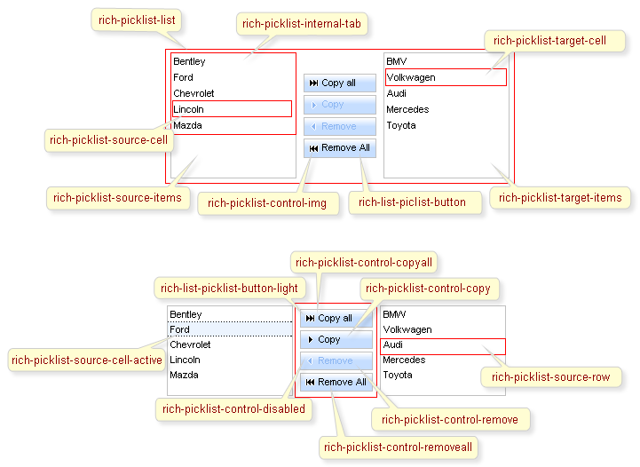
The following pictures illustrate how CSS classes define styles for component elements.
Table 6.547. Classes names that define a list representation
| Class name | Description |
|---|---|
| rich-list-picklist | Defines styles for a wrapper <table> element of a pickList |
Table 6.548. Classes names that define a source and target items representation
| Class name | Description |
|---|---|
| rich-picklist-source-items | Defines styles for a wrapper <div> element of a source list |
| rich-picklist-target-items | Defines styles for a wrapper <div> element of a target list |
| rich-picklist-body | Defines styles for a wrapper <table> element of a list body (source and target) |
| rich-picklist-list | Defines styles for a (source and target) list |
| rich-picklist-list-content | Defines styles for a (source and target) list content |
| rich-picklist-internal-tab | Defines styles for a wrapper <table> element of list items (source and target) |
Table 6.549. Classes names that define rows representation
| Class name | Description |
|---|---|
| rich-picklist-source-row | Defines styles for a source list row |
| rich-picklist-source-row-selected | Defines styles for a selected row in a source list |
| rich-picklist-target-row-selected | Defines styles for a selected row in a target list |
Table 6.550. Classes names that define a source cell representation
| Class name | Description |
|---|---|
| rich-picklist-source-cell | Defines styles for a cell in a source list |
| rich-picklist-source-cell-selected | Defines styles for a selected cell in a source list |
| rich-picklist-source-cell-active | Defines styles for an active cell in a source list |
Table 6.551. Classes names that define a target cell representation
| Class name | Description |
|---|---|
| rich-picklist-target-cell | Defines styles for a target list cell |
| rich-picklist-target-cell-selected | Defines styles for a selected cell in a target list |
| rich-picklist-target-cell-active | Defines styles for an active cell in a target list |
Table 6.552. Classes names that define a control representation
| Class name | Description |
|---|---|
| rich-picklist-controls | Defines styles for wrapper <div> element of a pickList controls |
| rich-picklist-control-disabled | Defines styles for a control in a disabled state |
| rich-picklist-control-copyall | Defines styles for a "copyAll" control |
| rich-picklist-control-copy | Defines styles for a "Copy" control |
| rich-picklist-control-remove | Defines styles for a "Remove" control |
| rich-picklist-control-removeall | Defines styles for a "removeAll" control |
| rich-picklist-control-img | Defines styles for a control image |
Table 6.553. Classes names that define a button representation
| Class name | Description |
|---|---|
| rich-list-picklist-button | Defines styles for a button |
| rich-list-picklist-button-disabled | Defines styles for a disabled button |
| rich-list-picklist-button-press | Defines styles for a pressed button |
| rich-list-picklist-button-light | Defines styles for a button highlight |
| rich-list-picklist-button-selection | Defines styles for a button selection |
| rich-list-picklist-button-content | Defines styles for a button content |
In order to redefine styles for all <rich:pickList> components on a page using CSS, it's enough to create classes with the same names (possible classes could be found in the tables above) and define necessary properties in them.
Example:
...

.rich-picklist-list{

        background-color:#ecf4fe;

}

...
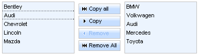
This is a result:
In the example the background color for lists is changed.
Also it's possible to change styles of particular <rich:pickList> component. In this case you should create own style classes and use them in the corresponding <rich:pickList> styleClass attributes. An example is placed below:
Example:
...

.myClass{

        font-weight:bold;

}

...
The "styleClass" attribute for <rich:pickList> is defined as it's shown in the example below:
Example:
<rich:pickList ... styleClass="myClass"/>
This is a result:
As it could be seen on the picture above, the font style for buttons is changed.
On RichFaces LiveDemo page you can see an example of <rich:pickList> usage and sources for the given example.