Create new RichFaces Documentation Jira issue

This will launch the RichFaces Jira page - to complete your feedback please login if needed, and submit the Jira.
JBoss.orgCommunity Documentation
The <rich:toolTip> component is used for creation of event-triggered non modal popup, that contains information regarding the page element, that event was applied to.
Highly customizable look and feel
Different ways of data loading to toolTip
Disablement support
Table 6.311. rich : toolTip attributes
| Attribute Name |
Description

|
|---|---|
| action | MethodBinding pointing at the application action to be invoked, if this UIComponent is activated by you, during the Apply Request Values or Invoke Application phase of the request processing lifecycle, depending on the value of the immediate property |
| actionListener | MethodBinding pointing at method accepting an ActionEvent with return type void |
| ajaxSingle | boolean attribute which provides possibility to limit JSF tree processing(decoding, conversion/validation, value applying) to the component which sends the request only. Default value is "true" |
| attached | If the value of the "attached" attribute is "true", a component is attached to the parent component; if "false", component does not listen to activating browser events, but could be activated externally. Default value is "true" |
| binding | JSF: The attribute takes a value-binding expression for a component property of a backing bean |
| direction | Defines direction of the popup list to appear. Possible values are "top-right", "top-left", "bottom-right", "bottom-left", "auto". Default value is "bottom-right" |
| disabled | HTML: If false the components is rendered on the client but JavaScript for calling disabled. Default value is "false" |
| event | DEPRECATED. Use showEvent instead. Default value is "mouseover" |
| followMouse | If "true" tooltip should follow the mouse while it moves over the parent element. Default value is "false" |
| for | Id of the target component |
| hideDelay | Delay in milliseconds before tooltip will be hidden. Default value is "0" |
| hideEvent | Event that triggers the tooltip disappearance. Default value is "none" (so, the component does not disappears) |
| horizontalOffset | Sets the horizontal offset between pop-up list and mouse pointer. Default value is "10" |
| id | JSF: Every component may have a unique id that is automatically created if omitted |
| immediate | True means, that the default ActionListener should be executed immediately (i.e. during Apply Request Values phase of the request processing lifecycle), rather than waiting until the Invoke Application phase |
| layout | Block/inline mode flag. Possible value are: "inline" or "block". Default value is "inline". Tooltip will contain div/span elements respectively |
| mode | Controls the way of data loading to a tooltip. May have following values: "client" (default) and "ajax" |
| onclick | DHTML: The client-side script method to be called when the tooltip is clicked |
| oncomplete | The client-side script method to be called after the tooltip is shown |
| ondblclick | DHTML: The client-side script method to be called when the tooltip is double-clicked |
| onhide | The client-side script method to be called after the tooltip is hidden |
| onkeydown | DHTML: The client-side script method to be called when a key is pressed down over the element |
| onkeypress | DHTML: The client-side script method to be called when a key is pressed over the element and released |
| onkeyup | DHTML: The client-side script method to be called when a key is released |
| onmousedown | DHTML: The client-side script method to be called when a mouse button is pressed down over the element |
| onmousemove | DHTML: The client-side script method to be called when a pointer is moved within the element |
| onmouseout | DHTML: The client-side script method to be called when a pointer is moved away from the element |
| onmouseover | DHTML: The client-side script method to be called when a pointer is moved onto the element |
| onmouseup | DHTML: The client-side script method to be called when a mouse button is released |
| onshow | The client-side script method to be called before the tooltip is shown |
| rendered | JSF: If "false", this component is not rendered |
| showDelay | Delay in milliseconds before tooltip will be displayed. Default value is "0" |
| showEvent | Event that triggers the tooltip. Default value is "onmouseover" |
| style | HTML: CSS style rules to be applied to the component |
| styleClass | JSF: Assigns one or more space-separated CSS class names to the component. Corresponds to the HTML "class" attribute. |
| value | JSF: The current value for this component |
| verticalOffset | Sets the vertical offset between pop-up list and mouse pointer. Default value is "10" |
| zorder | The same as CSS z-index for toolTip. Default value is "99" |
Table 6.312. Component identification parameters
| Name | Value |
|---|---|
| component-type | org.richfaces.component.toolTip |
| component-class | org.richfaces.component.html.HtmlToolTip |
| component-family | org.richfaces.component.toolTip |
| renderer-type | org.richfaces.renderkit.html.toolTipRenderer |
| tag-class | org.richfaces.taglib.HtmlToolTipTag |
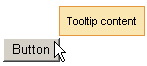
The simplest way to create the <rich:toolTip> component on a page is as following:
...

<rich:panel>

    <rich:toolTip value="Hello, I am the content of this tooltip!"/>

</rich:panel>

...
Example:
import org.richfaces.component.html.HtmlToolTip;

...

HtmltoolTip mytoolTip = new  HtmltoolTip();

...
Text information, labeled on the <rich:toolTip> , is specified with "value" attribute. Text that is put between tooltip start and end tags will also be rendered as tooltip content and could be marked with HTML tags. Images, links, buttons and other RichFaces components are also may be put and composed inside the <rich:toolTip> . The <rich:toolTip> borders are stretched automatically to enclose the contents.
There are three ways to attach the <rich:toolTip> to a page element. The first and simplest one is when the <rich:toolTip> is nested into a page element the tooltip is applied to. This way is shown on example in the Creating the Component with a Page Tag section. The "attached" attribute is "true" by default in this case, which means that the tolltip will be invoked automatically when the mouse cursor is hovered above the parent component.
The second one uses <rich:toolTip> "for" attribute. In this case the <rich:toolTip> is defined separately from a component it is applied to.
Example:
<rich:panel id="panelId">

...

</rich:panel>

<rich:toolTip value="This is a tooltip." for="panelId"/>
These two ways are also applicable for HTML elements that are not presented in components tree built by facelets. Use "for" attribute to attach the <rich:toolTip> in both cases.
Example:
<!-- The <rich:toolTip> is nested into the parent HTML element -->

<div id="para1">

      <p>This paragraph and tooltip are nested into the same <div> element.</p>

      <rich:toolTip for="para1">This is a tooltip.</rich:toolTip>

</div>


<!-- The <rich:toolTip> is defined separately -->

<div id="para2">

      <p>The tooltip for this paragraph is defined separately.</p>

</div>

<rich:toolTip for="para2">This is a tooltip.</rich:toolTip>
The third way to invoke the <rich:toolTip> uses JS API function. List of JS API functions available for <rich:toolTip> is listed below. JS API functions are defined for a component the <rich:toolTip> is applied to. The <rich:toolTip> "attached" attribute should be set to "false" in this case.
Example:
<rich:panel id="panelId" onclick="#{rich:component("tooltipId")}.show(event);" />

<a4j:form>

      <rich:toolTip id="tooltipId" attached="false" value="This is a tooltip."/>

</a4j:form>
To provide <rich:toolTip> component proper work in complex cases do the following:
specify "id's" for both <rich:toolTip> and component it is applied to;
define the <rich:toolTip> as last child, when nesting it into the component the <rich:toolTip> is applied to;
put the <rich:toolTip> into <a4j:form> when invoking it with JS API function.
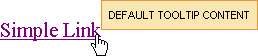
The "mode" attribute is provided you to control the way of data loading to <rich:toolTip> . The component works properly in client and Ajax modes. In client mode <rich:toolTip> content is rendered once on the server and could be rerendered only via external submit. In Ajax mode <rich:toolTip> content is requested from server for every activation. For Ajax mode there is possibility to define a facet "defaultContent" , which provides default <rich:toolTip> content to be displayed, while main content is loading into the <rich:toolTip> (see the example below).
Example:
...
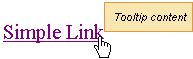
<h:commandLink value="Simple Link" id="link">
<rich:toolTip followMouse="true" direction="top-right" mode="ajax" value="#{bean.toolTipContent}" horizontalOffset="5"
verticalOffset="5" layout="block">
<f:facet name="defaultContent">
<f:verbatim>DEFAULT TOOLTIP CONTENT</f:verbatim>
</f:facet>
</rich:toolTip>
</h:commandLink>
...
This is the result:
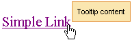
And after <rich:toolTip> loaded it is changed to next one:
<rich:toolTip>
appears attached to the corner
dependent on the
"direction"
attribute.
By default it is positioned bottom-right.
<rich:toolTip>
activation occurs after an event,
defined on the parent component, takes into consideration the "delay" attribute
or after calling JS API function show().
"hideEvent"
attribute defines the way
how
<rich:toolTip>
disappears.
It default value is "none", so the
<rich:toolTip>
does not disappears.
Deactivation may be set for example on
mouseout
event on the parent component
(excepting the situation when the mouse is hovered onto the
<rich:toolTip>
itself)
or after calling JS API function hide().
By default, <rich:toolTip> appears smart positioned. But as you can see from the previous example, you can define an appearance direction via the corresponding attribute "direction" . And also it's possible to define vertical and horizontal offsets relatively to a mouse position.
Disabled
<rich:toolTip>
is rendered to a page as usual but JS that responds for its activation is disabled until enable() is called.
Moreover, to add some JavaScript effects, client events defined on it are used:
Standart:
"onclick"
"ondblclick"
"onmouseout"
"onmousemove"
"onmouseover"
Special:
"onshow" - Called after the tooltip is called (some element hovered) but before its request
"oncomplete" - Called just after the tooltip is shown
"onhide" - Called after the tooltip is hidden
Table 6.313. JavaScript API
| Function | Description |
|---|---|
| show() | Shows the corresponding toolTip |
| hide() | Hides the corresponding toolTip |
| enable() | Enables the corresponding toolTip |
| disable() | Disables the corresponding toolTip |
Table 6.314. Facets
| Facet name | Description |
|---|---|
| defaultContent | Defines the default content for toolTip. It is used only if mode = "ajax" |
For skinnability implementation, the components use a style class redefinition method. Default style classes are mapped on skin parameters.
There are two ways to redefine the appearance of all <rich:toolTip> components at once:
Redefine the corresponding skin parameters
Add to your style sheets style classes used by a <rich:toolTip> component
Table 6.315. Skin parameters redefinition for a component
| Skin parameters | CSS properties |
|---|---|
| tipBackgroundColor | background-color |
| tipBorderColor | border-color |
| generalSizeFont | font-size |
| generalFamilyFont | font-family |
| generalFontColor | color |
Table 6.316. Classes names that define a component appearance
| Class name | Description |
|---|---|
| rich-tool-tip | Defines styles for a wrapper <span> or <div> element of a toolTip |
It depends on <rich:toolTip> layout what a wrapper element <span> or <div> to choose.
In order to redefine styles for all <rich:toolTip> components on a page using CSS, it's enough to create classes with the same names (possible classes could be found in the table above) and define necessary properties in them. An example is placed below:
Example:
...

.rich-tool-tip{

    background-color: #eef2f8;

    border-color: #7196c8;

}

...
This is a result:
In the example a tool tip background color, border color and font style were changed.
Also it's possible to change styles of particular <rich:toolTip> component. In this case you should create own style classes and use them in corresponding <rich:toolTip> styleClass attributes. An example is placed below:
Example:
...

.myClass{

     font-style: italic;

}

...
The "styleClass" attribute for <rich:toolTip> is defined as it's shown in the example below:
Example:
<rich:toolTip ... styleClass="myClass"/>
This is a result:
As it could be seen on the picture above, background color and border color of tool tip were changed.
On the component LiveDemo page you can see the example of <rich:toolTip> usage and sources for the given example.