Create new RichFaces Documentation Jira issue

This will launch the RichFaces Jira page - to complete your feedback please login if needed, and submit the Jira.
JBoss.orgCommunity Documentation
The <rich:calendar> component is used to create inputs for date and time and enter them inline or using pup-up calendar that allows to navigate through monthes and years.
Highly customizable look and feel
Popup representation
Disablement support
Smart and user-defined positioning
Cells customization
Macro substitution based on tool bars customization
The <rich:calendar> component can work properly in two ways of data loading defined by the "mode" attribute. The attribute has two possible values:
client — the default mode.
In this mode calendar loads an initial portion of data within a definite date range.
The range is specified with the help of
"preloadDateRangeBegin"
and
"preloadDateRangeEnd"
attributes
that are designed for this mode only!
Additional data requests are not sent.
ajax — in this mode the
<rich:calendar>
requests portions of data for element rendering from special Data Model.
The default calendar Data Model could be redefined with the help of
dataModel
attribute that points to the object that implements
CalendarDataModel
interface.
If
"dataModel"
attribute has
"null"
value, data requests are not sent.
In this case the "ajax" mode is equal to the "client".
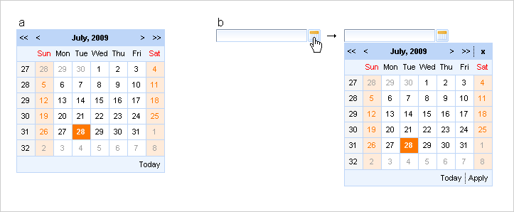
The <rich:calendar> could be represented on a page in two ways (a) the calendar itself without input field and button and (b) date input with button and popping-up calendar. This is defined with "popup" attribute, which is "true" by default. For popup rendering a "lazy" loading is implemented: a client side script method builds the popup after request is completed. Such improvement speeds up page loading time.
By default the <rich:calendar> is rendered as input filed with a button and calendar hidden in a pop-up. The button is represented with calendar pictogramm. This pictogramm could be easily changed with the help of "buttonIcon" and "buttonIconDisabled" attributes, which specify the icon for button enabled and disabled states respectively. To change the button appearance from icon to usual button define the value for the "buttonLabel" attribute. In this case "buttonIcon" and "buttonIconDisabled" attributes are ignored.
There are two attributes that specify the place where the popup calendar is rendered relative to the input field and icon: "jointPoint" and "direction" attributes. By default the pop-up calendar appears under input and aligned with it left border (see Fig. 6.211, b). Speaking in terms of RichFaces it means that <rich:calendar> jointPoint="bottom-left" and direction="bottom-right". There are four possible joint-points and four possible directions for each joint-point. Besides that, the values of "jointPoint" and "direction" could be set to "auto" that activates smart pop-up positioning.
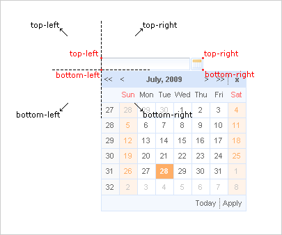
Figure 6.118. Four possible positions of joint-points (red) and four possible directions (black) shown for bottom-left joint-point.
Usage "currentDate" attribute isn't available in the popup mode.
With help of the "currentDate" attribute you can define month and year which will be displayed currently.
The "value" attribute stores selected date currently.
The difference between the value and currentDate attributes
The "todayControlMode" attribute defines the mode for "today" control. Possible values are:
"hidden" - in this mode "Today" button will not be displayed
"select" - (default) in this state "Today" button activation will scroll the calendar to the current date and it become selected date
"scroll" - in this mode "Today" activation will simply scroll the calendar to current month without changing selected day.
With the help of the "readonly" attribute you can make date, time and input field unavailable, but you can look through the next/previous month or the next/previous year.
In order to disable the component, use the "disabled" attribute. With its help both controls are disabled in the "popup" mode.
"ondateselect" attribute is used to define an event that is triggered before date selection.
The "ondateselected" attribute is used to define an event that is triggered after date selection.
For example, to fire some event after date selection you should use <a4j:support> . And it should be bound to "ondateselected" event as it's shown in the example below:
...

<rich:calendar id="date" value="#{bean.dateTest}">

          <a4j:support event="ondateselected" reRender="mainTable"/>

</rich:calendar>

...
When a timePicker was fulfilled, the "ondateselected" attribute does not allow you to submit a selected date. It happens because this event rose when the date is selected but the input hasn't been updated with new value yet.
"ondateselect" could be used for possibility of date selection canceling. See an example below:
...

<rich:calendar id="date" value="#{bean.dateTest}" ondateselect="if (!confirm('Are you sure to change date?')){return false;}"/>

...
"oncurrentdateselected" event is fired when the "next/previous month" or "next/previous year" button is pressed, and the value is applied.
"oncurrentdateselect" event is fired when the "next/previous month" or "next/previous year" button is pressed, but the value is not applied yet (you can change the logic of applying the value). Also this event could be used for possibility of "next/previous month" or "next/previous year" selection canceling. See an example below:
Example:
...

<rich:calendar id="date" value="#{bean.dateTest}" oncurrentdateselect="if (!confirm('Are you sure to change month(year)?')){return false;}"

          oncurrentdateselected="alert('month(year) select:'+event.rich.date.toString());"/>

...
How to use these attributes see also on the RichFaces Users Forum.
Information about the "process" attribute usage you can find in the corresponding section .
The
"label"
attribute is a generic attribute. The
"label"
attribute provides an association between a component, and
the message that the component (indirectly) produced. This attribute
defines the parameters of localized error and informational messages
that occur as a result of conversion, validation, or other application
actions during the request processing lifecycle. With the help of this
attribute you can replace the last parameter substitution token shown
in the messages. For example, {1} for
"DoubleRangeValidator.MAXIMUM",
{2} for "ShortConverter.SHORT".
The "defaultTime" attribute to set the default time value for the current date in two cases:
If time is not set
If another date is selected and the value of the "resetTimeOnDateSelect" attribute is set to "true"
The
"enableManualInput"
attribute enables/disables input field, so when
enableManualInput = "false" , user
can only pick the date manually and has no possibility to type in the
date (default value is "false").
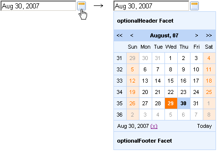
The
<rich:calendar>
component allows to use
"header"
,
"footer"
,
"optionalHeader"
,
"optionalFooter"
facets. The following elements are available in these
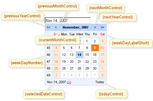
facets: {currentMonthControl},
{nextMonthControl}, {nextYearControl},
{previousYearControl},
{previousMonthControl},
{todayControl}, {selectedDateControl}. These
elements could be used for labels output.
Also you can use
"weekNumber"
facet with available {weekNumber},
{elementId} elements and
"weekDay"
facet with {weekDayLabel},
{weekDayLabelShort},
{weekDayNumber}, {isWeekend},
{elementId} elements.
{weekNumber}, {weekDayLabel},
{weekDayLabelShort},
{weekDayNumber} elements could be used for labels output,
{isWeekend}, {elementId} - for
additional processing in JavaScript code.
These elements are shown on the picture below.
Simple example of usage is placed below.
Example:
...

<!-- Styles for cells -->

<style>

    .width100{

        width:100%;

    }

    .talign{

        text-align:center;

    }

</style>

...
...

<rich:calendar id="myCalendar" popup="true" locale="#{calendarBean.locale}" value="#{bean.date}"

                            preloadRangeBegin="#{bean.date}" preloadRangeEnd="#{bean.date}" cellWidth="40px" cellHeight="40px">


    <!-- Customization with usage of facets and accessible elements -->

    <f:facet name="header">

        <h:panelGrid columns="2" width="100%" columnClasses="width100, fake">

            <h:outputText value="{selectedDateControl}" />

            <h:outputText value="{todayControl}"  style="font-weight:bold; text-align:left"/>

        </h:panelGrid>

    </f:facet>

    <f:facet name="weekDay">

        <h:panelGroup style="width:60px; overflow:hidden;" layout="block">

            <h:outputText value="{weekDayLabelShort}"/>

        </h:panelGroup>

    </f:facet>

    <f:facet name="weekNumber">

         <h:panelGroup>

            <h:outputText value="{weekNumber}" style="color:red"/>

        </h:panelGroup>

     </f:facet>

     <f:facet name="footer">

        <h:panelGrid columns="3" width="100%" columnClasses="fake, width100 talign">

            <h:outputText value="{previousMonthControl}" style="font-weight:bold;"/>

            <h:outputText value="{currentMonthControl}" style="font-weight:bold;"/>

            <h:outputText value="{nextMonthControl}" style="font-weight:bold;"/>

        </h:panelGrid>

    </f:facet>

    <h:outputText value="{day}"></h:outputText>

</rich:calendar>

...
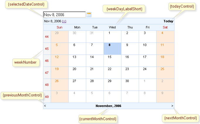
This is a result:
As it's shown on the picture above
{selectedDateControl}, {todayControl}
elements are placed in the
"header"
facet, {previousMonthControl},
{currentMonthControl},
{nextMonthControl} - in the
"footer"
facet, {weekDayLabelShort} - in the
"weekDay"
facet, {nextYearControl},
{previousYearControl} are absent. Numbers of
weeks are red colored.
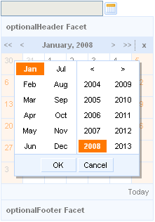
It is possible to show and manage date. Except scrolling controls you can use quick month and year selection feature. It's necessary to click on its field, i.e. current month control, and choose required month and year.
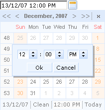
Also the
<rich:calendar>
component allows to show and manage time. It's
necessary to define time in a pattern (for example, it could be
defined as "d/M/yy HH:mm"). Then after
you choose some data in the calendar, it becomes possible to manage
time for this date. For time editing it's necessary to click
on its field (see a picture below). To clean the field click on the
"Clean".
It's possible to handle events for calendar from JavaScript code. A simplest example of usage JavaScript API is placed below:
Example:
...

<rich:calendar value="#{calendarBean.selectedDate}" id="calendarID"

                        locale="#{calendarBean.locale}"

                        popup="#{calendarBean.popup}"

                        datePattern="#{calendarBean.pattern}"

                        showApplyButton="#{calendarBean.showApply}" style="width:200px"/>

<a4j:commandLink onclick="$('formID:calendarID').component.doExpand(event)" value="Expand"/>

...
Also the discussion about this problem can be found on the RichFaces Users Forum.
The
<rich:calendar>
component provides the possibility to use
internationalization method to redefine and localize the labels. You
could use application resource bundle and define
RICH_CALENDAR_APPLY_LABEL,
RICH_CALENDAR_TODAY_LABEL,
RICH_CALENDAR_CLOSE_LABEL,
RICH_CALENDAR_OK_LABEL,
RICH_CALENDAR_CLEAN_LABEL,
RICH_CALENDAR_CANCEL_LABEL there.
You could also pack org.richfaces.renderkit.calendar
resource bundle with your JARs defining the same
properties.
Only for Internet Explorer 6 and later. To make <rich:calendar> inside <rich:modalPanel> rendered properly, enable the standards-compliant mode. Explore !DOCTYPE reference at MSDN to find out how to do this.
Table of <rich:calendar> attributes.
Table 6.165. Component Identification Parameters
| Name | Value |
|---|---|
| component-type | org.richfaces.Calendar |
| component-class | org.richfaces.component.html.HtmlCalendar |
| component-family | org.richfaces.Calendar |
| renderer-type | org.richfaces.CalendarRenderer |
| tag-class | org.richfaces.taglib.CalendarTag |
Table 6.166. JavaScript API
| Function | Description |
|---|---|
| selectDate(date) | Selects the date specified. If the date isn't in current month - performs request to select |
| isDateEnabled(date) | Checks if given date is selectable (to be implemented) |
| enableDate(date) | Enables date cell control on the calendar (to be implemented) |
| disableDate(date) | Disables date cell control on the calendar (to be implemented) |
| enableDates(date[]) | Enables dates cell controls set on the calendar (to be implemented) |
| disableDates(date[]) | Disables dates cell controls set on the calendar (to be implemented) |
| nextMonth() | Navigates to next month |
| nextYear() | Navigates to next year |
| prevMonth() | Navigates to previous month |
| prevYear() | Navigates to previous year |
| today() | Selects today date |
| getSelectedDate() | Returns currently selected date |
| Object getData() | Returns additional data for the date |
| getCurrentMonth() | Returns number of the month currently being viewed |
| getCurrentYear() | Returns number of the year currently being viewed |
| doCollapse() | Collapses calendar element |
| doExpand() | Expands calendar element |
| resetSelectedDate() | Clears a selected day value |
| doSwitch() | Inverts a state for the popup calendar |
Table 6.167. Facets
| Facet | Description |
|---|---|
| header | Redefines calendar header. Related attribute is "showHeader" |
| footer | Redefines calendar footer. Related attribute is "showFooter" |
| optionalHeader | Defines calendar's optional header |
| optionalFooter | Defines calendar's optional footer |
| weekNumber | Redefines week number |
| weekDay | Redefines names of the week days. Related attributes are "weekDayLabels" and "weekDayLabelsShort" |
Table 6.168. Classes names that define an input field and a button appearance
| Class name | Description |
|---|---|
| rich-calendar-input | Defines styles for an input field |
| rich-calendar-button | Defines styles for a popup button |
Table 6.169. Classes names that define a days appearance
| Class name | Description |
|---|---|
| rich-calendar-days | Defines styles for names of working days in a header |
| rich-calendar-weekends | Defines styles for names of weekend in a header |
| rich-calendar-week | Defines styles for weeks numbers |
| rich-calendar-today | Defines styles for cell with a current date |
| rich-calendar-cell | Defines styles for cells with days |
| rich-calendar-holly | Defines styles for holiday |
| rich-calendar-select | Defines styles for a selected day |
| rich-calendar-hover | Defines styles for a hovered day |
Table 6.170. Classes names that define a popup element
| Class name | Description |
|---|---|
| rich-calendar-popup | Defines styles for a popup element |
| rich-calendar-exterior | Defines styles for a popup element exterior |
| rich-calendar-tool | Defines styles for toolbars |
| rich-calendar-month | Defines styles for names of months |
| rich-calendar-header-optional | Defines styles for an optional header |
| rich-calendar-footer-optional | Defines styles for an optional footer |
| rich-calendar-header | Defines styles for a header |
| rich-calendar-footer | Defines styles for a footer |
| rich-calendar-boundary-dates | Defines styles for an active boundary button |
| rich-calendar-btn | Defines styles for an inactive boundary date |
| rich-calendar-toolfooter | Defines styles for a today control date |
Table 6.171. Classes names that define a popup element during quick month and year selection
| Class name | Description |
|---|---|
| rich-calendar-date-layout | Defines styles for a popup element during quick year selection |
| rich-calendar-editor-layout-shadow | Defines styles for a shadow |
| rich-calendar-editor-btn | Defines styles for an inactive boundary date |
| rich-calendar-date-layout-split | Defines styles for a wrapper <td> element for month items near split line |
| rich-calendar-editor-btn-selected | Defines styles for an selected boundary date |
| rich-calendar-editor-btn-over | Defines styles for a boundary date when pointer was moved onto |
| rich-calendar-editor-tool-over | Defines styles for a hovered toolbar items |
| rich-calendar-editor-tool-press | Defines styles for a pressed toolbar items |
| rich-calendar-date-layout-ok | Defines styles for a "ok" button |
| rich-calendar-date-layout-cancel | Defines styles for a "cancel" button |
Table 6.172. Classes names that define a popup element during time selection
| Class name | Description |
|---|---|
| rich-calendar-time-layout | Defines styles for a popup element during time selection |
| rich-calendar-editor-layout-shadow | Defines styles for a shadow |
| rich-calendar-time-layout-fields | Defines styles for a wrapper <td> element for input fields and buttons |
| rich-calendar-spinner-input-container | Defines styles for a wrapper <td> element for an input field |
| rich-calendar-spinner-input | Defines styles for an input field |
| rich-calendar-spinner-buttons | Defines styles for a wrapper <td> element for spinner buttons |
| rich-calendar-spinner-up | Defines styles for a "up" button |
| rich-calendar-spinner-down | Defines styles for a "down" button |
| rich-calendar-time-layout-ok | Defines styles for a "ok" button |
| rich-calendar-time-layout-cancel | Defines styles for a "cancel" button |
On the component LiveDemo page you can see the example of <rich:calendar> usage and sources for the given example.
How to use JavaScript API see on the RichFaces Users Forum.