Create new RichFaces Documentation Jira issue

This will launch the RichFaces Jira page - to complete your feedback please login if needed, and submit the Jira.
JBoss.orgCommunity Documentation
The <rich:colorPicker> component lets you visually choose a color or define it in hex, RGB, or HSB input fields.
Possibility to get color in hex, or RGB color models
Flat/inline representation
Highly customizable look and feel
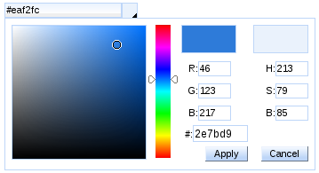
The <rich:colorPicker> component allows you easily select a color or define it in hex, RGB, or HSB input fields. There are two squares in the widget that help you to compare the currently selected color and the already selected color.
The "value" attribute stores the selected color.
The value of the <rich:colorPicker> component could be saved in hex or RGB color models. You can explicitly define a color model in the "colorMode" attribute.
Example:
...

<rich:colorPicker value="#{bean.color}" colorMode="rgb" />

...
This is the result:
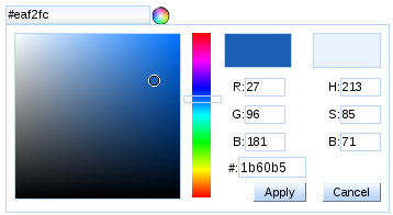
The <rich:colorPicker> component has two representation states: flat and inline. With the help of the "flat" attribute you can define whether the component is rendered flat.
Example:
...

<rich:colorPicker value="#{bean.color}" flat="true" />

...
The component specific event handler "onbeforeshow" captures the event which occurs before the <rich:colorPicker> widget is opened. The "onbeforeshow" attribute could be used in order to cancel this event. See the example below:
...

<rich:colorPicker value="#{bean.color}" onbeforeshow="if (!confirm('Are you sure you want to change a color?')){return false;}" />

...
The "showEvent" attribute defines the event that shows <rich:colorPicker> widget. The default value is "onclick".
The <rich:colorPicker> component allows to use the "icon" facet.
You can also customize
<rich:colorPicker>
rainbow slider (  ) with the help of the
"arrows"
facet.
) with the help of the
"arrows"
facet.
...

<rich:colorPicker value="#{bean.color}">

    <f:facet name="icon">

        <h:graphicImage value="/pages/colorPicker_ico.png" />

    </f:facet>

    <f:facet name="arrows">

        <f:verbatim>

            <div style="width: 33px; height: 5px; border: 1px solid #bed6f8; background:none;" />

        </f:verbatim>

    </f:facet>

</rich:colorPicker>

...
This is the result:
Table of <rich:colorPicker> attributes.
Table 6.173. Component Identification Parameters
| Name | Value |
|---|---|
| component-type | org.richfaces.ColorPicker |
| component-class | org.richfaces.component.html.HtmlColorPicker |
| component-family | org.richfaces.ColorPicker |
| renderer-type | org.richfaces.ColorPickerRenderer |
| tag-class | org.richfaces.taglib.ColorPickerTag |
Table 6.175. Classes names for the representation of the input field and icon containing selected color
| Selector name | Description |
|---|---|
| .rich-colorpicker-span input | Defines styles for the input field that contains selected color |
| .rich-colorpicker-icon | Defines styles for the icon |
Table 6.176. Classes names for the widget
| Class name | Description |
|---|---|
| .rich-colorpicker-ext | Defines styles for the wrapper <div> element of a widget |
| .rich-colorpicker-color | Defines styles for the color palette |
| .rich-colorpicker-current-color | Defines styles for the currently selected color |
| .rich-colorpicker-new-color | Defines styles for the already selected color |
| .rich-colorpicker-colors-input | Defines styles for the hex, RGB, and HSB input fileds |
Table 6.177. Classes names for the buttons representation
| Class name | Description |
|---|---|
| .rich-colorpicker-submit | Defines styles for the "Apply" button |
| .rich-colorpicker-cancel | Defines styles for the "Cancel" button |
On the component LiveDemo page you can see the example of <rich:colorPicker> component usage and sources for the given example.