Create new RichFaces Documentation Jira issue

This will launch the RichFaces Jira page - to complete your feedback please login if needed, and submit the Jira.
JBoss.orgCommunity Documentation
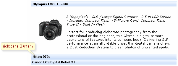
panelBarItem is used for grouping any content inside within one panelBar which is loaded on client side and appears as groups divided on child panels after header is clicked.
The "label" attribute defines text to be represented. If you can use the "label" facet, you can even not use the "label" attribute.
Example:
...

<rich:panelBarItem...>

        <f:facet name="label">

                <h:graphicImage value="/images/img1.png"/>

        </f:facet>

        ...

       <!--Any Content inside-->

        ...

</rich:panelBarItem>

...
As it was mentioned above, panelBarItem is used for grouping any content inside within one panelBar, thus its customization deals only with specification of sizes and styles for rendering.
panelBar could contain any number of child panelBarItem components inside, which content is uploaded onto the client and headers are controls to open the corresponding child element.
Table of <rich:panelBarItem> attributes.
Table 6.118. Component Identification Parameters
| Name | Value |
|---|---|
| component-type | org.richfaces.PanelBarItem |
| component-class | org.richfaces.component.html.HtmlPanelBarItem |
| component-family | org.richfaces.PanelBarItem |
| renderer-type | org.richfaces.PanelBarItemRenderer |
| tag-class | org.richfaces.taglib.PanelBarItemTag |
Table 6.120. Classes names that define a component appearance
| Class name | Class description |
|---|---|
| rich-panelbar-header | Defines styles for a wrapper <div> element of a header element |
| rich-panelbar-header-act | Defines styles for a wrapper <div> element of an active header element |
| rich-panelbar-content | Defines styles for a content |
Table 6.121. Style component classes
| A class attribute | A component element defined by an attribute |
|---|---|
| headerClass | Applicable to a header element |
| contentClass | Applicable to a content |