Create new RichFaces Documentation Jira issue

This will launch the RichFaces Jira page - to complete your feedback please login if needed, and submit the Jira.
JBoss.orgCommunity Documentation
The <rich:panelMenu> component is used to define an in line vertical menu on a page.
Highly customizable look and feel
Different submission modes
Collapsing/expanding sublevels with optional request sending
Custom and predefined icons support
Disablement support
All attributes are not required.
Use "event" attribute to define an event for appearance of collapsing/expanding sublevels. Default value is "onclick". An example could be seen below.
Example:
...

<rich:panelMenu event="onmouseover">

        <!--Nested panelMenu components-->

</rich:panelMenu>

...
Switching mode could be chosen with the "mode" attribute for all panelMenu items except ones where this attribute was redefined. By default all items send traditional request.
The "expandMode" attribute defines the submission modes for all collapsing/expanding panelMenu groups except ones where this attribute was redefined.
The "mode" and "expandMode" attributes could be used with three possible parameters. The "mode" attribute defines parameters for all included <rich:panelMenuItem> elements.
Server (default)
The common submission of the form is performed and a page is completely refreshed.
Example:
...

<rich:panelMenu mode="server">

        <rich:panelMenuGroup label="test Group" action="#{bean.action}">

                <rich:panelMenuItem label="test" action="#{capitalsBean.action}">

                    <f:param value="test value" name="test"/>

                </rich:panelMenuItem>

        </rich:panelMenuGroup>

</rich:panelMenu>

...
Ajax
An Ajax form submission is performed, and additionally specified elements in the "reRender" attribute are reRendered.
Example:
...

<rich:panelMenu mode="ajax">

        <rich:panelMenuGroup label="test Group" action="#{bean.action}">

                <rich:panelMenuItem label="test" reRender="test" action="#{capitalsBean.action}">

                        <f:param value="test value" name="test"/>

                </rich:panelMenuItem>

        </rich:panelMenuGroup>

</rich:panelMenu>

...
None
"Action" and "ActionListener" item's attributes are ignored. Items don't fire any submits itself. Behavior is fully defined by the components nested into items.
Example:
...

<rich:panelMenu event="onclick" submitMode="none">

        <rich:panelMenuItem label="Link to external page">

                <h:outputLink ... >

        <rich:panelMenuItem>

</rich:panelMenu>

...
As the <rich:panelMenu> component doesn't provide its own form, use it between <h:form> and </h:form> tags.
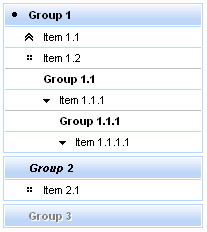
The "expandSingle" attribute is defined for expanding more than one submenu on the same level. The default value is "false" . If it's true the previously opened group on the top level closes before opening another one. See the picture below.
The "selectedChild" attribute is used for defining the name of the selected group or item. An example for group is placed below:
Here is an example:
Example:
...

<rich:panelMenu selectedChild="thisChild">

        <rich:panelMenuGroup label="Group1" name="thisChild">

                <!--Nested panelMenu components-->

        </rich:panelMenuGroup>

</rich:panelMenu>

...
The
"label"
attribute is a generic attribute.
The
"label"
attribute provides an association between a component, and the message that the component (indirectly) produced.
This attribute defines the parameters of localized error and informational messages that
occur as a result of conversion, validation, or other application actions during the request
processing lifecycle. With the help of this attribute you can replace the
last parameter substitution token shown in the messages. For example, {1} for "DoubleRangeValidator.MAXIMUM", {2}
for "ShortConverter.SHORT".
Table of <rich:panelMenu> attributes.
Table 6.122. Component Identification Parameters
| Name | Value |
|---|---|
| component-type | org.richfaces.PanelMenu |
| component-class | org.richfaces.component.html.HtmlPanelMenu |
| component-family | org.richfaces.PanelMenu |
| renderer-type | org.richfaces.PanelMenuRenderer |
| tag-class | org.richfaces.taglib.PanelMenuTag |
Table 6.123. JavaScript API
| Function | Description |
|---|---|
| expand() | Expands group element |
| collapse() | Collapses group element |
Table 6.124. Classes names that define a component appearance
| Class name | Class description |
|---|---|
| rich-pmenu | Defines styles for a wrapper <div> element of a component |
| rich-pmenu-top-group | Defines styles for a top group element of a component |
On the component LiveDemo page you can see the example of <rich:panelMenu> usage and sources for the given example.