Create new RichFaces Documentation Jira issue

This will launch the RichFaces Jira page - to complete your feedback please login if needed, and submit the Jira.
JBoss.orgCommunity Documentation
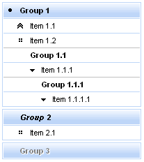
The <rich:panelMenuGroup> component is used to define an expandable group of items inside the panel menu or other group.
Highly customizable look-and-feel
Different submission modes inside every group
Optional submissions on expand collapse groups
Custom and predefined icons supported
Support for disabling
All attributes except "label" are optional. The "label" attribute defines text to be represented.
Switching mode could be chosen with the "expandMode" attribute for the concrete panelMenu group.
The "expandMode" attribute could be used with three possible parameters:
ServerM (default)
Regular form submission request is used.
Ajax
Ajax submission is used for switching.
None
"Action" and "actionListener" attributes are ignored. Items don't fire any submits itself. Behavior is fully defined by the components nested into items.
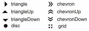
There are three icon-related attributes. The "iconExpanded" attribute defines an icon for an expanded state. The "iconCollapsed" attribute defines an icon for a collapsed state. The "iconDisabled" attribute defines an icon for a disabled state.
Default icons are shown on the picture below:
Here is an example:
Example:
...
<rich:panelMenu>
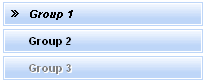
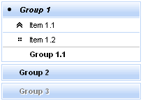
<rich:panelMenuGroup label="Group1" iconExpanded="disc" iconCollapsed="chevron">
<!--Nested panelMenu components-->
</rich:panelMenuGroup>
</rich:panelMenu>
...
As the result the pictures are shown below. The first one represents the collapsed state, the second one - expanded state:
It's also possible to define a path to the icon. Simple code is placed below.
...

<rich:panelMenu>

        <rich:panelMenuGroup label="Group1" iconExpanded="\images\img1.png" iconCollapsed="\images\img2.png">

                    <!--Nested menu components-->

        </rich:panelMenuGroup>

</rich:panelMenu>

...
Information about the "process" attribute usage you can find " Decide what to process " guide section.
Table of <rich:panelMenuGroup> attributes.
Table 6.125. Component Identification Parameters
| Name | Value |
|---|---|
| component-type | org.richfaces.PanelMenuGroup |
| component-class | org.richfaces.component.html.HtmlPanelMenuGroup |
| component-family | org.richfaces.PanelMenuGroup |
| renderer-type | org.richfaces.PanelMenuGroupRenderer |
| tag-class | org.richfaces.taglib.PanelMenuGroupTag |
Table 6.126. JavaScript API
| Function | Description |
|---|---|
| expand() | Expand group element |
| collapse() | Collapse group element |
Table 6.127. Classes names that define an upper level groups
| Class name | Description |
|---|---|
| rich-pmenu-top-group-self-icon | Defines styles for a top group icon |
| rich-pmenu-top-group-self-label | Defines styles for a top group label |
Table 6.128. Classes names that define a second and lower level groups
| Class name | Description |
|---|---|
| rich-pmenu-group | Defines styles for a group |
| rich-pmenu-group-self-icon | Defines styles for a group icon |
| rich-pmenu-group-self-label | Defines styles for a group label |
Table 6.129. Classes names that define a group state
| Class name | Description |
|---|---|
| rich-pmenu-hovered-element | Defines styles for a hovered group element |
| rich-pmenu-disabled-element | Defines styles for a disabled group element |
Some additional information about usage of component can be found on the component Live Demo page.