Documentation in development
Some concepts covered in this chapter may refer to the previous version of Richfaces, version 3.3.3. This chapter is scheduled for review to ensure all information is up to date.
Read this chapter for a guide to skinning and theming RichFaces applications, including how to implement themes, and details on customizing and extending skins.
Application skins are used with the RichFaces framework to change the appearance of an application through setting the colors and decoration of controls and components. Typically the appearance of web applications is handled through the CSS (Cascading Style Sheet) files associated with the application, but skinning allows the settings in a CSS file to be abstracted and easily edited. Using skins avoids repetitive coding and duplication in CSS files through the use of style variables and generalization. CSS files are not completely replaced: skins work as a high-level extension to standard CSS.
Each skin has a set of skin-parameters, which are used to define the theme palette and other elements of the user interface. These parameters work together with regular CSS declarations, and can be referred to from within CSS using JavaServer Faces Expression Language (EL).
The skinning feature of RichFaces also allows themes to be changed at runtime, so users can personalize an application's appearance.
RichFaces includes a number of predefined skins. These skins can be used in RichFaces web applications by specifying the skin name in the org.richfaces.SKIN context parameter in the web.xml settings file. The predefined skins are as follows:
DEFAULTplain, which contains no skin parameters and is intended for embedding RichFaces components into existing projects with their own styles.emeraldTownblueSkywinejapanCherryrubyclassicdeepMarinelagunadarkXglassX
To add one of these skins to your application, add the org.richfaces.SKIN context parameter to the web.xml configuration file:
<context-param>
    <param-name>org.richfaces.SKIN</param-name>
    <param-value>skin_name</param-value>
</context-param>RichFaces skins are designed to use a combination of styling elements. Themes for components can be applied using any of the following style classes:
- A default style class inserted into the framework
Style classes contain skin parameters linked to constant theme styles in the skin. Each component has a class style defining a default representation level. Application interfaces can be modified by altering the values of skin parameters in the skin itself.
- A style class extending the skin
A custom style class can be added to the skin, working in conjunction with CSS classes of the same name. All components referencing the class are extended in the same way.
- User style class
Components can use the
styleClassattribute to redefine specific component elements. As such, the appearance of an individual component can be customized according to a CSS style parameter specified in the class.
Example 6.1. Simple skinning example
Using any component, such as a panel, without specifying a styleClass will use the default skin parameters for that component.
<rich:panel>...</rich:panel>
When rendered for display, the panel consists of two HTML elements: a wrapper <div> element and a <div> element for the body of the panel. The wrapper element for a panel without a specified styleClass is rendered as follows:
<div class="dr-pnl rich-panel">

    ...

</div>
dr-pnl refers to a CSS class specified in the framework. The CSS class uses skin parameters for generic theme styles:
The
background-colorCSS class attribute is defined by thegeneralBackgroundColorskin parameter.The
border-colorCSS class attribute is defined by thepanelBorderColorskin parameter.
Changing the definitions for generalBackgroundColor or panelBorderColor in the skin will cause all panels in the application to change.
If a styleClass attribute is used, the specified style class is applied to the component, which could extend or override the default styles.
<rich:panel styleClass="customClass">...</rich:panel>
The customClass style is added to the CSS, and is applied to the component when it is rendered for display:
<div class="dr-pnl rich-panel customClass">

    ...

</div>
Table 6.1, “Parameter settings for the blueSky skin” lists the default values for the parameter settings in the blueSky skin. These values can be customized and extended for a unique application theme as described in Section 6.3, “Customizing skins”.
Table 6.1. Parameter settings for the blueSky skin
| Parameter name | Default value |
|---|---|
headerBackgroundColor
|
#BED6F8
|
headerGradientColor
|
#F2F7FF
|
headTextColor
|
#000000
|
headerWeightFont
|
bold
|
generalBackgroundColor
|
#FFFFFF
|
generalTextColor
|
#000000
|
generalSizeFont
|
11px
|
generalFamilyFont
|
Arial, Verdana, sans-serif
|
controlTextColor
|
#000000
|
controlBackgroundColor
|
#ffffff
|
additionalBackgroundColor
|
#ECF4FE
|
shadowBackgroundColor
|
#000000
|
shadowOpacity
|
1
|
panelBorderColor
|
#BED6F8
|
subBorderColor
|
#ffffff
|
tabBackgroundColor
|
#C6DEFF
|
tabDisabledTextColor
|
#8DB7F3
|
trimColor
|
#D6E6FB
|
tipBackgroundColor
|
#FAE6B0
|
tipBorderColor
|
#E5973E
|
selectControlColor
|
#E79A00
|
generalLinkColor
|
#0078D0
|
hoverLinkColor
|
#0090FF
|
visitedLinkColor
|
#0090FF
|
headerSizeFont
|
11px
|
headerFamilyFont
|
Arial, Verdana, sans-serif
|
tabSizeFont
|
11px
|
tabFamilyFont
|
Arial, Verdana, sans-serif
|
buttonSizeFont
|
11px
|
buttonFamilyFont
|
Arial, Verdana, sans-serif
|
tableBackgroundColor
|
#FFFFFF
|
tableFooterBackgroundColor
|
#cccccc
|
tableSubfooterBackgroundColor
|
#f1f1f1
|
tableBorderColor
|
#C0C0C0
|
The user can change skins at runtime if a managed bean is used to access the skin.
Create the skin bean
The skin bean is a simple interface to manage the skin:
public class SkinBean {


    private String skin;


    public String getSkin() {

        return skin;

    }

    public void setSkin(String skin) {

        this.skin = skin;

    }

}
Reference the skin bean
Use EL (Expression Language) to reference the skin bean from the
web.xmlsettings file.<context-param>
<param-name>org.richfaces.SKIN</param-name>
<param-value>#{skinBean.skin}</param-value>
</context-param>
Set initial skin
The application needs an initial skin to display before the user chooses an alternative skin. The initial skin is specified in the
web.xmlconfiguration file.<managed-bean>
<managed-bean-name>skinBean</managed-bean-name>
<managed-bean-class>SkinBean</managed-bean-class>
<managed-bean-scope>session</managed-bean-scope>
<managed-property>
<property-name>skin</property-name>
<value>classic</value>
</managed-property>
</managed-bean>
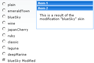
Example 6.2. Skin changing example
This example renders a list of radio buttons from which the user can choose their desired skin. The chosen skin is then applied to the panel bar items.
<h:form>

    <div style="display: block; float: left">

        <h:selectOneRadio value="#{skinBean.skin}" border="0" layout="pageDirection" title="Changing skin" style="font-size: 8; font-family: comic" onchange="submit()">

            <f:selectItem itemLabel="plain" itemValue="plain" />

            <f:selectItem itemLabel="emeraldTown" itemValue="emeraldTown" />

            <f:selectItem itemLabel="blueSky" itemValue="blueSky" />

            <f:selectItem itemLabel="wine" itemValue="wine" />

            <f:selectItem itemLabel="japanCherry" itemValue="japanCherry" />

            <f:selectItem itemLabel="ruby" itemValue="ruby" />

            <f:selectItem itemLabel="classic" itemValue="classic" />

            <f:selectItem itemLabel="laguna" itemValue="laguna" />

            <f:selectItem itemLabel="deepMarine" itemValue="deepMarine" />

            <f:selectItem itemLabel="blueSky Modified" itemValue="blueSkyModify" />

        </h:selectOneRadio>

    </div>

    <div style="display: block; float: left">

        <rich:panelBar height="100" width="200">

            <rich:panelBarItem label="Item 1" style="font-family: monospace; font-size: 12;">

                Changing skin in runtime

            </rich:panelBarItem>


            <rich:panelBarItem label="Item 2" style="font-family: monospace; font-size: 12;">

                This is a result of the modification "blueSky" skin

            </rich:panelBarItem>

        </rich:panelBar>

    </div>

</h:form>
Create the skin file
The name of the skin file should follow the format
new_skin_name.skin.propertiesMETA-INF/skins/directory or the classpath directory of your project.Define skin constants
Add skin parameter constants and values to the file. Example 6.3, “blueSky.skin.properties file” shows how the skin parameters listed in Table 6.1, “Parameter settings for the blueSky skin” are included in the skin file.
Example 6.3.
blueSky.skin.propertiesfileThe
blueSky.skin.propertiesfile lists all the skin parameter constants for the skin. It can be extracted from the/META-INF/skinsdirectory in the richfaces-impl-version.jar package.#Colors headerBackgroundColor=#BED6F8 headerGradientColor=#F2F7FF headerTextColor=#000000 headerWeightFont=bold generalBackgroundColor=#FFFFFF generalTextColor=#000000 generalSizeFont=11px generalFamilyFont=Arial, Verdana, sans-serif controlTextColor=#000000 controlBackgroundColor=#ffffff additionalBackgroundColor=#ECF4FE shadowBackgroundColor=#000000 shadowOpacity=1 panelBorderColor=#BED6F8 subBorderColor=#ffffff tabBackgroundColor=#C6DEFF tabDisabledTextColor=#8DB7F3 trimColor=#D6E6FB tipBackgroundColor=#FAE6B0 tipBorderColor=#E5973E selectControlColor=#E79A00 generalLinkColor=#0078D0 hoverLinkColor=#0090FF visitedLinkColor=#0090FF # Fonts headerSizeFont=11px headerFamilyFont=Arial, Verdana, sans-serif tabSizeFont=11 tabFamilyFont=Arial, Verdana, sans-serif buttonSizeFont=11 buttonFamilyFont=Arial, Verdana, sans-serif tableBackgroundColor=#FFFFFF tableFooterBackgroundColor=#cccccc tableSubfooterBackgroundColor=#f1f1f1 tableBorderColor=#C0C0C0 tableBorderWidth=1px #Calendar colors calendarWeekBackgroundColor=#F5F5F5 calendarHolidaysBackgroundColor=#FFEBDA calendarHolidaysTextColor=#FF7800 calendarCurrentBackgroundColor=#FF7800 calendarCurrentTextColor=#FFEBDA calendarSpecBackgroundColor=#E4F5E2 calendarSpecTextColor=#000000 warningColor=#FFE6E6 warningBackgroundColor=#FF0000 editorBackgroundColor=#F1F1F1 editBackgroundColor=#FEFFDA #Gradients gradientType=plain
Alternatively, instead of redefining an entire new skin, your skin can use an existing skin as a base on which to build new parameters. Specify a base skin by using the
baseSkinparameter in the skin file, as shown in Example 6.4, “Using a base skin”.Example 6.4. Using a base skin
This example takes the
blueSkyskin as a base and only changes thegeneralSizeFontparameter.baseSkin=blueSky generalSizeFont=12pt
Reference skin definition
Add a skin definition
<context-param>to theweb.xmlsettings file of your application:<context-param> <param-name>org.richfaces.SKIN</param-name> <param-value>new_skin_name</param-value> </context-param>
The RichFaces framework can also use skinning to theme JSF (JavaServer Faces) components in addition to RichFaces components. Follow these additional steps to skin JSF components.
Register a custom render kit
The custom render kit is created by registering it in the
faces-config.xmlconfiguration file:<render-kit> <render-kit-id>new_skin_name</render-kit-id> <render-kit-class>org.ajax4jsf.framework.renderer.ChameleonRenderKitImpl</render-kit-class> </render-kit>Register custom renderers for the JSF component
Add custom renderers in the
faces-config.xmlconfiguration file for each JSF component you want to skin:<renderer> <component-family>javax.faces.Command</component-family> <renderer-type>javax.faces.Link</renderer-type> <renderer-class>new_skin_name.HtmlCommandLinkRenderer</renderer-class> </renderer>Reference the render kit in the skin file
Add the following to the top of the skin parameters file:
render.kit=new_skin_name
Standard HTML controls and components used alongside RichFaces and JSF components can also be themed to create a cohesive user interface. The following HTML elements accept skinning:
<a>(includinga:hover,a:visitedand other elements)<fieldset><hr><input><isindex><keygen><legend><select><textarea>
Skinning for standard HTML controls can be included in one of two ways:
- Automatic skinning
The skinning style properties are automatically applied to controls based on their element names and attribute types. Specify the
org.richfaces.CONTROL_SKINNINGcontext parameter in theweb.xmlconfiguration file:<context-param>
<param-name>org.richfaces.CONTROL_SKINNING</param-name>
<param-value>enable</param-value>
</context-param>
- Skinning with CSS classes
The skinning style properties are determined through CSS. This method is available by default, but can be disabled through the
org.richfaces.CONTROL_SKINNING_CLASSEScontext parameter in theweb.xmlconfiguration file:<context-param>
<param-name>org.richfaces.CONTROL_SKINNING_CLASSES</param-name>
<param-value>disable</param-value>
</context-param>
When enabled, the parameter offers a predefined CSS class named
rich-container. Reference the class from any container-like component, and the standard HTML controls in the container will be skinned. Standard HTML controls can also be specifically defined in the CSS; refer to theorg/richfaces/renderkit/html/css/basic_classes.xcssfile in the richfaces-ui.jar package for examples of specially-defined CSS classes with skin parameters for HTML controls.
There are two levels of skinning for HTML controls, depending on whether the browser viewing the application includes rich visual styling capabilities, and whether the browser supports features of CSS2 and CSS3.
Browser lists may need to be updated.
Basic skinning
Apple Safari
Microsoft Internet Explorer 6
Microsoft Internet Explorer 7 in
BackCompatmode (refer to “compatModeProperty” at http://msdn.microsoft.com/en-us/library/ms533687(VS.85).aspxOpera
Extended skinning
Microsoft Internet Explorer 7 in standards-compliant mode
Mozilla Firefox
If the browser type cannot be identified, the extended level is used. Set the level explicitly by adding the following context parameter to the web.xml configuration file, and specifying the <param-value> element as either basic or extended:
<context-param>

    <param-name>org.richfaces.CONTROL_SKINNING_LEVEL</param-name>

    <param-value>basic</param-value>

</context-param>
RichFaces uses XCSS (XML-formatted CSS) files to add extra functionality to the skinning process. XCSS files can contain all the styling information for each RichFaces component in the library.
XCSS files contain mappings between CSS properties and skin parameters. The name attribute of the <u:selector> element is the name of the CSS selector. Each <u:style> element defines a CSS property with the name attribute as its name. Using the skin attribute specifies a skin parameter from the current skin file, while using the value attribute enters the literal value in the CSS file. An example of this is shown in Example 6.5, “XCSS style mappings”.
Example 6.5. XCSS style mappings
The XCSS code for the CSS selector named .rich-component-name is as follows:
<u:selector name=".rich-component-name">

    <u:style name="background-color" skin="additionalBackgroundColor" />

    <u:style name="border-color" skin="tableBorderColor" />

    <u:style name="border-width" skin="tableBorderWidth" />

    <u:style name="border-style" value="solid" />

</u:selector>
This renders the following CSS code to be read by a standard browser:
.rich-component-name {

    background-color: additionalBackgroundColor; /*the value of the constant defined by your skin*/

    border-color: tableBorderColor; /*the value of the constant defined by your skin*/

    border-width: tableBorderWidth; /*the value of the constant defined by your skin*/

    border-style: solid;

}
CSS selectors with identical skinning properties can be listed in a single name attribute of a <u:selector> element, separated by commas.
<u:selector name=".rich-ordering-control-disabled, .rich-ordering-control-top, .rich-ordering-control-bottom, .rich-ordering-control-up, .rich-ordering-control-down">

    <u:style name="border-color" skin="tableBorderColor" />

</u:selector>
Style properties can be modified using XML-based XCSS code, or using embedded standard CSS code, as shown in Example 6.6, “Using XCSS code or standard CSS code”
Example 6.6. Using XCSS code or standard CSS code
Using XCSS code
XCSS code follows an XML structure, using <u:selector> elements to define style classes and <u:style> elements for each style parameter.
...

<u:selector name=".rich-calendar-cell">

    <u:style name="border-bottom-color" skin="panelBorderColor"/>

    <u:style name="border-right-color" skin="panelBorderColor"/>

    <u:style name="background-color" skin="tableBackgroundColor"/>

    <u:style name="font-size" skin="generalSizeFont"/>

    <u:style name="font-family" skin="generalFamilyFont"/>

</u:selector>

...
Using standard CSS code
CSS code can be included in an XCSS file through the use of a <f:verbatim> element with a character data (CDATA) section.
<f:verbatim><![CDATA[

    ...

    .rich-calendar-cell {

        background: #537df8;

    }

    ...

]]></f:verbatim>
Plug-n-skin is an alternate method to create, customize, and add a skin. The skin can be based on an existing RichFaces skin, and can include support for skinning standard HTML controls.
Create a template
Use the Maven build and deployment tool to create the skin template by using the following command:
mvn archetype:create -DarchetypeGroupId=org.richfaces.cdk -DarchetypeArtifactId=maven-archetype-plug-n-skin -DarchetypeVersion=
RF-VERSION-DartifactId=ARTIFACT-ID-DgroupId=GROUP-ID-Dversion=VERSIONUse the following parameters for the command:
archetypeVersionThe version of RichFaces, for example,
4.0.0.GA.artifactIdThe artifact identifier or name of the project. The Maven template will be created in a directory using this name.
groupIdThe group identifier of the project.
versionThe version of your project, for example,
1.0.
Add the skin to the CDK
Change to the newly-created directory. Ensure it contains the
pom.xmlproject file, then enter the following command to create a new skin and add it to the CDK (Component Development Kit):mvn cdk:add-skin -Dname=
SKIN-NAME-Dpackage=SKIN-PACKAGEUse the following parameters for the command:
nameThe name of your new skin.
packageThe base package of the skin. By default, the group identifier is used.
Use the following optional keys for advanced features:
baseSkinThe skin to use as a base for the new skin.
createExtUse
createExt=trueto add extended CSS classes for skinning standard HTML controls.
The command creates the following files:
src/main/java/SKIN-PACKAGE/SKIN-NAME/images/BaseImage.javaThe base class to store images.
src/test/java/SKIN-PACKAGE/SKIN-NAME/images/BaseImage.javaA test version of the base class to store images.
src/main/resources/SKIN-PACKAGE/SKIN-NAME/css/The directory that holds the XCSS files that define the themes for RichFaces components affected by the new skin.
If the
createExt=trueparameter was used with the command, the following XCSS files are included for defining styles for standard HTML controls:extended_classes.xcssextended.xcss
src/main/resources/SKIN-PACKAGE/SKIN-NAME/css/SKIN-NAME.propertiesThe file that contains the skin properties.
src/main/resources/META-INF/skins/SKIN-NAME.xcssA global XCSS file that imports the component-specific XCSS files.
If the
createExt=trueparameter was used with the command, the followingskin-name-ext.xcsssrc/main/config/resources/SKIN-NAME-resources.xmlThe file that contains the description of all the files listed above.
Edit XCSS files
Edit the XCSS files contained in the
src/main/resources/META-INF/skins/directory. Refer to Section 6.8, “Defining skins for individual components” for instructions on how to edit XCSS files.Build the skin
After editing the XCSS files, build the skin by running the following command in the root directory of your skin project (the directory that contains the
pom.xmlfile).mvn clean install
Add the skin to the project configuration
Add the following context parameter to your project's
web.xmlconfiguration file to use the new skin in your application:<context-param> <param-name>org.ajax4jsf.SKIN</param-name> <param-value>SKIN-NAME</param-value> </context-param>