This chapter covers all components related to the display of tables and grids.
The <a4j:repeat> component is used to iterate changes through a repeated collection of components. It allows specific rows of items to be updated without sending Ajax requests for the entire collection. The <a4j:repeat> component forms the basis for many of the tabular components detailed in Chapter 9, Tables and grids.
The contents of the collection are determined using Expression Language (EL). The data model for the contents is specified with the value attribute. The var attribute names the object to use when iterating through the collection. This object is then referenced in the relevant child components. Example 9.1, “<a4j:repeat> example” shows how to use <a4j:repeat> to maintain a simple table.
Example 9.1. <a4j:repeat> example
<table>

    <tbody>

        <a4j:repeat value="#{repeatBean.items}" var="item">

            <tr>

                <td><h:outputText value="#{item.code}" id="item1" /></td>

                <td><h:outputText value="#{item.price}" id="item2" /></td>

            </tr>

        </a4j:repeat>

    </tbody>

</table>
Each row of a table contains two cells: one showing the item code, and the other showing the item price. The table is generated by iterating through items in the repeatBeans.items data model.
The <a4j:repeat> component uses other attributes common to iteration components, such as the first attribute for specifying the first item for iteration, and the rows attribute for specifying the number of rows of items to display.
Specific cells, rows, and columns can be updated without sending Ajax requests for the entire collection. Components that cause the change can specify which part of the table to update through the render attribute. The render attribute specifies which part of a table to update:
render=cellIdUpdate the cell with an identifier of
cellIdwithin the row that contains the current component.Instead of a specific identifier, the
cellIdreference could be a variable:render=#{bean.cellToUpdate}render=tableId:rowIdUpdate the row with an identifier of
rowIdwithin the table with an identifier oftableId. Alternatively, if the current component is contained within the table, userender=rowIdInstead of a specific identifier, the
tableIdofrowIdreferences could be variables:render=tableId:#{bean.rowToUpdate}render=tableId:rowId:cellIdUpdate the cell with an identifier of
cellId, within the row with and identifier ofrowId, within the table with an identifier oftableId.Instead of a specific identifier, any of the references could be variables:
render=tableId:#{bean.rowToUpdate}:cellId
Alternatively, keywords can be used with the render attribute:
render=@columnUpdate the column that contains the current component.
render=@rowUpdate the row that contains the current component.
render=tableId:@bodyUpdate the body of the table with the identifier of
tableId. Alternatively, if the current component is contained within the table, userender=@bodyrender=tableId:@headerUpdate the header of the table with the identifier of
tableId. Alternatively, if the current component is contained within the table, userender=@headerrender=tableId:@footerUpdate the footer of the table with the identifier of
tableId. Alternatively, if the current component is contained within the table, userender=@footer
The <rich:dataTable> component is used to render a table, including the table's header and footer. It works in conjunction with the <rich:column> and <rich:columnGroup> components to list the contents of a data model.
<rich:extendedDataTable>
The <rich:dataTable> component does not include extended table features, such as data scrolling, row selection, and column reordering. These features are available as part of the <rich:extendedDataTable> component; refer to Section 9.6, “<rich:extendedDataTable>” for further details.
The value attribute points to the data model, and the var attribute specifies a variable to use when iterating through the data model.
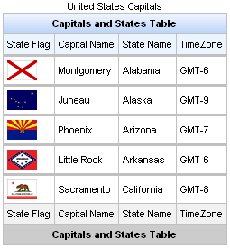
The first attribute specifies which item in the data model to start from, and the rows attribute specifies the number of items to list. The header, footer, and caption facets can be used to display text, and to customize the appearance of the table through skinning. demonstrates a simple table implementation.
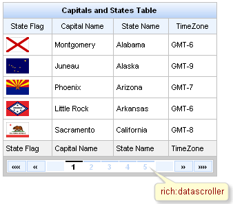
Example 9.2. <rich:dataTable> example
<rich:dataTable value="#{capitalsBean.capitals}" var="cap" rows="5">

    <f:facet name="caption">

        <h:outputText value="United States Capitals" />

    </f:facet>

    <f:facet name="header">

        <h:outputText value="Capitals and States Table" />

    </f:facet>

    <rich:column>

        <f:facet name="header">State Flag</f:facet>

            <h:graphicImage value="#{cap.stateFlag}"/>

        <f:facet name="footer">State Flag</f:facet>

    </rich:column>

    <rich:column>

        <f:facet name="header">State Name</f:facet>

            <h:outputText value="#{cap.state}"/>

        <f:facet name="footer">State Name</f:facet>

    </rich:column>

    <rich:column >

        <f:facet name="header">State Capital</f:facet>

            <h:outputText value="#{cap.name}"/>

        <f:facet name="footer">State Capital</f:facet>

    </rich:column>

    <rich:column>

        <f:facet name="header">Time Zone</f:facet>

            <h:outputText value="#{cap.timeZone}"/>

        <f:facet name="footer">Time Zone</f:facet>

    </rich:column>

    <f:facet name="footer">

        <h:outputText value="Capitals and States Table" />

    </f:facet>

</rich:dataTable>
For details on filtering and sorting data tables, refer to Section 9.10, “Table filtering” and Section 9.11, “Table sorting”.
As <rich:dataTable> the component is based on the <a4j:repeat> component, it can be partially updated with Ajax. Refer to Section 9.1.2, “Limited views and partial updates” for details on partially updating the <rich:dataTable> component.
The <rich:dataTable> component can be controlled through the JavaScript API. The JavaScript API provides the following functions:
expandAllSubTables()Expand any sub-tables contained in the data table.
collapseAllSubTables()Collapse any sub-tables contained in the data table.
switchSubTables()Switch the expanded or collapsed state of any sub-tables contained in the data table.
filter(columnId, newFilterValue, [isClearPreviousFilters])Filter the table based on the column specified with the
columnIdparameter. Use thenewFilterValueparameter as the filter value. The optionalisClearPreviousFiltersparameter is a boolean value which, if set totrue, will clear any previous filters applied to the table.sort(columnId, [direction], [isClearPreviousSorting])Sort the table based on the column specified with the
columnIdparameter. The optiondirectionparameter specifies whether to sort in ascending or descending order. The optionalisClearPreviousSortingparameter is a boolean value which, if set totrue, will clear any previous sorting applied to the table.
component-type:org.richfaces.DataTablecomponent-class:org.richfaces.component.html.HtmlDataTablecomponent-family:org.richfaces.DataTablerenderer-type:org.richfaces.DataTableRenderertag-class:org.richfaces.taglib.DataTableTag
Table 9.1. Style classes (selectors) and corresponding skin parameters
| Class (selector) | Skin Parameters | Mapped CSS properties |
|---|---|---|
|
| background-color |
| border-left-width, border-top-width | |
| border-left-color, border-top-color | |
| No skin parameters. | |
| No skin parameters. | |
| No skin parameters. | |
|
| background-color |
| border-bottom-width, border-right-width | |
| border-bottom-color, border-right-color | |
| color | |
| font-family | |
| font-size | |
|
| border-bottom-width, border-right-width |
| border-bottom-color, border-right-color | |
| color | |
| font-family | |
| font-size | |
| No skin parameters. | |
| No skin parameters. | |
|
| background-color |
| border-bottom-width, border-right-width | |
| border-bottom-color, border-right-color | |
| color | |
| font-family | |
| font-size | |
| No skin parameters. | |
| No skin parameters. | |
|
| background-color |
| border-bottom-width, border-right-width | |
| border-bottom-color, border-right-color | |
| color | |
| font-family | |
| font-size | |
| No skin parameters. | |
| No skin parameters. | |
|
| background-color |
| border-bottom-width, border-right-width | |
| border-bottom-color, border-right-color | |
| color | |
| font-family | |
| font-size | |
| No skin parameters. | |
| No skin parameters. | |
|
| background-color |
| border-bottom-width, border-right-width | |
| border-bottom-color, border-right-color | |
| color | |
| font-family | |
| font-size | |
The <rich:column> component facilitates columns in a table. It supports merging columns and rows, sorting, filtering, and customized skinning.
In general usage, the <rich:column> component is used in the same was as the JavaServer Faces (JSF) <h:column> component. It requires no extra attributes for basic usage, as shown in Example 9.3, “Basic column example”.
Example 9.3. Basic column example
<rich:dataTable value="#{capitalsBean.capitals}" var="cap" rows="5">

    <rich:column>

        <f:facet name="header">State Flag</f:facet>

        <h:graphicImage value="#{cap.stateFlag}"/>

    </rich:column>

    <rich:column>

        <f:facet name="header">State Name</f:facet>

        <h:outputText value="#{cap.state}"/>

    </rich:column>

    <rich:column >

        <f:facet name="header">State Capital</f:facet>

        <h:outputText value="#{cap.name}"/>

    </rich:column>

    <rich:column>

        <f:facet name="header">Time Zone</f:facet>

        <h:outputText value="#{cap.timeZone}"/>

    </rich:column>

</rich:dataTable>
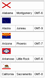
Columns can be merged by using the colspan attribute to specify how many normal columns to span. The colspan attribute is used in conjunction with the breakBefore attribute on the next column to determine how the merged columns are laid out. Example 9.4, “Column spanning example”.
Example 9.4. Column spanning example
<rich:dataTable value="#{capitalsBean.capitals}" var="cap" rows="5">

    <rich:column colspan="3">

        <h:graphicImage value="#{cap.stateFlag}"/>

    </rich:column>

    <rich:column breakBefore="true">

        <h:outputText value="#{cap.state}"/>

    </rich:column>

    <rich:column >

        <h:outputText value="#{cap.name}"/>

    </rich:column>

    <rich:column>

        <h:outputText value="#{cap.timeZone}"/>

    </rich:column>

</rich:dataTable>
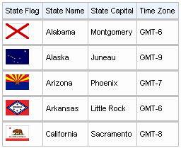
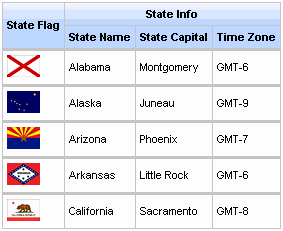
Similarly, the rowspan attribute can be used to merge and span rows. Again the breakBefore attribute needs to be used on related <rich:column> components to define the layout. Example 9.5, “Row spanning example” and the resulting Figure 9.5, “Complex headers using column groups” show the first column of the table spanning three rows.
Example 9.5. Row spanning example
<rich:dataTable value="#{capitalsBean.capitals}" var="cap" rows="5">

    <rich:column rowspan="3">

        <f:facet name="header">State Flag</f:facet>

        <h:graphicImage value="#{cap.stateFlag}"/>

    </rich:column>

    <rich:column>

        <f:facet name="header">State Info</f:facet>

        <h:outputText value="#{cap.state}"/>

    </rich:column>

    <rich:column breakBefore="true">

        <h:outputText value="#{cap.name}"/>

    </rich:column>

    <rich:column breakBefore="true">

        <h:outputText value="#{cap.timeZone}"/>

    </rich:column>

</rich:dataTable>
For details on filtering and sorting columns, refer to Section 9.10, “Table filtering” and Section 9.11, “Table sorting”.
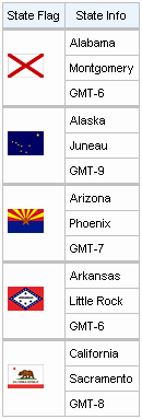
The <rich:columnGroup> component combines multiple columns in a single row to organize complex parts of a table. The resulting effect is similar to using the breakBefore attribute of the <rich:column> component, but is clearer and easier to follow in the source code.
The <rich:columnGroup> can also be used to create complex headers in a table. Example 9.6, “Complex headers using column groups” and the resulting Figure 9.5, “Complex headers using column groups” demonstrate how complex headers can be achieved.
Example 9.6. Complex headers using column groups
<rich:dataTable value="#{capitalsBean.capitals}" var="cap" rows="5" id="sublist">

    <f:facet name="header">

        <rich:columnGroup>

            <rich:column rowspan="2">

                <h:outputText value="State Flag"/>

            </rich:column>

            <rich:column colspan="3">

                <h:outputText value="State Info"/>

            </rich:column>

            <rich:column breakBefore="true">

                <h:outputText value="State Name"/>

            </rich:column>

            <rich:column>

                <h:outputText value="State Capital"/>

            </rich:column>

            <rich:column>

                <h:outputText value="Time Zone"/>

            </rich:column>

        </rich:columnGroup>

    </f:facet>

    <rich:column>

        <h:graphicImage value="#{cap.stateFlag}"/>

    </rich:column>

    <rich:column>

        <h:outputText value="#{cap.state}"/>

    </rich:column>

    <rich:column>

        <h:outputText value="#{cap.name}"/>

    </rich:column>

    <rich:column>

        <h:outputText value="#{cap.timeZone}"/>

    </rich:column>

</rich:dataTable>
The <rich:collapsibleSubTable> component acts as a child element to a <rich:dataTable> component. It allows sections of a table to be grouped into collapsible sections. The <rich:collapsibleSubTable> component works with the <rich:collapsibleSubTableToggler> component, which allows the user to expand and collapse the sub tables.
The <rich:collapsibleSubTable> component requires the same basic attributes as the <rich:dataTable> component. The value attribute points to the collection, and the var attribute specifies a variable to use when iterating through the collection.
In addition, the <rich:collapsibleSubTable> component typically needs a corresponding <rich:collapsibleSubTableToggler> component to allow expanding and collapsing. Declare the id identifier on the <rich:collapsibleSubTable> element so that the <rich:collapsibleSubTableToggler> component can reference it. Refer to Section 9.5.5, “<rich:collapsibleSubTableToggler>” for details on the <rich:collapsibleSubTableToggler> component.
Example 9.7. Basic usage
<rich:dataTable value="#{carsBean.inventoryVendorLists}" var="list">

   <f:facet name="header">

      <rich:columnGroup>

         <rich:column colspan="6">

            <h:outputText value="Cars marketplace" />

         </rich:column>

         <rich:column breakRowBefore="true">

            <h:outputText value="Model" />

         </rich:column>

         <rich:column>

            <h:outputText value="Price" />

         </rich:column>

         <rich:column>

            <h:outputText value="Mileage" />

         </rich:column>

         <rich:column>

            <h:outputText value="VIN Code" />

         </rich:column>

         <rich:column>

            <h:outputText value="Items stock" />

         </rich:column>

         <rich:column>

            <h:outputText value="Days Live" />

         </rich:column>

      </rich:columnGroup>

   </f:facet>

   <rich:column colspan="6">

      <rich:collapsibleSubTableToggler for="sbtbl" />

      <h:outputText value="#{list.vendor}" />

   </rich:column>

   <rich:collapsibleSubTable value="#{list.vendorItems}" var="item" id="sbtbl"

      expandMode="client">

      <rich:column>

         <h:outputText value="#{item.model}" />

      </rich:column>

      <rich:column>

         <h:outputText value="#{item.price}" />

      </rich:column>

      <rich:column>

         <h:outputText value="#{item.mileage}" />

      </rich:column>

      <rich:column>

         <h:outputText value="#{item.vin}" />

      </rich:column>

      <rich:column>

         <h:outputText value="#{item.stock}" />

      </rich:column>

      <rich:column>

         <h:outputText value="#{item.daysLive}" />

      </rich:column>

      <f:facet name="footer">

         <h:outputText value="Total of #{list.vendor} Cars: #{list.count}" />

      </f:facet>

   </rich:collapsibleSubTable>

</rich:dataTable>
The resulting tables contains multiple sub-tables, grouping the list of cars by vendor. Each sub-table can be expanded or collapsed using the toggle with the vendor's name. The screenshot shows all sub-tables collapsed except for the sub-table for Ford cars.
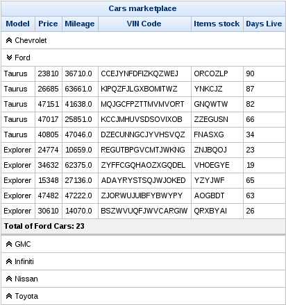
[D]
Use the boolean expanded attribute to control the current state of the sub-table.
The switching mode for performing submissions is determined by the expandMode attribute, which can have one of the following three values:
serverThe default setting. Expansion of the
<rich:collapsibleSubTable>component performs a common submission, completely re-rendering the page.ajaxExpansion of the
<rich:collapsibleSubTable>component performs an Ajax form submission, and the content of the data table is rendered.clientExpansion of the
<rich:collapsibleSubTable>component updates the data table on the client side.
component-type:org.richfaces.CollapsibleSubTablecomponent-class:org.richfaces.component.html.HtmlCollapsibleSubTablecomponent-family:org.richfaces.CollapsibleSubTablerenderer-type:org.richfaces.CollapsibleSubTabletag-class:org.richfaces.taglib.CollapsibleSubTableTag
Table 9.2. Style classes (selectors) and corresponding skin parameters
| Class (selector) | Skin Parameters | Mapped CSS properties |
|---|---|---|
| No skin parameters. | |
| No skin parameters. | |
| No skin parameters. | |
|
| background-color |
| border-bottom-width, border-right-width | |
| border-bottom-color, border-right-color | |
| color | |
| font-family | |
| font-size | |
| No skin parameters. | |
| No skin parameters. | |
| No skin parameters. | |
|
| background-color |
| border-bottom-width, border-right-width | |
| border-bottom-color, border-right-color | |
| color | |
| font-family | |
| font-size | |
| No skin parameters. | |
| No skin parameters. | |
|
| background-color |
| border-bottom-width, border-right-width | |
| border-bottom-color, border-right-color | |
| color | |
| font-family | |
| font-size | |
| No skin parameters. | |
| No skin parameters. | |
|
| background-color |
| border-bottom-width, border-right-width | |
| border-bottom-color, border-right-color | |
| color | |
| font-family | |
| font-size | |
| No skin parameters. | |
| No skin parameters. | |
|
| background-color |
| border-bottom-width, border-right-width | |
| border-bottom-color, border-right-color | |
| color | |
| font-family | |
| font-size | |
The <rich:collapsibleSubTableToggler> component provides a toggle control for the user to expand and collapse sub-tables.
The <rich:collapsibleSubTableToggler> component requires the for attribute. The for attribute references the id identifier of the <rich:collapsibleSubTable> component to control.
Refer to Example 9.7, “Basic usage” for an example using the <rich:collapsibleSubTable> component. In the example, the toggle control is placed in a column that spans the width of the table. Output text next to the toggle control displays the car vendor's name for that sub-table.
component-type:org.richfaces.CollapsibleSubTableTogglercomponent-class:org.richfaces.component.html.HtmlCollapsibleSubTableTogglercomponent-family:org.richfaces.CollapsibleSubTableTogglerrenderer-type:org.richfaces.CollapsibleSubTableTogglertag-class:org.richfaces.taglib.CollapsibleSubTableTogglerTag
The <rich:extendedDataTable> component builds on the functionality of the <rich:dataTable> component, adding features such as data scrolling, row and column selection, and rearranging of columns.
The <rich:extendedDataTable> component includes the following main attributes not included in the <rich:dataTable> component:
clientRowsfrozenColumnsheightonselectionchangeselectedClassselectionselectionMode
The <rich:extendedDataTable> component does not include the following attributes available with the <rich:dataTable> component:
breakBeforecolumnGroupcolSpanrowSpan
Complex sub-tables
Due to the complex mark-up involved in the <rich:extendedDataTable> component, it does not support the use of the <rich:collapsibleSubTable> component. The <rich:collapsibleSubTable> component is only available with the <rich:dataTable> component.
Similarly, complex row and column spanning using the breakBefore, columnGroup, colSpan, and rowSpan attributes is also not available with the <rich:extendedDataTable> component.
Basic use of the <rich:extendedDataTable> component requires the value and var attributes, the same as with the <rich:dataTable> component. Refer to Section 9.2, “<rich:dataTable>” for details.
The height attribute defines the height of the table on the page. This is set to 100% by default. The width of the table can be set by using the width attribute. As with the <rich:dataTable> component, the look of the <rich:extendedDataTable> component can be customized and skinned using the header and footer facets.
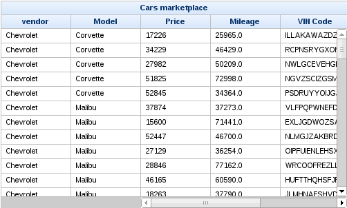
Example 9.8. <rich:extendedDataTable> example
This example <rich:extendedDataTable> component demonstrates horizontal and vertical scrolling and frozen columns. Each feature is detailed in this section.
<rich:extendedDataTable value="#{carsBean.allInventoryItems}"

                        var="car" id="table" frozenColumns="2"

                        style="height:300px; width:500px;" selectionMode="none">

   <f:facet name="header">

      <h:outputText value="Cars marketplace" />

   </f:facet>

   <rich:column>

      <f:facet name="header">

         <h:outputText value="vendor" />

      </f:facet>

      <h:outputText value="#{car.vendor}" />

   </rich:column>

   <rich:column>

      <f:facet name="header">

         <h:outputText value="Model" />

      </f:facet>

      <h:outputText value="#{car.model}" />

   </rich:column>

   <rich:column>

      <f:facet name="header">

         <h:outputText value="Price" />

      </f:facet>

      <h:outputText value="#{car.price}" />

   </rich:column>

   <rich:column>

      <f:facet name="header">

         <h:outputText value="Mileage" />

      </f:facet>

      <h:outputText value="#{car.mileage}" />

   </rich:column>

   <rich:column>

      <f:facet name="header">

         <h:outputText value="VIN Code" />

      </f:facet>

      <h:outputText value="#{car.vin}" />

   </rich:column>

   <rich:column>

      <f:facet name="header">

         <h:outputText value="Items stock" />

      </f:facet>

      <h:outputText value="#{car.stock}" />

   </rich:column>

   <rich:column>

      <f:facet name="header">

         <h:outputText value="Days Live" />

      </f:facet>

      <h:outputText value="#{car.daysLive}" />

   </rich:column>

</rich:extendedDataTable>
[D]
The example table shown in Example 9.8, “<rich:extendedDataTable> example” features both horizontal and vertical scrolling. Scrolling occurs automatically when the contents of the table exceed the dimensions specified with the height and width attributes. Headers and footers remain in place and visible when the table is scrolled.
Large tables can use Ajax "lazy" loading to cache data on the client during scrolling. Use the clientRows attribute to specify the number of rows to load. The specified number of rows are loaded on the initial rendering and with every vertical scroll. If the clientRows attribute is not specified, all the rows are loaded on the client without the use of Ajax.
In addition to Ajax scrolling, the <rich:extendedDataTable> component can also be used with the <rich:dataScroller> component in the same way as a regular <rich:dataTable> component. Refer to Section 9.9, “<rich:dataScroller>” for full details on using the <rich:dataScroller> component.
The example table shown in Example 9.8, “<rich:extendedDataTable> example” has the first two columns frozen so that they remain visible if the user scrolls horizontally through the table. Note that the horizontal scrollbar does not encompass these frozen columns. To freeze columns, use the frozenColumns attribute to specify the number of columns on the left-hand side of the table to freeze.
Row selection is determined by the selectionMode attribute. Setting the attribute to none allows for no row selection capability. The example table shown in Example 9.8, “<rich:extendedDataTable> example” does not allow row selection.
Setting the selectionMode attribute to single allows the user to select a single row at a time using the mouse. With the selectionMode attribute set to multiple, the user can select multiple rows. Holding down the Ctrl key while clicking selects additional rows with each click. Holding down the Shift key while clicking selects all the rows in a range.
The selection attribute points to a collection of objects. It holds the rowKey identifiers to track which rows are selected. Example 9.9, “Selecting multiple rows” shows how to implement multiple row selection in the same table from Example 9.8, “<rich:extendedDataTable> example”.
Example 9.9. Selecting multiple rows
<rich:extendedDataTable value="#{extTableSelectionBean.inventoryItems}"

                        var="car" selection="#{extTableSelectionBean.selection}"

                        id="table" frozenColumns="2"

                        style="height:300px; width:500px;" selectionMode="multiple">

   ...
The accompanying ExtSelectionBean bean handles which rows are selected. The rows are identified by their rowKey identifiers.
package org.richfaces.demo.tables;


import java.io.Serializable;

import java.util.ArrayList;

import java.util.Collection;

import java.util.List;


import javax.faces.bean.ManagedBean;

import javax.faces.bean.ManagedProperty;

import javax.faces.bean.SessionScoped;

import javax.faces.event.AjaxBehaviorEvent;


import org.richfaces.component.UIExtendedDataTable;

import org.richfaces.demo.tables.model.cars.InventoryItem;


@ManagedBean

@SessionScoped


public class ExtTableSelectionBean implements Serializable{


   private Collection<Object> selection;

   @ManagedProperty(value = "#{carsBean.allInventoryItems}")

   private List<InventoryItem> inventoryItems;

   private List<InventoryItem> selectionItems = new ArrayList<InventoryItem>();


   public void selectionListener(AjaxBehaviorEvent event){

      UIExtendedDataTable dataTable = (UIExtendedDataTable)event.getComponent();

      Object originalKey = dataTable.getRowKey();

      selectionItems.clear();

      for (Object selectionKey: selection) {

         dataTable.setRowKey(selectionKey);

         if (dataTable.isRowAvailable()){

            selectionItems.add((InventoryItem)dataTable.getRowData());

         }

      }

      dataTable.setRowKey(originalKey);

   }


   public Collection<Object> getSelection() {

      return selection;

   }


   public void setSelection(Collection<Object> selection) {

      this.selection = selection;

   }


   public List<InventoryItem> getInventoryItems() {

      return inventoryItems;

   }


   public void setInventoryItems(List<InventoryItem> inventoryItems) {

      this.inventoryItems = inventoryItems;

   }


   public List<InventoryItem> getSelectionItems() {

      return selectionItems;

   }


   public void setSelectionItems(List<InventoryItem> selectionItems) {

      this.selectionItems = selectionItems;

   }

}
[D]
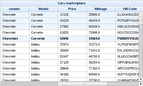
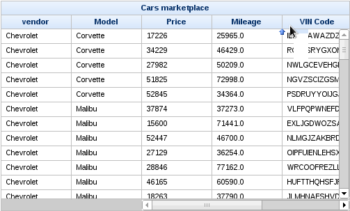
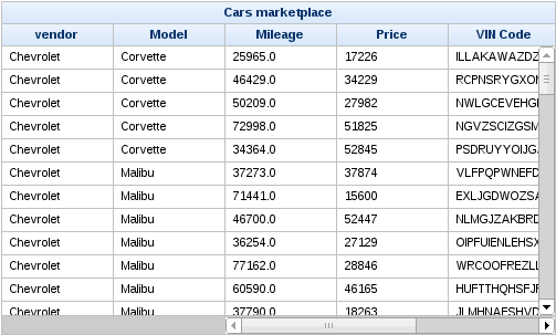
Columns in a <rich:extendedDataTable> component can be rearranged by the user by dragging each column to a different position. A graphical representation of the column is displayed during dragging. Figure 9.6, “Dragging columns” illustrates the Price column being dragged to a new location. The small blue arrow indicates where the column will be moved to if it is dropped in the current position. Figure 9.7, “Rearranged columns” shows the result of dragging the Price column.
The <rich:extendedDataTable> component can include filtering and sorting in the same way as a regular <rich:dataTable> component. For full details on filtering tables, refer to Section 9.10, “Table filtering”. For full details on sorting tables, refer to Section 9.11, “Table sorting”.
The <rich:extendedDataTable> component can be controlled through the JavaScript API. The JavaScript API provides the following functions:
sort()Sort the data table.
filter()Filter the data table.
clearSorting()Clear any sorting that is currently applied to the table.
clearFiltering()Clear any filtering that is currently applied to the table.
selectRow(index)Select the row specified by the
indexparameter.selectRows([startIndex, stopIndex])Select all the rows in the table. Optionally, select only those rows between the indexes specified with the
startIndexandstopIndexparameters.deselectRowDeselect the row that is currently selected.
setActiveRow(index)Set the active row to that specified by the
indexparameter.
component-type:org.richfaces.ExtendedDataTablecomponent-class:org.richfaces.component.html.HtmlExtendedDataTablecomponent-family:org.richfaces.ExtendedDataTablerenderer-type:org.richfaces.ExtendedDataTableRenderertag-class:org.richfaces.taglib.ExtendedDataTableTag
Table 9.3. Style classes (selectors) and corresponding skin parameters
| Class (selector) | Skin Parameters | Mapped CSS properties |
|---|---|---|
|
| border |
| background-color | |
| No skin parameters. | |
|
| border-bottom |
| border-right | |
|
| font-family |
| font-size | |
|
| border-bottom |
| color | |
| font-family | |
| font-size | |
| color | |
| No skin parameters. | |
|
| border-bottom |
| border-right | |
|
| font-family |
| font-size | |
| color | |
|
| border-top |
| background-color | |
|
| border-top |
| background-color | |
| No skin parameters. | |
|
| border-bottom |
| border-right | |
|
| font-family |
| font-size | |
| color | |
|
| border-right |
| No skin parameters. | |
| No skin parameters. | |
|
| border-right |
| No skin parameters. | |
| No skin parameters. | |
| No skin parameters. | |
|
| border-left |
|
| border |
| background-color | |
| No skin parameters. | |
| No skin parameters. | |
The <rich:dataGrid> component is used to arrange data objects in a grid. Values in the grid can be updated dynamically from the data model, and Ajax updates can be limited to specific rows. The component supports header, footer, and caption facets.
The <rich:dataGrid> component is similar in function to the JavaServer Faces <h:panelGrid> component. However, the <rich:dataGrid> component additionally allows iteration through the data model rather than just aligning child components in a grid layout.
The <rich:dataGrid> component requires the value attribute, which points to the data model, and the var attribute, which holds the current variable for the collection of data.
The number of columns for the grid is specifed with the columns attribute, and the number of elements to layout among the columns is determined with the elements attribute. The first attribute references the zero-based element in the data model from which the grid starts.
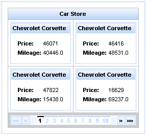
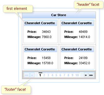
Example 9.10. <rich:dataGrid> example
<rich:panel style="width:150px;height:200px;">

  <h:form>

    <rich:dataGrid value="#{dataTableScrollerBean.allCars}" var="car" columns="2" elements="4" first="1">

        <f:facet name="header">

          <h:outputText value="Car Store"></h:outputText>

      </f:facet>

      <rich:panel>

          <f:facet name="header">

            <h:outputText value="#{car.make} #{car.model}"></h:outputText>

          </f:facet>

          <h:panelGrid columns="2">

            <h:outputText value="Price:" styleClass="label"></h:outputText>

            <h:outputText value="#{car.price}"/>

            <h:outputText value="Mileage:" styleClass="label"></h:outputText>

            <h:outputText value="#{car.mileage}"/>

          </h:panelGrid>

      </rich:panel>

      <f:facet name="footer">

          <rich:datascroller></rich:datascroller>

      </f:facet>

    </rich:dataGrid>

  </h:form>

</rich:panel>
As <rich:dataGrid> the component is based on the <a4j:repeat> component, it can be partially updated with Ajax. Refer to Section 9.1.2, “Limited views and partial updates” for details on partially updating the <rich:dataGrid> component.
component-type:org.richfaces.DataGridcomponent-class:org.richfaces.component.html.HtmlDataGridcomponent-family:org.richfaces.DataGridrenderer-type:org.richfaces.DataGridRenderertag-class:org.richfaces.taglib.DataGridTag
Table 9.4. Style classes (selectors) and corresponding skin parameters
| Class (selector) | Skin Parameters | Mapped CSS properties |
|---|---|---|
|
| background-color |
| border-left-width, border-top-width | |
| border-left-color, border-top-color | |
| No skin parameters. | |
| No skin parameters. | |
|
| border-bottom-width, border-right-width |
| border-bottom-color, border-right-color | |
| color | |
| font-family | |
| font-size | |
|
| border-bottom-width, border-right-width |
| border-bottom-color, border-right-color | |
| color | |
| font-family | |
| font-size | |
|
| border-bottom-width |
| border-bottom-color | |
| No skin parameters. | |
| No skin parameters. | |
| No skin parameters. | |
|
| background-color |
| border-bottom-width, border-right-width | |
| border-bottom-color, border-right-color | |
| color | |
| font-family | |
| font-size | |
| No skin parameters. | |
| No skin parameters. | |
|
| background-color |
| border-bottom-width, border-right-width | |
| border-bottom-color, border-right-color | |
| color | |
| font-family | |
| font-size | |
The <rich:list> component renders a list of items. The list can be an numerically ordered list, an un-ordered bullet-point list, or a data definition list. The component uses a data model for managing the list items, which can be updated dynamically.
The var attribute names a variable for iterating through the items in the data model. The items to iterate through are determined with the value attribute by using EL (Expression Language).
By default, the list is displayed as an un-ordered bullet-point list. The type attribute is used to specify different list types:
unorderedThe default presentation. The list is presented as a series of bullet-points, similar to the
<ul>HTML element.orderedThe list is presented as a numbered series of items, similar to the
<ol>HTML element.definitionsThe list is presented as a series of data definitions. Part of the data model, specified as the term, is listed prominently. The other associated data is listed after each term.
The term is marked using the
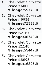
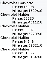
termfacet. The facet is required for all definition lists. Use of the facet is shown in Example 9.11, “Data definition list”.Example 9.11. Data definition list
<h:form>

    <rich:list var="car" value="#{dataTableScrollerBean.allCars}" type="definitions" rows="5" title="Cars">

        <f:facet name="term">

            <h:outputText value="#{car.make} #{car.model}"></h:outputText>

        </f:facet>

        <h:outputText value="Price:" styleClass="label"></h:outputText>

        <h:outputText value="#{car.price}" /><br/>

        <h:outputText value="Mileage:" styleClass="label"></h:outputText>

        <h:outputText value="#{car.mileage}" /><br/>

    </rich:list>

</h:form>
The appearance of bullet points for unordered lists or numeration for ordered lists can be customized through CSS, using the list-style-type property.
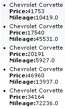
The first attribute specifies which item in the data model to start from, and the rows attribute specifies the number of items to list. The title attribute is used for a floating tool-tip. Example 9.12, “<rich:list> example” shows a simple example using the <rich:list> component.
Example 9.12. <rich:list> example
<h:form>

    <rich:list var="car" value="#{dataTableScrollerBean.allCars}" rows="5" type="unordered" title="Car Store">

        <h:outputText value="#{car.make} #{car.model}"/><br/>

        <h:outputText value="Price:" styleClass="label"></h:outputText>

        <h:outputText value="#{car.price} "/><br/>

        <h:outputText value="Mileage:" styleClass="label"></h:outputText>

        <h:outputText value="#{car.mileage} "/><br/>

    </rich:list>

</h:form>
component-type:org.richfaces.Listcomponent-class:org.richfaces.component.html.HtmlListcomponent-family:org.richfaces.Listrenderer-type:org.richfaces.ListRenderertag-class:org.richfaces.taglib.ListTag
Table 9.5. Style classes (selectors) and corresponding skin parameters
| Class (selector) | Skin Parameters | Mapped CSS properties |
|---|---|---|
|
| color |
| font-family | |
| font-size | |
|
| color |
| font-family | |
| font-size | |
|
| color |
| font-family | |
| font-size | |
|
| color |
| font-family | |
| font-size |
The <rich:dataScroller> component is used for navigating through multiple pages of tables or grids.
The <rich:dataScroller> must be placed in the footer facet of the table or grid it needs to control. Alternatively, use the for attribute to bind the parent table or grid to the scroller.
The bound table or grid should also have the rows attribute defined to limit the number of rows per page.
The <rich:dataScroller> component must be re-rendered whenever a filter changes on the bound table, so that the scroller matches the current model for the table.
Example 9.13. Basic usage
<rich:dataTable id="table" value="#{capitalsBean.capitals}" var="cap" rows="5">

   <!-- table content -->

   ...

</rich:dataTable>

<rich:datascroller for="table" maxPages="5">

   <f:facet name="first">

      <h:outputText value="First" />

   </f:facet>

   <f:facet name="last">

      <h:outputText value="Last" />

   </f:facet>

</rich:datascroller>
The page attribute is a value-binding attribute used to define and save the current page number.
The <rich:dataScroller> component provides a range of controllers for scrolling through tables and grids:
- Controls for scrolling by a specific amount
The component includes controls for switching to the first page, the last page, the next page, and the previous page, as well as controls for fast-forwarding or rewinding by a set amount. Use the
fastStepattribute to set the number of pages to skip when fast-forwarding or rewinding.The appearance of these controls can be customized using the following facets:
first,last,next,previous,fastForward, andfastRewind. Additionally, there are facets for the controls' disabled states:first_disabled,last_disabled,next_disabled,previous_disabled,fastforward_disabled, andrewind_disabled.- Page controls
The component also features a series of numbered controls to jump to a specific page. Use the
maxPagesattribute to limit the number of page controls that appear. The current page control is highlighted.
The pageIndexVar and pagesVar attributes are request-scope variables for the current page and the total number of pages. Use these attributes with the pages facet to provide information about the pages of the table, as shown in Example 9.14, “pages facet”.
Example 9.14. pages facet
<rich:dataTable value="#{capitalsBean.capitals}" var="cap" rows="5">

   <!-- table content -->

   ...

   <f:facet name="footer">

      <rich:datascroller pageIndexVar="pageIndex" pagesVar="pages">

         <f:facet name="pages">

            <h:outputText value="#{pageIndex} / #{pages}" />

         </f:facet>

      </rich:datascroller>

   </f:facet>

</rich:dataTable>
To add optional separators between controls, define the separators with the controlsSeparator facet.
The <rich:dataScroller> component can be controlled through the JavaScript API. The JavaScript API provides the following functions:
switchToPage(pageIndex)Switch to the page specified with the
pageIndexparameter.next()Switch to the next page.
previous()Switch to the previous page.
first()Switch to the first page.
last()Switch to the last page.
fastForward()Step forward through the pages by the
fastStepamount.fastRewind()Step backward through the pages by the
fastStepamount.
component-type:org.richfaces.DataScrollercomponent-class:org.richfaces.component.html.HtmlDataScrollercomponent-family:org.richfaces.DataScrollerrenderer-type:org.richfaces.DataScrollerRenderertag-class:org.richfaces.taglib.DataScrollerTag
Table 9.6. Style classes (selectors) and corresponding skin parameters
| Class (selector) | Skin Parameters | Mapped CSS properties |
|---|---|---|
|
| font-family |
| font-size | |
| background | |
|
| color |
| font-family | |
| font-size | |
| border-color | |
| background-color | |
| No skin parameters. | |
| No skin parameters. | |
| No skin parameters. | |
| No skin parameters. | |
| No skin parameters. | |
| No skin parameters. | |
|
| color |
| font-family | |
| font-size | |
| border-color | |
| background-color | |
|
| border-color |
| background | |
|
| color |
|
| color |
Documentation in development
This section is currently under development. Any features it describes may not be available in the current release of RichFaces.
Tables entries can be filtered by the user through either the basic method built in to the <rich:column> component, or by defining external filters. Refer to Section 9.3, “<rich:column>” for details on using the <rich:column> component in tables.
The built-in filtering abilities of the <rich:column> component allow the user to enter text as a filtering value. The table displays only those entries that begin with the filter value.
Set the filterValue attribute to point to the value used to filter the column. This can be either an initial filtering value on the page, or a value binding on the server. The filterValue value is then used with the JavaScript startsWith() method to filter the column entries based on the data specified with the filterBy attribute. Expressions in the filterBy attribute must refer to the variable declared in the table's var attribute, which is used to fill the contents of the table.
The filter is processed and the table is rendered when the onblur event occurs for the column. This can be changed by defining a different event with the filterEvent attribute. For example, to implement live updating such that the filter refreshes after every keystroke, set filterEvent="keyup".
Example 9.15. Basic filtering
<rich:dataTable value="#{capitalsBean.capitals}" var="cap">

   <f:facet name="header">

      <rich:column>

         <h:outputText value="State Name">

      </rich:column>

      <rich:column>

         <h:outputText value="State Capital">

      </rich:column>

   </f:facet>

   <rich:column filterValue="#{capitalsBean.currentStateFilterValue}"

                filterBy="#{cap.state}" filterEvent="keyup">

      <h:outputText value="#{cap.state}"/>

   </rich:column>

   <rich:column filterValue="#{capitalsBean.currentNameFilterValue}"

                filterBy="#{cap.name}" filterEvent="keyup">

      <h:outputText value="#{cap.name}"/>

   </rich:column>

</rich:dataTable>
The example uses the basic filtering method on both columns in the table.
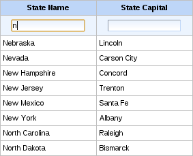
[D]
If you require more advanced filtering using custom functions or expressions, use the external filtering properties of the <rich:column> component.
Use the filterExpression attribute to define an expression that can be evaluated as a boolean value. The expression checks if each table entry satisfies the filtering condition when the table is rendered.
Use the filterMethod attribute to define a method binding. The method needs to accept an object as a parameter and return a boolean value. Similar to the filterExpression attribute, the table is rendered only with those entries that satisfy the filtering condition. By defining a custom filtering method, you can implement complex business logic to filter a table.
Example 9.16. External filtering
<rich:dataTable value="#{capitalsBean.capitals}" var="cap" id="table">

   <f:facet name="header">

      <rich:column>

         <h:outputText value="State Name">

      </rich:column>

      <rich:column>

         <h:outputText value="State Time Zone">

      </rich:column>

   </f:facet>

   <rich:column filterMethod="#{filteringBean.filterStates}">

        <f:facet name="header">

            <h:inputText value="#{filteringBean.filterValue}" id="input">

                <a4j:ajax event="keyup" render="table"

                              ignoreDupResponses="true" requestDelay="700"/>

            </h:inputText>

        </f:facet>

      <h:outputText value="#{cap.state}"/>

   </rich:column>

   <rich:column filterExpression=

      "#{fn:containsIgnoreCase(cap.timeZone, filteringBean.filterZone)}">

        <f:facet name="header">

            <h:selectOneMenu value="#{filteringBean.filterZone}">

                <f:selectItems value="#{filteringBean.filterZones}" />

                <a4j:ajax event="change" render="table" />

            </h:selectOneMenu>

        </f:facet>

      <h:outputText value="#{cap.timeZone}"/>

   </rich:column>

</rich:dataTable>
The example uses a filter expression on the first column and a filter method on the second column.
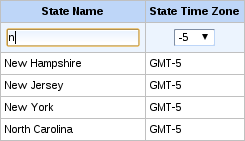
[D]
Documentation in development
This section is currently under development. Any features it describes may not be available in the current release of RichFaces.
Tables entries can be sorted by defining external sorting algorithms. Refer to Section 9.3, “<rich:column>” for details on using the <rich:column> component in tables.
Sorting non-English tables
To sort a table whose contents are not in English, add the org.richfaces.datatableUsesViewLocale context parameter to the project's web.xml settings file. Set the value of the context parameter to true.
Bind the sortOrder attribute to bean properties to manage the sorting order externally. The bean must handle all the sorting algorithms. Example 9.17, “External sorting” demonstrates table sorting using an external control.
Example 9.17. External sorting
<rich:dataTable value="#{dataTableScrollerBean.allCars}"

                var="category" rows="20" id="table" reRender="ds2"

                sortPriority="#{sortingBean.prioritList}">

   <rich:column id="make" sortBy="#{category.make}"

                sortOrder="#{sortingBean.makeDirection}">

      <f:facet name="header">

         <h:outputText styleClass="headerText" value="Make" />

      </f:facet>

      <h:outputText value="#{category.make}" />

   </rich:column>

   <rich:column id="model" sortBy="#{category.model}"

                sortOrder="#{sortingBean.modelDirection}">

      <f:facet name="header">

         <h:outputText styleClass="headerText" value="Model" />

      </f:facet>

      <h:outputText value="#{category.model}" />

   </rich:column>

   <rich:column id="price" sortBy="#{category.price}"

                sortOrder="#{sortingBean.priceDirection}">

      <f:facet name="header">

         <h:outputText styleClass="headerText" value="Price" />

      </f:facet>

      <h:outputText value="#{category.price}" />

   </rich:column>

   <rich:column id="mileage" sortBy="#{category.mileage}"

                sortOrder="#{sortingBean.mileageDirection}">

      <f:facet name="header">

         <h:outputText styleClass="headerText" value="Mileage" />

      </f:facet>

      <h:outputText value="#{category.mileage}" />

   </rich:column>

</rich:dataTable>
The example uses an external control to manage the table's sorting.
[D]
When using the sortMode="multiple" configuration, set the priority by which columns are sorted with the sortPriorities attribute.
Use the sortExpression attribute to define a bean property to use for sorting the column. The expression checks each table entry against the sorting expression during rendering.