Documentation in development
Some concepts covered in this chapter may refer to the previous version of Richfaces , version 3.3.3. This chapter is scheduled for review to ensure all information is up to date.
This chapter covers all components related to the display of tables and grids.
component-type:
org.richfaces.Columncomponent-class:
org.richfaces.component.html.HtmlColumncomponent-family:
org.richfaces.Columnrenderer-type:
org.richfaces.renderkit.CellRenderertag-class:
org.richfaces.taglib.ColumnTag
The <rich:column> component facilitates columns in a table or other UIData component. It supports merging columns and rows, sorting, filtering, and customized skinning.
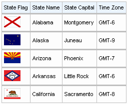
In general usage, the <rich:column> component is used in the same was as the JavaServer Faces (JSF) <h:column> component. It requires no extra attributes for basic usage, as shown in Example 9.1, “Basic column example”.
Example 9.1. Basic column example
<rich:dataTable value="#{capitalsBean.capitals}" var="cap" rows="5">

  <rich:column>

    <f:facet name="header">State Flag</f:facet>

    <h:graphicImage value="#{cap.stateFlag}"/>

  </rich:column>

  <rich:column>

    <f:facet name="header">State Name</f:facet>

    <h:outputText value="#{cap.state}"/>

  </rich:column>

  <rich:column >

    <f:facet name="header">State Capital</f:facet>

    <h:outputText value="#{cap.name}"/>

  </rich:column>

  <rich:column>

    <f:facet name="header">Time Zone</f:facet>

    <h:outputText value="#{cap.timeZone}"/>

  </rich:column>

</rich:dataTable>
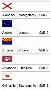
Columns can be merged by using the colspan attribute to specify how many normal columns to span. The colspan attribute is used in conjunction with the breakBefore attribute on the next column to determine how the merged columns are laid out. Example 9.2, “Column spanning example”.
Example 9.2. Column spanning example
<rich:dataTable value="#{capitalsBean.capitals}" var="cap" rows="5">

  <rich:column colspan="3">

    <h:graphicImage value="#{cap.stateFlag}"/>

  </rich:column>

  <rich:column breakBefore="true">

    <h:outputText value="#{cap.state}"/>

  </rich:column>

  <rich:column >

    <h:outputText value="#{cap.name}"/>

  </rich:column>

  <rich:column>

    <h:outputText value="#{cap.timeZone}"/>

  </rich:column>

</rich:dataTable>
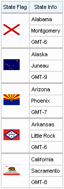
Similarly, the rowspan attribute can be used to merge and span rows. Again the breakBefore attribute needs to be used on related <rich:column> components to define the layout. Example 9.3, “Row spanning example” and the resulting Figure 9.4, “Complex headers using column groups” show the first column of the table spanning three rows.
Example 9.3. Row spanning example
<rich:dataTable value="#{capitalsBean.capitals}" var="cap" rows="5">

  <rich:column rowspan="3">

    <f:facet name="header">State Flag</f:facet>

    <h:graphicImage value="#{cap.stateFlag}"/>

  </rich:column>

  <rich:column>

    <f:facet name="header">State Info</f:facet>

    <h:outputText value="#{cap.state}"/>

  </rich:column>

  <rich:column breakBefore="true">

    <h:outputText value="#{cap.name}"/>

  </rich:column>

  <rich:column breakBefore="true">

    <h:outputText value="#{cap.timeZone}"/>

  </rich:column>

</rich:dataTable>
For details on filtering and sorting columns, refer to Section 9.11, “Table filtering” and Section 9.12, “Table sorting”.
component-type:
org.richfaces.ColumnGroupcomponent-class:
org.richfaces.component.html.HtmlColumnGroupcomponent-family:
org.richfaces.ColumnGrouprenderer-type:
org.richfaces.ColumnGroupRenderertag-class:
org.richfaces.taglib.ColumnGroupTag
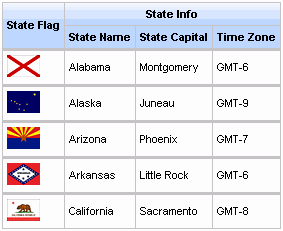
The <rich:columnGroup> component combines multiple columns in a single row to organize complex parts of a table. The resulting effect is similar to using the breakBefore attribute of the <rich:column> component, but is clearer and easier to follow in the source code.
The <rich:columnGroup> can also be used to create complex headers in a table. Example 9.4, “Complex headers using column groups” and the resulting Figure 9.4, “Complex headers using column groups” demonstrate how complex headers can be achieved.
Example 9.4. Complex headers using column groups
<rich:dataTable value="#{capitalsBean.capitals}" var="cap" rows="5" id="sublist">

  <f:facet name="header">

    <rich:columnGroup>

      <rich:column rowspan="2">

  <h:outputText value="State Flag"/>

      </rich:column>

      <rich:column colspan="3">

  <h:outputText value="State Info"/>

      </rich:column>

      <rich:column breakBefore="true">

  <h:outputText value="State Name"/>

      </rich:column>

      <rich:column>

  <h:outputText value="State Capital"/>

      </rich:column>

      <rich:column>

  <h:outputText value="Time Zone"/>

      </rich:column>

    </rich:columnGroup>

  </f:facet>

  <rich:column>

    <h:graphicImage value="#{cap.stateFlag}"/>

      </rich:column>

      <rich:column>

    <h:outputText value="#{cap.state}"/>

      </rich:column>

      <rich:column>

    <h:outputText value="#{cap.name}"/>

      </rich:column>

      <rich:column>

    <h:outputText value="#{cap.timeZone}"/>

  </rich:column>

</rich:dataTable>
component-type:
org.richfaces.Columntag-class:
org.richfaces.taglib.ColumnsTagHandler
The <rich:columns> component allows for dynamic sets of columns for tables. Columns and rows can be merged, and the look and feel can be highly customized. The component gets a list from a data model and creates a corresponding set of columns in a <rich:dataTable> component. The <rich:columns> component also supports header and footer facets.
Basic usage of the <rich:columns> component requires the value attribute, which points to the data model; the var attribute, which holds the current variable for the collection of data; and the index attribute, which holds the current counter. The id attribute is used for when the individuals rows require identifiers for Ajax events.
Example 9.5. Basic columns example
<rich:dataTable value="#{dataTableScrollerBean.model}" var="model" width="750">

  <rich:columns value="#{dataTableScrollerBean.columns}" var="columns" index="ind" id="column#{ind}">

    <f:facet name="header">

      <h:outputText value="#{columns.header}" />

    </f:facet>

    <h:outputText value="#{model[ind].model} " />

    <h:outputText value="#{model[ind].mileage} miles " />

    <h:outputText value="#{model[ind].price}$" />

  </rich:columns>

</rich:dataTable>
The output can be customized to display specific columns and rows. The columns attribute specifies the number of columns. The rowspan attribute specifies the number of rows to display; if the attribute is set to 0, all remaining rows in the table are displayed. The begin and end attributes are used to specify the first and last zero-based iteration items to display in the table. Columns can be adjusted using the colspan, rowspan, and breakBefore attributes the same as with the <rich:column> component.
The <rich:columns> component can be used alongside <rich:column> components.
Example 9.6. Using <rich:columns> and <rich:column> together
<rich:dataTable value="#{dataTableScrollerBean.model}" var="model" width="500px" rows="5">

  <f:facet name="header">

    <h:outputText value="Cars Available"></h:outputText>

  </f:facet>

  <rich:columns value="#{dataTableScrollerBean.columns}" var="columns" index="ind">

    <f:facet name="header">

      <h:outputText value="#{columns.header}" />

    </f:facet>

    <h:outputText value="#{model[ind].model} " />

  </rich:columns>

  <rich:column>

    <f:facet name="header">

      <h:outputText value="Price" />

    </f:facet>

    <h:outputText value="Price" />

  </rich:column>

  <rich:columns value="#{dataTableScrollerBean.columns}" var="columns" index="ind">

    <f:facet name="header">

      <h:outputText value="#{columns.header}" />

    </f:facet>

    <h:outputText value="#{model[ind].mileage}$" />

  </rich:columns>

</rich:dataTable>
For details on filtering and sorting columns, refer to Section 9.11, “Table filtering” and Section 9.12, “Table sorting”.
component-type:
org.richfaces.DataDefinitionListcomponent-class:
org.richfaces.component.html.HtmlDataDefinitionListcomponent-family:
org.richfaces.DataDefinitionListrenderer-type:
org.richfaces.DataDefinitionListRenderertag-class:
org.richfaces.taglib.DataDefinitionListTag
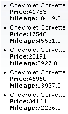
The <rich:dataDefinitionList> component renders a list of items with definitions. The component uses a data model for managing the list items, which can be updated dynamically.
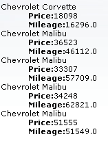
The var attribute names a variable for iterating through the items in the data model. The items to iterate through are determined with the value attribute by using EL (Expression Lanugage). The first attribute specifies which item in the data model to start from, and the rows attribute specifies the number of items to list. The title attribute is used for a floating tool-tip. Example 9.7, “<rich:dataDefinitionList> example” shows a simple example using the <rich:dataDefinitionList> component.
Example 9.7. <rich:dataDefinitionList> example
<h:form>

    <rich:dataDefinitionList var="car" value="#{dataTableScrollerBean.allCars}" rows="5" first="4" title="Cars">

        <f:facet name="term">

            <h:outputText value="#{car.make} #{car.model}"></h:outputText>

        </f:facet>

        <h:outputText value="Price:" styleClass="label"></h:outputText>

        <h:outputText value="#{car.price}" /><br/>

        <h:outputText value="Mileage:" styleClass="label"></h:outputText>

        <h:outputText value="#{car.mileage}" /><br/>

    </rich:dataDefinitionList>

</h:form>
component-type:
org.richfaces.DataFilterSlidercomponent-class:
org.richfaces.component.html.HtmlDataFilterSlidercomponent-family:
org.richfaces.DataFilterSliderrenderer-type:
org.richfaces.DataFilterSliderRenderertag-class:
org.richfaces.taglib.dataFilterSliderTag
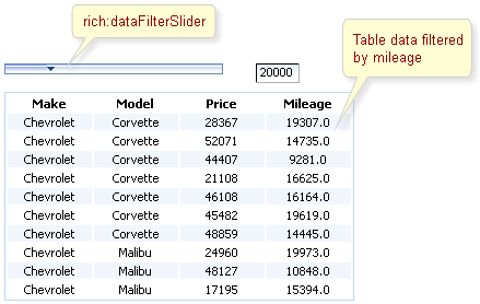
The <rich:dataFilterSlider> components is a slider control that can be used for filtering data in a table. The range and increment of the slider control are defined using the startRange, endRange, and increment attributes.
The slider is bound to a UIData component specified with the for attribute. The forValRef attribute refers to the value attribute used by the target component, and the filterBy attribute specifies which object member to filter according to the slider.
The handleValue attribute keeps the current handle position on the slider control; filtering is based on this value. The storeResults attribute allows the <rich:dataFilterSlider> component to keep the target UIData component in session.
The event defined with the submitOnSlide attribute is triggered when the handle value on the slider is changed.
Example 9.8. <rich:dataFilterSlider> example
<rich:dataFilterSlider sliderListener="#{mybean.doSlide}"

                       startRange="0"

                       endRange="50000"

                       increment="10000"

                       handleValue="1"

                       for="carIndex"

                       forValRef="inventoryList.carInventory"

                       filterBy="getMileage" />


<h:dataTable id="carIndex">

    ...

</h:dataTable>
component-type:
org.richfaces.DataGridcomponent-class:
org.richfaces.component.html.HtmlDataGridcomponent-family:
org.richfaces.DataGridrenderer-type:
org.richfaces.DataGridRenderertag-class:
org.richfaces.taglib.DataGridTag
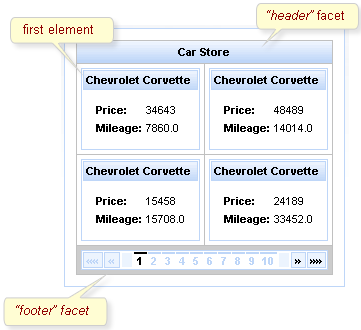
The <rich:dataGrid> component is used to arrange data objects in a grid. Values in the grid can be updated dynamically from the data model, and Ajax updates can be limited to specific rows. The component supports header, footer, and caption facets.
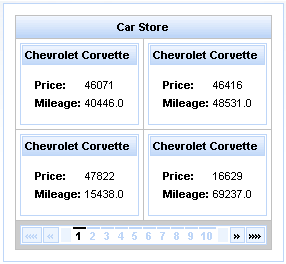
The <rich:dataGrid> component requires the value attribute, which points to the data model, and the var attribute, which holds the current variable for the collection of data. The number of columns for the grid is specifed with the columns attribute, and the number of elements to layout among the columns is determined with the elements attribute. The first attribute references the zero-based element in the data model from which the grid starts.
Example 9.9. <rich:dataGrid> example
<rich:panel style="width:150px;height:200px;">

  <h:form>

    <rich:dataGrid value="#{dataTableScrollerBean.allCars}" var="car" columns="2" elements="4" first="1">

        <f:facet name="header">

          <h:outputText value="Car Store"></h:outputText>

      </f:facet>

      <rich:panel>

          <f:facet name="header">

            <h:outputText value="#{car.make} #{car.model}"></h:outputText>

          </f:facet>

          <h:panelGrid columns="2">

            <h:outputText value="Price:" styleClass="label"></h:outputText>

            <h:outputText value="#{car.price}"/>

            <h:outputText value="Mileage:" styleClass="label"></h:outputText>

            <h:outputText value="#{car.mileage}"/>

          </h:panelGrid>

      </rich:panel>

      <f:facet name="footer">

          <rich:datascroller></rich:datascroller>

      </f:facet>

    </rich:dataGrid>

  </h:form>

</rich:panel>
As the component is based on the <a4j:repeat> component, it can be partially updated with Ajax. The ajaxKeys attribute allows row keys to be defined, which are updated after an Ajax request.
Example 9.10. ajaxKeys example
<rich:dataGrid value="#{dataTableScrollerBean.allCars}" var="car" ajaxKeys="#{listBean.list}" binding="#{listBean.dataGrid}" id="grid" elements="4" columns="2">

  ...

</rich:dataGrid>

...

<a4j:commandButton action="#{listBean.action}" reRender="grid" value="Submit"/>
component-type:
org.richfaces.DataListcomponent-class:
org.richfaces.component.html.HtmlDataListcomponent-family:
org.richfaces.DataListrenderer-type:
org.richfaces.DataListRenderertag-class:
org.richfaces.taglib.DataListTag
The <rich:dataList> component renders an unordered list of items. The component uses a data model for managing the list items, which can be updated dynamically.
The type attribute refers to the appearance of the bullet points. The values of the attribute correspond to the type parameter for the <ul> HTML element:
circleDisplays an unfilled circle as a bullet point.
discDisplays a filled disc as a bullet point.
squareDisplays a square as a bullet point.
The var attribute names a variable for iterating through the items in the data model. The items to iterate through are determined with the value attribute by using EL (Expression Lanugage). The first attribute specifies which item in the data model to start from, and the rows attribute specifies the number of items to list. The title attribute is used for a floating tool-tip. Example 9.7, “<rich:dataDefinitionList> example” shows a simple example using the <rich:dataDefinitionList> component.
Example 9.11. <rich:dataList> example
<h:form>

    <rich:dataList var="car" value="#{dataTableScrollerBean.allCars}" rows="5" type="disc" title="Car Store">

        <h:outputText value="#{car.make} #{car.model}"/><br/>

        <h:outputText value="Price:" styleClass="label"></h:outputText>

        <h:outputText value="#{car.price} "/><br/>

        <h:outputText value="Mileage:" styleClass="label"></h:outputText>

        <h:outputText value="#{car.mileage} "/><br/>

    </rich:dataList>

</h:form>
component-type:
org.richfaces.DataOrderedListcomponent-class:
org.richfaces.component.html.HtmlDataOrderedListcomponent-family:
org.richfaces.DataOrderedListrenderer-type:
org.richfaces.DataOrderedListRenderertag-class:
org.richfaces.taglib.DataOrderedListTag
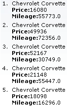
The <rich:dataOrderedList> component renders an ordered list of items from a data model. Specific rows can be updated dynamically without updating the entire list.
The type attribute defines the appearance of the numerating list markers for the list. The possible values for the type attribute are as follows:
ANumerates the list items as A, B, C, etc.
aNumerates the list items as a, b, c, etc.
INumerates the list items as I, II, III, etc.
iNumerates the list items as i, ii, iii, etc.
1Numerates the list items as 1, 2, 3, etc.
The first attribute specifies which item in the data model to start from, and the rows attribute specifies the number of items to list. The title attribute defines a pop-up title. To only update a sub-set of the rows in the list, use the ajaxKeys attribute, which points to an object that contains the specified rows.
Example 9.12. <rich:dataOrderedList> example
<h:form>

    <rich:dataOrderedList var="car" value="#{dataTableScrollerBean.allCars}" rows="5" type="1"  title="Car Store">

        <h:outputText value="#{car.make} #{car.model}"/><br/>

        <h:outputText value="Price:" styleClass="label"></h:outputText>

        <h:outputText value="#{car.price}" /><br/>

        <h:outputText value="Mileage:" styleClass="label"></h:outputText>

        <h:outputText value="#{car.mileage}" /><br/>

    </rich:dataOrderedList>

</h:form>
component-type:
org.richfaces.DataTablecomponent-class:
org.richfaces.component.html.HtmlDataTablecomponent-family:
org.richfaces.DataTablerenderer-type:
org.richfaces.DataTableRenderertag-class:
org.richfaces.taglib.DataTableTag
The <rich:dataTable> component is used to render a table, including the table's header and footer. It works in conjunction with the <rich:column>, <rich:columnGroup>, and <rich:columns> components to list the contents of a data model.
<rich:extendedDataTable>
The <rich:dataTable> component does not include extended table features, such as data scrolling, row selection, and column reordering. These features are available as part of the <rich:extendedDataTable> component; refer to Section 9.10, “<rich:extendedDataTable>” for further details.
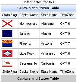
The value attribute points to the data model, and the var attribute specifies a variable to use when iterating through the data model. The first attribute specifies which item in the data model to start from, and the rows attribute specifies the number of items to list. The header, footer, and caption facets can be used to display text, and to customize the appearance of the table through skinning. demonstrates a simple table implementation.
Example 9.13. <rich:dataTable> example
<rich:dataTable value="#{capitalsBean.capitals}" var="cap" rows="5">

    <f:facet name="caption">

        <h:outputText value="United States Capitals" />

    </f:facet>

    <f:facet name="header">

        <h:outputText value="Capitals and States Table" />

    </f:facet>

    <rich:column>

        <f:facet name="header">State Flag</f:facet>

            <h:graphicImage value="#{cap.stateFlag}"/>

        <f:facet name="footer">State Flag</f:facet>

    </rich:column>

    <rich:column>

        <f:facet name="header">State Name</f:facet>

            <h:outputText value="#{cap.state}"/>

        <f:facet name="footer">State Name</f:facet>

    </rich:column>

    <rich:column >

        <f:facet name="header">State Capital</f:facet>

            <h:outputText value="#{cap.name}"/>

        <f:facet name="footer">State Capital</f:facet>

    </rich:column>

    <rich:column>

        <f:facet name="header">Time Zone</f:facet>

            <h:outputText value="#{cap.timeZone}"/>

        <f:facet name="footer">Time Zone</f:facet>

    </rich:column>

    <f:facet name="footer">

        <h:outputText value="Capitals and States Table" />

    </f:facet>

</rich:dataTable>
The <rich:dataTable> component is based on the <a4j:repeat> component, and as such it can be partially updated using Ajax. The ajaxKeys attribute defines the rows to be updated during an Ajax request.
For details on filtering and sorting data tables, refer to Section 9.11, “Table filtering” and Section 9.12, “Table sorting”.
component-type:
org.richfaces.ExtendedDataTablecomponent-class:
org.richfaces.component.html.HtmlExtendedDataTablecomponent-family:
org.richfaces.ExtendedDataTablerenderer-type:
org.richfaces.ExtendedDataTableRenderertag-class:
org.richfaces.taglib.ExtendedDataTableTag
The <rich:extendedDataTable> component builds on the functionality of the <rich:dataTable> component, adding features such as data scrolling, row and column selection, and rearranging of columns.
The <rich:extendedDataTable> component includes the following attributes not included in the <rich:dataTable> component:
activeClass | height | selection |
activeRowKey | noDataLabel | selectionMode |
enableContextMenu | onselectionchange | tableState |
groupingColumn | selectedClass |
The <rich:extendedDataTable> component does not include the following attributes available with the <rich:dataTable> component:
columnscolumnsWidthonRowContextMenu
Basic use of the <rich:extendedDataTable> component requires the value and var attributes, the same as with the <rich:dataTable> component. Refer to Section 9.9, “<rich:dataTable>” for details.
The height attribute is mandatory, and defines the height of the table on the page. This is set to 500px by default. The width of the table can be set by using the width attribute. As with the <rich:dataTable> component, the look of the <rich:extendedDataTable> component can be customized and skinned using the header, footer, and caption facets.
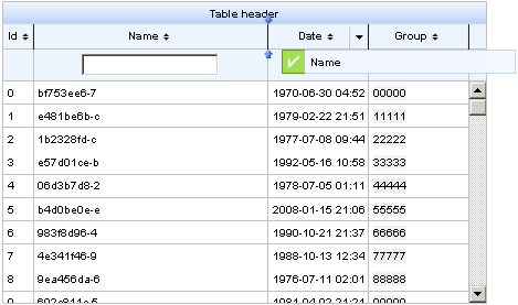
Example 9.14. <rich:extendedDataTable> example
<rich:extendedDataTable id="edt" value="#{extendedDT.dataModel}" var="edt" width="500px" height="500px" selectedClass="dataTableSelectedRow" sortMode="single" selectionMode="multi" selection="#{extendedDT.selection}" rowKeyVar="rkvar" tableState="#{extendedDT.tableState}">

    <rich:column id="id" headerClass="dataTableHeader" width="50" label="Id" sortable="true" sortBy="#{edt.id}" sortIconAscending="dataTableAscIcon" sortIconDescending="dataTableDescIcon">

        <f:facet name="header">

            <h:outputText value="Id" />

        </f:facet>

        <h:outputText value="#{edt.id}" />

    </rich:column>

    <rich:column id="name" width="300" headerClass="dataTableHeader" label="Name" sortable="true" sortBy="#{edt.name}" sortIconAscending="dataTableAscIcon" sortIconDescending="dataTableDescIcon" filterBy="#{edt.name}" filterEvent="onkeyup" visible="false">

        <f:facet name="header">

            <h:outputText value="Name" />

        </f:facet>

        <h:outputText value="#{edt.name}" />

    </rich:column>

    <rich:column id="date" width="100" headerClass="dataTableHeader" label="Date" sortable="true" comparator="#{extendedDT.dateComparator}" sortIconAscending="dataTableAscIcon" sortIconDescending="dataTableDescIcon">

        <f:facet name="header">

            <h:outputText value="Date" />

        </f:facet>

        <h:outputText value="#{edt.date}"><f:convertDateTime pattern="yyyy-MM-dd HH:mm:ss" />

        </h:outputText>

    </rich:column>

    <rich:column id="group" width="50" headerClass="dataTableHeader" label="Group" sortable="true" sortBy="#{edt.group}" sortIconAscending="dataTableAscIcon" sortIconDescending="dataTableDescIcon">

        <f:facet name="header">

            <h:outputText value="Group" />

        </f:facet>

        <h:outputText value="#{edt.group}" />

    </rich:column>

</rich:extendedDataTable>
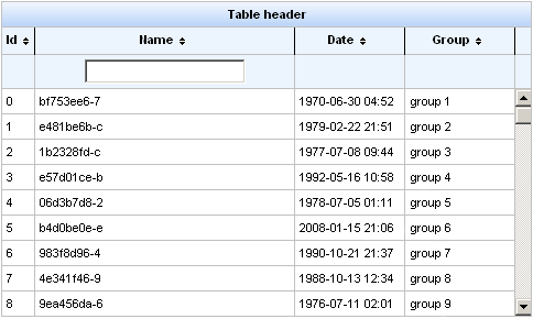
Example 9.14, “<rich:extendedDataTable> example” shows an example extended data table. The implementation features a scrolling data table, selection of one or more rows, sorting by columns, grouping by column, and a filter on the Name column.
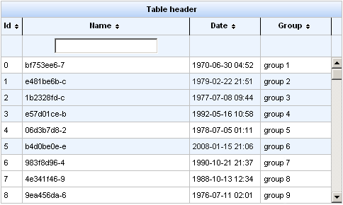
Row selection is determined by the selectionMode attribute. Setting the attribute to none allows for no row selection capability. Setting the selectionMode attribute to single allows the user to select a single row at a time using the mouse. With the selectionMode attribute set to multi, the user can select multiple rows by holding down the Shift or Ctrl keys while clicking. The selection attribute points to the object that tracks which rows are selected. Figure 9.13, “Selecting multiple rows” shows the table from the example with multiple rows selected.
The example uses the filter facet of the <rich:column> component to display the text field. A user can type their criteria into the text field to customize the filter of the column below. For full details on filtering tables, refer to Section 9.11, “Table filtering”.
When hovering the mouse over a column header, a menu button appears to the right-hand side, as shown in Figure 9.14, “Column menu”. This menu allows the user to sort the contents of the column, group the table by the column, or hide and show columns.
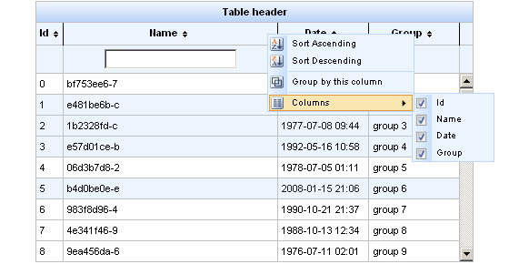
Each column can allow sorting by setting the <rich:column> component's sortable attribute to true. The value of the data model to sort by is specified with the sortBy attribute. In addition to using the menu for sorting, columns can be quickly sorted either ascending or descending by clicking on the directional icon next to the column title. The directional icons are defined in each <rich:column> component with the sortIconAscending and sortIconDescending attributes, for ascending and descending icons respectively. For full details on sorting tables, refer to Section 9.12, “Table sorting”.
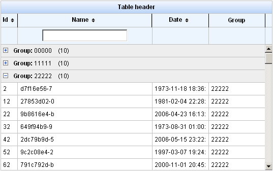
Grouping the table's entries by a column will organize the table into collapsible sections, as shown in Figure 9.15, “Grouping table entries by column”.
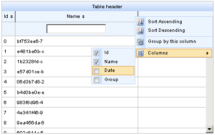
The checkboxes in the column menu under the sub-menu will hide or show the respective columns, as shown in Figure 9.16, “Hiding columns”.
Columns in a <rich:extendedDataTable> component can be rearranged by the user by dragging each column to a different position. The label attribute for the <rich:column> component is displayed during dragging, as shown in
Once the contents of the table have been rearranged and customized by the user, the tableState attribute can be used to preserve the customization so it can be restored later. The tableState attribute points to a backing-bean property which can in turn be saved to a database separate from standard JSF state-saving mechanisms.