Documentation in development
Some concepts covered in this chapter may refer to the previous version of Richfaces, version 3.3.3. This chapter is scheduled for review to ensure all information is up to date.
This chapter details those components which act as panels and containers to hold groups of other components.
The <rich:autocomplete> component is an auto-completing input-box with built-in Ajax capabilities. It supports client-side suggestions, browser-like selection, and customization of the look and feel.
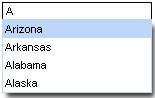
The value attribute stores the text entered by the user for the auto-complete box. Suggestions shown in the auto-complete list can be specified using the autocompleteList attribute, which points to a collection of suggestions:
Example 9.1. Defining suggestion values
<rich:autocomplete value="#{bean.state}" autocompleteList="#{bean.suggestions}" />
Users can type into the combo-box's text field to enter a value, which also searches through the suggestion items in the drop-down box. By default, the first suggestion item is selected as the user types. This behavior can be deactivated by setting selectFirst="false"
Setting autoFill="true"
The <rich:inplaceInput> component allows information to be entered in-line in blocks of text, improving readability of the text. Changes can be rendered either in-line or for the whole block, and inputs can be focused with keyboard navigation. The component has three functional states: the "view" state, where the component displays its initial setting, such as "click to edit"; the "edit" state, where the user can input text; and the "changed" state, where the new value for the component has been confirmed but can be edited again if required.
Basic usage requires the value attribute to point to the expression for the current value of the component.
By default, the event to switch the component to the "edit" state is a single mouse click. This can be changed using the editEvent attribute to specify a different event.
The user can confirm and save their input by pressing the Enter key or cancel by pressing the Esc key. Alternatively, buttons for confirming or canceling can be added to the component by setting showControls="true". These buttons can be positioned using the controlsHorizontalPosition attribute with settings of left, right, or center, and the controlsVerticalPosition attribute with settings bottom, center, or top. The confirmation control icons can be altered using the saveControlIcon and cancelControlIcon. Further customization is possible through the use of facets.
The <rich:inplaceSelect> component is similar to the <rich:inplaceInput> component, except that the <rich:inplaceSelect> component uses a drop-down selection box to enter text instead of a regular text field. Changes can be rendered either in-line or for the whole block, and inputs can be focused with keyboard navigation. The component has three functional states: the "view" state, where the component displays its initial setting, such as "click to edit"; the "edit" state, where the user can select a value from a drop-down list; and the "changed" state, where the new value for the component has been confirmed but can be edited again if required.
Basic usage requires the value attribute to point to the expression for the current value of the component and a list of items. The list of items can be defined using the JSF components <f:selectItem/> and <f:selectItems/>.
Example 9.2. Defining list items for <rich:inplaceSelect>
<rich:inplaceSelect value="#{bean.inputValue}" defaultLabel="click to edit" >

    <f:selectItems value="#{bean.selectItems}" />

    <f.selectItem itemValue="1" itemLabel="Item 1" />

    <f.selectItem itemValue="2" itemLabel="Item 2" />

    <f.selectItem itemValue="3" itemLabel="Item 3" />

    <f.selectItem itemValue="4" itemLabel="Item 4" />

</rich:comboBox>
When in the initial "view" state, the starting label can be set using the defaultLabel attribute, such as defaultLabel="click to edit".
By default, the event to switch the component to the "edit" state is a single mouse click. This can be changed using the editEvent attribute to specify a different event. When switching to "edit" mode, the drop-down list of possible values will automatically be displayed; this can be deactivated by setting openOnEdit="false"
Once the user selects an option from the drop-down list, the item becomes the new value for the component and the state is switched to the "changed" state. Alternatively, buttons for confirming or canceling can be added to the component by setting showControls="true". These buttons can be positioned using the controlsHorizontalPosition attribute with settings of left, right, or center, and the controlsVerticalPosition attribute with settings bottom, center, or top. The confirmation control icons can be altered using the saveControlIcon and cancelControlIcon. Further customization is possible through the use of facets.
There are several event handlers that are specific to the <rich:inplaceSelect> component:
oneditactivationis triggered before the "edit" state is activated.oneditactivatedis triggered after the "edit" state is activated.onviewactivationis triggered before the "view" or "changed" state is activated.onviewactivatedis triggered after the "view" or "changed" state is activated.
The <rich:inputNumberSlider> component provides a slider for changing numerical values. Optional features include control arrows to step through the values, a tool-tip to display the value while sliding, and a text field for typing the numerical value which can then be validated against the slider's range.
Basic use of the component with no attributes specified will render a slider with a minimum value of 0, a maximum of 100, and a gradient step of 1, together with a text field for typing the desired numerical value. The slider is labeled with the minimum and maximum boundary values, and a tool-tip showing the current value is shown while sliding the slider. The value attribute is used for storing the currently selected value of the slider.
The text field can be removed by setting showInput="false".
The properties of the slider can be set with the attributes minValue, maxValue, and step.
The minimum and maximum labels on the slider can be hidden by setting showBoundaryValues="false"showToolTip="false"
Arrow controls can be added to either side of the slider to adjust the value incrementally by setting showArrows="true"delay attribute.
component-type:org.richfaces.inputNumberSlidercomponent-class:org.richfaces.component.html.HtmlInputNumberSlidercomponent-family:org.richfaces.inputNumberSliderrenderer-type:org.richfaces.renderkit.inputNumberSliderRenderertag-class:org.richfaces.taglib.inputNumberSliderTag