Documentation in development
Some concepts covered in this chapter may refer to the previous version of Richfaces, version 3.3.3. This chapter is scheduled for review to ensure all information is up to date.
This chapter covers all components related to the display of tables and grids.
The <a4j:repeat> component is used to iterate changes through a repeated collection of components. It allows specific rows of items to be updated without sending Ajax requests for the entire collection. The <a4j:repeat> component forms the basis for many of the tabular components detailed in Chapter 11, Tables and grids.
The contents of the collection are determined using Expression Language (EL). The data model for the contents is specified with the value attribute. The var attribute names the object to use when iterating through the collection. This object is then referenced in the relevant child components. Example 11.1, “<a4j:repeat> example” shows how to use <a4j:repeat> to maintain a simple table.
Example 11.1. <a4j:repeat> example
<table>

    <tbody>

        <a4j:repeat value="#{repeatBean.items}" var="item">

            <tr>

                <td><h:outputText value="#{item.code}" id="item1" /></td>

                <td><h:outputText value="#{item.price}" id="item2" /></td>

            </tr>

        </a4j:repeat>

    </tbody>

</table>
Each row of a table contains two cells: one showing the item code, and the other showing the item price. The table is generated by iterating through items in the repeatBeans.items data model.
The <rich:column> component facilitates columns in a table. It supports merging columns and rows, sorting, filtering, and customized skinning.
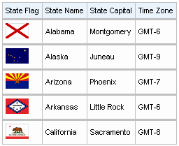
In general usage, the <rich:column> component is used in the same was as the JavaServer Faces (JSF) <h:column> component. It requires no extra attributes for basic usage, as shown in Example 11.2, “Basic column example”.
Example 11.2. Basic column example
<rich:dataTable value="#{capitalsBean.capitals}" var="cap" rows="5">

    <rich:column>

        <f:facet name="header">State Flag</f:facet>

        <h:graphicImage value="#{cap.stateFlag}"/>

    </rich:column>

    <rich:column>

        <f:facet name="header">State Name</f:facet>

        <h:outputText value="#{cap.state}"/>

    </rich:column>

    <rich:column >

        <f:facet name="header">State Capital</f:facet>

        <h:outputText value="#{cap.name}"/>

    </rich:column>

    <rich:column>

        <f:facet name="header">Time Zone</f:facet>

        <h:outputText value="#{cap.timeZone}"/>

    </rich:column>

</rich:dataTable>
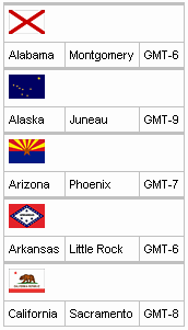
Columns can be merged by using the colspan attribute to specify how many normal columns to span. The colspan attribute is used in conjunction with the breakBefore attribute on the next column to determine how the merged columns are laid out. Example 11.3, “Column spanning example”.
Example 11.3. Column spanning example
<rich:dataTable value="#{capitalsBean.capitals}" var="cap" rows="5">

    <rich:column colspan="3">

        <h:graphicImage value="#{cap.stateFlag}"/>

    </rich:column>

    <rich:column breakBefore="true">

        <h:outputText value="#{cap.state}"/>

    </rich:column>

    <rich:column >

        <h:outputText value="#{cap.name}"/>

    </rich:column>

    <rich:column>

        <h:outputText value="#{cap.timeZone}"/>

    </rich:column>

</rich:dataTable>
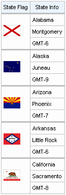
Similarly, the rowspan attribute can be used to merge and span rows. Again the breakBefore attribute needs to be used on related <rich:column> components to define the layout. Example 11.4, “Row spanning example” and the resulting Figure 11.4, “Complex headers using column groups” show the first column of the table spanning three rows.
Example 11.4. Row spanning example
<rich:dataTable value="#{capitalsBean.capitals}" var="cap" rows="5">

    <rich:column rowspan="3">

        <f:facet name="header">State Flag</f:facet>

        <h:graphicImage value="#{cap.stateFlag}"/>

    </rich:column>

    <rich:column>

        <f:facet name="header">State Info</f:facet>

        <h:outputText value="#{cap.state}"/>

    </rich:column>

    <rich:column breakBefore="true">

        <h:outputText value="#{cap.name}"/>

    </rich:column>

    <rich:column breakBefore="true">

        <h:outputText value="#{cap.timeZone}"/>

    </rich:column>

</rich:dataTable>
For details on filtering and sorting columns, refer to Section 11.8, “Table filtering” and Section 11.9, “Table sorting”.
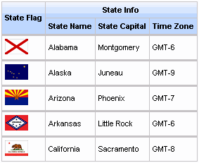
The <rich:columnGroup> component combines multiple columns in a single row to organize complex parts of a table. The resulting effect is similar to using the breakBefore attribute of the <rich:column> component, but is clearer and easier to follow in the source code.
The <rich:columnGroup> can also be used to create complex headers in a table. Example 11.5, “Complex headers using column groups” and the resulting Figure 11.4, “Complex headers using column groups” demonstrate how complex headers can be achieved.
Example 11.5. Complex headers using column groups
<rich:dataTable value="#{capitalsBean.capitals}" var="cap" rows="5" id="sublist">

    <f:facet name="header">

        <rich:columnGroup>

            <rich:column rowspan="2">

                <h:outputText value="State Flag"/>

            </rich:column>

            <rich:column colspan="3">

                <h:outputText value="State Info"/>

            </rich:column>

            <rich:column breakBefore="true">

                <h:outputText value="State Name"/>

            </rich:column>

            <rich:column>

                <h:outputText value="State Capital"/>

            </rich:column>

            <rich:column>

                <h:outputText value="Time Zone"/>

            </rich:column>

        </rich:columnGroup>

    </f:facet>

    <rich:column>

        <h:graphicImage value="#{cap.stateFlag}"/>

    </rich:column>

    <rich:column>

        <h:outputText value="#{cap.state}"/>

    </rich:column>

    <rich:column>

        <h:outputText value="#{cap.name}"/>

    </rich:column>

    <rich:column>

        <h:outputText value="#{cap.timeZone}"/>

    </rich:column>

</rich:dataTable>
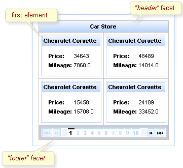
The <rich:dataGrid> component is used to arrange data objects in a grid. Values in the grid can be updated dynamically from the data model, and Ajax updates can be limited to specific rows. The component supports header, footer, and caption facets.
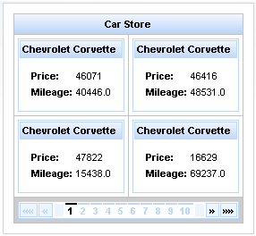
The <rich:dataGrid> component requires the value attribute, which points to the data model, and the var attribute, which holds the current variable for the collection of data.
The number of columns for the grid is specifed with the columns attribute, and the number of elements to layout among the columns is determined with the elements attribute. The first attribute references the zero-based element in the data model from which the grid starts.
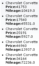
Example 11.6. <rich:dataGrid> example
<rich:panel style="width:150px;height:200px;">

  <h:form>

    <rich:dataGrid value="#{dataTableScrollerBean.allCars}" var="car" columns="2" elements="4" first="1">

        <f:facet name="header">

          <h:outputText value="Car Store"></h:outputText>

      </f:facet>

      <rich:panel>

          <f:facet name="header">

            <h:outputText value="#{car.make} #{car.model}"></h:outputText>

          </f:facet>

          <h:panelGrid columns="2">

            <h:outputText value="Price:" styleClass="label"></h:outputText>

            <h:outputText value="#{car.price}"/>

            <h:outputText value="Mileage:" styleClass="label"></h:outputText>

            <h:outputText value="#{car.mileage}"/>

          </h:panelGrid>

      </rich:panel>

      <f:facet name="footer">

          <rich:datascroller></rich:datascroller>

      </f:facet>

    </rich:dataGrid>

  </h:form>

</rich:panel>
As the component is based on the <a4j:repeat> component, it can be partially updated with Ajax. The ajaxKeys attribute allows row keys to be defined, which are updated after an Ajax request.
Example 11.7. ajaxKeys example
<rich:dataGrid value="#{dataTableScrollerBean.allCars}" var="car" ajaxKeys="#{listBean.list}" binding="#{listBean.dataGrid}" id="grid" elements="4" columns="2">

    ...

</rich:dataGrid>

...

<a4j:commandButton action="#{listBean.action}" reRender="grid" value="Submit"/>
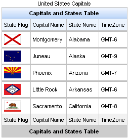
The <rich:dataTable> component is used to render a table, including the table's header and footer. It works in conjunction with the <rich:column> and <rich:columnGroup> components to list the contents of a data model.
<rich:extendedDataTable>
The <rich:dataTable> component does not include extended table features, such as data scrolling, row selection, and column reordering. These features are available as part of the <rich:extendedDataTable> component; refer to Section 11.6, “<rich:extendedDataTable>” for further details.
The value attribute points to the data model, and the var attribute specifies a variable to use when iterating through the data model.
The first attribute specifies which item in the data model to start from, and the rows attribute specifies the number of items to list. The header, footer, and caption facets can be used to display text, and to customize the appearance of the table through skinning. demonstrates a simple table implementation.
Example 11.8. <rich:dataTable> example
<rich:dataTable value="#{capitalsBean.capitals}" var="cap" rows="5">

    <f:facet name="caption">

        <h:outputText value="United States Capitals" />

    </f:facet>

    <f:facet name="header">

        <h:outputText value="Capitals and States Table" />

    </f:facet>

    <rich:column>

        <f:facet name="header">State Flag</f:facet>

            <h:graphicImage value="#{cap.stateFlag}"/>

        <f:facet name="footer">State Flag</f:facet>

    </rich:column>

    <rich:column>

        <f:facet name="header">State Name</f:facet>

            <h:outputText value="#{cap.state}"/>

        <f:facet name="footer">State Name</f:facet>

    </rich:column>

    <rich:column >

        <f:facet name="header">State Capital</f:facet>

            <h:outputText value="#{cap.name}"/>

        <f:facet name="footer">State Capital</f:facet>

    </rich:column>

    <rich:column>

        <f:facet name="header">Time Zone</f:facet>

            <h:outputText value="#{cap.timeZone}"/>

        <f:facet name="footer">Time Zone</f:facet>

    </rich:column>

    <f:facet name="footer">

        <h:outputText value="Capitals and States Table" />

    </f:facet>

</rich:dataTable>
For details on filtering and sorting data tables, refer to Section 11.8, “Table filtering” and Section 11.9, “Table sorting”.
The <rich:dataTable> component is based on the <a4j:repeat> component, and as such it can be partially updated using Ajax. The ajaxKeys attribute defines the rows to be updated during an Ajax request.
The <rich:extendedDataTable> component builds on the functionality of the <rich:dataTable> component, adding features such as data scrolling, row and column selection, and rearranging of columns.
The <rich:extendedDataTable> component includes the following attributes not included in the <rich:dataTable> component:
frozenColumns | onselectionchange | selectionMode |
height | selectedClass | tableState |
noDataLabel | selection |
The <rich:extendedDataTable> component does not include the following attributes available with the <rich:dataTable> component:
columnscolumnsWidth
Basic use of the <rich:extendedDataTable> component requires the value and var attributes, the same as with the <rich:dataTable> component. Refer to Section 11.5, “<rich:dataTable>” for details.
The height attribute defines the height of the table on the page. This is set to 100% by default. The width of the table can be set by using the width attribute. As with the <rich:dataTable> component, the look of the <rich:extendedDataTable> component can be customized and skinned using the header, footer, and caption facets.
Example 11.9. <rich:extendedDataTable> example
<rich:extendedDataTable id="edt" value="#{extendedDT.dataModel}" var="edt" width="500px" height="500px" selectedClass="dataTableSelectedRow" sortMode="single" selectionMode="multi" selection="#{extendedDT.selection}" rowKeyVar="rkvar" tableState="#{extendedDT.tableState}">

    <rich:column id="id" headerClass="dataTableHeader" width="50" label="Id" sortable="true" sortBy="#{edt.id}" sortIconAscending="dataTableAscIcon" sortIconDescending="dataTableDescIcon">

        <f:facet name="header">

            <h:outputText value="Id" />

        </f:facet>

        <h:outputText value="#{edt.id}" />

    </rich:column>

    <rich:column id="name" width="300" headerClass="dataTableHeader" label="Name" sortable="true" sortBy="#{edt.name}" sortIconAscending="dataTableAscIcon" sortIconDescending="dataTableDescIcon" filterBy="#{edt.name}" filterEvent="onkeyup" visible="false">

        <f:facet name="header">

            <h:outputText value="Name" />

        </f:facet>

        <h:outputText value="#{edt.name}" />

    </rich:column>

    <rich:column id="date" width="100" headerClass="dataTableHeader" label="Date" sortable="true" comparator="#{extendedDT.dateComparator}" sortIconAscending="dataTableAscIcon" sortIconDescending="dataTableDescIcon">

        <f:facet name="header">

            <h:outputText value="Date" />

        </f:facet>

        <h:outputText value="#{edt.date}"><f:convertDateTime pattern="yyyy-MM-dd HH:mm:ss" />

        </h:outputText>

    </rich:column>

    <rich:column id="group" width="50" headerClass="dataTableHeader" label="Group" sortable="true" sortBy="#{edt.group}" sortIconAscending="dataTableAscIcon" sortIconDescending="dataTableDescIcon">

        <f:facet name="header">

            <h:outputText value="Group" />

        </f:facet>

        <h:outputText value="#{edt.group}" />

    </rich:column>

</rich:extendedDataTable>
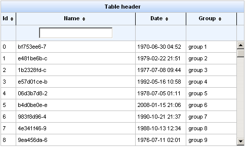
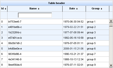
Example 11.9, “<rich:extendedDataTable> example” shows an example extended data table. The implementation features a scrolling data table, selection of one or more rows, sorting by columns, grouping by column, and a filter on the Name column.
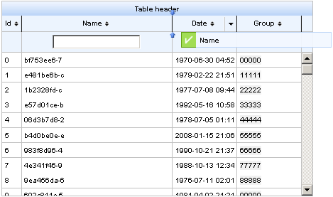
Row selection is determined by the selectionMode attribute. Setting the attribute to none allows for no row selection capability. Setting the selectionMode attribute to single allows the user to select a single row at a time using the mouse. With the selectionMode attribute set to multi, the user can select multiple rows by holding down the Shift or Ctrl keys while clicking. The selection attribute points to the object that tracks which rows are selected. Figure 11.9, “Selecting multiple rows” shows the table from the example with multiple rows selected.
A user can type their criteria into the text field to customize the filter of the column below. For full details on filtering tables, refer to Section 11.8, “Table filtering”.
Each column can be used to sort the contents of the table. The value of the data model to sort by is specified with the sortBy attribute. Columns can be quickly sorted either ascending or descending by clicking on the directional icon next to the column title. The directional icons are defined in each <rich:column> component with the sortIconAscending and sortIconDescending attributes, for ascending and descending icons respectively. For full details on sorting tables, refer to Section 11.9, “Table sorting”.
Columns in a <rich:extendedDataTable> component can be rearranged by the user by dragging each column to a different position. The label attribute for the <rich:column> component is displayed during dragging, as shown in
Once the contents of the table have been rearranged and customized by the user, the tableState attribute can be used to preserve the customization so it can be restored later. The tableState attribute points to a backing-bean property which can in turn be saved to a database separate from standard JSF state-saving mechanisms.
The <rich:list> component renders a list of items. The list can be an numerically ordered list, an unordered bullet-point list, or a data definition list. The component uses a data model for managing the list items, which can be updated dynamically.
The var attribute names a variable for iterating through the items in the data model. The items to iterate through are determined with the value attribute by using EL (Expression Lanugage).
By default, the list is displayed as an unordered bullet-point list. The type attribute is used to specify different list types:
unorderedThe default presentation. The list is presented as a series of bullet-points, similar to the
<ul>HTML element.orderedThe list is presented as a numbered series of items, similar to the
<ol>HTML element.dataThe list is presented as a series of data definitions. Part of the data model, specified as the term, is listed prominently. The other associated data is listed after each term.
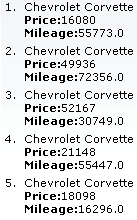

The first attribute specifies which item in the data model to start from, and the rows attribute specifies the number of items to list. The title attribute is used for a floating tool-tip. Example 11.10, “<rich:list> example” shows a simple example using the <rich:dataList> component.
Example 11.10. <rich:list> example
<h:form>

    <rich:dataList var="car" value="#{dataTableScrollerBean.allCars}" rows="5" type="unordered" title="Car Store">

        <h:outputText value="#{car.make} #{car.model}"/><br/>

        <h:outputText value="Price:" styleClass="label"></h:outputText>

        <h:outputText value="#{car.price} "/><br/>

        <h:outputText value="Mileage:" styleClass="label"></h:outputText>

        <h:outputText value="#{car.mileage} "/><br/>

    </rich:dataList>

</h:form>