Documentation in development
Some concepts covered in this chapter may refer to the previous version of Richfaces, version 3.3.3. This chapter is scheduled for review to ensure all information is up to date.
This chapter details rich components for user input and interaction.
The <rich:autocomplete> component is an auto-completing input-box with built-in Ajax capabilities. It supports client-side suggestions, browser-like selection, and customization of the look and feel.
To attach an auto-completion behavior to other components, use the <rich:autocompleteBehavior> behavior. Refer to ??? for full details on the <rich:autocompleteBehavior> behavior.
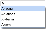
The value attribute stores the text entered by the user for the auto-complete box. Suggestions shown in the auto-complete list can be specified using the autocompleteMethod attribute, which points to a collection of suggestions.
Example 9.1. Defining suggestion values
<rich:autocomplete value="#{bean.state}" autocompleteMethod="#{bean.suggestions}" />
Users can type into the combo-box's text field to enter a value, which also searches through the suggestion items in the drop-down box. By default, the first suggestion item is selected as the user types. This behavior can be deactivated by setting selectFirst="false"
Setting autoFill="true"
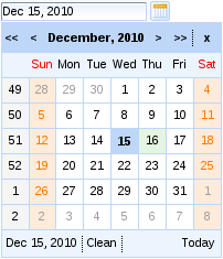
The <rich:calendar> component allows the user to enter a date and time through an in-line or pop-up calendar. The pop-up calendar can navigate through months and years, and its look and feel can be highly customized.
Basic usage of the <rich:calendar> component requires only the value attribute, which holds the currently selected date. Example 9.2, “Basic usage” shows a basic declaration, with the value pointing to a data model.
The <rich:calendar> component supports two different ways of loading data through defining the mode attribute. When not specified, the component uses client mode, which loads an initial portion of data within a set date range. The range can be defined by using the preloadDateRangeBegin and preloadDateRangeEnd attributes. Additional data requests are not sent.
Alternatively, with mode="ajax" the <rich:calendar> requests portions of data for rendering from a special data model. The data model can be defined through the dataModel attribute, which points to an object that implements the CalendarDataModel interface. If the dataModel attribute is not defined or has a value of null, the ajax mode functions the same as the client mode.
The <rich:calendar> component is presented as a pop-up by default, appearing as a text field with a button to expand the full pop-up calendar. To render the calendar in-line on the page instead, set popup="false. This displays the full calendar without the text field or display button.
To change the appearance of the display button from the standard calendar icon, use the buttonIcon and buttonIconDisabled attributes to replace the icon with a specified file. Alternatively, use the buttonLabel attribute to display text on the button without an icon. If buttonLabel is specified then both the buttonIcon and buttonIconDisabled attributes are ignored. To hide the text field box, set showInput="false".
To change the default position at which the pop-up calendar is shown relative to the text field and button, use the jointPoint and direction attributes. The jointPoint attribute refers to the corner of the text field and button with which the calendar will be aligned and the direction specifies which direction the pop-up calendar will span relative to the joint point. The default settings are jointPoint="bottom-left" and direction="bottom-right", causing the pop-up calendar to align with the bottom-left corner of the text field and span to the bottom-right, underneath the text field and button. The diagram shows the joint points and directions that can be used. Alternatively, set both jointPoint and direction attributes to auto to allow smart pop-up positioning. Figure 9.3, “Pop-up positioning” shows the different possible settings for the jointPoint and direction attributes.
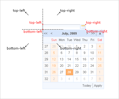
[D]
Pop-up positioning is determined using the jointPoint and direction attributes. Values for the jointPoint attribute are shown in red, while values for the direction attribute are shown in black.
Figure 9.3. Pop-up positioning
The calendar features a button for locating today's date on the calendar. This can be set to three different values using the todayControlMode attribute:
hidden, which does not display the button;select, the default setting, which scrolls the calendar to the current month and selects today's date; andscroll, which scrolls the calendar to the current month but does not select today's date.
To make the entire calendar read-only, set readonly="true". This allows months and years to be browsed through with the arrow controls, but dates and times cannot be selected.
The <rich:calendar> component can additionally allow a time of day to be specified with the date. After selecting a date the option to set a time becomes available. The default time can be set with the defaultTime attribute. If the time is altered and a new date is selected, it will not reset unless resetTimeOnDateSelect="true" is specified.
There are several event handlers that are unique to the <rich:calendar> component.
ondateselectis triggered when the date is selected by the user, before the update request is sent.ondateselectedis triggered after the date is selected by the user.oncurrentdateselectis triggered when any of the year- or month-changing buttons are pressed, before the update request is sent.oncurrentdateselectedis triggered after any of the year- or month-changing buttons are pressed.ontimeselectis triggered when the time is set by the user, before the update request is sent.ontimeselectedis triggered after the time has been set by the user.
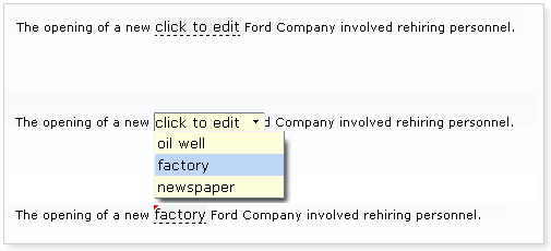
The <rich:inplaceInput> component allows information to be entered in-line in blocks of text, improving readability of the text. Multiple input regions can be navigated with keyboard navigation. The component has three functional states: the "view" state, where the component displays its initial setting, such as "click to edit"; the "edit" state, where the user can input text; and the "changed" state, where the new value for the component has been confirmed but can be edited again if required.
Basic usage requires the value attribute to point to the expression for the current value of the component.
When in the initial "view" state, the starting label can be set using the defaultLabel attribute. Once the user has entered text, the label is stored in the model specified by the value attribute. The use of the default label and value is shown in Example 9.3, “Default label and value”.
Example 9.3. Default label and value
<rich:inplaceInput value="#{bean.value}" defaultLabel="click to edit"/>
By default, the event to switch the component to the "edit" state is a single mouse click. This can be changed using the editEvent attribute to specify a different event.
The user can confirm and save their input by pressing the Enter key or cancel by pressing the Esc key. Alternatively, buttons for confirming or canceling can be added to the component by setting showControls="true".
The <rich:inplaceSelect> component is similar to the <rich:inplaceInput> component, except that the <rich:inplaceSelect> component uses a drop-down selection box to enter text instead of a regular text field. Changes can be rendered either in-line or for the whole block, and inputs can be focused with keyboard navigation. The component has three functional states: the "view" state, where the component displays its initial setting, such as "click to edit"; the "edit" state, where the user can select a value from a drop-down list; and the "changed" state, where the new value for the component has been confirmed but can be edited again if required.
Basic usage requires the value attribute to point to the expression for the current value of the component and a list of items. The list of items can be defined using the JSF components <f:selectItem/> and <f:selectItems/>.
Example 9.4. Defining list items for <rich:inplaceSelect>
<rich:inplaceSelect value="#{bean.inputValue}" defaultLabel="click to edit" >

    <f:selectItems value="#{bean.selectItems}" />

    <f.selectItem itemValue="1" itemLabel="Item 1" />

    <f.selectItem itemValue="2" itemLabel="Item 2" />

    <f.selectItem itemValue="3" itemLabel="Item 3" />

    <f.selectItem itemValue="4" itemLabel="Item 4" />

</rich:comboBox>
When in the initial "view" state, the starting label can be set using the defaultLabel attribute, such as defaultLabel="click to edit".
By default, the event to switch the component to the "edit" state is a single mouse click. This can be changed using the editEvent attribute to specify a different event. When switching to "edit" mode, the drop-down list of possible values will automatically be displayed; this can be deactivated by setting openOnEdit="false"
Once the user selects an option from the drop-down list, the item becomes the new value for the component and the state is switched to the "changed" state. Alternatively, buttons for confirming or canceling can be added to the component by setting showControls="true". These buttons can be positioned using the controlsHorizontalPosition attribute with settings of left, right, or center, and the controlsVerticalPosition attribute with settings bottom, center, or top. The confirmation control icons can be altered using the saveControlIcon and cancelControlIcon. Further customization is possible through the use of facets.
There are several event handlers that are specific to the <rich:inplaceSelect> component:
oneditactivationis triggered before the "edit" state is activated.oneditactivatedis triggered after the "edit" state is activated.onviewactivationis triggered before the "view" or "changed" state is activated.onviewactivatedis triggered after the "view" or "changed" state is activated.
The <rich:inputNumberSlider> component provides a slider for changing numerical values. Optional features include control arrows to step through the values, a tool-tip to display the value while sliding, and a text field for typing the numerical value which can then be validated against the slider's range.
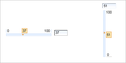
Basic use of the component with no attributes specified will render a slider with a minimum value of 0, a maximum of 100, and a gradient step of 1, together with a text field for typing the desired numerical value. The slider is labeled with the minimum and maximum boundary values, and a tool-tip showing the current value is shown while sliding the slider. The value attribute is used for storing the currently selected value of the slider.
The text field can be removed by setting showInput="false".
The properties of the slider can be set with the attributes minValue, maxValue, and step.
The minimum and maximum labels on the slider can be hidden by setting showBoundaryValues="false"showToolTip="false"
Arrow controls can be added to either side of the slider to adjust the value incrementally by setting showArrows="true"delay attribute.
component-type:org.richfaces.inputNumberSlidercomponent-class:org.richfaces.component.html.HtmlInputNumberSlidercomponent-family:org.richfaces.inputNumberSliderrenderer-type:org.richfaces.renderkit.inputNumberSliderRenderertag-class:org.richfaces.taglib.inputNumberSliderTag
The <rich:inputNumberSpinner> component is a single-line input field with buttons to increase and decrease a numerical value. The value can be changed using the corresponding directional keys on a keyboard, or by typing into the field.
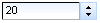
Basic use of the component with no attributes specified will render a number spinner with a minimum value of 1, a maximum value of 100, and a gradient step of 1.
These default properties can be re-defined with the attributes minValue, maxValue, and step respectively. The starting value of the spinner is the minimum value unless otherwise specified with the value attribute.
When changing the value using the buttons, raising the value above the maximum or cause the spinner to restart at the minimum value. Likewise, when lowering below the minimum value the spinner will reset to the maximum value. This behavior can be deactivated by setting cycled="false", which will cause the buttons to stop responding when the reach the maximum or minimum value.
The ability to change the value by typing into the text field can be disabled by setting enableManualInput="false".
component-type:org.richfaces.inputNumberSpinnercomponent-class:org.richfaces.component.html.HtmlInputNumberSpinnercomponent-family:org.richfaces.inputNumberSpinnerrenderer-type:org.richfaces.renderkit.inputNumberSpinnerRenderertag-class:org.richfaces.taglib.inputNumberSpinnerTag
The <rich:select> component provides a drop-down list box for selecting a single value from multiple options. The component supports keyboard navigation and can optionally accept typed input as a combo-box.
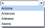
Simple usage of the <rich:select> component does not need any attributes declared, but child tags to manage the list of selections are required. An <f:selectItem> tag manages the currently selected value, while an <f:selectItems> tag points to the list of selection items.
Example 9.5. Selection items
<rich:select>

   <f:selectItem itemLabel="constantOption" itemValue="0">

   <f:selectItems="#{bean.items}">

</rich:select>
The arrow keys on a keyboard can be used to highlight different items in the list, even if the list is closed with the control still focused. If the control loses focus or the Enter key is pressed, the highlighted option is chosen as the value and the list is closed. Pressing the Esc key will close the list but not change the value.
Combo-boxes are drop-down lists that allow the user to type into a text field to scroll through or filter the list. By default, the <rich:select> component functions as a drop-down list. To add keyboard support to make it function like a combo-box, set enableManualInput="true".
Once the user begins typing, the first available matching option is highlighted. If the typed text does not match any values in the list, no value is chosen and the drop-down list displays as empty. Other keyboard interaction remains the same as the basic drop-down list.
Typing text into a combo-box causes the list to scroll to the relevant item by default. This behavior can be changed so that the typed text filters the contents of the list instead, showing only those items that begin with the typed text. To use typed text as a filter for combo-box lists, set filterOnUpdates="true".