Documentation in development
Some concepts covered in this chapter may refer to the previous version of Richfaces, version 3.3.3. This chapter is scheduled for review to ensure all information is up to date.
This chapter details rich components for user input and interaction.
The <rich:autocomplete> component is an auto-completing input-box with built-in Ajax capabilities. It supports client-side suggestions, browser-like selection, and customization of the look and feel.
The value attribute stores the text entered by the user for the auto-complete box. Suggestions shown in the auto-complete list can be specified using the autocompleteMethod attribute, which points to a collection of suggestions.
Example 9.1. Defining suggestion values
<rich:autocomplete value="#{bean.state}" autocompleteMethod="#{bean.suggestions}" />
Users can type into the text field to enter a value, which also searches through the suggestion items in the drop-down box. By default, the first suggestion item is selected as the user types. This behavior can be deactivated by setting selectFirst="false"
Setting autoFill="true"
The <rich:autocomplete> component uses the JavaScript startsWith() method to create the list of suggestions. The filtering is performed on the client side. Alternatively, use the clientFilter attribute to specify a custom filtering function. The custom function must accept two parameters: the subString parameter is the filtering value as typed into the text box by the user, and the value parameter is an item in the list of suggestions against which the subString must be checked. Each item is iterated through and passed to the function as the value parameter. The custom function must return a boolean value indicating whether the passed item meets the conditions of the filter, and the suggestion list is constructed from successful items.
Example 9.2. Customizing the filter
This example demonstrates how to use a custom filter with the clientFilter attribute. The custom filter determines if the sub-string is contained anywhere in the suggestion item, instead of just at the start.
<script>

   function customFilter(subString, value){

      if(subString.length>=1) {

         if(value.indexOf(subString)!=-1)

            return true;

      }else return false;

   };

</script>

<h:form>

   <rich:autocomplete mode="client" minChars="0" autofill="false"

                      clientFilter="customFilter"

                      autocompleteMethod="#{autocompleteBean.autocomplete}" />

</h:form>
The <rich:calendar> component allows the user to enter a date and time through an in-line or pop-up calendar. The pop-up calendar can navigate through months and years, and its look and feel can be highly customized.
Basic usage of the <rich:calendar> component requires only the value attribute, which holds the currently selected date. Example 9.3, “Basic usage” shows a basic declaration, with the value pointing to a data model.
The <rich:calendar> component supports two different ways of loading data through defining the mode attribute. When not specified, the component uses client mode, which loads an initial portion of data within a set date range. The range can be defined by using the preloadDateRangeBegin and preloadDateRangeEnd attributes. Additional data requests are not sent.
Alternatively, with mode="ajax" the <rich:calendar> requests portions of data for rendering from a special data model. The data model can be defined through the dataModel attribute, which points to an object that implements the CalendarDataModel interface. If the dataModel attribute is not defined or has a value of null, the ajax mode functions the same as the client mode.
Instead of using a data model, the <rich:calendar> component can be customized on the client-side. Example 9.4, “Client-side customization” demonstrates how client-side customization can be used to style different days in a calendar.
Example 9.4. Client-side customization
<style>
.everyThirdDay {
background-color: gray;
}
.weekendBold {
font-weight: bold;
font-style: italic;
}
</style>
<script type="text/javascript">
var curDt = new Date();
function disablementFunction(day){
if (day.isWeekend) return false;
if (curDt==undefined){
curDt = day.date.getDate();
}
if (curDt.getTime() - day.date.getTime() < 0) return true;
else return false;
}
function disabledClassesProv(day){
if (curDt.getTime() - day.date.getTime() >= 0) return 'rf-ca-boundary-dates';
var res = '';
if (day.isWeekend) res+='weekendBold ';
if (day.day%3==0) res+='everyThirdDay';
return res;
}
</script>
<rich:calendar dayDisableFunction="disablementFunction"
dayClassFunction="disabledClassesProv"
boundaryDatesMode="scroll" />
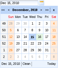
The <rich:calendar> component is presented as a pop-up by default, appearing as a text field with a button to expand the full pop-up calendar. To render the calendar in-line on the page instead, set popup="false. This displays the full calendar without the text field or display button.
To add keyboard support for manual input, set enableManualInput="true". To disable the calendar from any user input, set disabled="true".
To change the appearance of the display button from the standard calendar icon, use the buttonIcon and buttonDisabledIcon attributes to replace the icon with a specified file. Alternatively, use the buttonLabel attribute to display text on the button without an icon. If buttonLabel is specified then both the buttonIcon and buttonDisabledIcon attributes are ignored. To hide the text field box, set showInput="false".
The calendar features a button for locating today's date on the calendar. This can be set to three different values using the todayControlMode attribute:
hidden, which does not display the button;select, the default setting, which scrolls the calendar to the current month and selects today's date; andscroll, which scrolls the calendar to the current month but does not select today's date.
To make the entire calendar read-only, set readonly="true". This allows months and years to be browsed through with the arrow controls, but dates and times cannot be selected.
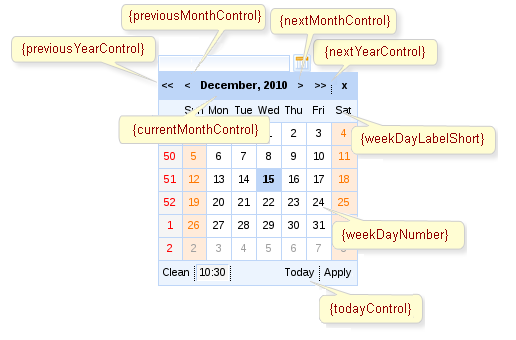
The styling and appearance of the calendar can be fully customized using facets. The header and footer facets define the calendar's header and footer. The optionalHeader and optionalFooter facets define the calendar's optional header and optional footer. The weekNumber facet controls the appearance of the week numbers, and the weekDay facet controls the appearance of the individual day cells on the calendar. Figure 9.3, “Facet elements” shows some of the elements available for customization through the various facets.
The <rich:calendar> component can additionally allow a time of day to be specified with the date. After selecting a date the option to set a time becomes available. The default time can be set with the defaultTime attribute. If the time is altered and a new date is selected, it will not reset unless resetTimeOnDateSelect="true" is specified.
Support for seconds
In RichFaces 4, the <rich:calendar> component supports times that include seconds. Previous versions of RichFaces only supported hours and minutes.
Date and time strings can be formatted in a set pattern. Use standard locale formatting strings specified by ISO 8601 (for example, d/M/yy HH:mm a) with the datePattern attribute to format date and time strings.
To set the locale of the calendar, use the locale attribute. The calendar will render month and day names in the relevant language. For example, to set the calendar to the US locale, specify locale="en/US".
The <rich:calendar> component can be controlled through the JavaScript API. The JavaScript API provides the following functions:
selectDate(date)Select the specified date. If the date is not in the currently displayed month, a request is performed to display the correct month.
isDateEnabled(date)Check if the specified date is able to be selected.
enableDate(date)Enable the specified date cell control on the calendar.
disableDate(date)Disable the specified date cell control on the calendar.
enableDates(date[])Enable the specified dates' cell controls on the calendar.
disableDates(date[])Disable the specified dates' cell controls on the calendar.
nextMonth()Display the next month.
nextYear()Display the next year.
prevMonth()Display the previous month.
prevYear()Display the previous year.
getCurrentMonth()Return the number of the month currently being displayed.
getCurrentYear()Return the number of the year currently being displayed.
today()Select today's date.
getSelectedDate()Return the currently selected date.
Object getData()Return additional data for the date.
resetSelectedDate()Clear the selected day value.
doCollapse()Collapse the pop-up calendar element.
doExpand()Expand the pop-up calendar element.
doSwitch()Invert the state of the pop-up calendar element.
The <rich:fileUpload> component allows the user to upload files to a server. It features multiple uploads, progress bars, restrictions on file types, and restrictions on sizes to be uploaded.
Basic usage requires the fileUploadListener attribute. Use the attribute to call a function on the server side after each file is uploaded.
Files are uploaded to either the temporary folder (different for each operating system) or to RAM (random-access memory), depending on the value of the org.richfaces.fileUpload.createTempFile parameter of the web.xml settings file for the project. If the parameter is set to true, the files are uploaded to the temporary folder.
To limit the maximum size of the uploaded files, define the byte size with the org.richfaces.fileUpload.maxRequestSize parameter of the web.xml settings file for the project.
The text labels used in the component can be completely customized. Labels for the various controls of the component can be set using the following parameters:
addLabelThe
addLabelparameter sets the label for the button.clearAllLabelThe
clearAllLabelparameter sets the label for the button.clearLabelThe
clearLabelparameter sets the label for the button.uploadLabelThe
uploadLabelparameter sets the label for the button.
The progress of a file upload operation can be represented using either a referencing <rich:progressBar> component, or the progress facet. Refer to Section 14.3, “<rich:progressBar>” for details on the <rich:progressBar> component.
To disable the <rich:fileUpload> component, use the disabled attribute.
There are a number of event handlers specific to the <rich:fileUpload> component:
filesubmitis triggered before a file is uploaded.uploadcompleteis triggered after all files in the list have finished uploading.
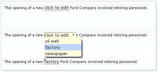
The <rich:inplaceInput> component allows information to be entered in-line in blocks of text, improving readability of the text. Multiple input regions can be navigated with keyboard navigation. The component has three functional states: the "view" state, where the component displays its initial setting, such as "click to edit"; the "edit" state, where the user can input text; and the "changed" state, where the new value for the component has been confirmed but can be edited again if required.
Basic usage requires the value attribute to point to the expression for the current value of the component.
When in the initial "view" state, the starting label can be set using the defaultLabel attribute. Once the user has entered text, the label is stored in the model specified by the value attribute. The use of the default label and value is shown in Example 9.6, “Default label and value”.
Example 9.6. Default label and value
<rich:inplaceInput value="#{bean.value}" defaultLabel="click to edit"/>
By default, the event to switch the component to the "edit" state is a single mouse click. This can be changed using the editEvent attribute to specify a different event.
The user can confirm and save their input by pressing the Enter key or cancel by pressing the Esc key. Alternatively, buttons for confirming or canceling can be added to the component by setting showControls="true".
The <rich:inplaceSelect> component is similar to the <rich:inplaceInput> component, except that the <rich:inplaceSelect> component uses a drop-down selection box to enter text instead of a regular text field. Changes can be rendered either in-line or for the whole block, and inputs can be focused with keyboard navigation. The component has three functional states: the "view" state, where the component displays its initial setting, such as "click to edit"; the "edit" state, where the user can select a value from a drop-down list; and the "changed" state, where the new value for the component has been confirmed but can be edited again if required.
Basic usage requires the value attribute to point to the expression for the current value of the component and a list of items. The list of items can be defined using the JSF components <f:selectItem/> and <f:selectItems/>.
Example 9.7. Defining list items for <rich:inplaceSelect>
<rich:inplaceSelect value="#{bean.inputValue}" defaultLabel="click to edit" >

    <f:selectItems value="#{bean.selectItems}" />

    <f.selectItem itemValue="1" itemLabel="Item 1" />

    <f.selectItem itemValue="2" itemLabel="Item 2" />

    <f.selectItem itemValue="3" itemLabel="Item 3" />

    <f.selectItem itemValue="4" itemLabel="Item 4" />

</rich:comboBox>
When in the initial "view" state, the starting label can be set using the defaultLabel attribute, such as defaultLabel="click to edit".
By default, the event to switch the component to the "edit" state is a single mouse click. This can be changed using the editEvent attribute to specify a different event. When switching to "edit" mode, the drop-down list of possible values will automatically be displayed; this can be deactivated by setting openOnEdit="false"
Once a new value for the control is saved, the state switches to the "changed" state. Saving a new value for the control can be performed in three different ways:
Once the user selects an item from the drop-down list, the item is saved as the new control value. This is the default setting.
If
saveOnBlur="true"is set, the selected item is saved as the new control value when the control loses focus.If
showControls="true"is set, buttons are added to the control to confirm or cancel the selection. The new control value is only saved once the user confirms the selection using the button.
The <rich:inputNumberSlider> component provides a slider for changing numerical values. Optional features include control arrows to step through the values, a tool-tip to display the value while sliding, and a text field for typing the numerical value which can then be validated against the slider's range.
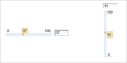
Basic use of the component with no attributes specified will render a slider with a minimum value of 0, a maximum of 100, and a gradient step of 1, together with a text field for typing the desired numerical value. The slider is labeled with the minimum and maximum boundary values, and a tool-tip showing the current value is shown while sliding the slider. The value attribute is used for storing the currently selected value of the slider.
The text field can be removed by setting showInput="false".
The properties of the slider can be set with the attributes minValue, maxValue, and step.
The minimum and maximum labels on the slider can be hidden by setting showBoundaryValues="false"showToolTip="false"
Arrow controls can be added to either side of the slider to adjust the value incrementally by setting showArrows="true"delay attribute.
component-type:org.richfaces.inputNumberSlidercomponent-class:org.richfaces.component.html.HtmlInputNumberSlidercomponent-family:org.richfaces.inputNumberSliderrenderer-type:org.richfaces.renderkit.inputNumberSliderRenderertag-class:org.richfaces.taglib.inputNumberSliderTag
The <rich:inputNumberSpinner> component is a single-line input field with buttons to increase and decrease a numerical value. The value can be changed using the corresponding directional keys on a keyboard, or by typing into the field.
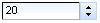
Basic use of the component with no attributes specified will render a number spinner with a minimum value of 1, a maximum value of 100, and a gradient step of 1.
These default properties can be re-defined with the attributes minValue, maxValue, and step respectively. The starting value of the spinner is the minimum value unless otherwise specified with the value attribute.
When changing the value using the buttons, raising the value above the maximum or cause the spinner to restart at the minimum value. Likewise, when lowering below the minimum value the spinner will reset to the maximum value. This behavior can be deactivated by setting cycled="false", which will cause the buttons to stop responding when the reach the maximum or minimum value.
The ability to change the value by typing into the text field can be disabled by setting enableManualInput="false".
component-type:org.richfaces.inputNumberSpinnercomponent-class:org.richfaces.component.html.HtmlInputNumberSpinnercomponent-family:org.richfaces.inputNumberSpinnerrenderer-type:org.richfaces.renderkit.inputNumberSpinnerRenderertag-class:org.richfaces.taglib.inputNumberSpinnerTag
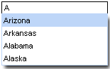
The <rich:select> component provides a drop-down list box for selecting a single value from multiple options. The component supports keyboard navigation and can optionally accept typed input. The <rich:select> component functions similarly to the JavaServer Faces <h:selectOneMenu> component.
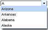
Simple usage of the <rich:select> component does not need any attributes declared, but child tags to manage the list of selections are required. The child tags can either be a number of <f:selectItem> tags or a <f:selectItems> tag which points to a data model containing a list of selection items. The value attribute is used to store the current selection.
Example 9.8. Selection items
- Using multiple
<f:selectItem>tags <rich:select>
<f:selectItem itemValue="0" itemLabel="Option 1" />
<f:selectItem itemValue="1" itemLabel="Option 2" />
<f:selectItem itemValue="2" itemLabel="Option 3" />
<f:selectItem itemValue="3" itemLabel="Option 4" />
<f:selectItem itemValue="4" itemLabel="Option 5" />
</rich:select>
- Using a single
<f:selectItems>tag <rich:select>
<f:selectItems value="#{bean.options}" />
</rich:select>
The arrow keys on a keyboard can be used to highlight different items in the list. If the control loses focus or the Enter key is pressed, the highlighted option is chosen as the value and the list is closed. Pressing the Esc key will close the list but not change the value.
Use the defaultLabel attribute to set a place-holder label, such as defaultLabel="select an option".
Server-side processing occurs in the same manner as for an <h:selectOneMenu> component. As such, custom objects used for selection items should use the same converters as for an <h:selectOneMenu> component.
Selection lists can allow the user to type into a text field to scroll through or filter the list. By default, the <rich:select> component functions as a drop-down list with no manual input. To add keyboard support for manual input, set enableManualInput="true".
Once the user begins typing, the first available matching option is highlighted. If the typed text does not match any values in the list, no value is chosen and the drop-down list displays as empty. Other keyboard interaction remains the same as the basic drop-down list.