Read this chapter for details on components that display messages and other feedback to the user.
The <rich:chart> component allows the user to plot data and to create line, bar or pie charts. It uses up to five children tags <r:series>, <r:legend>, <r:xaxis>, <r:yaxis> and <r:point>. Each child tag customizes a particular aspect of the chart. All are optional except at least one <r:series> tag is required.
Additionally the <rich:chart> component allows one to handle events using either a client-side JavaScript or using server-side listeners.
The <rich:chart> tag and its optional children tags generate and customize the chart. The chart type is selected by a <r:series> attribute. The only requirements for use of the <rich:chart> are selection of the chart type and to pass at least one series of data - explained below.
The <rich:chart> component accepts data by two means - by facelet iteration or by creating data model object.
Use <r:repeat> and a collection of objects inside the <r:series> tag and specify what you want to be plotted on the x and y axis using <r:point> tag. The <r:repeat> approach can also be used at the <r:series> level.
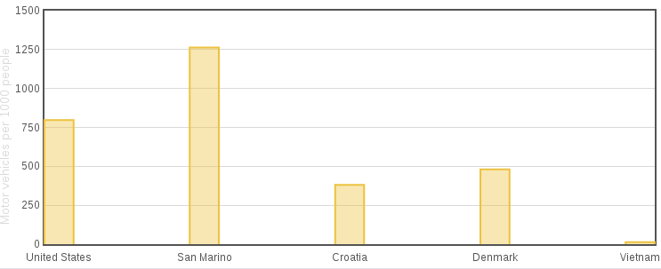
Example 13.1. rich:chart facelet iteration example
<rich:chart id="barChart" title="Countries by vehicles per capita">

   <r:series type="bar">

    <r:repeat value="#{bean.records}" var="record">

          <r:point x="#{record.country}" y="#{record.count}"/>

    </r:repeat>

   </r:series>

   <r:yaxis label="Motor vehicles per 1000 people"/>

</rich:chart>
When facelet iteration is used the ChartDataModel object is created by the ChartRenderer. An alternative to this is to create a ChratDataModel yourself and pass it using <r:series> data attribute. To do this, create an instance one of the child classes of ChartDataModel - NumberChartDataModel, StringChartDataModel or DateChartDataModel (not yet fully supported). Select the class according to the data type used on the x-axis. Add values to the model using the put method and pass it to the <r:series> tag using the data attribute.
Example 13.2. rich:chart DataModel object example
<rich:chart id="barChart" title="Countries by vehicles per capita">

   <r:series type="bar" data="#{bean.cars}"/>

   <r:yaxis label="Motor vehicles per 1000 people"/>

</rich:chart>
cars = new StringChartDataModel(ChartDataModel.ChartType.bar);

cars.put("San Marino", 1263);

cars.put("United States", 797);

...
If there is a model passed using the <r:series> data attribute, any nested <r:point> tags are ignored. If the data attribute is not used, then nested <r:point> tags are expected.
The chart configuration is split into multiple tags provide a more clear facelet API. To configure axes, their min/max values, and label use <r:xaxis> or <r:yaxis> tag. The <r:legend> allows one to set up the position of the legend and the order of the labels within it.
To adjust the chart component size you can use CSS class .richfaces-chart-container, to customize title use .richfaces-chart-title the placeholder. The chart itself is placed in the div with the CSS class .richfaces-chart.
The <rich:chart> component does not only create static charts.
-
It allows the user to zoom line charts when the
<rich:chart>attribute zoom is set true. To reset zoom you can use the JavaScript API. -
You can also add functions to handle events fired by components. Event handlers are set up using proper
<rich:chart>attributes. They handle events fired by any series. If you want to handle an event only fired by a particular series, set up handlers using the<r:series>attributes.
-
The
PlotClickEventis fired when the user clicks a point in the chart. To set a listner use theClickListenerattribute.
-
The
plothoverevent points to the client-side function to execute when the mouse cursor is over the chart point. -
The
plotclickevent points to the client-side function to execute when the user clicks the chart point. -
The
mouseoutevent points to the cient-side function to execute when the mouse cursor leaves the chart grid.
The plothover and plotclick handlers are given an event-object that contains the deatils of which point fired the event.
function log(e){
           	console.log("Series index: "+
                 	e.data.seriesIndex +" DataIndex: "+
                 	e.data.dataIndex+' ['+e.data.x+','+e.data.y+']');
}
To access the jQuery widget of the component, use the componentID + chart
resetZoom()- display chart without scaling
getPlotObject()- returns JavaScript object containing chart data and options
Example
<rich:chart id= price >
&
$(document.getElementById(“priceChart”)).chart(“resetZoom”)
The <rich:message> component renders a single FacesMessage message instance added for the component. The appearance of the message can be customized, and tool-tips can be used for further information about the message.
The <rich:message> component is rendered in the same way as the standard <h:message> component, but allows separate styling of the message summary and detail. It allows unified icons to be set using background images in predefined classes.
The <rich:message> component needs the for attribute to point to the id identifier of the related component. The message is displayed after the FacesMessage message instance is created and added for the client identifier of the related component.
The <rich:message> component is automatically rendered after an Ajax request. This occurs without the use of an <a4j:outputPanel> component or a specific reference through the render attribute of the Ajax request source.
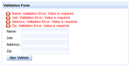
Example 13.3. rich:message example
<h:outputText value="Zip:" />

<h:inputText label="Zip" id="zip" required="true"

             value="#{userBean.zip}">

   <f:validateLength minimum="4" maximum="9" />

</h:inputText>

<rich:message for="zip" ajaxRendered="true"/>
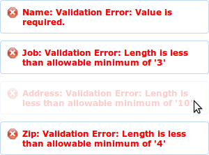
The example contains a text input for zip codes. The simple validation requires the entered zip code to be between 4 and 9 characters long. The <rich:message> component references the input box, and reports any messages relating to the input validation.
The showSummary attribute specifies whether to display only a summary of the full message. The full message can be displayed in a tool-tip when hovering the mouse over the summary.
Use CSS (Cascading Style Sheets) to customize the appearance and icon for the <rich:message> component. To use a custom icon, set the background-image property to the icon graphic, as shown in Example 13.4, “Message icons”. Refer to Section 13.2.4, “Style classes and skin parameters” for a complete list of style classes for the <rich:message> component.
Example 13.4. Message icons
.rf-msg-err{
   background-image: url('#{facesContext.externalContext.requestContextPath}/images/icons/error.gif');
}
The example demonstrates how an icon for an error message could be added using CSS.
-
component-type:org.richfaces.RichMessage -
component-class:org.richfaces.component.UIRichMessage -
component-family:javax.faces.Message -
renderer-type:org.richfaces.MessageRenderer
Table 13.1. Style classes (selectors) and corresponding skin parameters
| Class (selector) | Skin Parameters | Mapped CSS properties |
|---|---|---|
|
|
|
|
| |
|
|
|
|
|
|
|
|
|
|
|
|
|
|
|
| No skin parameters. | |
The <rich:messages> components works similarly to the <rich:message> component, but can display all the validation messages added for the current view instead of just a single message. Refer to Section 13.1, “<rich:chart>” for details on the <rich:message> component.
The <rich:messages> component doesn’t require any extra attributes for basic usage. It displays all messages relating to requests from components.
To limit the messages to a specific component, use the for attribute to reference the component’s identifier.
To show only those messages that are not attached to specific components, set globalOnly="true".
The <rich:messages> component is automatically rendered after an Ajax request. This occurs without the use of an <a4j:outputPanel> component or a specific reference through the render attribute of the Ajax request source.
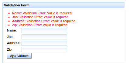
The <rich:messages> component displays error messages for each validating component in the same container.
The <rich:messages> component can be further styled through CSS, the same as for the <rich:message> component. Refer to Section 13.2.2, “Appearance” for an example of message styling, and refer to Section 13.3.4, “Style classes and skin parameters” for a complete list of style classes for the <rich:message> component.
The layout of the messages can also be customized through CSS. By default, the messages are arranged in a block as shown in Figure 13.4, “Messages in a block”.
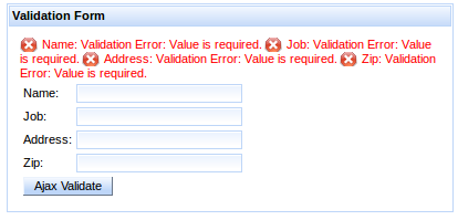
Override the display property for all CSS message classes to customize the layout as follows:
- Display messages in a list with no icons
- To display the messages in a list format without the default icons, override the message styles as follows:
.rf-msg-err, .rf-msgs-err, .rf-msg-ftl, .rf-msgs-ftl, .rf-msg-inf,
.rf-msgs-inf, .rf-msg-wrn, .rf-msgs-wrn, .rf-msg-ok, .rf-msgs-ok {
   display: list-item;
   margin-left: 20px;
   padding-left: 0px; }

.rf-msg-err, .rf-msgs-err{ background-image:none; }
- Display in-line messages
- To display the messages in line with text, override the message styles as follows:
.rf-msg-err, .rf-msgs-err, .rf-msg-ftl, .rf-msgs-ftl, .rf-msg-inf,
.rf-msgs-inf, .rf-msg-wrn, .rf-msgs-wrn, .rf-msg-ok, .rf-msgs-ok { display:inline; }
-
component-type:org.richfaces.RichMessages -
component-class:org.richfaces.component.UIRichMessages -
component-family:javax.faces.Messages -
renderer-type:org.richfaces.MessagesRenderer
Table 13.2. Style classes (selectors) and corresponding skin parameters
| Class (selector) | Skin Parameters | Mapped CSS properties |
|---|---|---|
|
|
|
|
| |
|
|
|
|
|
|
|
|
|
|
|
|
|
|
|
| No skin parameters. | |
The <rich:notify> component serves for advanced user interaction, using notification boxes to give the user instant feedback on what’s happening within the application. Each time this component is rendered, a floating notification box is displayed in the selected corner of the browser screen.
The <rich:notify> has two message customization attributes: summary is short text summarizing the message, while detail configures the detailed body of the message. Both attributes have their counterparts in form of facets with the same names as the corresponding attributes.
A notification appears on the page each time it is rendered, either on full-page or ajax requests. The notification remains on the screen for 8 seconds and then disappears. Users can close the notification with the close button in the top-right corner of the notification.
Notification stacks can be used to create sequences. For customization of stacking see the <rich:notifyStack> component.
There are several attributes that can change default behavior:
-
sticky: notifications does not disappear automatically, they needs to be closed explicitly with close button (this attribute can’t be used together withnonblockingandstayTime) -
stayTime: configures how long notification stays on the screen before it disappears (in miliseconds) -
styleClass: defines the class customizing the notification -
nonblocking: defines notifications which becomes partially transparent and user can click through. Non-blocking notifications don’t have close button. -
nonblockingOpacity: defines opacity of nonblocking notifications when mouse hovers over notification (decimal number between 0 and 1) -
showShadow: defines whether shadow will be displayed under the notification
Note
Nonblocking notifications can be clicked through, but because they are using jQuery mechanism to bypass events, only jQuery event handlers are triggered. IThis means that standard links won’t be triggered.
-
component-type:org.richfaces.Notify -
component-class:org.richfaces.component.UINotify -
component-family:org.richfaces.Notify -
renderer-type:org.richfaces.NotifyRenderer
Note that skinning is common for <rich:notify>, <rich:notifyMessage> and <rich:notifyMessages>
Table 13.3. Style classes (selectors) and corresponding skin parameters
| Class (selector) | Skin Parameters | Mapped CSS properties |
|---|---|---|
| No skin parameters. | |
|
|
|
|
| |
|
|
|
|
| |
|
| |
| No skin parameters. | |
| No skin parameters. | |
| No skin parameters. | |
| No skin parameters. | |
| No skin parameters. | |
The <rich:notifyMessage> component is built on top of <rich:notify>, the difference is in usage. The <rich:notifyMessage> component displays FacesMessage s associated with a given component, similar to <rich:message>: one notification is displayed for first FacesMessage in the stack that is risen either programatically or during conversion/validation of the component. The severity of the message determines the color and icon of the resulting notification.
For customization of notification behavior, please refer to Customizing notifications of <rich:notify>.
-
component-type:org.richfaces.HtmlNotifyMessage -
component-class:org.richfaces.component.html.HtmlNotifyMessage -
component-family:javax.faces.Message -
renderer-type:org.richfaces.NotifyMessageRenderer
Note that <rich:notifyMessage> shares common classes with <rich:notify>, since there is exactly one notification rendered for each JSF message.
The <rich:notifyMessage> specific classes are redefining the look for various message severity levels.
Table 13.4. Style classes (selectors) and corresponding skin parameters
| Class (selector) | Skin Parameters | Mapped CSS properties |
|---|---|---|
|
|
|
| No skin parameters. | |
| No skin parameters. | |
| No skin parameters. | |
| No skin parameters. | |
The <rich:notifyMessages> component is the same as the <rich:notifyMessage> component, but each of the available messages generates one notification.
<rich:notifyMessages> shares the same set of attributes with <rich:notifyMessage>
-
component-type:org.richfaces.HtmlNotifyMessages -
component-class:org.richfaces.component.html.HtmlNotifyMessages -
component-family:javax.faces.Messages -
renderer-type:org.richfaces.NotifyMessagesRenderer
Notifications emited by <rich:notify>, <rich:notifyMessage> and <rich:notifyMessages> are displayed in top-right corner of the screen by default.
It is <rich:notifyStack> which defines where messages will appear and handles their stacking.
Stack also provides way how to remove messages from screen - when stack is re-rendered, current notifications are destroyed, freeing place for new notifications.
They are three alternative ways to bind notifications with a stack:
-
wrapping: nesting
<rich:notify>,<rich:notifyMessage>or<rich:notifyMessages>binds notifications with the stack in which they are wrapped -
binding by id: notification can be bound directly to a stack using it’s
componentIdin thestackattribute - using default stack: a default stack is used when no other binding is defined for a given notification
<rich:notifyStack position="bottomRight">

    <rich:notifyMessages />

</rich:notifyStack>
The sample above defines the stack explicitly, where notifications use the stack in which they are wrapped.
The sample bellow uses a notification rendered into the top-left corner of the screen. The notification is bound to a stack using it’s id.
<rich:notifyStack id="leftStack" position="topLeft" />


<rich:notify stack="leftStack" />
To redefine the position of a notification, one needs to define a stack and bind it with the given notification.
<rich:notifyStack> uses the position attribute to place the stack and it’s notifications into one of four corners: topRight (default), bottomRight, bottomLeft, topLeft.
There are two attributes which influences how notifications are placed into a stack:
-
method: defines where new notifications are placed and how they are removed. Options:first(default),last.direction: defines in which direction will be messages stacked. Options:vertical(default),horizontal
The following sample shows a stack which will place new notifications up front - the incoming message will appear first, causing all notifications currently in stack to shift. Subsequently, messages at the end of stack will be then removed.
<rich:notifyStack method="first" />
On the other hand, stacking method last provides a method to place messages on the end of the stack, and when removing a notification, it is removed from the start, causing all other notifications to shift.
-
component-type:org.richfaces.NotifyStack -
component-class:org.richfaces.component.UINotifyStack -
component-family:org.richfaces.NotifyStack -
renderer-type:org.richfaces.NotifyStackRenderer
Table 13.5. Style classes (selectors) and corresponding skin parameters
| Class (selector) | Skin Parameters | Mapped CSS properties |
|---|---|---|
| No skin parameters. | |
| No skin parameters. | |
| No skin parameters. | |
| No skin parameters. | |
The <rich:progressBar> component displays a progress bar to indicate the status of a process to the user. It can update either through Ajax or on the client side, and the look and feel can be fully customized.

Basic usage of the <rich:progressBar> component requires the value attribute, which points to the property that holds the current progress value. When the value is greater than or equal to the minimum value ( 0 by default), the progress bar becomes active, and starts sending Ajax requests if in ajax mode.
By default, the minimum value of the progress bar is 0 and the maximum value of the progress bar is 100. These values can be customized using the minValue and maxValue attributes respectively.
The progress bar can be labeled in one of two ways:
- Using the
labelattribute -
The content of the
labelattribute is displayed over the progress bar.
Example 13.6. Using the label attribute
<rich:progressBar value="#{bean.incValue}" id="progrs" label="#{bean.incValue} % complete"/>
- Using nested child components
-
Child components, such as the JSF
<h:outputText>component, can be nested in the<rich:progressBar>component to display over the progress bar.
Example 13.7. Using nested child components
<rich:progressBar value="#{bean.incValue}">

    <h:outputText value="#{bean.incValue} % complete"/>

</rich:progressBar>
Define the initial and finish facets to customize the progress bar’s appearance before progress has started and after progress has finished. When the current progress bar value is less than the minimum value, the initial facet is displayed. When the current progress bar is greater than the maximum value, the finish facet is displayed.
Example 13.8. Initial and finished states
<rich:progressBar value="#{bean.incValue1}">

    <f:facet name="initial">

        <h:outputText value="Process has not started"/>

    </f:facet>

    <f:facet name="finish">

        <h:outputText value="Process has completed"/>

    </f:facet>

</rich:progressBar>
The mode for updating the progress bar is determined by the mode attribute, which can have one of the following values:
ajax-
The progress bar updates in the same way as the
<a4j:poll>component. The<rich:progressBar>component repeatedly polls the server for the current progress value. client- The progress bar must be explicitly updated on the client side through the JavaScript API.
The <rich:progressBar> component can be set to constantly poll for updates at a constant interval. Use the interval component to set the interval in milliseconds. The progress bar is updated whenever the polled value changes. Polling is only active when the enabled attribute is set to true.
Example 13.9. Using set intervals
<rich:progressBar value="#{bean.incValue1}" id="progress" interval="900" enabled="#{bean.enabled1}"/>
The <rich:progressBar> component can be controlled through the JavaScript API. The JavaScript API provides the following functions:
getValue()- Return the current value displayed on the progress bar.
setValue()- Set the current value to display on the progress bar.
getMinValue()- Return the minimum value for the progress bar.
getMaxValue()- Return the maximum value for the progress bar.
disable()- Disables the progress bar.
enable()- Enables the progress bar.
isEnabled()- Returns a boolean value indicating whether the progress bar is enabled.
-
component-type:org.richfaces.ProgressBar -
component-class:org.richfaces.component.UIProgressBar -
component-family:org.richfaces.ProgressBar -
renderer-type:org.richfaces.ProgressBarRenderer
Table 13.6. Style classes (selectors) and corresponding skin parameters
| Class (selector) | Skin Parameters | Mapped CSS properties |
|---|---|---|
| No skin parameters. | |
|
|
|
|
| |
|
|
|
|
| |
|
| |
The <rich:tooltip> component provides an informational tool-tip. The tool-tip can be attached to any control and is displayed when hovering the mouse cursor over the control.
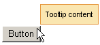
For basic usage, define the tool-tip text using the value attribute. The <rich:tooltip> component is then automatically attached to the parent element, and is usually shown when the mouse cursor hovers.
Alternatively, the content of the tool-tip can be defined inside the <rich:tooltip> tags, and the value attribute is not used. This allows HTML tags to be used to define the content, and provides for rich content such as images, links, buttons, and other RichFaces components.
Example 13.10. Defining tool-tip content
- Basic content
<rich:panel>

    <rich:tooltip value="This is a tool-tip."/>

</rich:panel>
- Rich content
<rich:panel>

    <rich:tooltip>

        This is a <b>tool-tip</b>.

    </rich:tooltip>

</rich:panel>
If not otherwise specified, the tool-tip is attached to the parent element in which it is defined. The target attribute is used to attach the tool-tip to another component, pointing to the target component’s id identifier. This allows the <rich:tooltip> component to be specified outside the target element. This approach is demonstrated in Example 13.11, “Attaching the tool-tip”.
Example 13.11. Attaching the tool-tip
<rich:panel id="panelId">

...

</rich:panel>


<rich:tooltip value="This is a tool-tip." target="panelId"/>
The <rich:tooltip> component can alternatively be left unattached, and is instead invoked through an event handler on the target component. To leave the <rich:tooltip> component unattached, set attached="false", and define the event handler to trigger the tool-tip on the target component. This approach is demonstrated in Example 13.12, “Unattached tool-tips”. When leaving the <rich:tooltip> component unattached, ensure it has an id identifier defined. If it is defined outside the target element, it must be nested in an <h:form> component.
Example 13.12. Unattached tool-tips
<rich:panel id="panelId" onclick="#{rich:component('tooltipId')}.show(event);" />


<h:form>

    <rich:tooltip id="toolTipId" attached="false" value="This is a tool-tip."/>

</h:form>
By default, the <rich:tooltip> component is positioned intelligently based on the position of the mouse cursor. Use the jointPoint attribute to specify a corner of the target component at which to display the tool-tip instead, and use the direction attribute to specify the direction the tool-tip will appear relative to that corner. Possible values for both attributes are top-left, top-right, bottom-left, and bottom-right. Use the horizontalOffset and verticalOffset attributes to specify the horizontal offset and vertical offset at which to display the tool-tip.
Use the showEvent attribute to specify when the tool-tip is shown. By default it appears when the attached component is hovered-over with the mouse. Use the hideEvent attribute to specify when the tool-tip is hidden. The default value is none, so the tool-tip remains shown. However, it can be linked to an event on the target component, such as the mouseout event.
Set followMouse="true" to cause the tool-tip to follow the user’s mouse movements.
Advanced appearance features are demonstrated in Example 13.13, “Advanced tool-tip usage”.
The mode for updating the tool-tip is determined by the mode attribute, which can have one of the following values:
ajax- The tool-tip content is requested from the server with every activation.
client- The tool-tip content is rendered once on the server. An external submit causes the content to re-render.
When using mode="ajax", define the loading facet. The tool-tip displays the content of the loading facet while loading the actual content from the server.
Example 13.13. Advanced tool-tip usage
<h:commandLink value="Simple Link" id="link">

    <rich:tooltip followMouse="true" direction="topRight" mode="ajax" value="#{bean.toolTipContent}"

                  horizontalOffset="5" verticalOffset="5" layout="block">

        <f:facet name="loading">

            <f:verbatim>Loading...</f:verbatim>

        </f:facet>

    </rich:tooltip>

</h:commandLink>
The <rich:tooltip> component supports the following client-side events:
click- This event is activated when the tool-tip is clicked with the mouse.
dblclick- This event is activated when the tool-tip is double-clicked with the mouse.
mouseout- This event is activated when the mouse cursor leaves the tool-tip.
mousemove- This event is activated when the mouse cursor moves over the tool-tip.
mouseover- This event is activated when the mouse cursor hovers over the tool-tip.
show- This event is activated when the tool-tip is shown.
complete- This event is activated when the tool-tip is completed.
hide- This event is activated when the tool-tip is hidden.
The <rich:tooltip> component can be controlled through the JavaScript API. The JavaScript API provides the following functions:
show(event)- Show the tool-tip.
hide()- Hide the tool-tip.
-
component-type:org.richfaces.Tooltip -
component-class:org.richfaces.component.UITooltip -
component-family:org.richfaces.Tooltip -
renderer-type:org.richfaces.TooltipRenderer
Table 13.7. Style classes (selectors) and corresponding skin parameters
| Class (selector) | Skin Parameters | Mapped CSS properties |
|---|---|---|
| No skin parameters. | |
| No skin parameters. | |
| No skin parameters. | |
|
|
|
|
| |
|
| |