Read this chapter for details on miscellaneous components that provide extended functionality to web applications.
The <rich:componentControl> behavior allows JavaScript API functions to be called on target components. The functions are called after defined events are triggered on the component to with the <rich:componentControl> behavior is attached. Initialization variants and activation events can be customized, and parameters can be passed to the target component.
The operation attribute is required to attach JavaScript functions to the parent component, along with either the target or selector attributes. Use the operation attribute to specify the JavaScript API function to perform. Use the target attribute to define the id identifier of the target component, or use the selector attribute to define a number of target components through the use of valid jQuery selectors.
Use the event attribute to specify the event that triggers the JavaScript API function call if it is different from the default triggering event for the parent component.
Example 17.1. <rich:componentControl> basic usage
<h:commandButton value="Show Modal Panel">

    <!--componentControl is attached to the commandButton-->

    <rich:componentControl target="ccModalPanelID" event="click" operation="show"/>

</h:commandButton>
The example contains a single command button, which when clicked shows the modal panel with the identifier ccModalPanelID.
The operation can receive parameters through nested <f:param> elements.
Example 17.2. Using parameters
<rich:componentControl event="click" target="modalPanel" operation="show">

   <f:param value="width" name="500"/>

</rich:componentControl>
To group multiple parameters for a function, use the <rich:hashParam> component to create a hash map. Refer to Section 17.4, “<rich:hashParam>” for details.
-
client-behavior-renderer-type:org.richfaces.behavior.ComponentControlBehavior -
behavior-id:org.richfaces.behavior.ComponentControlBehavior -
handler-class:org.richfaces.taglib.ComponentControlHandler -
behavior-class:org.richfaces.component.behavior.ComponentControlBehavior -
client-behavior-renderer-class:org.richfaces.renderkit.html.ToggleControlRenderer
The <rich:focus> component allows one to manipulate the focus of components on a page. It is intended to be used with any input field.
The component will behave differently when placed:
- in a form - defines behavior for components in the given form
- in a view (outside of forms) - defines behavior for components in all forms in the view
There can be only one focus per form.
If both, form- and view-based focuses are defined, the form one takes a priority.
The focus is applied each time it is rendered - either on form submission or after an AJAX request. Only focuses inside the form which is submitted are applied.
You can turn focusing-after-AJAX-requests off by setting the ajaxRendered attribute to false.
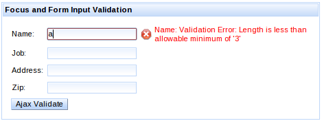
The <rich:focus> component reflects the results of validation of components in a view. Focus is given to the first input component in the page which is invalid.
If all components are valid, then first component in the form is focused.
The order of input components is determined on the client-side and reflects the tabindex and position in the page. You can prioritize the focusing of a specific component by increasing its tabindex.
You can turn validation awareness off by setting the validationAware attribute to false.
Focus can be configured to keep focus on the input component which had focus before sending the JSF request (using either AJAX or form submission).
Example 17.3. <rich:focus> preserving focus
<h:form>

    <rich:focus preserve="true" />


    <h:inputText id="query" value="#{query}" />

    <a4j:commandButton value="Search" render="output" />


    <h:outputText value="Searched query:" />

    <h:outputText id="output" value="#{query}" />

</h:form>
In the example above, everytime the user hits Search (or hits enter), the focus is given back to the query input after the request.
This configuration will take priority over any other focus setup.
In certain situations, focus needs to be applied with a delay - once suitable conditions are met.
By configuring a focus with the attribute delayed to true, the focus won’t be applied on initial page request.
Then it is possible to call the applyFocus() JavaScript API method in order to let the focus be applied.
For a situation when none of the options above help one to achieve the desired focus behavior, one can use the server-side component FocusManager.
A component focus chosen by the FocusManager will take priority over any focus configuration.
Example 17.4. <rich:focus> preserving focus
FocusManager focusManager = ServiceTracker.getService(FocusManager.class);

focusManager.focus("input2");
If the target component is inside an iteration component such as <rich:dataTable> or <ui:repeat>
the string passed to the focus method has to include a part of the full id containing the row number, starting with a separator (by default ":")
focusManager.focus(":2:input");
The <rich:hotKey> component allows one to register hot keys for the page or particular elements and to define client-side processing functions for these keys.
There are two ways to register <rich:hotKey>:
-
place it anywhere on the page. In this case the
<rich:hotKey>component is attached to the whole page. This is the default scenario. -
attach it to specific elements by defining the
selectorattribute. This attribute uses the syntax of the jQuery Selectors (a superset of CSS selectors defined by W3C consortium) and additionally it expands JSF component IDs to client-side IDs (see the VDL documentation for theselectorattribute).
The key attribute defines the hot key itself, which is processed by the component.
The key sequences can be defined using a " +" key separator. The key sequence modifiers needs to be defined in alphabetical order, e.g. alt+ctrl+shift.
Hot key processing can be disabled by setting rendered to false.
Example 17.5. <rich:hotKey> basic usage
<rich:hotKey key="ctrl+z">

    <rich:componentControl target="popup" operation="show" />

</rich:hotKey>


<rich:popupPanel id="popup">

    ...

</rich:popupPanel>
The example contains <rich:hotKey> which handles the Ctrl+Z key sequence on the whole page. When the key sequence is pressed, the <rich:popupPanel> is displayed.
The enabledInInput attribute enables the hot key event processing when form inputs are focused. This attribute is false by default.
The preventDefault attribute specifies whether the hot key binding should prevent default browser-specific actions to be taken (e.g. Ctrl+A hot key selecting all available text, Ctrl+B opening bookmarks bar, etc.). This attribute has a default value of true.
Cross-browser support for preventing default actions
Even though RichFaces instructs the browser to prevent the default action, browser implementations do not support preventing browser’s native actions for selected key combinations.
Although the inability to prevent default action is not usual, you may experience that both the programatically-defined action and the browser’s native action are triggered (e.g. native popup appears).
To keep an application accessible, it is convenient to not depend on hot keys or hot key combinations heavily. Best practice is using a hot key only as shortcut for a given action.
The following event handlers could be used to trigger client-side behaviors or to invoke javascript directly:
-
keydown(default event) is fired when the hot key sequence is initiated (the keys are down) -
keyupis fired when the hot key sequence is finished (the keys are up)
Example 17.6. <rich:hotKey> event handlers
<rich:hotKey key="ctrl+a" onkeyup="alert('Ctrl+A was pressed')" />
Hot Key in Editor
The <rich:editor> uses <iframe> for the editable area.
The <iframe> doesn’t allow one to propagate events outside of the <rich:editor>, making <rich:hotKey> unusable for handling events from <rich:editor>.
The CKEditor specific event handling mechanism should be used instead.
The <rich:hashParam> component allows client-side parameters to be grouped into a hash map. The hash map can then be passed to the client JavaScript API functions of any RichFaces component.
Nest parameter tags in the <rich:hashParam> component to group them in the hash map. The hash map itself can then be passed as a function parameter.
Example 17.7. <rich:hashParam>
<h:commandButton value="Show popup">

   <rich:componentControl target="popupPanel" operation="show">

      <a4j:param noEscape="true" value="event" />

      <rich:hashParam>

         <f:param name="width" value="500" />

         <f:param name="height" value="300" />

         <f:param name="minWidth" value="300" />

         <f:param name="minHeight" value="150" />

         <a4j:param noEscape="true" name="left" value="(jQuery(window).width()/2)-250" />

         <a4j:param noEscape="true" name="top" value="(jQuery(window).height()/2)-150" />

      </rich:hashParam>

   </rich:componentControl>

</h:commandButton>
The example illustrates the use of the <rich:hashParam> component to group multiple parameters into a hash map. The parameters are passed through to the show function pop-up panel with the popupPanel identifier.
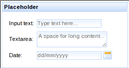
The <rich:placeholder> component allows one to use functionality similar to the HTML5 placeholder attribute for input components.
This component brings a backward compatibility for HTML5 non-compliant browsers and some additional features:
-
per-component styling using
styleClassattribute -
application to multiple components at once using
selectorattribute
Example 17.8. <rich:placeholder> with input components
<h:outputLabel value="Input text:" />

<h:inputText id="input">

    <rich:placeholder value="Type text here..." />

</h:inputText>


<h:outputLabel value="Textarea:" />

<h:inputTextarea id="textarea">

    <rich:placeholder value="A space for long content..." />

</h:inputTextarea>


<h:outputLabel value="Date:" />

<rich:calendar datePattern="dd/M/yyyy" enableManualInput="true">

    <rich:placeholder value="dd/mm/yyyy" />

</rich:calendar>
-
component-type:org.richfaces.Placeholder -
component-class:org.richfaces.component.UIPlaceholder -
component-family:org.richfaces.Placeholder -
renderer-type:org.richfaces.PlaceholderRenderer
Table 17.1. Style classes (selectors) and corresponding skin parameters
| Class (selector) | Skin Parameters | Mapped CSS properties |
|---|---|---|
|