This chapter details components for user input and interaction.
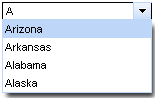
The <r:autocomplete> component is an auto-completing input-box with built-in Ajax capabilities. It supports client-side suggestions, browser-like selection, and customization of the look and feel.
The auto-complete box is a standard JSF UIInput control.
The value attribute stores the text entered by the user for the auto-complete box. Suggestions shown in the auto-complete list can be specified using one of two different methods:
- The
autocompleteMethodattribute points to a method which returns a list of suggestions according to a supplied prefix.
client mode
The prefix is normally ignored in client mode. In this mode, the component requests the suggestion list only once, and performs filtering on the client.
- The
autocompleteListattribute points to a collection of suggestions.
Example 8.1. Defining suggestion values
- Using the
autocompleteMethodattribute <r:autocomplete value="#{bean.state}" autocompleteMethod="#{bean.autocomplete}" />
public List<String> autocomplete(String prefix) {

    ArrayList<String> result = new ArrayList<String>();

    ...

    return result;

}
The
<r:autocomplete>component uses thebean.autocompletemethod to provide suggestions, based on the entered prefix.- Using the
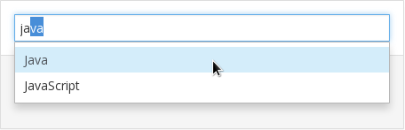
autocompleteListattribute <r:autocomplete value="#{bean.state}" autocompleteList="#{bean.suggestions}" />
public List<String> getAutocompleteList() {

    return Arrays.asList("Java", "JavaScript");

}
The
<r:autocomplete>component retrieve the suggestion list frombean.suggestions.
Use the mode attribute to determine how the suggestion list is requested:
- The
clientsetting pre-loads data to the client and uses the input to filter the possible suggestions. - The
ajaxsetting fetches suggestions with every input change using Ajax requests. - The
cachedAjaxsetting pre-loads data via Ajax requests when the input length matches a minimum value. Set the minimum value with theminCharsattribute. All suggestions are handled on the client until the input prefix is changed, at which point a new request is made based on the new input prefix.
Selecting appropriate mode
A mode should be always selected for particular use case: if it is assumed that Autocomplete will handle tons of data, use cachedAjax or ajax mode. If it will allow to select just between few options, e.g. tens, you can use client mode. Be aware that ajax mode can overload your server with number of requests.
Users can type into the text field to enter a value, which also searches through the suggestion items in the suggestion box. By default, the first suggestion item is selected as the user types. This behavior can be deactivated by setting selectFirst="false".
Setting autoFill="true" causes the suggestion box to fill the text field with a matching suggestion as the user types.
To allow users to enter multiple values separated by specific characters, use the tokens attribute. As the user types, a suggestion will present as normal. When they enter a character specified as a token, this begins a new suggestion process, and the component only uses text entered after the token character for suggestions. For example, if tokens=", " is set, the <r:autocomplete> component uses both the comma and space characters as tokens to separate entries. When the user enters a comma or a space, a new suggestion process begins.
Using tokens
When declaring tokens, avoid using any characters that are present in the list of suggestions. This may cause unexpected behavior as the user expects the character to match suggestions instead of separating suggested entries.
The <r:autocomplete> component uses the JavaScript startsWith() method to create the list of suggestions. The filtering is performed on the client side. Alternatively, use the clientFilterFunction attribute to specify a custom filtering function. The custom function must accept two parameters: the subString parameter is the filtering value as typed into the text box by the user, and the value parameter is an item in the list of suggestions against which the subString must be checked. Each item is iterated through and passed to the function as the value parameter. The custom function must return a boolean value indicating whether the passed item meets the conditions of the filter, and the suggestion list is constructed from successful items.
Example 8.2. Customizing the filter
This example demonstrates how to use a custom filter with the clientFilterFunction attribute. The custom filter determines if the sub-string is contained anywhere in the suggestion item, instead of just at the start.
<script>

   function customFilter(subString, value){

      if(subString.length>=1) {

         if(value.indexOf(subString)!=-1)

            return true;

      }else return false;

   };

</script>

<h:form>

   <r:autocomplete mode="client" minChars="0" autofill="false"

                      clientFilterFunction="customFilter"

                      autocompleteMethod="#{autocompleteBean.autocomplete}" />

</h:form>
The <r:autocomplete> component can be controlled through the JavaScript API. The JavaScript API provides the following functions:
search()- Show the pop-up list of completion values.
close()- Hide the pop-up list.
enable()- Enables an input field and autocompletion functionality.
disable()- Disables an input field and autocompletion functionality.
The <r:calendar> component allows the user to enter a date and time through an in-line or pop-up calendar. The pop-up calendar can navigate through months and years, and its look and feel can be highly customized.
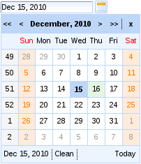
Basic usage of the <r:calendar> component requires only the value attribute, which holds the currently selected date. Example 8.3, “Basic usage” shows a basic declaration, with the value pointing to a bean property. The bean property holds the selected date.
The <r:calendar> component is presented as a pop-up by default, appearing as a text field with a button to expand the full pop-up calendar. To render the calendar in-line on the page instead, set popup="false. This displays the full calendar without the text field and display button.
To add keyboard support for manual input, set enableManualInput="true". To disable the calendar from any user input, set disabled="true".
To change the appearance of the display button from the standard calendar icon, use the buttonIcon and buttonDisabledIcon attributes to replace the icon with a specified file. Alternatively, use the buttonLabel attribute to display text on the button without an icon. If buttonLabel is specified then both the buttonIcon and buttonDisabledIcon attributes are ignored. To hide the text field box, set showInput="false".
The calendar features a button for locating today’s date on the calendar. This can be set to three different values using the todayControlMode attribute:
hidden, which does not display the button;select, the default setting, which scrolls the calendar to the current month and selects the date; andscroll, which scrolls the calendar to the month but does not select the date.inactive, which displays the date but performs no action when clicked.
To make the entire calendar read-only, set readonly="true". This allows months and years to be browsed through with the arrow controls, but dates and times cannot be selected.
The <r:calendar> component can additionally allow a time of day to be specified with the date. After selecting a date the option to set a time becomes available. The default time can be set with the defaultTime attribute. If the time is altered and a new date is selected, it will not reset unless resetTimeOnDateSelect="true" is specified.
The date selection feature is activated if the time is present in the datePattern attribute for the calendar.
Support for seconds
In RichFaces 4, the <r:calendar> component supports times that include seconds. Previous versions of RichFaces only supported hours and minutes.
Date and time strings can be formatted in a set pattern. Use standard locale formatting strings specified by ISO 8601 (for example, d/M/yy HH:mm a) with the datePattern attribute to format date and time strings.
To set the locale of the calendar, use the locale attribute. The calendar will render month and day names in the relevant language. For example, to set the calendar to the US locale, specify locale="en/US".
Use an application resource bundle to localize the calendar control labels. Define the following strings in the resource bundle:
- The
RICH_CALENDAR_APPLY_LABELstring is the label for the button. - The
RICH_CALENDAR_TODAY_LABELstring is the label for the button. - The
RICH_CALENDAR_CLOSE_LABELstring is the label for the button. - The
RICH_CALENDAR_OK_LABELstring is the label for the button. - The
RICH_CALENDAR_CLEAN_LABELstring is the label for the button. - The
RICH_CALENDAR_CANCEL_LABELstring is the label for the button.
Alternatively, use the org.richfaces.calendar resource bundle with Java Archive files ( JAR s) defining the same properties.
The look and feel of the <r:calendar> component can be customized through the use of a data model on the server side. The component supports two different ways of loading data from the server side through defining the mode attribute.
When the mode attribute is not specified, the component uses the client mode. The client mode loads an initial portion of data within a set date range. The range can be defined by using the preloadDateRangeBegin and preloadDateRangeEnd attributes. Additional data requests for months outside the range are not sent.
Alternatively, with mode="ajax" the <r:calendar> requests portions of data from the data model every time the month is switched. The data model can be defined through the dataModel attribute, which points to an object that implements the CalendarDataModel interface. If the dataModel attribute is not defined or has a value of null, the ajax mode functions the same as the client mode.
Instead of using a data model, the <r:calendar> component can be customized on the client-side using JavaScript. Use the dayClassFunction attribute to reference the function that determines the CSS style class for each day cell. Use the dayDisableFunction to reference the function that enables or disables a day cell. Example 8.4, “Client-side customization” demonstrates how client-side customization can be used to style different days in a calendar.
Example 8.4. Client-side customization
<style>
.everyThirdDay {
background-color: gray;
}
.weekendBold {
font-weight: bold;
font-style: italic;
}
</style>
<script type="text/javascript">
var curDt = new Date();
function disablementFunction(day){
if (day.isWeekend) return false;
if (curDt==undefined){
curDt = day.date.getDate();
}
if (curDt.getTime() - day.date.getTime() < 0) return true;
else return false;
}
function disabledClassesProv(day){
if (curDt.getTime() - day.date.getTime() >= 0) return 'rf-ca-boundary-dates';
var res = '';
if (day.isWeekend) res+='weekendBold ';
if (day.day%3==0) res+='everyThirdDay';
return res;
}
</script>
<r:calendar dayDisableFunction="disablementFunction"
dayClassFunction="disabledClassesProv"
boundaryDatesMode="scroll" />
The <r:calendar> component can be controlled through the JavaScript API. The JavaScript API provides the following functions:
showPopup()- Expand the pop-up calendar element.
hidePopup()- Collapse the pop-up calendar element.
switchPopup()- Invert the state of the pop-up calendar element.
getValue()- Return the selected date value of the calendar.
getValueAsString()- Return the selected date value of the calendar as a formatted string.
setValue(newValue)- Set the selected date value to the
newValuedate passed as a parameter. If the new date is not in the currently displayed month, a request is performed to display the correct month. resetValue()- Clear the selected date value.
today()- Select today’s date.
getCurrentMonth()- Return the number of the month currently being displayed.
getCurrentYear()- Return the number of the year currently being displayed.
showSelectedDate()- Show the calendar month that contains the currently selected date.
showDateEditor()- Show the date editor pop-up.
hideDateEditor()- Hide the date editor pop-up.
showTimeEditor()- Show the time editor pop-up.
hideTimeEditor()- Hide the time editor pop-up.
component-type:org.richfaces.Calendarcomponent-class:org.richfaces.component.UICalendarcomponent-family:org.richfaces.Calendarrenderer-type:org.richfaces.CalendarRendererhandler-class:org.richfaces.view.facelets.CalendarHandler
Table 8.1. Style classes (selectors) and corresponding skin parameters
| Class (selector) | Skin Parameters | Mapped CSS properties |
|---|---|---|
|
|
|
| No skin parameters. | |
|
|
|
|
| |
|
| |
|
| |
|
|
|
|
| |
|
| |
|
| |
|
|
|
|
| |
|
| |
|
| |
|
| |
|
|
|
|
| |
|
| |
|
| |
|
|
|
|
| |
|
| |
|
| |
|
|
|
|
| |
|
| |
|
| |
|
| |
|
|
|
|
| |
|
| |
| No skin parameters. | |
| No skin parameters. | |
|
|
|
|
| |
|
| |
|
| |
|
|
|
|
| |
| No skin parameters. | |
|
|
|
|
| |
|
| |
|
| |
| No skin parameters. | |
|
|
|
|
| |
|
|
|
|
| |
|
|
|
|
| |
|
|
|
|
| |
|
| |
|
| |
|
|
|
|
| |
| No skin parameters. | |
|
|
|
|
| |
|
|
|
|
| |
|
| |
|
|
|
| No skin parameters. | |
| No skin parameters. | |
| No skin parameters. | |
|
|
|
|
|
|
| No skin parameters. | |
|
|
|
|
| |
|
|
|
|
| |
|
|
|
|
| |
|
| |
|
|
|
|
| |
|
| |
| No skin parameters. | |
|
|
|
|
| |
|
|
|
|
| |
|
| |
|
|
|
|
| |
|
| |
|
| |
|
|
|
|
| |
| No skin parameters. | |
| No skin parameters. | |
|
|
|
|
| |
|
| |
|
| |
|
|
|
|
| |
|
|
|
|
| |
|
|
|
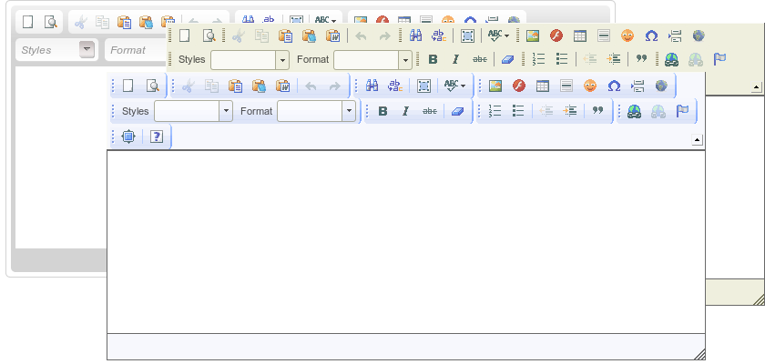
The <r:editor> component is used for creating a WYSIWYG editor on a page.
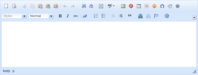
<r:editor> component is based on the CKEditor implementation.
When rendering a <r:editor>, a textarea is rendered to the page and once the page is completely loaded (ready state), the textarea is enhanced using a CKEditor script and replaced with a full-featured WYSIWYG editor.
Basic usage requires the value attribute to point to the expression for the current value of the component.
Example 8.5. Basic usage of <r:editor>
<r:editor value="#{backingBean.editedValue}" />


<h:outputText escape="false" value="#{backingBean.editedValue}" />
Note that the editor produces HTML markup and to be able to render it’s output, the markup needs to be unescaped (as with <h:outputText> component in example above).
The dimensions of the editor can be managed using width and height attributes.
The readonly attribute can be used to switch the editor into a read-only mode.
The tabindex attribute specifies the position of the current element in the tabbing order for the current document.
Note
The ResourceServlet has to be registered for the url-pattern /org.richfaces.resources/\* in order to serve the editor resources (JavaScript, CSS, images) correctly. Check the RichFaces Developer’s Guide for further details.
Note
The <r:editor> requires the <h:body> component to be present in the view and must be an ancestor of the editor in order for the resource dependencies to render correctly.
There are several options to customize the style of the editor:
style, styleClass: customizes the style of the editor and underlying textareaeditorStyle, editorClass: customizes the style of the CKEditor instancetextareaStyle, textareaClass: customizes the style of the underlying textarea
The <r:editor> is skinnable using the skin attribute and either of the two approaches:
By default, <r:editor> has a skin called richfaces that is optimized to match rest of the component suite look & feel and changes to match the active RichFaces skin (refer to RichFaces Developer’s Guide for details about Skinning and theming).
Alternatively, you can use any other CKeditor skin, either from the standard distribution, a downloaded skin, or a custom skin. In the distribution, there are three skins bundled: kama, v2, office2003.
The basic set of <r:editor> attributes allows you to support common use-cases for a WYSIWYG editor. However the underlying CKEditor implementation supports many more configuration options.
Use the config attribute to define any of these advanced configuration options supported by the CKEditor. This configuration is written in JavaScript object format and its value is interpolated for EL expressions (making configuration dynamic).
There are two ways to define the configuration: the config attribute or a facet named config. The facet takes precedence over attribute when both are defined.
<r:editor config="startupFocus: #{userPreferences.startupFocus}" />


<r:editor>

    <f:facet name="config">

        startupFocus: #{userPreferences.startupFocus}

    </f:facet>

</r:editor>
In the above samples, the <r:editor> is configured to take focus after loading the page as defined by the userPreference bean. Definitions using either attribute or facet are equivalent.
Note
For further configuration options, refer to CKEditor 3 Developer Guide and CKEditor 3 configuration reference.
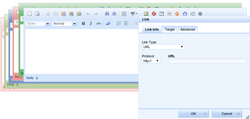
The <r:editor> supports a toolbar attribute, which is able to change the configuration of the toolbar’s button set. There are two configurations available: basic (default), full (enables all of the features).
It is also possible to define a custom toolbar using the CKEditor toolbar configuration in a config facet:
<r:editor toolbar="CustomToolbar">

    <f:facet name="config">

        toolbar_CustomToolbar:

        [

        { name: 'document', items : [ 'NewPage','Preview' ] },

        { name: 'clipboard', items : [ 'Cut','Copy','Paste','-','Undo','Redo' ] },

        { name: 'editing', items : [ 'Find','Replace','-','SelectAll','-','Scayt' ] },

        { name: 'insert', items : [ 'Image', 'Flash', 'Table', 'HorizontalRule',

                 'Smiley', 'SpecialChar', 'PageBreak', 'Iframe' ] },

                '/',

        { name: 'styles', items : [ 'Styles','Format' ] },

        { name: 'basicstyles', items : [ 'Bold','Italic','Strike','-','RemoveFormat' ] },

        { name: 'paragraph', items : [ 'NumberedList','BulletedList','-','Outdent','Indent','-','Blockquote' ] },

        { name: 'links', items : [ 'Link','Unlink','Anchor' ] },

        { name: 'tools', items : [ 'Maximize' ] }

        ]

        </f:facet>

</r:editor>
Note that toolbar name ( CustomToolbar) needs to match the toolbar_<name> configuration option.
The <r:editor> comes with a lang attribute which allows you to change the localization of the editor. For language configuration options, refer to http://www.w3.org/TR/html4/struct/dirlang.html.
The lang attribute influences following settings:
- underlying textarea - specifies the i18n settings for received and submitted content
- editor value - specifies the i18n settings for value edited in WYSIWYG mode
- default settings of localization of editor controls and interface
However the interface first localized using the browser configuration (usually determined by client system settings). To force the editor to use a specific localization for the interface, you use the advanced CKEditor configuration option language, as in following sample:
<r:editor lang="fr" config="language: 'fr'" />
The above sample forces the editor to use a french interface, suppressing the browser preferred settings.
The <r:editor> component produces set of events for handling component specific interaction.
init- once the editor is initialized and ready to be handle user interactionfocus- once the editor is focusedblur- once the editor is blurredchange- fired on blur event when editor content has been changed after previous focusdirty- fired immediately after editor content has been changed
Events can be handled either by registering a JavaScript event handler or by attaching JSF behavior:
<r:editor value="#{backingBean.editorValue}">

    <r:ajax event="change" render="editorOutput" />

    <r:ajax event="dirty" render="editorOutput">

        <r:attachQueue requestDelay="1000" />

    </r:ajax>

</r:editor>


<r:outputPanel id="editorOutput">

    <h:outputText escape="false" value="#{backingBean.editorValue}" />

</r:outputPanel>
The example above shows the editor and its output, which is updated every second after each instant change or immediately after user focus leaves the editor area.
The <r:editor> component can be controlled through the JavaScript API. The JavaScript API provides the following functions:
getValue()- Get the current value of the input control.
setValue(newValue)- Set the value of the input control to the
newValuestring passed as a parameter. getEditor()- Returns the CKEditor object instance associated to given
<r:editor>component. getInput()- Returns the associated textarea.
focus()- Gives focus to this component
blur()- Removes focus from this component
isFocused()- Returns
trueif this component is focused isDirty()- Returns
trueif editor is focused and it was edited from last focus event (reset by blur event, by usingsetValue(newValue)call and when component is re-rendered) isValueChanged()- Returns
trueif the control’s value has been changed from the default (reset bysetValue(newValue)call and when component is re-rendered) isReadonly()- Returns
trueif editor content is editable. setReadonly(readonly)- When
readonlyistrue, editor will be switched to editable state. Otherwise, it will be switched to readonly state.
component-type:org.richfaces.Editorcomponent-class:org.richfaces.component.UIEditorcomponent-family:org.richfaces.Editorrenderer-type:org.richfaces.EditorRenderer
Table 8.2. Style classes (selectors) and corresponding skin parameters
| Class (selector) | Skin Parameters | Mapped CSS properties |
|---|---|---|
|
|
|
|
|
|
|
|
|
|
| |
|
|
|
|
| |
|
| |
|
| |
|
| |
|
|
|
|
|
|
|
| |
|
|
|
|
| |
|
|
|
|
| |
|
| |
|
| |
|
| |
|
|
|
|
|
The <r:fileUpload> component allows the user to upload files to a server. It features multiple uploads, progress bars, restrictions on file types, and restrictions on sizes of the files to be uploaded.
Basic usage requires the fileUploadListener attribute. Use the attribute to reference a listener function on the server side after each file is uploaded. The listener should process files as required, such as storing them in the session/db/filesystem/ directory. The component itself does not store uploaded files, so if the listener is not implemented they are not stored anywhere.
Files are uploaded to either the temporary folder (different for each operating system) or to RAM (random-access memory), depending on the value of the org.richfaces.fileUpload.createTempFiles context parameter of the web.xml settings file for the project. If the parameter is set to true, the files are uploaded to the temporary folder.
To limit the maximum size of the uploaded files, define the byte size with the org.richfaces.fileUpload.maxRequestSize context parameter of the web.xml settings file for the project.
Any file is accepted by r:fileUpload component by default. There are three parameters available for limiting what can user upload to the server:
maxFilesQuantity- The
maxFilesQuantityparameter defines maximum number of files allowed to be uploaded. After a number of files in the list equals to the value of this attribute, "Add" button disappears and nothing could be uploaded even if you clear the whole list. In order to upload files again you should rerender the component. acceptedTypes- The
acceptedTypesparameter defines comma separated list of file extensions accepted by component. The component does not provide any feedback when rejecting file. For introducing feedback for rejection, useontyperejectedparameter. ontyperejected- The
ontyperejectedparameter defines event handler when file does not meet conditions stated byacceptedTypesparameter.
Set the immediateUpload attribute to true to upload files as soon as they are added to the list, rather than waiting for the user to press the button.
The text labels used in the component can be completely customized. Labels for the various controls of the component can be set using the following parameters:
addLabel- The
addLabelparameter sets the label for the button. clearAllLabel- The
clearAllLabelparameter sets the label for the button. clearLabel- The
clearLabelparameter sets the label for the button. uploadLabel- The
uploadLabelparameter sets the label for the button.
The <r:fileUpload> component provides a built-in progress bar to indicate the progress of each file that is uploaded. This progress bar can be replaced with a <r:progressBar> component added to the progress facet. Refer to Section 13.7, “<r:progressBar>” for details on the <r:progressBar> component.
To disable the <r:fileUpload> component, use the disabled attribute.
There are a number of event handlers specific to the <r:fileUpload> component:
filesubmitis triggered before a file is uploaded.uploadcompleteis triggered after all files in the list have finished uploading.
component-type:org.richfaces.FileUploadcomponent-class:org.richfaces.component.UIFileUploadcomponent-family:org.richfaces.FileUploadrenderer-type:org.richfaces.FileUploadRendererhandler-class:org.richfaces.view.facelets.FileUploadHandler
Table 8.3. Style classes (selectors) and corresponding skin parameters
| Class (selector) | Skin Parameters | Mapped CSS properties |
|---|---|---|
|
|
|
|
| |
|
|
|
| No skin parameters. | |
| No skin parameters. | |
| No skin parameters. | |
|
|
|
|
| |
|
|
|
|
| |
|
| |
|
|
|
|
| |
|
|
|
|
| |
|
| |
|
|
|
|
| |
|
|
|
|
| |
|
| |
|
|
|
|
| |
|
|
|
|
| |
|
| |
|
|
|
| No skin parameters. | |
|
|
|
|
| |
|
| |
|
|
|
|
| |
|
| |
|
|
|
|
| |
|
| |
| No skin parameters. | |
| No skin parameters. | |
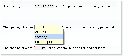
The <r:inplaceInput> component allows information to be entered in-line in blocks of text, improving readability of the text. Multiple input regions can be navigated with keyboard navigation. The component has three functional states: the view state, where the component displays its initial setting, such as "click to edit"; the edit state, where the user can input text; and the "changed" state, where the new value for the component has been confirmed but can be edited again if required.
Basic usage requires the value attribute to point to the expression for the current value of the component. Validation and conversion rules for the JSF UIInput control apply as usual.
When in the initial view state, the starting label can be set using the defaultLabel attribute. Alternatively, if the initial value is already set through the value attribute, this is displayed instead.
Once the user has entered text, the label is stored in the model specified by the value attribute. The use of the default label and value is shown in Example 8.9, “Default label and value”.
Example 8.9. Default label and value
<r:inplaceInput value="#{bean.value}" defaultLabel="click to edit"/>
By default, the event to switch the component to the edit state is a single mouse click. This can be changed using the editEvent attribute to specify a different event.
The user can confirm and save their input in multiple ways:
- By default, pressing the Enter key will confirm and save the input.
- If
showControls="true"is set, buttons for confirming or canceling are added to the component. - If
saveOnBlur="true"is set, the input is saved on the component’s blur event.
Pressing the Esc key cancels editing in all cases.
The <r:inplaceInput> component can be controlled through the JavaScript API. The JavaScript API provides the following functions:
getValue()- Get the current value of the input control.
setValue(newValue)- Set the value of the input control to the
newValuestring passed as a parameter. isEditState()- Returns
trueif the control is currently in the edit state, orfalseif the control is currently in the view state. isValueChanged()- Returns
trueif the control’s value has been changed from the default. save()- Saves the current item as the control’s value.
cancel()- Cancel editing the value.
getInput()- Return the DOM element for the input.
component-type:org.richfaces.InplaceInputcomponent-class:org.richfaces.component.UIInplaceInputcomponent-family:org.richfaces.InplaceInputrenderer-type:org.richfaces.InplaceInputRenderer
Table 8.4. Style classes (selectors) and corresponding skin parameters
| Class (selector) | Skin Parameters | Mapped CSS properties |
|---|---|---|
|
|
|
|
| |
| No skin parameters. | |
| No skin parameters. | |
| No skin parameters. | |
|
|
|
|
| |
|
| |
|
| |
|
|
|
|
| |
| No skin parameters. | |
|
|
|
|
| |
|
|
|
|
| |
| No skin parameters. | |
| No skin parameters. | |
| No skin parameters. | |
| No skin parameters. | |
The <r:inplaceSelect> component is similar to the <r:inplaceInput> component, except that the <r:inplaceSelect> component uses a drop-down selection box to enter text instead of a regular text field. Changes can be rendered either in-line or for the whole block, and inputs can be focused with keyboard navigation. The component is based on the JSF UISelectOne component, so all the standard rules for value definition, processing, conversion, and validation apply.
The component has three functional states:
- When in the view state, the component displays its initial setting, such as "click to edit".
- When in the edit state, the user can select a value from a drop-down list.
- When in the changed state, the new value for the component has been confirmed, but it can be edited again if required.
Basic usage requires the value attribute to point to the expression for the current value of the component and a list of items. The list of items can be defined using the JSF components <f:selectItem/> and <f:selectItems/>.
Example 8.10. Defining list items for <r:inplaceSelect>
<r:inplaceSelect value="#{bean.inputValue}" defaultLabel="click to edit" >

    <f:selectItems value="#{bean.selectItems}" />

    <f.selectItem itemValue="1" itemLabel="Item 1" />

    <f.selectItem itemValue="2" itemLabel="Item 2" />

    <f.selectItem itemValue="3" itemLabel="Item 3" />

    <f.selectItem itemValue="4" itemLabel="Item 4" />

</r:inplaceSelect>
When in the initial view state, the starting label can be set using the defaultLabel attribute, such as defaultLabel="click to edit". Alternatively, if the initial value is already set through the value attribute, this is displayed instead.
By default, the event to switch the component to the edit state is a single mouse click. This can be changed using the editEvent attribute to specify a different event. When switching to edit mode, the drop-down list of possible values will automatically be displayed; this can be deactivated by setting openOnEdit="false".
Once a new value for the control is saved, the state switches to the "changed" state. Saving a new value for the control can be performed in a number of ways:
- Once the user selects an item from the drop-down list, the item is saved as the new control value. This is the default setting. If
saveOnSelect="false"is set, the component applies the selected item but remains in the edit state so a different selection could be chosen. The value is then applied when the Enter key is pressed. - If
saveOnBlur="true"is set, the selected item is saved as the new control value when the control loses focus. - If
showControls="true"is set, buttons are added to the control to confirm or cancel the selection. The new control value is only saved once the user confirms the selection using the button.
Pressing the Esc key cancels editing in all cases.
The <r:inplaceSelect> component can be controlled through the JavaScript API. The JavaScript API provides the following functions:
getValue()- Get the current value of the select control.
setValue(newValue)- Set the value of the select control to the
newValuestring passed as a parameter. isEditState()- Returns
trueif the control is currently in the edit state, orfalseif the control is currently in the view state. isValueChanged()- Returns
trueif the control’s value has been changed from the default. save()- Saves the current item as the control’s value.
cancel()- Cancel editing the value.
getInput()- Return the input entered into the control by the user.
getLabel()- Return the default label of the control.
setLabel(newLabel)- Set the default label of the control to the
newLabelstring passed as a parameter. showPopup()- Show the pop-up list of possible values.
hidePopup()- Hide the pop-up list.
component-type:org.richfaces.InplaceSelectcomponent-class:org.richfaces.component.UIInplaceSelectcomponent-family:org.richfaces.Selectrenderer-type:org.richfaces.InplaceSelectRenderer
Table 8.5. Style classes (selectors) and corresponding skin parameters
| Class (selector) | Skin Parameters | Mapped CSS properties |
|---|---|---|
|
|
|
|
| |
| No skin parameters. | |
| No skin parameters. | |
| No skin parameters. | |
|
|
|
|
| |
|
| |
|
| |
|
|
|
|
|
|
| No skin parameters. | |
| No skin parameters. | |
| No skin parameters. | |
|
|
|
|
| |
|
|
|
|
| |
| No skin parameters. | |
| No skin parameters. | |
|
|
|
|
| |
| No skin parameters. | |
| No skin parameters. | |
| No skin parameters. | |
| No skin parameters. | |
| No skin parameters. | |
The <r:inputNumberSlider> component provides a slider for changing numerical values. Optional features include control arrows to step through the values, a tool-tip to display the value while sliding, and a text field for typing the numerical value which can then be validated against the slider’s range.
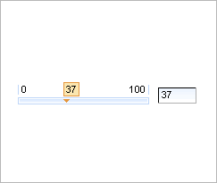
Basic use of the component with no attributes specified will render a slider with a minimum value of 0, a maximum of 100, and a gradient step of 1, together with a text field for typing the desired numerical value. The slider is labeled with the minimum and maximum boundary values, and a tool-tip showing the current value is shown while sliding the slider. The value attribute is used for storing the currently selected value of the slider. Standard conversion and validation for the JSF UIInput component is applied.
The text field can be removed by setting showInput="false".
The properties of the slider can be set with the attributes minValue, maxValue, and step.
The minimum and maximum labels on the slider can be hidden by setting showBoundaryValues="false". The tool-tip showing the current value can be hidden by setting showToolTip="false".
Arrow controls can be added to either side of the slider to adjust the value incrementally by setting showArrows="true". Clicking the arrows move the slider indicator in that direction by the gradient step, and clicking and holding the arrows moves the indicator continuously. The time delay for each step when updating continuously can be defined using the delay attribute.
The <r:inputNumberSlider> component can be controlled through the JavaScript API. The JavaScript API provides the following functions:
getValue()- Get the current value of the slider control.
setValue(newValue)- Set the value of the slider control to the
newValueinteger passed as a parameter. increase()- Increase the value of the slider control by the gradient step amount.
decrease()- Decrease the value of the slider control by the gradient step amount.
component-type:org.richfaces.InputNumberSlidercomponent-class:org.richfaces.component.UIInputNumberSlidercomponent-family:org.richfaces.Inputrenderer-type:org.richfaces.inputNumberSliderRenderer
Table 8.6. Style classes (selectors) and corresponding skin parameters
| Class (selector) | Skin Parameters | Mapped CSS properties |
|---|---|---|
| No skin parameters. | |
|
|
|
|
| |
| No skin parameters. | |
|
|
|
|
| |
|
| |
|
| |
|
|
|
|
| |
|
| |
|
| |
|
|
|
|
| |
|
| |
| No skin parameters. | |
| No skin parameters. | |
| No skin parameters. | |
| No skin parameters. | |
| No skin parameters. | |
| No skin parameters. | |
| No skin parameters. | |
| No skin parameters. | |
|
|
|
|
| |
|
| |
|
| |
|
| |
The <r:inputNumberSpinner> component is a single-line input field with buttons to increase and decrease a numerical value. The value can be changed using the corresponding directional keys on a keyboard, or by typing into the field.
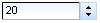
Basic use of the component with no attributes specified will render a number spinner with a minimum value of 1, a maximum value of 100, and a gradient step of 1.
These default properties can be re-defined with the attributes minValue, maxValue, and step respectively. The starting value of the spinner is the minimum value unless otherwise specified with the value attribute.
When changing the value using the buttons, raising the value above the maximum or cause the spinner to restart at the minimum value. Likewise, when lowering below the minimum value the spinner will reset to the maximum value. This behavior can be deactivated by setting cycled="false", which will cause the buttons to stop responding when the reach the maximum or minimum value.
The ability to change the value by typing into the text field can be disabled by setting enableManualInput="false".
The <r:inputNumberSpinner> component can be controlled through the JavaScript API. The JavaScript API provides the following functions:
getValue()- Get the current value of the spinner control.
setValue(newValue)- Set the value of the spinner control to the
newValueinteger passed as a parameter. increase()- Increase the value of the spinner control by the gradient step amount.
decrease()- Decrease the value of the spinner control by the gradient step amount.
component-type:org.richfaces.InputNumberSpinnercomponent-class:org.richfaces.component.UIInputNumbercomponent-family:org.richfaces.Inputrenderer-type:org.richfaces.InputNumberSpinnerRenderer
Table 8.7. Style classes (selectors) and corresponding skin parameters
| Class (selector) | Skin Parameters | Mapped CSS properties |
|---|---|---|
|
|
|
|
|
|
|
| |
|
| |
|
| |
|
|
|
|
| |
| No skin parameters. | |
| No skin parameters. | |
The <r:select> component provides a drop-down list box for selecting a single value from multiple options. The <r:select> component can be configured as a combo-box, where it will accept typed input. The component also supports keyboard navigation. The <r:select> component functions similarly to the JSF UISelectOne component.
Simple usage of the <r:select> component requires the value attribute to store the selected value. Additionally, child tags to manage the list of selections are required. The child tags can either be a number of <f:selectItem> tags or a <f:selectItems> tag which points to a data model containing a list of selection items. The value attribute is used to store the current selection.
Example 8.11. Selection items
- Using multiple
<f:selectItem>tags
<r:select>

   <f:selectItem itemValue="0" itemLabel="Option 1" />

   <f:selectItem itemValue="1" itemLabel="Option 2" />

   <f:selectItem itemValue="2" itemLabel="Option 3" />

   <f:selectItem itemValue="3" itemLabel="Option 4" />

   <f:selectItem itemValue="4" itemLabel="Option 5" />

</r:select>
- Using a single
<f:selectItems>tag
<r:select>

   <f:selectItems value="#{bean.options}" />

</r:select>
The arrow keys on a keyboard can be used to highlight different items in the list. If the control loses focus or the Enter key is pressed, the highlighted option is chosen as the value and the list is closed. Pressing the Esc key will close the list but not change the value.
The <r:select> component allows the user to type into a text field to scroll through or filter the list. By default, the <r:select> component functions as a drop-down list with no manual input. To add keyboard support for manual input, set enableManualInput="true".
Once the user begins typing, the first available matching option is highlighted. If the typed text does not match any values in the list, no value is chosen and the drop-down list displays as empty. Other keyboard interaction remains the same as the basic drop-down list.
The standard JSF <h:selectOne> component does not offer this extended keyboard support. However, since the <r:select> component is still based on the JSF UISelectOne component, it will not accept a value that does not match any items in the drop-down list. If an invalid value is entered, it is highlighted as erroneous and validation messages appear with the submission.
Use the defaultLabel attribute to set a place-holder label, such as defaultLabel="select an option".
Server-side processing occurs in the same manner as for an <h:selectOneMenu> component. As such, custom objects used for selection items should use the same converters as for an <h:selectOneMenu> component.
The <r:select> component can be controlled through the JavaScript API. The JavaScript API provides the following functions:
getValue()- Get the current value of the text field.
setValue(newValue)- Set the value of the text field to the
newValuestring passed as a parameter. getLabel()- Return the default label of the control.
showPopup()- Show the pop-up list of completion values.
hidePopup()- Hide the pop-up list.
component-type:org.richfaces.Selectcomponent-class:org.richfaces.component.UISelectcomponent-family:org.richfaces.Selectrenderer-type:org.richfaces.SelectRenderer
Table 8.8. Style classes (selectors) and corresponding skin parameters
| Class (selector) | Skin Parameters | Mapped CSS properties |
|---|---|---|
| No skin parameters. | |
|
|
|
|
|
|
| No skin parameters. | |
|
|
|
|
| |
|
| |
|
|
|
| No skin parameters. | |
|
|
|
|
| |
| No skin parameters. | |
| No skin parameters. | |
| No skin parameters. | |
| No skin parameters. | |
| No skin parameters. | |
The <r:orderingList> is a component for ordering items in a list (client-side).
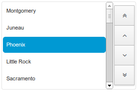
To use the <r:orderingList> bind the value attribute to the list to be ordered. The var attribute specifies a variable to use when iterating through the list values. The var attribute is used within the itemLabel to assign the object value to be displayed. Similarly, the var attribute is used within the itemValue attribute to specify the object value mapped by the display value. If the itemValue is not of type String, a converter must be specified for this itemValue using either the converter attribute, or a nested <f:converter> tag.
Example 8.12. ItemLabel/ItemValue use
- Using the
itemLabelanditemValueattributes
<r:orderingList value="#{listSelectBean.capitals}" var="capital" itemValue="#{capital}" itemLabel="#{capital.name}">

    <f:converter converterId="CapitalsConverter" />

</r:orderingList>
In addition to the above simple itemLabel display, the <r:orderingList> supports a columnar layout of the itemValues to be sorted. This is achieved by nesting <r:column> tags within the orderingList, and referencing the var attribute from within the <r:column> EL.
Example 8.13. Nested <r:column> tags
- Using
<r:column>tags nested within the<r:orderingList>
<r:orderingList value="#{listSelectBean.capitals}" var="capital"  listWidth="300px">

    <f:converter converterId="CapitalsConverter" />

    <r:column>

        <f:facet name="header">Flag</f:facet>

        <h:graphicImage value="#{capital.stateFlag}" alt="flag"  width="33"/>

    </r:column>

    <r:column>

        <f:facet name="header">Name</f:facet>

        #{capital.name}

    </r:column>

    <r:column>

        <f:facet name="header">State</f:facet>

        #{capital.state}

    </r:column>

</r:orderingList>
When using <r:column> tags to layout the <r:orderingList> items, the itemLabel attribute is irrelevant, and may be left out.
The <r:orderingList> component can be controlled through the JavaScript API. The JavaScript API provides the following functions:
moveUp()- Move the currently selected item(s) up one step.
moveDown()- Move the currently selected item(s) down one step.
moveFirst()- Move the currently selected item(s) to the top of the list.
moveLast()- Move the currently selected item(s) to the bottom of the list.
getSelected()- Find and return the list of orderingList elements that are selected.
selectItem(item)- Select the given
item. selectAll()- Select all items in the orderingList
unselectAll()- Un-select all items in the orderingList
unSelectItem(item)- Un-select the given
item.
The <r:pickList> is a component for selecting items from a list. Additionally, it allows for the selected items to be ordered (client-side). From the client side perspective, items are added/removed from the source list, and removed/added to the target list. However it is important to note that the server-side source of items is never modified, and always represents the list of all items available for selection. If the list of unselected items is required, it can be determined by subtracting the collection of all selected items from the collection of all available items.
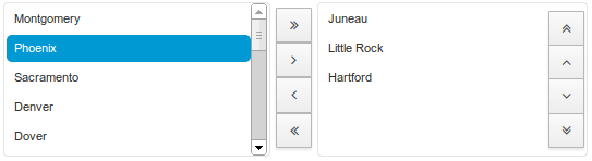
To use the <r:pickList> bind the value attribute to the target list, where the selected items will be stored. The list of source items is provided by nesting a SelectItem source, such as a <f:selectItems> tag, or a list of <f:selectItem> tags. If the itemValue of the SelectItem is not of type String, a converter must be specified for this itemValue using either the converter attribute, or a nested <f:converter> tag.
Example 8.14. Simple pickList use
- Using the default
SelectItemitemLabel to generate the pickList source and target items.
<r:pickList value="#{listSelectBean.selectedCapitals}"

               sourceCaption="Available cities" targetCaption="Selected cities"

               listWidth="170px" listHeight="100px"

               orderable="true">

    <f:selectItems value="#{listSelectBean.capitals}" var="capital" itemValue="#{capital}" itemLabel="#{capital.name}" />

    <f:converter converterId="CapitalsConverter" />

</r:pickList>
The items in the target list can be ordered client-side by setting the orderable attribute of the <r:pickList> tag to true. The arrow keys on a keyboard can then be used to highlight different items in the target list, and pressing the ctrlmodifier with the arrow keys will move the selected item up or down within the target list.
In addition to the above simple SelectItem itemLabel display, the <r:pickList> supports a columnar layout of the items to be selected. This is achieved by adding a var attribute used to represent the collection of nested SelectItems, and nesting <r:column> tags within the pickList. The var attribute of the <f:selectItem> is then referenced from within the <r:column> EL.
Example 8.15. Nested <r:column> tags
- Using
<r:column>tags nested within the<r:pickList>
<r:pickList value="#{listSelectBean.selectedCapitals}" var="capital" listHeight="200px">

    <f:selectItems value="#{listSelectBean.capitals}" />

    <f:converter converterId="CapitalsConverter" />

    <r:column>

        <f:facet name="header">Flag</f:facet>

        <h:graphicImage value="#{capital.stateFlag}" alt="flag" width="33"/>

    </r:column>

    <r:column>

        <f:facet name="header">Name</f:facet>

        #{capital.name}

    </r:column>

    <r:column>

        <f:facet name="header">State</f:facet>

        #{capital.state}

    </r:column>

</r:pickList>
The <r:pickList> component can be controlled through the JavaScript API. The JavaScript API provides the following functions:
getSourceWidget()- Returns the javascript list object backing the
<r:pickList>source list. This list can be used to select/unselect item(s). getTargetWidget()- Returns the javascript list object backing the
<r:pickList>target list. This list can be used to select/unselect item(s). addItems()- Add the currently selected items to the target list, removing them from the source list.
addAllItems()- Add all the source items to the target list, removing them from the source list.
removeItems()- Remove the currently selected items from the target list, adding them to the source list.
removeAllItems()- Remove all the source items from the target list, adding them to the source list.