Create new RichFaces Documentation Jira issue

This will launch the RichFaces Jira page - to complete your feedback please login if needed, and submit the Jira.
JBoss.orgCommunity Documentation
The component defines a tab panel displaying tabs for grouping content of the panel.
Skinnable tab panel and child items
Disabled/enabled tab options
Customizable headers
Group any content inside a tab
Each tab has a unique name for direct access (e.g. for switching between tabs)
Switch methods can be easily customized with attribute to:
Server
Client
Ajax
Switch methods can be selected for the whole tab panel and for the each tab separately
As it was mentioned above, tabPanel groups content on panels and performs switching from one to another. Hence, modes of switching between panels are described first of all.
All tabPanels should be wrapped into a form element so as content is correctly submitted inside. If a form is placed into each tab, the Action elements of Tab controls appear to be out of the form and content submission inside the panels could be performed only for Action components inside tabs.
Switching mode could be chosen with the tabPanel attribute "switchType" with three possible parameters.
server (DEFAULT)
The common submission is performed around tabPanel and a page is completely rendered on a called panel. Only one at a time tabPanel is uploaded onto the client side.
ajax
AJAX form submission is performed around the tabPanel, content of the called tabPanel is uploaded on Ajax request. Only one at a time tabPanel is uploaded on the client.
client
All tabPanels are uploaded on the client side. The switching from the active to the hidden panel is performed with client JavaScript.
As a result, the tabPanel is switched to the second tab according to the action returning outcome for moving onto another page and switching from the second to the first tab is performed.
There is also the "selectedTab" attribute. The attribute keeps an active tab name; therefore, an active tabPanel could be changed with setting a name of the necessary tab to this attribute.
There is also the "headerAlignment" attribute responsible for rendering of tabPanel components. The attribute has several values: "left" (Default), "right", "center", which specify Tabs components location on the top of the tabPanel.
Example:
...
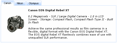
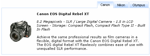
<rich:tabPanel width="40%" headerAlignment="right">
<rich:tab label="Canon">
...
</rich:tab>
<rich:tab label="Nikon">
...
</rich:tab>
<rich:tab label="Olympus">
...
</rich:tab>
</rich:tabPanel>
...
The
"label"
attribute is a generic attribute. The
"label"
attribute provides an association between a component, and
the message that the component (indirectly) produced. This attribute
defines the parameters of localized error and informational messages
that occur as a result of conversion, validation, or other application
actions during the request processing lifecycle. With the help of this
attribute you can replace the last parameter substitution token shown
in the messages. For example, {1} for
"DoubleRangeValidator.MAXIMUM",
{2} for "ShortConverter.SHORT".
Except the specific attributes, the component has all necessary attributes for JavaScript events definition.
"onmouseover"
"onmouseout"
etc.
Table of <rich:tabPanel> attributes.
Table 6.143. Component Identification Parameters
| Name | Value |
|---|---|
| component-type | org.richfaces.tabPanel |
| component-class | org.richfaces.component.html.HtmltabPanel |
| component-family | org.richfaces.tabPanel |
| renderer-type | org.richfaces.tabPanelRenderer |
| tag-class | org.richfaces.taglib.tabPanelTag |
Table 6.144. Classes names that define a component appearance
| Class name | Description |
|---|---|
| rich-tabpanel | Defines styles for all tabPanel |
| rich-tabpanel-content | Defines styles for an internal content |
| rich-tabpanel-content-position | Defines styles for a wrapper element of a tabPanel content. It should define a shift equal to borders width in order to overlap panel tabs |
| rich-tabhdr-side-border | Defines styles for side elements of a tabPanel header |
| rich-tabhdr-side-cell | Defines styles for a header internal element |
| rich-tab-bottom-line | Defines styles for a tab bottom line element of a tabPanel |
Table 6.145. Classes names that define different tab header states (corresponds to rich-tabhdr-side-cell)
| Class name | Description |
|---|---|
| rich-tabhdr-cell-active | Defines styles for an internal element of an active header |
| rich-tabhdr-cell-inactive | Defines styles for an internal element of an inactive label |
| rich-tabhdr-cell-disabled | Defines styles for an internal element of a disabled label |
You can find all necessary information about style classes redefinition in Definition of Custom Style Classes section.
Visit TabPanel page at RichFaces LiveDemo for examples of component usage and their sources.
If you have any questions or ideas regarding the <rich:tab> tell about them at the RichFaces Users Forum.