Create new RichFaces Documentation Jira issue

This will launch the RichFaces Jira page - to complete your feedback please login if needed, and submit the Jira.
JBoss.orgCommunity Documentation
The <rich:calendar> component is used for creating inputs for dates enriched with interactive calendar that allows navigate through monthes and years.
Highly customizable look and feel
Popup representation
Disablement support
Smart and user-defined positioning
Cells customization
Macro substitution based on tool bars customization
Table 6.317. rich : calendar attributes
| Attribute Name |
Description

|
|---|---|
| ajaxSingle | boolean attribute which provides possibility to limit JSF tree processing(decoding, conversion/validation, value applying) to the component which send the request only. Default value is "true" |
| binding | JSF: The attribute takes a value-binding expression for a component property of a backing bean |
| boundaryDatesMode | This attribute is responsible for behaviour of dates from the previous and next months which are displayed in the current month. Valid values are "inactive" (Default) dates inactive and gray colored, "scroll" boundaries work as month scrolling controls, and "select" boundaries work in the same way as "scroll" but with the date clicked selection. Default value is "inactive". |
| buttonClass | Assigns one or more space-separated CSS class names to the component popup button |
| buttonIcon | Defines icon for the popup button element. The attribute is ignored if the "buttonLabel" is set |
| buttonIconDisabled | Defines disabled icon for the popup button element. The attribute is ignored if the "buttonLabel" is set |
| buttonLabel | Defines label for the popup button element. If the attribute is set "buttonIcon" and "buttonIconDisabled" are ignored |
| bypassUpdates | If "true", after process validations phase it skips updates of model beans on a force render response. It can be used for validating components input |
| cellHeight | attribute to set fixed cells height |
| cellWidth | attribute to set fixed cells width |
| converter | JSF: Id of Converter to be used or reference to a Converter |
| converterMessage | A ValueExpression enabled attribute that, if present, will be used as the text of the converter message, replacing any message that comes from the converter |
| currentDate | Defines current date |
| currentDateChangeListener | MethodExpression representing an action listener method that will be notified after date selection |
| dataModel | Used to provide data for calendar elements. If data is not provided, all Data Model related functions are disabled |
| datePattern | Defines date pattern. Default value is "MMM d, yyyy". |
| dayStyleClass | Should be binded to some JS function that will provide style classes for special sets of days highlighting |
| defaultTime | Defines time that will be used: 1) to set time when the value is empty 2) to set time when date changes and flag "resetTimeOnDateSelect" is true. Default value is "getDefaultValueOfDefaultTime()" |
| direction | Defines direction of the calendar popup ("top-left", "top-right", "bottom-left", "bottom-right" (Default), "auto"). Default value is "bottom-right". |
| disabled | HTML: If "true", rendered is disabled. In "popup" mode both controls are disabled. Default value is "false". |
| enableManualInput | If "true" calendar input will be editable and it will be possible to change the date manualy. If "false" value for this attribute makes a text field "read-only", so the value can be changed only from a handle. Default value is "false". |
| eventsQueue | Name of requests queue to avoid send next request before complete other from same event. Can be used to reduce number of requests of frequently events (key press, mouse move etc.) |
| firstWeekDay | Gets what the first day of the week is; e.g., SUNDAY in the U.S., MONDAY in France. Default value is "getDefaultFirstWeekDay()". Possible values should be integers from 0 to 6, 0 corresponds to Sunday |
| focus | ID of an element to set focus after request is completed on client side |
| horizontalOffset | Sets the horizontal offset between button and calendar element conjunction point. Default value is "0". |
| id | JSF: Every component may have a unique id that is automatically created if omitted |
| ignoreDupResponses | Attribute allows to ignore an Ajax Response produced by a request if the newest 'similar' request is in a queue already. ignoreDupResponses="true" does not cancel the request while it is processed on the server, but just allows to avoid unnecessary updates on the client side if the response isn't actual now |
| immediate | A flag indicating that this component value must be converted and validated immediately (that is, during Apply Request Values phase), rather than waiting until a Process Validations phase |
| inputClass | Assigns one or more space-separated CSS class names to the component input field |
| inputSize | Defines the size of an input field. Similar to the "size" attribute of <h:inputText/> |
| inputStyle | CSS style rules to be applied to the component input field |
| isDayEnabled | Should be binded to some JS function that returns day state |
| jointPoint | Set the corner of the button for the popup to be connected with (top-left, top-right, bottom-left (Default), bottom-right, auto). Default value is "bottom-left". |
| label | A localized user presentable name for this component. |
| limitToList | If "true", then of all AJAX-rendered on the page components only those will be updated, which ID's are passed to the "reRender" attribute of the describable component. "false"-the default value-means that all components with ajaxRendered="true" will be updated. |
| locale | Used for locale definition. Default value is "getDefaultLocale()". |
| minDaysInFirstWeek | Gets what the minimal days required in the first week of the year are; e.g., if the first week is defined as one that contains the first day of the first month of a year, this method returns 1. If the minimal days required must be a full week, this method returns 7. Default value is "getDefaultMinDaysInFirstWeek()". |
| mode | Valid values: ajax or client. Default value is "client". |
| monthLabels | Attribute that allows to customize names of the months. Should accept list with the month names |
| monthLabelsShort | Attribute that allows to customize short names of the months. Should accept list with the month names |
| onbeforedomupdate | The client-side script method to be called before DOM is updated |
| onchanged | The client-side script method to be called when the date or time is changed and applied to input |
| oncollapse | The client-side script method to be called before the calendar popup is closed |
| oncomplete | The client-side script method to be called after the request is completed |
| oncurrentdateselect | The client-side script method to be called when the current month or year is changed |
| oncurrentdateselected | The client-side script method to be called after the current month or year is changed |
| ondatemouseout | The client-side script method to be called when a pointer is moved away from the date cell |
| ondatemouseover | The client-side script method to be called when a pointer is moved onto the date cell |
| ondateselect | The client-side script method to be called when some date cell is selected |
| ondateselected | The client-side script method to be called after some date cell is selected |
| onexpand | The client-side script method to be called before the calendar popup is opened |
| oninputblur | The client-side script method to be called when the input field loses the focus |
| oninputchange | The client-side script method to be called when the input field value is changed manually |
| oninputclick | The client-side script method to be called when the input field is clicked |
| oninputfocus | The client-side script method to be called when the input field gets the focus |
| oninputkeydown | The client-side script method to be called when a key is pressed down in the input field |
| oninputkeypress | The client-side script method to be called when a key is pressed and released in the input field |
| oninputkeyup | The client-side script method to be called when a key is released in the input field |
| oninputmouseout | The client-side script method to be called when a pointer is moved away from the input field |
| oninputmouseover | The client-side script method to be called when a pointer is moved onto the input field |
| oninputselect | The client-side script method to be called when the input field value is selected |
| ontimeselect | The client-side script method to be called before new time is selected |
| ontimeselected | The client-side script method to be called after time is selected |
| popup | If "true", the calendar will be rendered initially as hidden with additional elements for calling as popup. Default value is "true". |
| preloadDateRangeBegin | Define the initial range of date which will be loaded to client from dataModel under rendering. Default value is "getDefaultPreloadBegin(getCurrentDateOrDefault())". |
| preloadDateRangeEnd | Defines the last range of date which will be loaded to client from dataModel under rendering. Default value is "getDefaultPreloadEnd(getCurrentDateOrDefault())". |
| process | Id['s] (in format of call UIComponent.findComponent()) of components, processed at the phases 2-5 in case of AjaxRequest caused by this component. Can be single id, comma-separated list of Id's, or EL Expression with array or Collection |
| readonly | HTML: If "true". Date and time are not selectable. In "popup" mode input is disabled and button is enabled. Default value is "false". |
| rendered | JSF: If "false", this component is not rendered |
| requestDelay | Attribute defines the time (in ms.) that the request will be wait in the queue before it is ready to send. When the delay time is over, the request will be sent to the server or removed if the newest 'similar' request is in a queue already |
| required | JSF: If "true", this component is checked for non-empty input |
| requiredMessage | A ValueExpression enabled attribute which defines text of validation message to show, if a required field is missing |
| reRender | Id['s] (in format of call UIComponent.findComponent()) of components, rendered in case of AjaxRequest caused by this component. Can be single id, comma-separated list of Id's, or EL Expression with array or Collection |
| resetTimeOnDateSelect | If value is true then calendar should change time to defaultTime for newly-selected dates. Default value is "false" |
| showApplyButton | If false ApplyButton should not be shown. Default value is "false". |
| showFooter | If false Calendar's footer should not be shown. Default value is "true". |
| showHeader | If false Calendar's header should not be shown. Default value is "true". |
| showInput | "false" value for this attribute makes text field invisible. It works only if popupMode="true" If showInput is "true" - input field will be shown. Default value is "true". |
| showWeekDaysBar | If false this bar should not be shown. Default value is "true". |
| showWeeksBar | If false this bar should not be shown. Default value is "true". |
| similarityGroupingId | If there are any component requests with identical IDs then these requests will be grouped. |
| status | ID (in format of call UIComponent.findComponent()) of Request status component |
| style | HTML: CSS style rules to be applied to the component |
| styleClass | JSF: Assigns one or more space-separated CSS class names to the component. Corresponds to the HTML "class" attribute. |
| tabindex | HTML: This attribute specifies the position of the current element in the tabbing order for the current document. This value must be a number between 0 and 32767. User agents should ignore leading zeros |
| timeout | Response waiting time on a particular request. If a response is not received during this time, the request is aborted |
| timeZone | Used for current date calculations. Default value is "getDefaultTimeZone()". |
| todayControlMode | This attribute defines the mode for "today" control. Possible values are "scroll", "select", "hidden". Default value is "select". |
| validator | JSF: MethodBinding pointing at a method that is called during Process Validations phase of the request processing lifecycle, to validate the current value of this component |
| validatorMessage | A ValueExpression enabled attribute that, if present, will be used as the text of the validator message, replacing any message that comes from the validator |
| value | JSF: The current value of this component |
| valueChangeListener | JSF: Listener for value changes |
| verticalOffset | Sets the vertical offset between button and calendar element conjunction point. Default value is "0". |
| weekDayLabels | List of the day names displays on the days bar in the following way "Sun, Mon, Tue, Wed, " |
| weekDayLabelsShort | Attribute that allows to customize short names of the weeks. Should accept list with the weeks names. |
| zindex | Attribute is similar to the standard HTML attribute and can specify window placement relative to the content. Default value is "3". |
Table 6.318. Component identification parameters
| Name | Value |
|---|---|
| component-type | org.richfaces.Calendar |
| component-class | org.richfaces.component.html.HtmlCalendar |
| component-family | org.richfaces.Calendar |
| renderer-type | org.richfaces.CalendarRenderer |
| tag-class | org.richfaces.taglib.CalendarTag |
To create the simplest variant on a page use the following syntax:
...

<rich:calendar popup="false"/>

...
import org.richfaces.component.html.HtmlCalendar;

...

HtmlCalendar myCalendar = new HtmlCalendar();

...
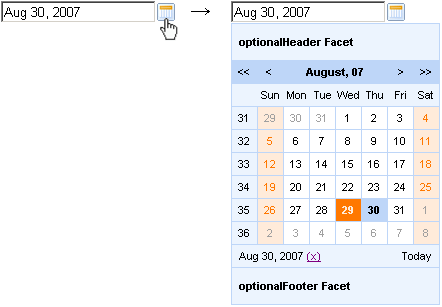
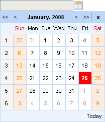
The "popup" attribute defines calendar representation mode on a page. If it's "true" the calendar is represented on a page as an input field and a button. Clicking on the button calls the calendar popup as it's shown on the picture below. For popup rendering a "lazy" loading is implemented: after the request is completed a client side script method builds the popup. Such improvement speeds up page loading time.
Usage "currentDate" attribute isn't available in the popup mode.
With help of the "currentDate" attribute you can define month and year which will be displayed currently.
The "value" attribute stores selected date currently.
The difference between the value and currentDate attributes
The "todayControlMode" attribute defines the mode for "today" control. Possible values are:
"hidden" - in this mode "Today" button will not be displayed
"select" - (default) in this state "Today" button activation will scroll the calendar to the current date and it become selected date
"scroll" - in this mode "Today" activation will simply scroll the calendar to current month without changing selected day.
With the help of the "readonly" attribute you can make date, time and input field unavailable, but you can look through the next/previous month or the next/previous year.
In order to disable the component, use the "disabled" attribute. With its help both controls are disabled in the "popup" mode.
The
<rich:calendar>
component can render pages of days in two modes. A mode
could be defined with the
"mode"
attribute with two possible parameters:
"ajax" and
"client". Default value is
"client".
Ajax
Calendar requests portions of data from Data Model for a page rendering.
If
"dataModel"
attribute has "null" value, data
requests are not sent. In this case the
"ajax" mode is equal to the
"client".
Client
Calendar loads an initial portion of data in a specified range and use this data to render months. Additional data requests are not sent.
"preloadDateRangeBegin"
and
"preloadDateRangeEnd"
attributes were designed only for the
"client" mode to
load some data initially.
"ondateselect" attribute is used to define an event that is triggered before date selection.
The "ondateselected" attribute is used to define an event that is triggered after date selection.
For example, to fire some event after date selection you should use <a4j:support> . And it should be bound to "ondateselected" event as it's shown in the example below:
...

<rich:calendar id="date" value="#{bean.dateTest}">

          <a4j:support event="ondateselected" reRender="mainTable"/>

</rich:calendar>

...
When a timePicker was fulfilled, the "ondateselected" attribute does not allow you to submit a selected date. It happens because this event rose when the date is selected but the input hasn't been updated with new value yet.
"ondateselect" could be used for possibility of date selection canceling. See an example below:
...

<rich:calendar id="date" value="#{bean.dateTest}" ondateselect="if (!confirm('Are you sure to change date?')){return false;}"/>

...
"oncurrentdateselected" event is fired when the "next/previous month" or "next/previous year" button is pressed, and the value is applied.
"oncurrentdateselect" event is fired when the "next/previous month" or "next/previous year" button is pressed, but the value is not applied yet (you can change the logic of applying the value). Also this event could be used for possibility of "next/previous month" or "next/previous year" selection canceling. See an example below:
Example:
...

<rich:calendar id="date" value="#{bean.dateTest}" oncurrentdateselect="if (!confirm('Are you sure to change month(year)?')){return false;}"

          oncurrentdateselected="alert('month(year) select:'+event.rich.date.toString());"/>

...
How to use these attributes see also on the RichFaces Users Forum.
Information about the "process" attribute usage you can find in the corresponding section .
There are three button-related attributes:
"buttonLabel" defines a label for the button. If the attribute is set "buttonIcon" and "buttonIconDisabled" are ignored
"buttonIcon" defines an icon for the button
"buttonIconDisabled" defines an icon for the disabled state of the button
The "direction" and "jointPoint" attributes are used for defining aspects of calendar appearance.
The possible values for the "direction" are:
"top-left" - a calendar drops to the top and left
"top-right" - a calendar drops to the top and right
"bottom-left" - a calendar drops to the bottom and left
"bottom-right" - a calendar drops to the bottom and right
"auto" - smart positioning activation
By default, the "direction" attribute is set to "bottom-right".
The possible values for the "jointPoint" are:
"top-left" - a calendar docked to the top-left point of the button element
"top-right" - a calendar docked to the top-right point of the button element
"bottom-left" - a calendar docked to the bottom-left point of the button element
"bottom-right" - a calendar docked to the bottom-right point of the button element
"auto" - smart positioning activation
By default, the "jointPoint" attribute is set to "bottom-left".
The
"label"
attribute is a generic attribute. The
"label"
attribute provides an association between a component, and
the message that the component (indirectly) produced. This attribute
defines the parameters of localized error and informational messages
that occur as a result of conversion, validation, or other application
actions during the request processing lifecycle. With the help of this
attribute you can replace the last parameter substitution token shown
in the messages. For example, {1} for
"DoubleRangeValidator.MAXIMUM",
{2} for "ShortConverter.SHORT".
The "defaultTime" attribute to set the default time value for the current date in two cases:
If time is not set
If another date is selected and the value of the "resetTimeOnDateSelect" attribute is set to "true"
The
"enableManualInput"
attribute enables/disables input field, so when
enableManualInput = "false" , user
can only pick the date manually and has no possibility to type in the
date (default value is "false").
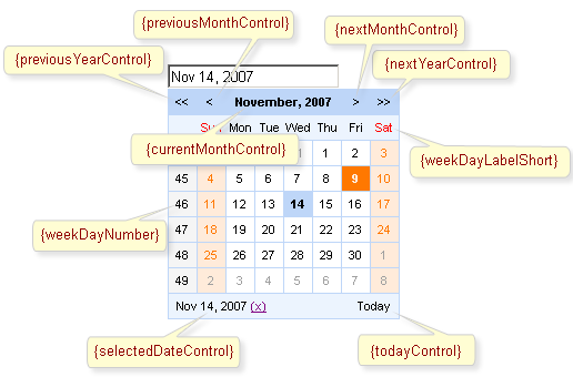
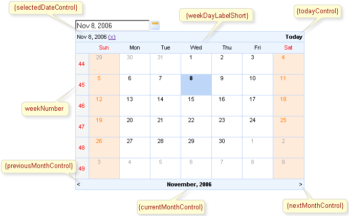
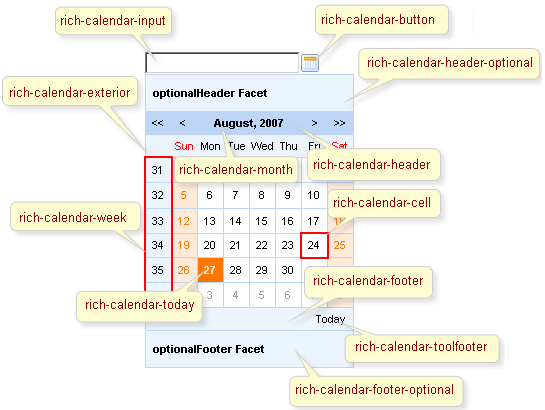
The
<rich:calendar>
component allows to use
"header"
,
"footer"
,
"optionalHeader"
,
"optionalFooter"
facets. The following elements are available in these
facets: {currentMonthControl},
{nextMonthControl}, {nextYearControl},
{previousYearControl},
{previousMonthControl},
{todayControl}, {selectedDateControl}. These
elements could be used for labels output.
Also you can use
"weekNumber"
facet with available {weekNumber},
{elementId} elements and
"weekDay"
facet with {weekDayLabel},
{weekDayLabelShort},
{weekDayNumber}, {isWeekend},
{elementId} elements.
{weekNumber}, {weekDayLabel},
{weekDayLabelShort},
{weekDayNumber} elements could be used for labels output,
{isWeekend}, {elementId} - for
additional processing in JavaScript code.
These elements are shown on the picture below.
Simple example of usage is placed below.
Example:
...

<!-- Styles for cells -->

<style>

    .width100{

        width:100%;

    }

    .talign{

        text-align:center;

    }

</style>

...
...

<rich:calendar id="myCalendar" popup="true" locale="#{calendarBean.locale}" value="#{bean.date}"

                            preloadRangeBegin="#{bean.date}" preloadRangeEnd="#{bean.date}" cellWidth="40px" cellHeight="40px">


    <!-- Customization with usage of facets and accessible elements -->

    <f:facet name="header">

        <h:panelGrid columns="2" width="100%" columnClasses="width100, fake">

            <h:outputText value="{selectedDateControl}" />

            <h:outputText value="{todayControl}"  style="font-weight:bold; text-align:left"/>

        </h:panelGrid>

    </f:facet>

    <f:facet name="weekDay">

        <h:panelGroup style="width:60px; overflow:hidden;" layout="block">

            <h:outputText value="{weekDayLabelShort}"/>

        </h:panelGroup>

    </f:facet>

    <f:facet name="weekNumber">

         <h:panelGroup>

            <h:outputText value="{weekNumber}" style="color:red"/>

        </h:panelGroup>

     </f:facet>

     <f:facet name="footer">

        <h:panelGrid columns="3" width="100%" columnClasses="fake, width100 talign">

            <h:outputText value="{previousMonthControl}" style="font-weight:bold;"/>

            <h:outputText value="{currentMonthControl}" style="font-weight:bold;"/>

            <h:outputText value="{nextMonthControl}" style="font-weight:bold;"/>

        </h:panelGrid>

    </f:facet>

    <h:outputText value="{day}"></h:outputText>

</rich:calendar>

...
This is a result:
As it's shown on the picture above
{selectedDateControl}, {todayControl}
elements are placed in the
"header"
facet, {previousMonthControl},
{currentMonthControl},
{nextMonthControl} - in the
"footer"
facet, {weekDayLabelShort} - in the
"weekDay"
facet, {nextYearControl},
{previousYearControl} are absent. Numbers of
weeks are red colored.
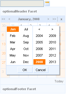
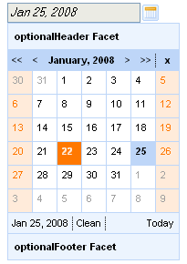
It is possible to show and manage date. Except scrolling controls you can use quick month and year selection feature. It's necessary to click on its field, i.e. current month control, and choose required month and year.
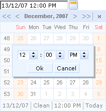
Also the
<rich:calendar>
component allows to show and manage time. It's
necessary to define time in a pattern (for example, it could be
defined as "d/M/yy HH:mm"). Then after
you choose some data in the calendar, it becomes possible to manage
time for this date. For time editing it's necessary to click
on its field (see a picture below). To clean the field click on the
"Clean".
It's possible to handle events for calendar from JavaScript code. A simplest example of usage JavaScript API is placed below:
Example:
...

<rich:calendar value="#{calendarBean.selectedDate}" id="calendarID"

                        locale="#{calendarBean.locale}"

                        popup="#{calendarBean.popup}"

                        datePattern="#{calendarBean.pattern}"

                        showApplyButton="#{calendarBean.showApply}" style="width:200px"/>

<a4j:commandLink onclick="$('formID:calendarID').component.doExpand(event)" value="Expand"/>

...
Also the discussion about this problem can be found on the RichFaces Users Forum.
The <rich:calendar> component provides the possibility to use a special Data Model to define data for element rendering. Data Model includes two major interfaces:
CalendarDataModel provides the following function:
CalendarDataModelItem[]
                                        getData(Date[])
;
This method is called when it's necessary to represent the next
block of CalendarDataModelItem. It happens during navigation
to the next (previous) month or in any other case when calendar
renders. This method is called in
"Ajax"
mode when the calendar renders a new page.
CalendarDataModelItem provides the following function:
Date getDate() - returns date from the
item. Default implementation returns date.
Boolean isEnabled() - returns
"true" if date is
"selectable"
on the calendar. Default
implementation returns
"true".
String getStyleClass() - returns string
appended to the style class for the date span. For
example it could be "relevant
holyday". It means that the class could
be defined like the
"rich-cal-day-relevant-holyday"
one. Default implementation returns empty
string.
Object getData() - returns any additional
payload that must be JSON-serializable object. It
could be used in the custom date representation on
the calendar (inside the custom facet).
The
<rich:calendar>
component provides the possibility to use
internationalization method to redefine and localize the labels. You
could use application resource bundle and define
RICH_CALENDAR_APPLY_LABEL,
RICH_CALENDAR_TODAY_LABEL,
RICH_CALENDAR_CLOSE_LABEL,
RICH_CALENDAR_OK_LABEL,
RICH_CALENDAR_CLEAN_LABEL,
RICH_CALENDAR_CANCEL_LABEL there.
You could also pack org.richfaces.renderkit.calendar
resource bundle with your JARs defining the same
properties.
Only for Internet Explorer 6 and later. To make <rich:calendar> inside <rich:modalPanel> rendered properly, enable the standards-compliant mode. Explore !DOCTYPE reference at MSDN to find out how to do this.
Table 6.319. JavaScript API
| Function | Description |
|---|---|
| selectDate(date) | Selects the date specified. If the date isn't in current month - performs request to select |
| isDateEnabled(date) | Checks if given date is selectable (to be implemented) |
| enableDate(date) | Enables date cell control on the calendar (to be implemented) |
| disableDate(date) | Disables date cell control on the calendar (to be implemented) |
| enableDates(date[]) | Enables dates cell controls set on the calendar (to be implemented) |
| disableDates(date[]) | Disables dates cell controls set on the calendar (to be implemented) |
| nextMonth() | Navigates to next month |
| nextYear() | Navigates to next year |
| prevMonth() | Navigates to previous month |
| prevYear() | Navigates to previous year |
| today() | Selects today date |
| getSelectedDate() | Returns currently selected date |
| Object getData() | Returns additional data for the date |
| getCurrentMonth() | Returns number of the month currently being viewed |
| getCurrentYear() | Returns number of the year currently being viewed |
| doCollapse() | Collapses calendar element |
| doExpand() | Expands calendar element |
| resetSelectedDate() | Clears a selected day value |
| doSwitch() | Inverts a state for the popup calendar |
Table 6.320. Facets
| Facet | Description |
|---|---|
| header | Redefines calendar header. Related attribute is "showHeader" |
| footer | Redefines calendar footer. Related attribute is "showFooter" |
| optionalHeader | Defines calendar's optional header |
| optionalFooter | Defines calendar's optional footer |
| weekNumber | Redefines week number |
| weekDay | Redefines names of the week days. Related attributes are "weekDayLabels" and "weekDayLabelsShort" |
For skinnability implementation, the components use a style class redefinition method. Default style classes are mapped on skin parameters.
There are two ways to redefine the appearance of all <rich:calendar> components at once:
Redefine the corresponding skin parameters
Add to your style sheets style classes used by a <rich:calendar> component
Table 6.321. Skin parameters redefinition for a popup element
| Skin parameters | CSS properties |
|---|---|
| panelBorderColor | border-color |
Table 6.322. Skin parameters redefinition for headers (header, optional header)
| Skin parameters | CSS properties |
|---|---|
| panelBorderColor | border-bottom-color |
| additionalBackgroundColor | background-color |
| generalSizeFont | font-size |
| generalFamilyFont | font-family |
Table 6.323. Skin parameters redefinition for footers (footer, optional footer) and names of working days
| Skin parameters | CSS properties |
|---|---|
| panelBorderColor | border-top-color |
| panelBorderColor | border-right-color |
| additionalBackgroundColor | background |
| generalSizeFont | font-size |
| generalFamilyFont | font-family |
Table 6.324. Skin parameters redefinition for weeks numbers
| Skin parameters | CSS properties |
|---|---|
| panelBorderColor | border-bottom-color |
| panelBorderColor | border-right-color |
| additionalBackgroundColor | background |
| calendarWeekBackgroundColor | background-color |
| generalSizeFont | font-size |
| generalFamilyFont | font-family |
Table 6.325. Skin parameters redefinition for a toolBar and names of months
| Skin parameters | CSS properties |
|---|---|
| headerBackgroundColor | background-color |
| headerSizeFont | font-size |
| headerFamilyFont | font-family |
| headerWeightFont | font-weight |
| headerTextColor | color |
Table 6.326. Skin parameters redefinition for cells with days
| Skin parameters | CSS properties |
|---|---|
| panelBorderColor | border-bottom-color |
| panelBorderColor | border-right-color |
| generalBackgroundColor | background-color |
| generalSizeFont | font-size |
| generalFamilyFont | font-family |
Table 6.327. Skin parameters redefinition for holiday
| Skin parameters | CSS properties |
|---|---|
| calendarHolidaysBackgroundColor | background-color |
| calendarHolidaysTextColor | color |
Table 6.328. Skin parameters redefinition for cell with a current date
| Skin parameters | CSS properties |
|---|---|
| calendarCurrentBackgroundColor | background-color |
| calendarCurrentTextColor | color |
Table 6.329. Skin parameters redefinition for a selected day
| Skin parameters | CSS properties |
|---|---|
| headerBackgroundColor | background-color |
| headerTextColor | color |
| headerWeightFont | font-weight |
Table 6.330. Skin parameters redefinition for a popup element during quick month and year selection
| Skin parameters | CSS properties |
|---|---|
| tableBackgroundColor | background |
| panelBorderColor | border-color |
Table 6.331. Skin parameters redefinition for a shadow
| Skin parameters | CSS properties |
|---|---|
| shadowBackgroundColor | background-color |
Table 6.332. Skin parameters redefinition for a selected month and year
| Skin parameters | CSS properties |
|---|---|
| calendarCurrentBackgroundColor | background-color |
| calendarCurrentTextColor | color |
Table 6.333. Skin parameters redefinition for a hovered month and year
| Skin parameters | CSS properties |
|---|---|
| panelBorderColor | border-color |
| calendarSpecBackgroundColor | background |
Table 6.334. Skin parameters redefinition for a month items near split line
| Skin parameters | CSS properties |
|---|---|
| panelBorderColor | border-right-color |
Table 6.335. Skin parameters redefinition for a hovered toolbar items
| Skin parameters | CSS properties |
|---|---|
| calendarWeekBackgroundColor | background-color |
| generalTextColor | color |
| tableBackgroundColor | border-color |
| panelBorderColor | border-right-color |
| panelBorderColor | border-bottom-color |
Table 6.336. Skin parameters redefinition for a pressed toolbar items
| Skin parameters | CSS properties |
|---|---|
| panelBorderColor | border-color |
| tableBackgroundColor | border-right-color |
| tableBackgroundColor | border-bottom-color |
Table 6.337. Skin parameters redefinition for "ok" and "cancel" buttons
| Skin parameters | CSS properties |
|---|---|
| additionalBackgroundColor | background |
| panelBorderColor | border-top-color |
Table 6.338. Skin parameters redefinition for a popup element during time selection
| Skin parameters | CSS properties |
|---|---|
| additionalBackgroundColor | background |
| panelBorderColor | border-color |
Table 6.339. Skin parameters redefinition for a wrapper <td> element for an input field
| Skin parameters | CSS properties |
|---|---|
| controlBackgroundColor | background-color |
| panelBorderColor | border-color |
| subBorderColor | border-bottom-color |
| subBorderColor | border-right-color |
Table 6.340. Skin parameters redefinition for an input field
| Skin parameters | CSS properties |
|---|---|
| buttonSizeFont | font-size |
| buttonFamilyFont | font-family |
Table 6.341. Skin parameters redefinition for a wrapper <td> element for spinner buttons
| Skin parameters | CSS properties |
|---|---|
| headerBackgroundColor | background-color |
| headerBackgroundColor | border-color |
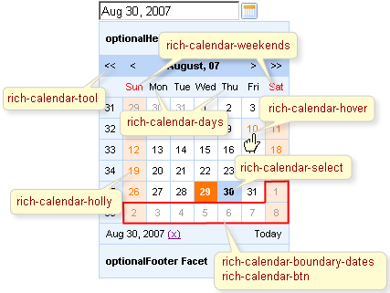
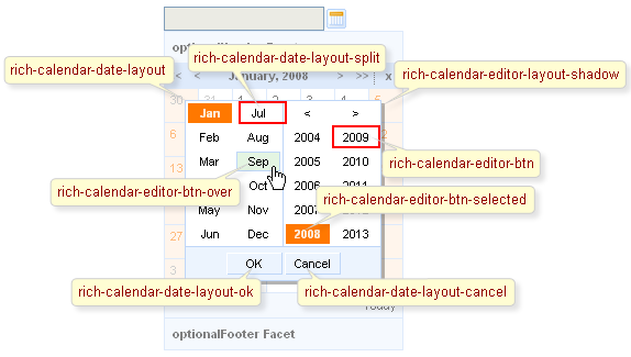
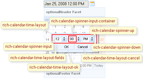
On the screenshot there are classes names that define styles for component elements.
Table 6.342. Classes names that define an input field and a button appearance
| Class name | Description |
|---|---|
| rich-calendar-input | Defines styles for an input field |
| rich-calendar-button | Defines styles for a popup button |
Table 6.343. Classes names that define a days appearance
| Class name | Description |
|---|---|
| rich-calendar-days | Defines styles for names of working days in a header |
| rich-calendar-weekends | Defines styles for names of weekend in a header |
| rich-calendar-week | Defines styles for weeks numbers |
| rich-calendar-today | Defines styles for cell with a current date |
| rich-calendar-cell | Defines styles for cells with days |
| rich-calendar-holly | Defines styles for holiday |
| rich-calendar-select | Defines styles for a selected day |
| rich-calendar-hover | Defines styles for a hovered day |
Table 6.344. Classes names that define a popup element
| Class name | Description |
|---|---|
| rich-calendar-popup | Defines styles for a popup element |
| rich-calendar-exterior | Defines styles for a popup element exterior |
| rich-calendar-tool | Defines styles for toolbars |
| rich-calendar-month | Defines styles for names of months |
| rich-calendar-header-optional | Defines styles for an optional header |
| rich-calendar-footer-optional | Defines styles for an optional footer |
| rich-calendar-header | Defines styles for a header |
| rich-calendar-footer | Defines styles for a footer |
| rich-calendar-boundary-dates | Defines styles for an active boundary button |
| rich-calendar-btn | Defines styles for an inactive boundary date |
| rich-calendar-toolfooter | Defines styles for a today control date |
Table 6.345. Classes names that define a popup element during quick month and year selection
| Class name | Description |
|---|---|
| rich-calendar-date-layout | Defines styles for a popup element during quick year selection |
| rich-calendar-editor-layout-shadow | Defines styles for a shadow |
| rich-calendar-editor-btn | Defines styles for an inactive boundary date |
| rich-calendar-date-layout-split | Defines styles for a wrapper <td> element for month items near split line |
| rich-calendar-editor-btn-selected | Defines styles for an selected boundary date |
| rich-calendar-editor-btn-over | Defines styles for a boundary date when pointer was moved onto |
| rich-calendar-editor-tool-over | Defines styles for a hovered toolbar items |
| rich-calendar-editor-tool-press | Defines styles for a pressed toolbar items |
| rich-calendar-date-layout-ok | Defines styles for a "ok" button |
| rich-calendar-date-layout-cancel | Defines styles for a "cancel" button |
Table 6.346. Classes names that define a popup element during time selection
| Class name | Description |
|---|---|
| rich-calendar-time-layout | Defines styles for a popup element during time selection |
| rich-calendar-editor-layout-shadow | Defines styles for a shadow |
| rich-calendar-time-layout-fields | Defines styles for a wrapper <td> element for input fields and buttons |
| rich-calendar-spinner-input-container | Defines styles for a wrapper <td> element for an input field |
| rich-calendar-spinner-input | Defines styles for an input field |
| rich-calendar-spinner-buttons | Defines styles for a wrapper <td> element for spinner buttons |
| rich-calendar-spinner-up | Defines styles for a "up" button |
| rich-calendar-spinner-down | Defines styles for a "down" button |
| rich-calendar-time-layout-ok | Defines styles for a "ok" button |
| rich-calendar-time-layout-cancel | Defines styles for a "cancel" button |
In order to redefine styles for all <rich:calendar> components on a page using CSS, it's enough to create classes with the same names (possible classes could be found in the tables above) and define necessary properties in them.
Example:
...

.rich-calendar-today {

    background-color: #FF0000;

}

...
This is a result:
In the example an active cell background color was changed.
Also it's possible to change styles of particular <rich:calendar> component. In this case you should create own style classes and use them in corresponding <rich:calendar> styleClass attributes. An example is placed below:
Example:
...

.myFontClass{

    font-style: italic;

}

...
The "inputClass" attribute for <rich:calendar> is defined as it's shown in the example below:
Example:
<rich:calendar ... inputClass="myFontClass"/>
This is a result:
As it could be seen on the picture above, the font style for output text was changed.
On the component LiveDemo page you can see the example of <rich:calendar> usage and sources for the given example.
How to use JavaScript API see on the RichFaces Users Forum.