Create new RichFaces Documentation Jira issue

This will launch the RichFaces Jira page - to complete your feedback please login if needed, and submit the Jira.
JBoss.orgCommunity Documentation
The <rich:colorPicker> component lets you visually choose a color or define it in hex, RGB, or HSB input fields.
Possibility to get color in hex, or RGB color models
Flat/inline representation
Highly customizable look and feel
Table 6.347. rich : colorPicker attributes
| Attribute Name |
Description

|
|---|---|
| binding | JSF: The attribute takes a value-binding expression for a component property of a backing bean |
| colorMode | Defines a color mode for the component input. Possible values are hex, rgb. |
| converter | JSF: Id of Converter to be used or reference to a Converter |
| converterMessage | A ValueExpression enabled attribute that, if present, will be used as the text of the converter message, replacing any message that comes from the converter |
| flat | Defines whether the component will be rendered flat. |
| id | JSF: Every component may have a unique id that is automatically created if omitted |
| immediate | A flag indicating that this component value must be converted and validated immediately (that is, during Apply Request Values phase), rather than waiting until a Process Validations phase |
| inputSize | inputSize - way to set the size of the edit box |
| onbeforeshow | The client-side script method to be called before the component widget is opened |
| onchange | DHTML: The client-side script method to be called when the element value is changed |
| onclick | DHTML: The client-side script method to be called when the element is clicked |
| ondblclick | DHTML: The client-side script method to be called when the element is double-clicked |
| onhide | The client-side script method to be called before the component widget is hidden |
| onkeydown | DHTML: The client-side script method to be called when a key is pressed down over the element |
| onkeypress | DHTML: The client-side script method to be called when a key is pressed over the element and released |
| onkeyup | DHTML: The client-side script method to be called when a key is released |
| onmousedown | DHTML: The client-side script method to be called when a mouse button is pressed down over the element |
| onmousemove | DHTML: The client-side script method to be called when a pointer is moved within the element |
| onmouseout | DHTML: The client-side script method to be called when a pointer is moved away from the element |
| onmouseover | DHTML: The client-side script method to be called when a pointer is moved onto the element |
| onmouseup | DHTML: The client-side script method to be called when a mouse button is released |
| onselect | The client-side script method to be called when the color is selected |
| onshow | The client-side script method to be called when the component widget is displayed |
| rendered | JSF: If "false", this component is not rendered |
| required | JSF: If "true", this component is checked for non-empty input |
| requiredMessage | A ValueExpression enabled attribute which defines text of validation message to show, if a required field is missing |
| showEvent | Defines the event that triggers the colorPicker. Default value is "onclick". |
| validator | JSF: MethodBinding pointing at a method that is called during Process Validations phase of the request processing lifecycle, to validate the current value of this component |
| validatorMessage | A ValueExpression enabled attribute that, if present, will be used as the text of the validator message, replacing any message that comes from the validator |
| value | JSF: The current value of this component |
| valueChangeListener | JSF: Listener for value changes |
Table 6.348. Component identification parameters
| Name | Value |
|---|---|
| component-type | org.richfaces.ColorPicker |
| component-class | org.richfaces.component.html.HtmlColorPicker |
| component-family | org.richfaces.ColorPicker |
| renderer-type | org.richfaces.ColorPickerRenderer |
| tag-class | org.richfaces.taglib.ColorPickerTag |
Here is a simple example of how the component can be used on a page:
Example:
...

<rich:colorPicker value="#{bean.color}" />

...
Example:
import org.richfaces.component.html.colorPicker;

...

HtmlColorPicker myColorPicker = new ColorPicker();

...
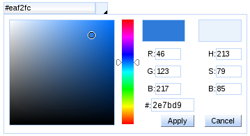
The <rich:colorPicker> component allows you easily select a color or define it in hex, RGB, or HSB input fields. There are two squares in the widget that help you to compare the currently selected color and the already selected color.
The "value" attribute stores the selected color.
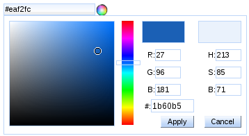
The value of the <rich:colorPicker> component could be saved in hex or RGB color models. You can explicitly define a color model in the "colorMode" attribute.
Example:
...

<rich:colorPicker value="#{bean.color}" colorMode="rgb" />

...
This is the result:
The <rich:colorPicker> component has two representation states: flat and inline. With the help of the "flat" attribute you can define whether the component is rendered flat.
Example:
...

<rich:colorPicker value="#{bean.color}" flat="true" />

...
The component specific event handler "onbeforeshow" captures the event which occurs before the <rich:colorPicker> widget is opened. The "onbeforeshow" attribute could be used in order to cancel this event. See the example below:
...

<rich:colorPicker value="#{bean.color}" onbeforeshow="if (!confirm('Are you sure you want to change a color?')){return false;}" />

...
The "showEvent" attribute defines the event that shows <rich:colorPicker> widget. The default value is "onclick".
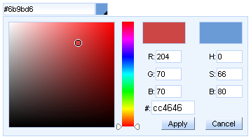
The <rich:colorPicker> component allows to use the "icon" facet.
You can also customize
<rich:colorPicker>
rainbow slider (  ) with the help of the
"arrows"
facet.
) with the help of the
"arrows"
facet.
...

<rich:colorPicker value="#{bean.color}">

    <f:facet name="icon">

        <h:graphicImage value="/pages/colorPicker_ico.png" />

    </f:facet>

    <f:facet name="arrows">

        <f:verbatim>

            <div style="width: 33px; height: 5px; border: 1px solid #bed6f8; background:none;" />

        </f:verbatim>

    </f:facet>

</rich:colorPicker>

...
This is the result:
For skinnability implementation, the components use a style class redefinition method. Default style classes are mapped on skin parameters.
There are two ways to redefine the appearance of all <rich:colorPicker> components at once:
Redefine the corresponding skin parameters
Add style classes used by a <rich:colorPicker> component to your style sheets
Table 6.349. Skin parameters redefinition for the input field that contains selected color
| Skin parameters | CSS properties |
|---|---|
| panelBorderColor | border-color |
| generalSizeFont | font-size |
| generalFamilyFont | font-family |
Table 6.350. Skin parameters redefinition for the wrapper <div> element of a widget
| Skin parameters | CSS properties |
|---|---|
| panelBorderColor | border-color |
| generalBackgroundColor | background-color |
| generalFamilyFont | font-family |
Table 6.351. Skin parameters redefinition for the icon, color palette, current color, and new color
| Skin parameters | CSS properties |
|---|---|
| panelBorderColor | border-color |
Table 6.352. Skin parameters redefinition for the hex, RGB, and HSB input fileds
| Skin parameters | CSS properties |
|---|---|
| generalSizeFont | font-size |
| generalFamilyFont | font-family |
| generalTextColor | color |
| panelBorderColor | border-color |
| controlBackgroundColor | background-color |
Table 6.353. Skin parameters redefinition for the "Apply" and "Cancel" button
| Skin parameters | CSS properties |
|---|---|
| buttonFontSize | font-size |
| buttonFamilyFont | font-family |
| headerTextColor | color |
| headerBackgroundColor | border-color |
| panelBorderColor | border-color |
| generalSizeFont | font-size |
| generalFamilyFont | font-family |
| headerBackgroundColor | background-color |
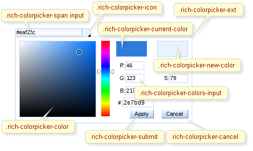
On the screenshot there are classes names that define styles for component elements.
Table 6.354. Classes names for the representation of the input field and icon containing selected color
| Selector name | Description |
|---|---|
| .rich-colorpicker-span input | Defines styles for the input field that contains selected color |
| .rich-colorpicker-icon | Defines styles for the icon |
Table 6.355. Classes names for the widget
| Class name | Description |
|---|---|
| .rich-colorpicker-ext | Defines styles for the wrapper <div> element of a widget |
| .rich-colorpicker-color | Defines styles for the color palette |
| .rich-colorpicker-current-color | Defines styles for the currently selected color |
| .rich-colorpicker-new-color | Defines styles for the already selected color |
| .rich-colorpicker-colors-input | Defines styles for the hex, RGB, and HSB input fileds |
Table 6.356. Classes names for the buttons representation
| Class name | Description |
|---|---|
| .rich-colorpicker-submit | Defines styles for the "Apply" button |
| .rich-colorpicker-cancel | Defines styles for the "Cancel" button |
In order to redefine styles for all <rich:colorPicker> components on a page using CSS, it's enough to create classes with the same names (possible classes could be found in the tables above) and define necessary properties in them.
Example:
...

.rich-colorPicker-ext{

    background-color: #ecf4fe;

}

...
This is the result:
In the shown example the background color for the widget is changed.
On the component LiveDemo page you can see the example of <rich:colorPicker> component usage and sources for the given example.