Create new RichFaces Documentation Jira issue

This will launch the RichFaces Jira page - to complete your feedback please login if needed, and submit the Jira.
JBoss.orgCommunity Documentation
The component combines columns in one row to organize complex subparts of a table.
Completely skinned table columns and child elements
Possibility to combine columns and rows inside
Possibility to update a limited set of strings with Ajax
Table 6.59. rich : columnGroup attributes
| Attribute Name |
Description

|
|---|---|
| binding | JSF: The attribute takes a value-binding expression for a component property of a backing bean |
| columnClasses | JSF: Assigns one or more space-separated CSS class names to the columns of the table. If the CSS class names are comma-separated, each class will be assigned to a particular column in the order they follow in the attribute. If you have less class names than columns, the class will be applied to every n-fold column where n is the order in which the class is listed in the attribute. If there are more class names than columns, the overflow ones are ignored. |
| dir | HTML: Direction indication for text that does not inherit directionality. Valid values are "LTR" (left-to-right) and "RTL" (right-to-left) |
| id | JSF: Every component may have a unique id that is automatically created if omitted |
| lang | HTML: Code describing the language used in the generated markup for this component |
| rendered | JSF: If "false", this component is not rendered |
| rowClasses | JSF: Assigns one or more space-separated CSS class names to the rows of the table. If the CSS class names are comma-separated, each class will be assigned to a particular row in the order they follow in the attribute. If you have less class names than rows, the class will be applied to every n-fold row where n is the order in which the class is listed in the attribute. If there are more class names than rows, the overflow ones are ignored. |
| style | HTML: CSS style rules to be applied to the component |
| styleClass | JSF: Assigns one or more CSS class names to the component. Corresponds to the HTML "class" attribute. |
| title | HTML: Advisory title information about markup elements generated for this component |
Table 6.60. Component identification parameters
| Name | Value |
|---|---|
| component-type | org.richfaces.ColumnGroup |
| component-class | org.richfaces.component.html.HtmlColumnGroup |
| component-family | org.richfaces.ColumnGroup |
| renderer-type | org.richfaces.ColumnGroupRenderer |
| tag-class | org.richfaces.taglib.ColumnGroupTag |
To create the simplest variant of columnGroup on a page, use the following syntax:
Example:
...

<rich:columnGroup>

        <rich:column>

                <h:outputText value="Column1"/>

        </rich:column>

        <rich:column>

                <h:outputText value="Column2"/>

        </rich:column>

</rich:columnGroup>

...
Example:
import org.richfaces.component.html.HtmlColumnGroup;

...

HtmlColumnGroup myRow = new HtmlColumnGroup();

...
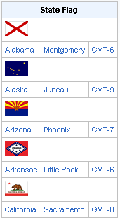
The <rich:columnGroup> component combines columns set wrapping them into the <tr> element and outputting them into one row. Columns are combined in a group the same way as when the "breakBefore" attribute is used for columns to add a moving to the next rows, but the first variant is clearer from a source code. Hence, the following simple examples are very same.
Example:
...

<rich:dataTable value="#{capitalsBean.capitals}" var="cap" rows="5" id="sublist">

        <rich:column colspan="3">

                <f:facet name="header">State Flag</f:facet>

                <h:graphicImage value="#{cap.stateFlag}"/>

        </rich:column>

       <rich:columnGroup>

                <rich:column>

                    <h:outputText value="#{cap.state}"/>

                </rich:column>

               <rich:column >

                    <h:outputText value="#{cap.name}"/>

               </rich:column>

               <rich:column >

                    <h:outputText value="#{cap.timeZone}"/>

               </rich:column>

        </rich:columnGroup>

</rich:dataTable>

...
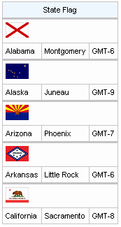
And representation without a grouping:
Example:
...

<rich:dataTable value="#{capitalsBean.capitals}" var="cap" rows="5" id="sublist">

        <rich:column colspan="3">

                <f:facet name="header">State Flag</f:facet>

                <h:graphicImage value="#{cap.stateFlag}"/>

        </rich:column>

        <rich:column breakBefore="true">

                <h:outputText value="#{cap.state}"/>

        </rich:column>

        <rich:column breakBefore="true">

                <h:outputText value="#{cap.name}"/>

        </rich:column>

        <rich:column >

                <h:outputText value="#{cap.timeZone}"/>

        </rich:column>

</rich:dataTable>

....
The result is:
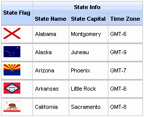
It's also possible to use the component for output of complex headers in a table. For example adding of a complex header to a facet for the whole table looks the following way:
Example:
...

<f:facet name="header">

        <rich:columnGroup>

                <rich:column rowspan="2">

                    <h:outputText value="State Flag"/>

                </rich:column>

                <rich:column colspan="3">

                        <h:outputText value="State Info"/>

                </rich:column>

                <rich:column breakBefore="true">

                        <h:outputText value="State Name"/>

                </rich:column>

                <rich:column>

                        <h:outputText value="State Capital"/>

                </rich:column>

                <rich:column>

                        <h:outputText value="Time Zone"/>

                </rich:column>

        </rich:columnGroup>

</f:facet>

...
Generated on a page as:
For skinnability implementation, the components use a style class redefinition method. Default style classes are mapped on skin parameters.
There are two ways to redefine the appearance of all <rich:columnGroup> components at once:
Redefine the corresponding skin parameters
Add to your style sheets style classes used by a <rich:columnGroup> component
Skin parameters redefinition for <rich:columnGroup> are the same as for the <rich:dataTable> component.
Custom style classes for <rich:columnGroup> are the same as for the <rich:dataTable> component.
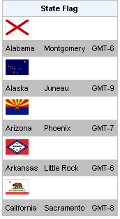
In order to redefine styles for all <rich:columnGroup> components on a page using CSS, it's enough to create classes with the same names (possible classes could be found in the tables above) and define necessary properties in them.
Example:
...

.rich-table-cell{

        color:  #316ac5;

}

...
This is a result:
In the example cells color was changed.
Also it's possible to change styles of particular <rich:columnGroup> component. In this case you should create own style classes and use them in corresponding <rich:columnGroup> styleClass attributes. An example is placed below:
Example:
...

.myClass{

        background-color: #c0c0c0;

}

...
The "columnClasses" attribute for <rich:columnGroup> is defined as it's shown in the example below:
Example:
<rich:columnGroup columnClasses="myClass">
This is a result:
As it could be seen on the picture above, the background color for columns was changed.
On the component LiveDemo page you can see the example of <rich:columnGroup> usage and sources for the given example.