Create new RichFaces Documentation Jira issue

This will launch the RichFaces Jira page - to complete your feedback please login if needed, and submit the Jira.
JBoss.orgCommunity Documentation
The component for tables rendering that allows choosing data from a model and obtains built-in support of Ajax updates.
A completely skinned table and child elements
Possibility to insert the complex subcomponents "colGroup" and "subTable"
Possibility to update a limited set of strings with Ajax
Possibility to sort and to filter of columns
Table 6.88. rich : dataTable attributes
| Attribute Name |
Description

|
|---|---|
| ajaxKeys | This attribute defines row keys that are updated after an AJAX request |
| align | Deprecated. This attribute specifies the position of the table with respect to the document. The possible values are "left", "center" and "right". The default value is "left". |
| bgcolor | Deprecated. This attribute sets the background color for the document body or table cells. This attribute sets the background color of the canvas for the document body (the BODY element) or for tables (the TABLE, TR, TH, and TD elements). Additional attributes for specifying text color can be used with the BODY element. This attribute has been deprecated in favor of style sheets for specifying background color information |
| binding | JSF: The attribute takes a value-binding expression for a component property of a backing bean |
| border | HTML: This attributes specifies the width of the frame around a component. Default value is "0". |
| captionClass | Assigns one or more space-separated CSS class names to the component caption |
| captionStyle | CSS style rules to be applied to the component caption |
| cellpadding | This attribute specifies the amount of space between the border of the cell and its contents. Default value is "0". |
| cellspacing | This attribute specifies the amount of space between the border of the cell and its contents. The attribute also specifies the amount of space to leave between cells. Default value is "0". |
| columnClasses | JSF: Assigns one or more space-separated CSS class names to the columns of the table. If the CSS class names are comma-separated, each class will be assigned to a particular column in the order they follow in the attribute. If you have less class names than columns, the class will be applied to every n-fold column where n is the order in which the class is listed in the attribute. If there are more class names than columns, the overflow ones are ignored. |
| columns | Specifies the number of columns |
| columnsWidth | Comma-separated list of width attribute for every column. Specifies a default width for each column in the table. In addition to the standard pixel, percentage, and relative values, this attribute allows the special form "0*" (zero asterisk) which means that the width of the each column in the group should be the minimum width necessary to hold the column's contents. This implies that a column's entire contents must be known before its width may be correctly computed. Authors should be aware that specifying "0*" will prevent visual user agents from rendering a table incrementally |
| componentState | It defines EL-binding for a component state for saving or redefinition |
| dir | HTML: Direction indication for text that does not inherit directionality. Valid values are "LTR" (left-to-right) and "RTL" (right-to-left) |
| first | A zero-relative row number of the first row to display |
| footerClass | Assigns one or more space-separated CSS class names to the component footer |
| frame | This attribute specifies which sides of the frame surrounding a table will be visible. Possible values: "void", "above", "below", "hsides", "lhs", "rhs", "vsides", "box" and "border". The default value is "void". |
| headerClass | Assigns one or more space-separated CSS class names to the component header |
| id | JSF: Every component may have a unique id that is automatically created if omitted |
| lang | HTML: Code describing the language used in the generated markup for this component |
| onclick | DHTML: The client-side script method to be called when the element is clicked |
| ondblclick | DHTML: The client-side script method to be called when the element is double-clicked |
| onkeydown | DHTML: The client-side script method to be called when a key is pressed down over the element |
| onkeypress | DHTML: The client-side script method to be called when a key is pressed over the element and released |
| onkeyup | DHTML: The client-side script method to be called when a key is released |
| onmousedown | DHTML: The client-side script method to be called when a mouse button is pressed down over the element |
| onmousemove | DHTML: The client-side script method to be called when a pointer is moved within the element |
| onmouseout | DHTML: The client-side script method to be called when a pointer is moved away from the element |
| onmouseover | DHTML: The client-side script method to be called when a pointer is moved onto the element |
| onmouseup | DHTML: The client-side script method to be called when a mouse button is released |
| onRowClick | The client-side script method to be called when the row is clicked |
| onRowContextMenu | The client-side script method to be called when a right mouse button is clicked over the row. Returning false prevents default browser context menu from being displayed. |
| onRowDblClick | The client-side script method to be called when the row is double-clicked |
| onRowMouseDown | The client-side script method to be called when a mouse button is pressed down over the row |
| onRowMouseMove | The client-side script method to be called when a pointer is moved within the row |
| onRowMouseOut | The client-side script method to be called when a pointer is moved away from the row |
| onRowMouseOver | The client-side script method to be called when a pointer is moved onto the row |
| onRowMouseUp | The client-side script method to be called when a mouse button is released over the row |
| rendered | JSF: If "false", this component is not rendered |
| reRender | Id['s] (in format of call UIComponent.findComponent()) of components, rendered in case of AjaxRequest caused by this component. Can be single id, comma-separated list of Id's, or EL Expression with array or Collection |
| rowClasses | JSF: Assigns one or more space-separated CSS class names to the rows of the table. If the CSS class names are comma-separated, each class will be assigned to a particular row in the order they follow in the attribute. If you have less class names than rows, the class will be applied to every n-fold row where n is the order in which the class is listed in the attribute. If there are more class names than rows, the overflow ones are ignored. |
| rowKeyConverter | Converter for a RowKey object. |
| rowKeyVar | The attribute provides access to a row key in a Request scope |
| rows | HTML: A number of rows to display, or zero for all remaining rows in the table |
| rules | This attribute specifies which rules will appear between cells within a table. The rendering of rules is user agent dependent. Possible values: * none: No rules. This is the default value. * groups: Rules will appear between row groups (see THEAD, TFOOT, and TBODY) and column groups (see COLGROUP and COL) only. * rows: Rules will appear between rows only. * cols: Rules will appear between columns only. * all: Rules will appear between all rows and columns |
| sortMode | Defines mode of sorting. Possible values are 'single' for sorting of one column and 'multi' for some. |
| sortPriority | Defines a set of columns ids in the sorting order |
| stateVar | The attribute provides access to a component state on the client side |
| style | HTML: CSS style rules to be applied to the component |
| styleClass | JSF: Assigns one or more CSS class names to the component. Corresponds to the HTML "class" attribute. |
| title | HTML: Advisory title information about markup elements generated for this component |
| value | JSF: The current value for this component |
| var | A request-scope attribute via which the data object for the current row will be used when iterating |
| width | HTML: This attribute specifies the desired width of the entire table and is intended for visual user agents. When the value is percentage value, the value is relative to the user agent's available horizontal space. In the absence of any width specification, table width is determined by the user agent |
Table 6.89. Component identification parameters
| Name | Value |
|---|---|
| component-type | org.richfaces.DataTable |
| component-class | org.richfaces.component.html.HtmlDataTable |
| component-family | org.richfaces.DataTable |
| renderer-type | org.richfaces.DataTableRenderer |
| tag-class | org.richfaces.taglib.DataTableTag |
Here is a simple example as it could be used on a page:
Example:
...

 <rich:dataTable value="#{capitalsBean.capitals}" var="capitals">

        <rich:column>

                ...

        </rich:column>

</rich:dataTable>

...
Example:
import org.richfaces.component.html.HtmlDataTable;

...

HtmlDataTable myTable = new HtmlDataTable();

...
The <rich:dataTable> component is similar to the <h:dataTable> one, except Ajax support and skinnability. Ajax support is possible, because the component was created basing on the <a4j:repeat> component and as a result it could be partially updated with Ajax. "ajaxKeys" attribute allows to define row keys that is updated after an Ajax request.
Here is an example:
Example:
...

<rich:dataTable value="#{capitalsBean.capitals}" var="capitals"

                ajaxKeys="#{bean.ajaxSet}" binding="#{bean.table}" id="table">

        ...

</rich:dataTable>

...

<a4j:commandButton action="#{tableBean.action}" reRender="table" value="Submit"/>

...
In the example "reRender" attribute contains value of "id" attribute for <rich:dataTable> component. As a result the component is updated after an Ajax request.
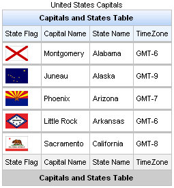
The component allows to use "header" , "footer" and "caption" facets for output. See an example below:
Example:
...

<rich:dataTable value="#{capitalsBean.capitals}" var="cap" rows="5">

        <f:facet name="caption">

                <h:outputText value="United States Capitals" />

        </f:facet>

        <f:facet name="header">

                <h:outputText value="Capitals and States Table" />

        </f:facet>

        <rich:column>

                <f:facet name="header">State Flag</f:facet>

                        <h:graphicImage value="#{cap.stateFlag}"/>

                <f:facet name="footer">State Flag</f:facet>

        </rich:column>

        <rich:column>

                <f:facet name="header">State Name</f:facet>

                        <h:outputText value="#{cap.state}"/>

                <f:facet name="footer">State Name</f:facet>

        </rich:column>

        <rich:column >

                <f:facet name="header">State Capital</f:facet>

                        <h:outputText value="#{cap.name}"/>

                <f:facet name="footer">State Capital</f:facet>

        </rich:column>

        <rich:column>

                <f:facet name="header">Time Zone</f:facet>

                    <h:outputText value="#{cap.timeZone}"/>

                <f:facet name="footer">Time Zone</f:facet>

        </rich:column>

        <f:facet name="footer">

                <h:outputText value="Capitals and States Table" />

        </f:facet>

</rich:dataTable>

...
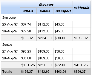
This is a result:
Information about sorting and filtering you can find in the corresponding section.
You can find information how to remove header's gradient in the "How to remove rich:dataTable header background " article.
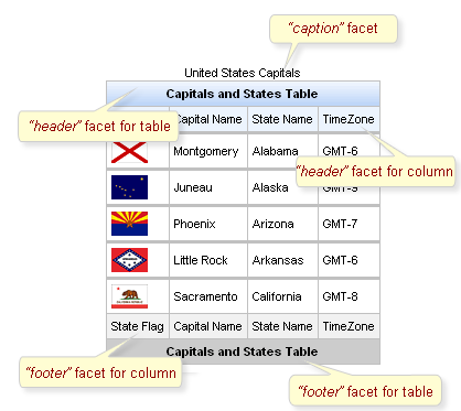
Table 6.90. Facets
| Facet | Description |
|---|---|
| header | Redefines the header content |
| footer | Redefines the footer content |
| caption | Defines the caption content |
For skinnability implementation, the components use a style class redefinition method. Default style classes are mapped on skin parameters.
There are two ways to redefine the appearance of all <rich:dataTable> components at once:
Redefine the corresponding skin parameters
Add to your style sheets style classes used by a <rich:dataTable> component
Table 6.91. Skin parameters redefinition for a table
| Skin parameters | CSS properties |
|---|---|
| tableBackgroundColor | background-color |
Table 6.92. Skin parameters redefinition for a header
| Skin parameters | CSS properties |
|---|---|
| headerBackgroundColor | background-color |
Table 6.93. Skin parameters redefinition for a footer
| Skin parameters | CSS properties |
|---|---|
| tableFooterBackgroundColor | background-color |
Table 6.94. Skin parameters redefinition for a column header
| Skin parameters | CSS properties |
|---|---|
| additionalBackgroundColor | background-color |
Table 6.95. Skin parameters redefinition for a column footer
| Skin parameters | CSS properties |
|---|---|
| tableSubfooterBackgroundColor | background-color |
Table 6.96. Skin parameters redefinition for cells
| Skin parameters | CSS properties |
|---|---|
| generalSizeFont | font-size |
| generalTextColor | color |
| generalFamilyFont | font-family |
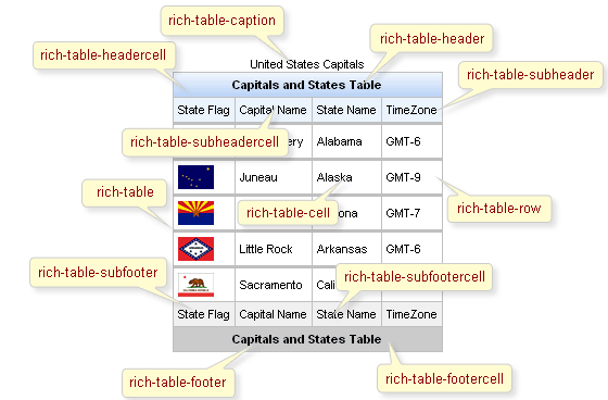
On the screenshot there are classes names that define styles for component elements.
Table 6.97. Classes names that define a whole component appearance
| Class name | Description |
|---|---|
| rich-table | Defines styles for all table |
| rich-table-caption | Defines styles for a "caption" facet element |
Table 6.98. Classes names that define header and footer elements
| Class name | Description |
|---|---|
| rich-table-header | Defines styles for a table header row |
| rich-table-header-continue | Defines styles for all header lines after the first |
| rich-table-subheader | Defines styles for a column header |
| rich-table-footer | Defines styles for a footer row |
| rich-table-footer-continue | Defines styles for all footer lines after the first |
| rich-table-subfooter | Defines styles for a column footer |
Table 6.99. Classes names that define rows and cells of a table
| Class name | Description |
|---|---|
| rich-table-headercell | Defines styles for a header cell |
| rich-table-subheadercell | Defines styles for a column header cell |
| rich-table-cell | Defines styles for a table cell |
| rich-table-row | Defines styles for a table row |
| rich-table-firstrow | Defines styles for a table's first row |
| rich-table-footercell | Defines styles for a footer cell |
| rich-table-subfootercell | Defines styles for a column footer cell |
In order to redefine styles for all <rich:dataTable> components on a page using CSS, it's enough to create classes with the same names (possible classes could be found in the tables above) and define necessary properties in them.
Example:
...

.rich-table-cell{

    font-weight:bold;

}

...
This is a result:
In the example the font weight for table cell was changed.
Also it's possible to change styles of particular <rich:dataTable> component. In this case you should create own style classes and use them in corresponding <rich:dataTable> styleClass attributes. An example is placed below:
Example:
...

.myClass{

    font-style:italic;

}

...
The "headerClass" attribute for <rich:dataTable> is defined as it's shown in the example below:
Example:
<rich:dataTable ... headerClass="myClass"/>
This is a result:
As it could be seen on the picture above, the font style for header was changed.
Detailed information on how to set <rich:dataTable> border to "0px" you can find in the " How to set rich:dataTable border to 0px article " .
On the component LiveDemo page you can see the example of <rich:dataTable> usage and sources for the given example.
The article about <rich:dataTable> flexibility can be found in the "rich:dataTable Flexibility " article .
Article on dataTable skinability provides you a simple example of skinnability.
More information about using <rich:dataTable> and <rich:subTable> could be found on the RichFaces Users Forum.
How to use <rich:dataTable> and <rich:datascroller> in a context of Extended Data Model see on the RichFaces Users Forum.
From "rich:dataTable border to 0px " article you'll figure out how to set rich:dataTable border to 0px
dataTable Background Out tells you how to remove rich:dataTable header background