Create new RichFaces Documentation Jira issue

This will launch the RichFaces Jira page - to complete your feedback please login if needed, and submit the Jira.
JBoss.orgCommunity Documentation
The component designed for providing the functionality of tables scrolling using Ajax requests.
Provides table scrolling functionality
Built-in Ajax processing
Provides fast controls
Skin support
Table 6.78. rich : datascroller attributes
| Attribute Name |
Description

|
|---|---|
| action | MethodBinding pointing at the application action to be invoked, if this UIComponent is activated by you, during the Apply Request Values or Invoke Application phase of the request processing lifecycle, depending on the value of the immediate property |
| actionListener | MethodBinding pointing at method accepting an ActionEvent with return type void |
| ajaxSingle | Boolean attribute which provides possibility to limit JSF tree processing(decoding, conversion/validation, value applying) to the component which send the request only. Default value is "true" |
| align | This attribute specifies the position of the table with relatively to the document. Possible values are "left","center","right ". Default value is "center". |
| binding | JSF: The attribute takes a value-binding expression for a component property of a backing bean |
| boundaryControls | The attribute specifies the visibility of boundaryControls. Possible values are: "show" (controls are always visible ). "hide" (controls are hidden. "auto" (unnecessary controls are hidden). Default value is "show". |
| bypassUpdates | If "true", after process validations phase it skips updates of model beans on a force render response. It can be used for validating components input |
| data | Serialized (on default with JSON) data passed on the client by a developer on AJAX request. It's accessible via "data.foo" syntax |
| eventsQueue | Name of requests queue to avoid send next request before complete other from same event. Can be used to reduce number of requests of frequently events (key press, mouse move etc.) |
| fastControls | The attribute specifies the visibility of fastControls. Possible values are: "show" (controls are always visible ). "hide" (controls are hidden. "auto" (unnecessary controls are hidden). Default value is "show". |
| fastStep | The attribute indicates pages quantity to switch onto when fast scrolling is used. Default value is "0". |
| focus | ID of an element to set focus after request is completed on client side |
| for | ID of the table component whose data is scrollled |
| handleValue | Current handle value |
| id | JSF: Every component may have a unique id that is automatically created if omitted |
| ignoreDupResponses | Attribute allows to ignore an Ajax Response produced by a request if the newest 'similar' request is in a queue already. ignoreDupResponses="true" does not cancel the request while it is processed on the server, but just allows to avoid unnecessary updates on the client side if the response isn't actual now. Default value is "true". |
| immediate | A flag indicating that this component value must be converted and validated immediately (that is, during Apply Request Values phase), rather than waiting until a Process Validations phase |
| inactiveStyle | CSS style rules to be applied to the scroller inactive cells |
| inactiveStyleClass | Assigns one or more space-separated CSS class names to the scroller inactive cells |
| lastPageMode | The attribute to control whether last page of datascroller shows "rows" number of items or just the rest. Possible values are "full" and "short". Default value is "short". |
| limitToList | If "true", then of all AJAX-rendered on the page components only those will be updated, which ID's are passed to the "reRender" attribute of the describable component. "false"-the default value-means that all components with ajaxRendered="true" will be updated. |
| maxPages | Maximum quantity of pages. Default value is "10". |
| onbeforedomupdate | The client-side script method to be called before DOM is updated |
| onclick | DHTML: The client-side script method to be called when the element is clicked |
| oncomplete | The client-side script method to be called after the request is completed |
| ondblclick | DHTML: The client-side script method to be called when the element is double-clicked |
| onkeydown | DHTML: The client-side script method to be called when a key is pressed down over the element |
| onkeypress | DHTML: The client-side script method to be called when a key is pressed over the element and released |
| onkeyup | DHTML: The client-side script method to be called when a key is released |
| onmousedown | DHTML: The client-side script method to be called when a mouse button is pressed down over the element |
| onmousemove | DHTML: The client-side script method to be called when a pointer is moved within the element |
| onmouseout | DHTML: The client-side script method to be called when a pointer is moved away from the element |
| onmouseover | DHTML: The client-side script method to be called when a pointer is moved onto the element |
| onmouseup | DHTML: The client-side script method to be called when a mouse button is released |
| onpagechange | The client-side script method to be called when a page is changed |
| page | If page >= 1 then it's a page number to show |
| pageIndexVar | Name of variable in request scope containing index of active page |
| pagesVar | Name of variable in request scope containing number of pages |
| process | Id['s] (in format of call UIComponent.findComponent()) of components, processed at the phases 2-5 in case of AjaxRequest caused by this component. Can be single id, comma-separated list of Id's, or EL Expression with array or Collection |
| rendered | JSF: If "false", this component is not rendered |
| renderIfSinglePage | If renderIfSinglePage is "true" then datascroller is displayed on condition that the data hold on one page. Default value is "true". |
| requestDelay | Attribute defines the time (in ms.) that the request will be wait in the queue before it is ready to send. When the delay time is over, the request will be sent to the server or removed if the newest 'similar' request is in a queue already |
| reRender | Id['s] (in format of call UIComponent.findComponent()) of components, rendered in case of AjaxRequest caused by this component. Can be single id, comma-separated list of Id's, or EL Expression with array or Collection |
| scrollerListener | MethodBinding representing an action listener method that will be notified after scrolling |
| selectedStyle | CSS style rules to be applied to the scroller selected cell |
| selectedStyleClass | Assigns one or more space-separated CSS class names to the scroller selected cell |
| similarityGroupingId | If there are any component requests with identical IDs then these requests will be grouped. |
| status | ID (in format of call UIComponent.findComponent()) of Request status component |
| stepControls | The attribute specifies the visibility of stepControls. Possible values are: "show" (controls are always visible ). "hide" (controls are hidden. "auto" (unnecessary controls are hidden). Default value is "show". |
| style | HTML: CSS style rules to be applied to the component |
| styleClass | JSF: Assigns one or more space-separated CSS class names to the component. Corresponds to the HTML "class" attribute. |
| tableStyle | CSS style rules to be applied to the wrapper table element of the component |
| tableStyleClass | Assigns one or more space-separated CSS class names to the wrapper table element of the component |
| timeout | Response waiting time on a particular request. If a response is not received during this time, the request is aborted |
| value | JSF: The current value for this component |
Table 6.79. Component identification parameters
| Name | Value |
|---|---|
| component-type | org.richfaces.Datascroller |
| component-class | org.richfaces.component.html.HtmlDatascroller |
| component-family | org.richfaces.Datascroller |
| renderer-type | org.richfaces.DataScrollerRenderer |
| tag-class | org.richfaces.taglib.DatascrollerTag |
Here is a simple example as it could be used on a page:
Example:
...

<h:dataTable id="table">

          ...

</h:dataTable>

...

<rich:datascroller for="table"/>

...
Example:
import org.richfaces.component.html.HtmlDatascroller;

...

HtmlDatascroller myScroll = new HtmlDatascroller();

...
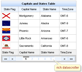
The <rich:datascroller> component provides table scrolling functionalitity the same as TOMAHAWK scroller but with Ajax requests usage.
The <rich:datascroller> component should be reRendered also with <rich:dataTable> when you changing filter in order to be updated according to the <rich:dataTable> current model.
The component should be placed into footer of the parent table or be bound to it with the "for" attribute. Note, that "for" is evaluated on view build, not on view render, that is why it will ignore JSTL tags.
The table should also have the defined "rows" attribute limiting the quantity of inputted table rows.
The scroller could limit the maximum quantity of rendered links on the table pages with the help of the "maxPages" attribute.
Component provides two controllers groups for switching:
Page numbers for switching onto a particular page
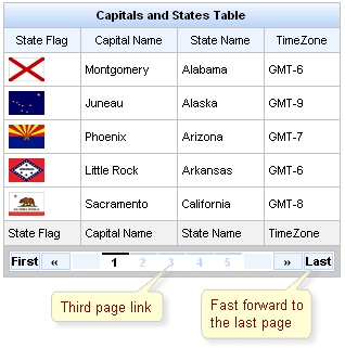
The controls of fast switching: "first", "last", "next", "previous", "fastforward", "fastrewind"
The controls of fast switching are created adding the facets component with the corresponding name:
Example:
 ...

<rich:datascroller for="table" maxPages="10">

          <f:facet name="first">

                    <h:outputText value="First"/>

          </f:facet>

          <f:facet name="last">

                    <h:outputText value="Last"/>

          </f:facet>

</rich:datascroller>

...
The screenshot shows one controller from each group.
There are also facets used to create the disabled states:
"first_disabled",
"last_disabled",
"next_disabled",
"previous_disabled",
"fastforward_disabled",
"fastrewind_disabled".
For the
"fastforward"/"fastrewind"
controls customization the additional
"fastStep"
attribute is used. The attribute indicates pages quantity
to switch onto when fast scrolling is used.
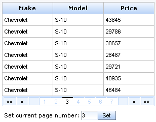
The "page" is a value-binding attribute used to define and save current page number. The example is placed below.
Example:
...

<h:form id="myForm">

    <rich:dataTable id="carList" rows="7" value="#{dataTableScrollerBean.allCars}" var="category">

        <f:facet name="header">

            <rich:columnGroup>

                <h:column>

                    <h:outputText value="Make" />

                </h:column>

                <h:column>

                    <h:outputText value="Model" />

                </h:column>

                <h:column>

                    <h:outputText value="Price" />

                </h:column>

            </rich:columnGroup>

        </f:facet>

        <h:column>

            <h:outputText value="#{category.make}" />

        </h:column>

        <h:column>

            <h:outputText value="#{category.model}" />

        </h:column>

        <h:column>

            <h:outputText value="#{category.price}" />

        </h:column>

    </rich:dataTable>

    <rich:datascroller id="sc2" for="carList" reRender="sc1" maxPages="7" page="#{dataTableScrollerBean.scrollerPage}" />

    <h:panelGrid>

        <h:panelGroup>

            <h:outputText value="Set current page number:" />

            <h:inputText value="#{dataTableScrollerBean.scrollerPage}" id="sc1" size="1"/>

            <h:commandButton value="Set" />

        </h:panelGroup>

    </h:panelGrid>

</h:form>

...
In the example above you can enter the page number you want and set it by clicking on the <h:commandButton> . By the way, if you use <rich:datascroller> page links the input field rerenders and current page number changes.
This is a result:
The "pageIndexVar" and "pagesVar" attributes define a request scope variables and provide an ability to show the current page and the number of pages in the <rich:datascroller> .
These attributes are used for definition the names of variables, that is used in the facet with name "pages" . An example can be found below:
Example:
...

<h:form>

    <rich:dataTable value="#{capitalsBean.capitals}" var="cap" rows="5">

        <rich:column>

            <h:outputText value="#{cap.name}" />

        </rich:column>

        <f:facet name="footer">

            <rich:datascroller pageIndexVar="pageIndex" pagesVar="pages">

                <f:facet name="pages">

                    <h:outputText value="#{pageIndex} / #{pages}" />

                </f:facet>

            </rich:datascroller>

        </f:facet>

    </rich:dataTable>

</h:form>

...
It's possible to insert optional separators between controls. For this purpose use a "controlsSeparator" facet. An example is placed below.
 ...

<f:facet name="controlsSeparator">

          <h:graphicImage value="/image/sep.png"/>

</f:facet>

...
Starting from 3.2.1 of RichFaces multiple <rich:datascroller> instances behavior and page bindings are corrected. Incorrect page after model changes handling is added. Phase Listener called before RenderResponce scans the page for the <rich:datascroller> and performs the following operations:
Checks if the <rich:datascroller> is rendered. (If the checking generates an exception, the <rich:datascroller> is considered to be not rendered )
If the <rich:datascroller> is rendered - the table to which the <rich:datascroller> is attached gets the value of the page attribute of <rich:datascroller> .
Information about the "process" attribute usage you can find in the " Decide what to process " guide section.
Make sure, that all <rich:datascroller> components, defined for a table, have same values for all "page" attributes. The page, specified in the last "page" , will be rendered in browser.
Table 6.80. JavaScript API
| Function | Description |
|---|---|
| switchToPage(page) | Switches to the defined page, "page" is Number or String |
| next() | Navigates to the next page |
| previous() | Navigates to the previous page |
| first() | Navigates to the first page |
| last() | Navigates to the last page |
| fastForward() | Navigates ahead over a certain number of pages. The number of pages to traverse is defined with fastStep attribute |
| fastRewind() | Navigates backwards over a certain number of pages. The number of pages to traverse is defined with fastStep attribute |
Table 6.81. Facets
| Facet | Description |
|---|---|
| controlsSeparator | Redefines optional separators between controls |
| first | Redefines the "first" button with the content set |
| first_disabled | Redefines the disabled "first" button with the content set |
| last | Redefines the "last" button with the content set |
| last_disabled | Redefines the disabled "last" button with the content set |
| fastrewind | Redefines the "fastrewind" button with the content set |
| fastrewind_disabled | Redefines the disabled "fastrewind" button with the content set |
| fastforward | Redefines the "fastforward" button with the content set |
| fastforward_disabled | Redefines the disabled "fastforward" button with the content set |
| previous | Redefines the "previous" button with the content set |
| previous_disabled | Redefines the disabled "previous" button with the content set |
| next | Redefines the "next" button with the content set |
| next_disabled | Redefines the disabled "next" button with the content set |
| pages | Redefines the pages buttons with the content set |
For skinnability implementation, the components use a style class redefinition method. Default style classes are mapped on skin parameters.
There are two ways to redefine the appearance of all <rich:datascroller> components at once:
Redefine the corresponding skin parameters
Add to your style sheets style classes used by a <rich:datascroller> component
Table 6.82. Skin parameters redefinition for a wrapper element
| Skin parameters | CSS properties |
|---|---|
| tableBackgroundColor | background-color |
| panelBorderColor | border-color |
Table 6.83. Skin parameters redefinition for a button
| Skin parameters | CSS properties |
|---|---|
| additionalBackgroundColor | background-color |
| panelBorderColor | border-color |
| generalFamilyFont | font-family |
| generalSizeFont | font-size |
Table 6.84. Skin parameters redefinition for an active button
| Skin parameters | CSS properties |
|---|---|
| generalTextColor | border-top-color |
| generalTextColor | color |
| generalFamilyFont | font-family |
| generalSizeFont | font-size |
Table 6.85. Skin parameters redefinition for an inactive button
| Skin parameters | CSS properties |
|---|---|
| headerBackgroundColor | border-top-color |
| headerBackgroundColor | color |
| generalFamilyFont | font-family |
| generalSizeFont | font-size |
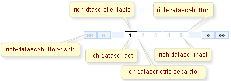
On the screenshot there are classes names that define styles for component elements.
Table 6.86. Classes names that define a component appearance
| Class name | Description |
|---|---|
| rich-datascr | Defines styles for a wrapper <div> element of a datascroller |
| rich-dtascroller-table | Defines styles for a wrapper table element of a datascroller |
| rich-datascr-button | Defines styles for a button |
| rich-datascr-ctrls-separator | Defines styles for a separator between buttons |
Table 6.87. Classes names that define a buttons appearance
| Class name | Description |
|---|---|
| rich-datascr-act | Defines styles for an active button |
| rich-datascr-inact | Defines styles for an inactive button |
| rich-datascr-button-dsbld | Defines styles for a disabled button |
In order to redefine styles for all <rich:datascroller> components on a page using CSS, it's enough to create classes with the same names (possible classes could be found in the table above) and define necessary properties in them. An example is placed below:
Example:
...

.rich-datascr-button{

    color: #CD6600;

}

...
This is a result:
In the example an input text font style was changed.
Also it's possible to change styles of particular <rich:datascroller> component. In this case you should create own style classes and use them in corresponding <rich:datascroller> styleClass attributes. An example is placed below:
Example:
...

.myClass{

    background-color: #C6E2FF;

}

...
The "styleClass" attribute for <rich:datascroller> is defined as it's shown in the example below:
Example:
<rich:datascroller ... selectedStyleClass="myClass"/>
This is a result:
As it could be seen on the picture above, background color of the selected cell on scroller was changed.
On the component LiveDemo page you can see the example of <rich:datascroller> usage and sources for the given example.
The solution about how to do correct pagination using datascroller (load a part of data from database) can be found on the RichFaces Users Forum.
How to use <rich:dataTable> and <rich:datascroller> in a context of Extended Data Model see on theRichFaces Users Forum.