Create new RichFaces Documentation Jira issue

This will launch the RichFaces Jira page - to complete your feedback please login if needed, and submit the Jira.
JBoss.orgCommunity Documentation
The <rich:dropDownMenu> component is used for creating multilevel drop-down menus.
Highly customizable look-and-feel
Pop-up appearance event customization
Different submission modes
Ability to define a complex representation for elements
Support for disabling
Smart user-defined positioning
Table 6.151. rich : dropDownMenu attributes
| Attribute Name |
Description

|
|---|---|
| binding | JSF: The attribute takes a value-binding expression for a component property of a backing bean |
| direction | Defines direction of the popup list to appear. Possible values are "top-right", "top-right", "top-left", "bottom-right", "bottom-left", "auto". Default value is "auto". |
| disabled | HTML: Attribute 'disabled' provides possibility to make the whole menu disabled if its value equals to "true". Default value is "false" |
| disabledItemClass | Assigns one or more space-separated CSS class names to the component disabled item |
| disabledItemStyle | CSS style rules to be applied to the component disabled item |
| disabledLabelClass | Assigns one or more space-separated CSS class names to the component label when it is disabled |
| event | Defines the event on the representation element that triggers the menu's appearance. |
| hideDelay | Delay between losing focus and menu closing. Default value is "800". |
| horizontalOffset | Sets the horizontal offset between popup list and label element. Default value is "0". conjunction point |
| id | JSF: Every component may have a unique id that is automatically created if omitted |
| itemClass | Assigns one or more space-separated CSS class names to the component item |
| itemStyle | CSS style rules to be applied to the component item |
| jointPoint | Sets the corner of the label for the pop-up to be connected with. Possible values are "tr", "tl", "bl", "br", "bottom-left", "auto". Default value is "auto". "tr" stands for top-right. |
| labelClass | Assigns one or more space-separated CSS class names to the component label |
| oncollapse | The client-side script method to be called when a menu is collapsed |
| onexpand | The client-side script method to be called when a menu is expanded |
| ongroupactivate | The client-side script method to be called when some menu group is activated |
| onitemselect | The client-side script method to be called when a menu item is selected |
| onmousemove | DHTML: The client-side script method to be called when a pointer is moved within the menu |
| onmouseout | DHTML: The client-side script method to be called when a pointer is moved away from the menu |
| onmouseover | DHTML: The client-side script method to be called when a pointer is moved onto the menu |
| popupWidth | Sets minimal width for all lists that will appear. |
| rendered | JSF: If "false", this component is not rendered |
| selectedLabelClass | Assigns one or more space-separated CSS class names to the component label when it is selected |
| selectItemClass | Assigns one or more space-separated CSS class names to the component selected item |
| selectItemStyle | CSS style rules to be applied to the component selected item |
| showDelay | Delay between event and menu showing. Default value is "50". |
| style | HTML: CSS style rules to be applied to the component |
| styleClass | JSF: Assigns one or more CSS class names to the component. Corresponds to the HTML "class" attribute. |
| submitMode | Sets the submission mode for all menu items of the menu except ones where this attribute redefined. Possible values are "ajax","server","none". Default value is "sever". |
| value | JSF: Defines representation text for Label used for menu calls. |
| verticalOffset | Sets the vertical offset between popup list and label element. Default value is "0". conjunction point |
Table 6.152. Component identification parameters
| Name | Value |
|---|---|
| component-type | org.richfaces.DropDownMenu |
| component-class | org.richfaces.component.html.HtmlDropDownMenu |
| component-family | org.richfaces.DropDownMenu |
| renderer-type | org.richfaces.DropDownMenuRenderer |
| tag-class | org.richfaces.taglib.DropDownMenuTag |
Here is a simple example as it could be used on a page:
Example:
...

<rich:dropDownMenu value="Item1">

    <!--Nested menu components-->

</rich:dropDownMenu>

...
Example:
import org.richfaces.component.html.HtmlDropDownMenu;

...

HtmlDropDownMenu myDropDownMenu = new HtmlDropDownMenu();

...
All attributes except "value" are optional. The "value" attribute defines text to be represented. If you can use the "label" facet, you can even not use the "value" attribute.
Here is an example:
Example:
...

<f:facet name="label">

    <h:graphicImage value="/images/img1.png"/>

</f:facet>

...
Use the "event" attribute to define an event for the represented element that triggers a menu appearance. An example of a menu appearance on a click can be seen below.
Example:
...

<rich:dropDownMenu event="onclick" value="Item1">

    <!--Nested menu components-->

</rich:dropDownMenu>

...
The <rich:dropDownMenu> "submitMode" attribute can be set to three possible parameters:
Server (default)
Regular form submission request is used.
Ajax
Ajax submission is used for switching.
None
The "action" and "actionListener" item's attributes are ignored. Menu items don't fire any submits themselves. The behavior is fully defined by the components nested into items.
As the <rich:dropDownMenu> component doesn't provide its own form, use it between <h:form> and </h:form> tags.
The "direction" and "jointPoint" attributes are used for defining aspects of menu appearance.
Possible values for the "direction" attribute are:
"top-left" - a menu drops to the top and left
"top-right" - a menu drops to the top and right
"bottom-left" - a menu drops to the bottom and left
"bottom-right" - a menu drops to the bottom and right
"auto" - smart positioning activation
Possible values for the "jointPoint" attribute are:
"tr" - a menu is attached to the top-right point of the button element
"tl" - a menu is attached to the top-left point of the button element
"br" - a menu is attached to the bottom-right point of the button element
"bl" - a menu is attached to the bottom-left point of the button element
"auto" - smart positioning activation
By default, the "direction" and "jointPoint" attributes are set to "auto".
Here is an example:
Example:
...
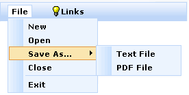
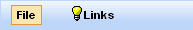
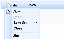
<rich:dropDownMenu value="File" direction="bottom-right" jointPoint="bl">
<rich:menuItem submitMode="ajax" value="New" action="#{ddmenu.doNew}"/>
<rich:menuItem submitMode="ajax" value="Open" action="#{ddmenu.doOpen}"/>
<rich:menuGroup value="Save As...">
<rich:menuItem submitMode="ajax" value="Text File" action="#{ddmenu.doSaveText}"/>
<rich:menuItem submitMode="ajax" value="PDF File" action="#{ddmenu.doSavePDF}"/>
</rich:menuGroup>
<rich:menuItem submitMode="ajax" value="Close" action="#{ddmenu.doClose}"/>
<rich:menuSeparator id="menuSeparator11"/>
<rich:menuItem submitMode="ajax" value="Exit" action="#{ddmenu.doExit}"/>
</rich:dropDownMenu>
...
This is the result:
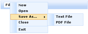
You can correct an offset of the pop-up list relative to the label using the following attributes: "horizontalOffset" and "verticalOffset" .
Here is an example:
Example:
...

<rich:dropDownMenu value="File" direction="bottom-right" jointPoint="tr" horizontalOffset="-15" verticalOffset="0">

    <rich:menuItem submitMode="ajax" value="New" action="#{ddmenu.doNew}"/>

    <rich:menuItem   submitMode="ajax"  value="Open" action="#{ddmenu.doOpen}"/>

    <rich:menuGroup value="Save As...">

        <rich:menuItem   submitMode="ajax" value="Text File"  action="#{ddmenu.doSaveText}"/>

        <rich:menuItem   submitMode="ajax" value="PDF File"  action="#{ddmenu.doSavePDF}"/>

    </rich:menuGroup>

    <rich:menuItem  submitMode="ajax" value="Close" action="#{ddmenu.doClose}"/>

    <rich:menuSeparator id="menuSeparator11"/>

    <rich:menuItem  submitMode="ajax" value="Exit"  action="#{ddmenu.doExit}"/>

</rich:dropDownMenu>

...
This is the result:
The "disabled" attribute is used for disabling whole <rich:dropDownMenu> component. In this case it is necessary to define "disabled" attribute as "true". An example is placed below.
Example:
...

<rich:dropDownMenu value="File"  disabled="true">

    ...

</rich:dropDownMenu>

...
Table 6.153. Facets
| Facet | Description |
|---|---|
| label | Redefines the content set of label |
| labelDisabled | Redefines the content set of disabled label |
For skinnability implementation, the components use a style class redefinition method. Default style classes are mapped on skin parameters.
There are two ways to redefine the appearance of all <rich:dropDownMenu> components at once:
Redefine the corresponding skin parameters
Add to your style sheets style classes used by a <rich:dropDownMenu> component
Table 6.154. Skin parameters redefinition for a label <div> element
| Skin parameters | CSS properties |
|---|---|
| generalFamilyFont | font-family |
| generalSizeFont | font-size |
Table 6.155. Skin parameters redefinition for a selected label
| Skin parameters | CSS properties |
|---|---|
| panelBorderColor | border-color |
| controlBackgroundColor | background-color |
| generalTextColor | background-colorcolor |
Table 6.156. Skin parameters redefinition for a border
| Skin parameters | CSS properties |
|---|---|
| panelBorderColor | border-color |
| additionalBackgroundColor | background-color |
Table 6.157. Skin parameters redefinition for a background
| Skin parameters | CSS properties |
|---|---|
| additionalBackgroundColor | border-top-color |
| additionalBackgroundColor | border-left-color |
| additionalBackgroundColor | border-right-color |
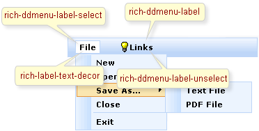
On the screenshot there are classes names that define styles for component elements.
Table 6.158. Classes names that define a label
| Class name | Description |
|---|---|
| rich-label-text-decor | Defines text style for a representation element |
| rich-ddmenu-label | Defines styles for a wrapper <div> element of a representation element |
| rich-ddmenu-label-select | Defines styles for a wrapper <div> element of a selected representation element |
| rich-ddmenu-label-unselect | Defines styles for a wrapper <div> element of an unselected representation element |
| rich-ddmenu-label-disabled | Defines styles for a wrapper <div> element of a disabled representation element |
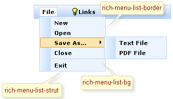
On the screenshot there are classes names that define styles for component elements.
Table 6.159. Classes names that define a popup element
| Class name | Description |
|---|---|
| rich-menu-list-border | Defines styles for borders |
| rich-menu-list-bg | Defines styles for a general background list |
| rich-menu-list-strut | Defines styles for a wrapper <div> element for a strut of a popup list |
In order to redefine styles for all <rich:dropDownMenu> components on a page using CSS, it's enough to create classes with the same names (possible classes could be found in the table above) and define necessary properties in them. An example is placed below:
Example:
...

.rich-ddmenu-label-select{

    background-color:  #fae6b0;

    border-color: #e5973e;

}

...
This is a result:
In the example a label select background color and border color were changed.
Also it's possible to change styles of particular <rich:dropDownMenu> component. In this case you should create own style classes and use them in corresponding <rich:dropDownMenu> styleClass attributes. An example is placed below:
Example:
...

.myClass{

    font-style: italic;

}

...
The "itemClass" attribute for <rich:dropDownMenu> is defined as it's shown in the example below:
Example:
<rich:dropDownMenu ... itemClass="myClass"/>
This is a result:
As it could be seen on the picture above, the font style for items was changed.
On the component LiveDemo page you can see the example of <rich:dropDownMenu> usage and sources for the given example.