Create new RichFaces Documentation Jira issue

This will launch the RichFaces Jira page - to complete your feedback please login if needed, and submit the Jira.
JBoss.orgCommunity Documentation
The <rich:menuGroup> component is used to define an expandable group of items inside a pop-up list or another group.
Highly customizable look-and-feel
Grouping of any menu's items
Pop-up appearance event customization
Support for disabling
Smart user-defined positioning
Table 6.160. rich : menuGroup attributes
| Attribute Name |
Description

|
|---|---|
| binding | JSF: The attribute takes a value-binding expression for a component property of a backing bean |
| converter | JSF: Id of Converter to be used or reference to a Converter |
| direction | Defines direction of the popup sublist to appear ("right", "left", "auto"(Default), "left-down", "left-up", "right-down", "right-up") |
| disabled | HTML: If "true" sets state of the item to disabled state. Default value is "false". |
| event | Defines the event on the representation element that triggers the menu's appearance. Default value is "onmouseover". |
| icon | Path to the icon to be displayed for the enabled item state |
| iconClass | Assigns one or more space-separated CSS class names to the component icon element |
| iconDisabled | Path to the icon to be displayed for the disabled item state |
| iconFolder | Path to the folder icon to be displayed for the enabled item state |
| iconFolderDisabled | Path to the folder icon to be displayed for the enabled item state |
| iconStyle | CSS style rules to be applied to the component icon element |
| id | JSF: Every component may have a unique id that is automatically created if omitted |
| labelClass | Assigns one or more space-separated CSS class names to the component label element |
| onclose | The client-side script method to be called when a group is closed |
| onmousemove | DHTML: The client-side script method to be called when a pointer is moved within the menu group |
| onmouseout | DHTML: The client-side script method to be called when a pointer is moved away from the menu group |
| onmouseover | DHTML: The client-side script method to be called when a pointer is moved onto the menu group |
| onopen | The client-side script method to be called when a group is opened |
| rendered | JSF: If "false", this component is not rendered |
| selectClass | Assigns one or more space-separated CSS class names to the component selected items |
| selectStyle | CSS style rules to be applied to the component selected items |
| showDelay | Delay between event and menu showing. Default value is "300". |
| style | HTML: CSS style rules to be applied to the component |
| styleClass | JSF: Assigns one or more CSS class names to the component. Corresponds to the HTML "class" attribute. |
| value | JSF: Defines representation text for menuItem |
Table 6.161. Component identification parameters
| Name | Value |
|---|---|
| component-type | org.richfaces.MenuGroup |
| component-class | org.richfaces.component.html.HtmlMenuGroup |
| component-family | org.richfaces.DropDownMenu |
| renderer-type | org.richfaces.MenuGroupRenderer |
| tag-class | org.richfaces.taglib.MenuGroupTag |
Here is a simple example as it could be used on a page:
Example:
...

<rich:dropDownMenu value="Active">

        ...

        <rich:menuGroup value="Active">

                <!--Nested menu components-->

        </rich:menuGroup>

        ...

</rich:dropDownMenu >

...
Example:
import org.richfaces.component.html.HtmlMenuGroup;

...

HtmlMenuGroup myMenuGroup = new HtmlMenuGroup();

...
The "value" attribute defines the text representation of a group element in the page.
The "icon" attribute defines an icon for the component. The "iconDisabled" attribute defines an icon for when the group is disabled. Also you can use the "icon" and "iconDisabled" facets. If the facets are defined, the corresponding "icon" and "iconDisabled" attributes are ignored and the facets' contents are used as icons. This could be used for an item check box implementation.
Here is an example:
...

<f:facet name="icon">

        <h:selectBooleanCheckbox value="#{bean.property}"/>

</f:facet>

...
The "iconFolder" and "iconFolderDisabled" attributes are defined for using icons as folder icons. The "iconFolder" and "iconFolderDisabled" facets use their contents as folder icon representations in place of the attribute values.
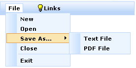
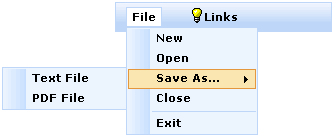
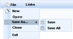
The "direction" attribute is used to define which way to display the menu as shown in the example below:
Possible values are:
"left - down" - a submenu is attached to the left side of the menu and is dropping down
"left - up" - a submenu is attached to the left side of the menu and is dropping up
"right - down" - a submenu is attached to the right side of the menu and is dropping down
"right - up" - a submenu is attached to the right side of the menu and is dropping up
"auto - smart" positioning activation
By default, the "direction" attribute is set to "auto".
Here is an example:
...

<rich:menuGroup value="Save As..." direction="left-down">

        <rich:menuItem   submitMode="ajax" value="Text File"  action="#{ddmenu.doSaveText}"/>

        <rich:menuItem   submitMode="ajax" value="PDF File"  action="#{ddmenu.doSavePDF}"/>

</rich:menuGroup>

...
This would be the result:
The <rich:menuGroup> component was designed to be used only for pop-up menu list creation.
Table 6.162. Facets
| Facet | Description |
|---|---|
| icon | Redefines the icon for the enabled item state. Related attribute is "icon" |
| iconFolder | Redefines the folder icon for the enabled item state. Related attribute is "iconFolder" |
For skinnability implementation, the components use a style class redefinition method. Default style classes are mapped on skin parameters.
There are two ways to redefine the appearance of all <rich:menuGroup> components at once:
Redefine the corresponding skin parameters
Add to your style sheets style classes used by a <rich:menuGroup> component
Table 6.163. Skin parameters redefinition for a group
| Skin parameters | CSS properties |
|---|---|
| generalFamilyFont | font-family |
| generalSizeFont | font-size |
Table 6.164. Skin parameters redefinition for a disabled group
| Skin parameters | CSS properties |
|---|---|
| tabDisabledTextColor | color |
Table 6.165. Skin parameters redefinition for a label
| Skin parameters | CSS properties |
|---|---|
| generalTextColor | color |
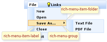
On the screenshot there are classes names that define styles for component elements.
Table 6.166. Classes names that define an appearance of group elements
| Class name | Description |
|---|---|
| rich-menu-group | Defines styles for a wrapper <div> element for a group |
| rich-menu-item-label | Defines styles for a label of an item |
| rich-menu-item-icon | Defines styles for the left icon of an item |
| rich-menu-item-folder | Defines styles for the right icon of an item |
Table 6.167. Classes names that define different states
| Class name | Description |
|---|---|
| rich-menu-item-label-disabled | Defines styles for a label of a disabled item |
| rich-menu-item-icon-disabled | Defines styles for the left icon of a disabled item |
| rich-menu-item-folder-disabled | Defines styles for the right icon of a disabled item |
| rich-menu-group-hover | Defines styles for a wrapper <div> element of a hover group |
| rich-menu-item-icon-enabled | Defines styles for the left icon of an enabled item |
| rich-menu-item-icon-selected | Defines styles for the left icon of a selected item |
In order to redefine styles for all <rich:menuGroup> components on a page using CSS, it's enough to create classes with the same names (possible classes could be found in the tables above) and define necessary properties in them.
Example:
...

.rich-menu-item-label-disabled{

        font-style: italic;

}

...
This is a result:
In the example a disabled label font style was changed.
Also it's possible to change styles of particular <rich:menuGroup> component. In this case you should create own style classes and use them in corresponding <rich:menuGroup> styleClass attributes. An example is placed below:
Example:
...

.myClass{

    background-color: #acbece;

    border: none;

}

...
The "selectClass" attribute for <rich:menuGroup> is defined as it's shown in the example below:
Example:
<rich:menuGroup value="Save As..." selectClass="myClass">
This is a result:
As it could be seen on the picture above, the background color for selected class was changed. Also selected class has no border.
On the component LiveDemo page you can see the example of <rich:menuGroup> usage and sources for the given example.