Create new RichFaces Documentation Jira issue

This will launch the RichFaces Jira page - to complete your feedback please login if needed, and submit the Jira.
JBoss.orgCommunity Documentation
The <rich:inputNumberSlider> component is a slider component. A handler's position corresponds to a definite value on the slider track. In order to change the value you can slide a handler or set the necessary value into the input field. You can dispose it horizontally or vertically on the page.
Fully skinnable control and input elements
Optional value text field with an attribute-managed position
Optional disablement of the component on a page
Optional toolTip to display the current value while a handle is dragged
Dragged state is stable after the mouse moves
Optional manual input possible if a text input field is present
Validation of manual input
Possibility to display 2 controls that increase/decrease the value by the defined step width, when they will be clicked.
Attribute "orientation" that can have the values "vertical" and "horizontal" to define in which direction the slider should be movable.
Table 6.456. rich : inputNumberSlider attributes
| Attribute Name |
Description

|
|---|---|
| accesskey | HTML: This attribute assigns an access key to an element. An access key is a single character from the document character set. Note: Authors should consider the input method of the expected reader when specifying an accesskey |
| barClass | Assigns one or more space-separated CSS class names to the component bar element |
| barStyle | CSS style rules to be applied to the component bar element |
| binding | JSF: The attribute takes a value-binding expression for a component property of a backing bean |
| clientErrorMessage | an error message to use in client-side validation events |
| converter | JSF: Id of Converter to be used or reference to a Converter |
| converterMessage | A ValueExpression enabled attribute that, if present, will be used as the text of the converter message, replacing any message that comes from the converter |
| decreaseClass | Assigns one or more space-separated CSS class names to the decrease arrow element |
| decreaseSelectedClass | Assigns one or more space-separated CSS class names to the decrease arrow element selected |
| decreaseStyle | CSS style rules to be applied to the decrease arrow element |
| delay | Delay in pressed increase/decrease arrows in miliseconds. Default value is "200". |
| disabled | HTML: When set for a form control, this boolean attribute disables the control for your input |
| enableManualInput | If set to "false" this attribute makes the text field "read-only", so the value can be changed only from a handle. Default value is "true". |
| handleClass | Assigns one or more space-separated CSS class names to the handle element |
| handleSelectedClass | Assigns one or more space-separated CSS class names to the handle element selected |
| height | The height of a slider control. Default value is "20px", for orientation="vertical" value is "20px" |
| id | JSF: Every component may have a unique id that is automatically created if omitted |
| immediate | A flag indicating that this component value must be converted and validated immediately (that is, during Apply Request Values phase), rather than waiting until a Process Validations phase |
| increaseClass | Assigns one or more space-separated CSS class names to the increase arrow element |
| increaseSelectedClass | Assigns one or more space-separated CSS class names to the increase arrow element selected |
| increaseStyle | CSS style rules to be applied to the increase arrow element |
| inputClass | Assigns one or more space-separated CSS class names to the component input field |
| inputPosition | If "right", the InputText Box would be rendered on the right side of the ruler. If "left", the InputText Box would be rendered on the left side of the ruler. If "top", the InputText Box would be rendered on the top of the ruler. If "bottom", the InputText Box would be rendered on the bottom of the ruler. |
| inputSize | Similar to the "Size" attribute of h:inputText. Default value is "3". |
| inputStyle | CSS style rules to be applied to the component input field |
| label | A localized user presentable name for this component. |
| maxlength | HTML: Specifies the maximum number of digits that could be entered into the input field. The maximum number is unlimited by default. If entered value exceeds the value specified in "maxValue" attribute than the slider takes a maximum value position. |
| maxValue | Attribute to set an "end" value. Default value is "100" |
| minValue | Attribute to set the "start" value. Default value is "0". |
| onblur | DHTML: The client-side script method to be called when the element loses the focus |
| onchange | DHTML: The client-side script method to be called when the element value is changed |
| onclick | DHTML: The client-side script method to be called when the element is clicked |
| ondblclick | DHTML: The client-side script method to be called when the element is double-clicked |
| onerror | The client-side script method to be called when a non-number value or a number value that is out of the range is input |
| onfocus | DHTML: The client-side script method to be called when the element gets the focus |
| oninputclick | The client-side script method to be called when the component input field is clicked |
| oninputdblclick | The client-side script method to be called when the component input field is double-clicked |
| oninputkeydown | The client-side script method to be called when a key is pressed down in the input field |
| oninputkeypress | The client-side script method to be called when a key is pressed and released in the input field |
| oninputkeyup | The client-side script method to be called when a key is released in the input field |
| oninputmousedown | The client-side script method to be called when a mouse button is pressed down in the input field |
| oninputmousemove | The client-side script method to be called when a pointer is moved within the input field |
| oninputmouseout | The client-side script method to be called when a pointer is moved away from the input field |
| oninputmouseover | The client-side script method to be called when a pointer is moved onto the input field |
| oninputmouseup | The client-side script method to be called when a mouse button is released in the input field |
| onmousedown | DHTML: The client-side script method to be called when a mouse button is pressed down over the element |
| onmousemove | DHTML: The client-side script method to be called when a pointer is moved within the element |
| onmouseout | DHTML: The client-side script method to be called when a pointer is moved away from the element |
| onmouseover | DHTML: The client-side script method to be called when a pointer is moved onto the element |
| onmouseup | DHTML: The client-side script method to be called when a mouse button is released |
| onselect | DHTML: The client-side script method to be called when some text is selected in the text field. This attribute can be used with the INPUT and TEXTAREA elements. |
| onslide | The client-side script method to be called when a slider handle is moved |
| orientation | Attribute can have the values "vertical" and "horizontal" to define in which direction the slider should be moveable. |
| rendered | JSF: If "false", this component is not rendered |
| required | JSF: If "true", this component is checked for non-empty input |
| requiredMessage | A ValueExpression enabled attribute which defines text of validation message to show, if a required field is missing |
| showArrows | False value for this attribute makes increase/decrease arrows invisible. Default value is "false". |
| showBoundaryValues | If the min/max values are shown on the right/left borders of a control. Default value is "true". |
| showInput | False value for this attribute makes text a field invisible. Default value is "true". |
| showToolTip | If "true"the current value is shown in the tooltip when a handle control is in a "dragged" state. Default value is "true". |
| step | Parameter that determines a step between the nearest values while using a handle. Default value is "1". |
| style | HTML: CSS style rules to be applied to the component |
| styleClass | JSF: Assigns one or more space-separated CSS class names to the component. Corresponds to the HTML "class" attribute. |
| tabindex | HTML: This attribute specifies the position of the current element in the tabbing order for the current document. This value must be a number between 0 and 32767. User agents should ignore leading zeros |
| tipClass | Assigns one or more space-separated CSS class names to the tool tip element of the handle |
| tipStyle | CSS style rules to be applied to the tool tip element of the handle |
| validator | JSF: MethodBinding pointing at a method that is called during Process Validations phase of the request processing lifecycle, to validate the current value of this component |
| validatorMessage | A ValueExpression enabled attribute that, if present, will be used as the text of the validator message, replacing any message that comes from the validator |
| value | JSF: The current value of this component |
| valueChangeListener | JSF: Listener for value changes |
| width | HTML: The width of a slider control. Default value is "200px", for orientation="vertical" value is "200px" |
Table 6.457. Component identification parameters
| Name | Value |
|---|---|
| component-type | org.richfaces.inputNumberSlider |
| component-class | org.richfaces.component.html.HtmlInputNumberSlider |
| component-family | org.richfaces.inputNumberSlider |
| renderer-type | org.richfaces.InputNumberSliderRenderer |
| tag-class | org.richfaces.taglib.InputNumberSliderTag |
To create the simplest variant on a page use the following syntax:
Example:
...

<rich:inputNumberSlider minValue="0" maxValue="100" step="1"/>

...
Example:
import org.richfaces.component.html.HtmlInputNumberSlider;

...

HtmlInputNumberSlider mySlider = new HtmlInputNumberSlider();

...
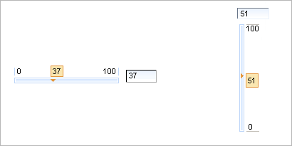
<rich:inputNumberSlider> is used to facilitate your data input with rich UI Controls.
Here is the simplest variant of a slider definition with "minValue" , "maxValue" and "step" (on default is "1") attributes, which define the beginning and the end of a numerical area and a slider property step.
Example:
<rich:inputNumberSlider></rich:inputNumberSlider>
It's generated on a page:
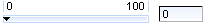
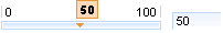
Using "showInput" (default is "true") and "enableManualInput" (default value is "true") attributes, it's possible to output the input area near the slider, and make it read-only or editable.
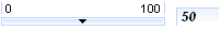
To remove input area use
showInput = "false"
:
Example:
<rich:inputNumberSlider minValue="1" maxValue="100" showInput="false"/>
It's displayed at a page like:
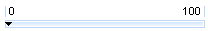
It's also possible to switch off displaying of "boundary values" and a toolTip showing on a handle drawing. This could be performed with the help of the component defined attributes: "showBoundaryValues" which is responsible for "boundary values" displaying (default is true) and "showToolTip" which is responsible for tooltTip displaying (default is "true").
Moreover, to add e.g. some JavaScript effects, events defined on it are used.
"onchange"
"onmouseover"
"onclick"
"onfocus"
"onmouseout"
etc.
The
"label"
attribute is a generic attribute. The
"label"
attribute provides an association between a component, and
the message that the component (indirectly) produced. This
attribute defines the parameters of a localized error and
informational messages that occur as a result of conversion,
validation, or other application actions during the request
processing lifecycle. With the help of this attribute you
can replace the last parameter substitution token shown in
the messages. For example, {1} for
"DoubleRangeValidator.MAXIMUM"
, {2} for
"ShortConverter.SHORT".
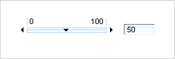
The "showArrows" boolean attribute when set to "true" enables additional controls for increasing and decreasing slider value. The controls (arrows by default) are placed in the beginning and in the end of slider track:
Clicking an arrow changes the driven value on the amount defined with "step" attribute. Keepeng an arrow control pressed changes the value continuous. Time that value takes to change from one step to another is definded with "delay" attribute.
For skinnability implementation, the components use a style class redefinition method. Default style classes are mapped on skin parameters.
There are two ways to redefine the appearance of all <rich:inputNumberSlider> components at once:
Redefine the corresponding skin parameters
Add to your style sheets style classes used by a <rich:imputNumberSlider> component
Table 6.458. Skin parameters redefinition for a bar
| Skin parameters | CSS properties |
|---|---|
| controlBackgroundColor | background-color |
Table 6.459. Skin parameters redefinition for numbers
| Skin parameters | CSS properties |
|---|---|
| generalFamilyFont | font-family |
| generalSizeFont | font-size |
| generalTextColor | color |
| panelBorderColor | border-color |
| generalSizeFont | line-height |
Table 6.460. Skin parameters redefinition for a text field
| Skin parameters | CSS properties |
|---|---|
| controlBackgroundColor | background-color |
| generalFamilyFont | font-family |
| generalSizeFont | font-size |
| controlTextColor | color |
| panelBorderColor | border-color |
| subBorderColor | border-bottom-color |
| subBorderColor | border-right-color |
Table 6.461. Skin parameters redefinition for a hint
| Skin parameters | CSS properties |
|---|---|
| tipBackgroundColor | background-color |
| tipBorderColor | border-color |
| generalFamilyFont | font-family |
| generalSizeFont | font-size |
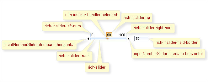
Style classes names that define styles for component elements are shown on the picture below:
Table 6.462. Classes names that define a component appearance
| Class name | Description |
|---|---|
| rich-slider | Defines styles for a wrapper table element of a component |
| rich-inslider-track | Defines styles for a bar |
| rich-inslider-handler | Defines styles for a slider handler |
| rich-inslider-handler-selected | Defines styles for a selected handler |
| rich-inslider-field | Defines styles for a text field |
| rich-inslider-right-num | Defines styles for the right number |
| rich-inslider-left-num | Defines styles for the left number |
| rich-inslider-track-border | Defines styles for track border |
| rich-inslider-tip | Defines styles for a hint |
| inputNumberSlider-increase-vertical | Defines styles for the top arrow |
| inputNumberSlider-decrease-vertical | Defines styles for the bottom arrow |
| inputNumberSlider-increase-horizontal | Defines styles for the right arrow |
| inputNumberSlider-decrease-horizontal | Defines styles for the left arrow |
In order to redefine styles for all <rich:inputNumberSlider> components on a page using CSS, it's enough to create classes with the same names (possible classes could be found in the table above ) and define necessary properties in them. An example is placed below:
Example:
...

.rich-inslider-tip{

    background-color: #FFDAB9;

    font-family: Arial Black;

}

...
This is a result:
In the example a tip background color and font family was changed.
Also it's possible to change styles of particular <rich:inputNumberSlider> component. In this case you should create own style classes and use them in corresponding <rich:inputNumberSlider> styleClass attributes. An example is placed below:
Example:
...

.myClass{

    font-style: italic;

    font-weight:bold;

    font-size:12px;

}

...
The "inputClass" attribute for <rich:inputNumberSlider> is defined as it's shown in the example below:
Example:
<rich: inputNumberSlider ... inputClass="myClass"/>
This is a result:
As it could be seen on the picture above, the font style for input text was changed.
On the component Live Demo page you can see the example of <rich:inputNumberSlider> usage and sources for the given example.