Create new RichFaces Documentation Jira issue

This will launch the RichFaces Jira page - to complete your feedback please login if needed, and submit the Jira.
JBoss.orgCommunity Documentation
A single line input field that lets selecting a number using controls near a text field. It's possible to change a value using "Up/Down" keyboard keys. The keyboard input in a field is possible if it isn't locked by the "enableManualInput" attribute. When arrow controls are pressed, the cursor can be moved in any way without losing a dragged state.
Fully skinnable control and input elements
3D look and feel with an easily customizable appearance
Attribute-managed positions of the controls (inside/outside of the input field)
Keyboard controls support
Optional disablement of the component on a page
Optional "cycled" mode of scrolling values
Optional manual/controls-only input into a value text field
Validation of manual input
Table 6.463. rich : inputNumberSpinner attributes
| Attribute Name |
Description

|
|---|---|
| accesskey | HTML: This attribute assigns an access key to an element. An access key is a single character from the document character set. Note: Authors should consider the input method of the expected reader when specifying an accesskey |
| binding | JSF: The attribute takes a value-binding expression for a component property of a backing bean |
| clientErrorMessage | An error message to use in client-side validation events |
| converter | JSF: Id of Converter to be used or reference to a Converter |
| converterMessage | A ValueExpression enabled attribute that, if present, will be used as the text of the converter message, replacing any message that comes from the converter |
| cycled | If "true" after the current value reaches the border value it is reversed to another border value after next increasing/decreasing. In other case possibilities of next increasing (or decreasing) will be locked. Default value is " true ". |
| disableBrowserAutoComplete | Disable browser's auto completion. Default value is "false" |
| disabled | HTML: When set for a form control, this boolean attribute disables the control for your input |
| enableManualInput | if "false" your's input to the text field using keyboard will be locked. Default value is "true" |
| id | JSF: Every component may have a unique id that is automatically created if omitted |
| immediate | A flag indicating that this component value must be converted and validated immediately (that is, during Apply Request Values phase), rather than waiting until a Process Validations phase |
| inputClass | Assigns one or more space-separated CSS class names to the component input field |
| inputSize | Attribute specifies the initial length of input in characters. Default value is "10". |
| inputStyle | CSS style rules to be applied to the component input field |
| label | A localized user presentable name for this component. |
| maxValue | Maximum value. Default value is "100". |
| minValue | Minimum value. Default value is "0". |
| onblur | DHTML: The client-side script method to be called when the element loses the focus |
| onchange | DHTML: The client-side script method to be called when the element value is changed |
| onclick | DHTML: The client-side script method to be called when the element is clicked |
| ondblclick | DHTML: The client-side script method to be called when the element is double-clicked |
| ondownclick | The client-side script method to be called when the 'Down' button is clicked |
| onerror | The client-side script method to be called whenever a JavaScript error occurs |
| onfocus | DHTML: The client-side script method to be called when the element gets the focus |
| oninputclick | The client-side script method to be called when the component input field is clicked |
| oninputdblclick | The client-side script method to be called when the component input field is double-clicked |
| oninputkeydown | The client-side script method to be called when a key is pressed down in the input field |
| oninputkeypress | The client-side script method to be called when a key is pressed and released in the input field |
| oninputkeyup | The client-side script method to be called when a key is released in the input field |
| oninputmousedown | The client-side script method to be called when a mouse button is pressed down in the input field |
| oninputmousemove | The client-side script method to be called when a pointer is moved within the input field |
| oninputmouseout | The client-side script method to be called when a pointer is moved away from the input field |
| oninputmouseover | The client-side script method to be called when a pointer is moved onto the input field |
| oninputmouseup | The client-side script method to be called when a mouse button is released in the input field |
| onmousedown | DHTML: The client-side script method to be called when a mouse button is pressed down over the element |
| onmousemove | DHTML: The client-side script method to be called when a pointer is moved within the element |
| onmouseout | DHTML: The client-side script method to be called when a pointer is moved away from the element |
| onmouseover | DHTML: The client-side script method to be called when a pointer is moved onto the element |
| onmouseup | DHTML: The client-side script method to be called when a mouse button is released |
| onselect | DHTML: The client-side script method to be called when some text is selected in the text field. This attribute can be used with the INPUT and TEXTAREA elements. |
| onupclick | The client-side script method to be called when the 'Up' button is clicked |
| rendered | JSF: If "false", this component is not rendered |
| required | JSF: If "true", this component is checked for non-empty input |
| requiredMessage | A ValueExpression enabled attribute which defines text of validation message to show, if a required field is missing |
| step | Parameter that determines the step between nearest values while using controls. Default value is "1" |
| style | HTML: CSS style rules to be applied to the component |
| styleClass | JSF: Assigns one or more CSS class names to the component. Corresponds to the HTML "class" attribute. |
| tabindex | HTML: This attribute specifies the position of the current element in the tabbing order for the current document. This value must be a number between 0 and 32767. User agents should ignore leading zeros |
| validator | JSF: MethodBinding pointing at a method that is called during Process Validations phase of the request processing lifecycle, to validate the current value of this component |
| validatorMessage | A ValueExpression enabled attribute that, if present, will be used as the text of the validator message, replacing any message that comes from the validator |
| value | JSF: The current value of this component |
| valueChangeListener | JSF: Listener for value changes |
Table 6.464. Component identification parameters
| Name | Value |
|---|---|
| component-type | org.richfaces.inputNumberSpinner |
| component-class | org.richfaces.component.html.HtmlInputNumberSpinner |
| component-family | org.richfaces.inputNumberSpinner |
| renderer-type | org.richfaces.InputNumberSpinnerRenderer |
| tag-class | org.richfaces.taglib.InputNumberSpinnerTag |
To create the simplest variant on a page use the following syntax:
Example:
...

<rich:inputNumberSpinner minValue="0" maxValue="100" step="1"/>

...
Example:
import org.richfaces.component.html.HtmlInputNumberSpinner;

...

HtmlInputNumberSpinner mySpinner = new HtmlInputNumberSpinner ();

...
<rich:inputNumberSpinner> is used to facilitate your data input with rich UI Controls.
Here is the simplest variant of spinner definition with "minValue" , "maxValue" and "step" (on default is "1") attributes, which define the beginning and the end of numerical area and a spinner step.
Example:
...
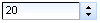
<rich:inputNumberSpinner minValue="1" maxValue="100"/>
...
It generates on a page:
There are also several attributes to define functionality peculiarities:
"cycled" if the attribute is "true" after the current value reaches the border value it's be reversed to another border value after next increasing/decreasing. In other case possibilities of next increasing/decreasing are locked
"disabled" is an attribute that defines whether a component is active on a page
"enableManualInput" is an attribute that defines whether a keyboard input is possible or only UI controls could be used
Moreover, to add e.g. some JavaScript effects, events defined on it are used
"onchange"
"onmouseover"
"onclick"
"onfocus"
"onmouseout"
etc.
The
"label"
attribute is a generic attribute. The
"label"
attribute provides an association between a component, and
the message that the component (indirectly) produced. This attribute
defines the parameters of localized error and informational messages
that occur as a result of conversion, validation, or other application
actions during the request processing lifecycle. With the help of this
attribute you can replace the last parameter substitution token shown
in the messages. For example, {1} for
"DoubleRangeValidator.MAXIMUM"
, {2} for "ShortConverter.SHORT" .
For skinnability implementation, the components use a style class redefinition method. Default style classes are mapped on skin parameters.
There are two ways to redefine the appearance of all <rich:inputNumberSpinner> components at once:
Redefine the corresponding skin parameters
Add to your style sheets style classes used by a <rich:inputNumberSpinner> component
Table 6.465. Skin parameters redefinition for a container
| Skin parameters | CSS properties |
|---|---|
| controlBackgroundColor | background-color |
| panelBorderColor | border-color |
| subBorderColor | border-bottom-color |
| subBorderColor | border-right-color |
Table 6.466. Skin parameters redefinition for an input field
| Skin parameters | CSS properties |
|---|---|
| buttonSizeFont | font-size |
| buttonFamilyFont | font-family |
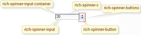
On the screenshot there are classes names that define styles for component elements.
Table 6.467. Classes names that define a component appearance
| Class name | Description |
|---|---|
| rich-spinner-c | Defines styles for a wrapper table element of a component |
| rich-spinner-input-container | Defines styles for a container |
| rich-spinner-input | Defines styles for a wrapper <td> element for input fields |
| rich-spinner-button | Defines styles for a button |
| rich-spinner-buttons | Defines styles for all buttons |
In order to redefine styles for all <rich:inputNumberSpinner> components on a page using CSS, it's enough to create classes with the same names (possible classes could be found in the table above ) and define necessary properties in them. An example is placed below:
Example:
...

.rich-spinner-input{

    font-style:italic;

}

...
This is a result:
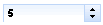
In the example an input text font style was changed.
Also it's possible to change styles of particular <rich:inputNumberSpinner> component. In this case you should create own style classes and use them in corresponding <rich:inputNumberSpinner> styleClass attributes. An example is placed below:
Example:
...

.myClass{

    font-family: Arial Black;

}

...
The "inputClass" attribute for <rich:inputNumberSpinner> is defined as it's shown in the example below:
Example:
<rich: inputNumberSpinner ... inputClass="myClass"/>
This is a result:
As it could be seen on the picture above, the font family for input text was changed.
On the component Live Demo page you can see the example of <rich:inputNumberSpinner> usage and sources for the given example.