Create new RichFaces Documentation Jira issue

This will launch the RichFaces Jira page - to complete your feedback please login if needed, and submit the Jira.
JBoss.orgCommunity Documentation
The <rich:progressBar> component is designed for displaying a progress bar which shows the current status of the process.
Ajax or Client modes
Option to control rerendering frequency
Customizable status information label
Highly customizable look and feel
Table 6.257. rich : progressBar attributes
| Attribute Name |
Description

|
|---|---|
| actionListener | MethodBinding pointing at method accepting an ActionEvent with return type void |
| ajaxSingle | Limits JSF tree processing (decoding, conversion, validation and model updating) only to a component that sends the request. Boolean |
| binding | JSF: The attribute takes a value-binding expression for a component property of a backing bean |
| bypassUpdates | If "true", after process validations phase it skips updates of model beans on a force render response. It can be used for validating components input |
| completeClass | Assigns one or more space-separated CSS class names to the component progress line rendering |
| data | Serialized (on default with JSON) data passed on the client by a developer on AJAX request. It's accessible via "data.foo" syntax |
| enabled | Enables/disables polling. Default value is "true". |
| eventsQueue | Name of requests queue to avoid send next request before complete other from same event. Can be used to reduce number of requests of frequently events (key press, mouse move etc.) |
| finishClass | Assigns one or more space-separated CSS class names to the progress bar complete state |
| focus | ID of an element to set focus after request is completed on client side |
| id | JSF: Every component may have a unique id that is automatically created if omitted |
| ignoreDupResponses | Attribute allows to ignore an Ajax Response produced by a request if the newest 'similar' request is in a queue already. ignoreDupResponses="true" does not cancel the request while it is processed on the server, but just allows to avoid unnecessary updates on the client side if the response isn't actual now |
| immediate | True means, that the default ActionListener should be executed immediately (i.e. during Apply Request Values phase of the request processing lifecycle), rather than waiting until the Invoke Application phase |
| initialClass | Assigns one or more space-separated CSS class names to the progress bar initial state |
| interval | Interval (in ms) for call poll requests. Default value 1000 ms (1 sec) |
| label | Attribute defines a simple label instead of rendering children component |
| limitToList | If "true", then of all AJAX-rendered on the page components only those will be updated, which ID's are passed to the "reRender" attribute of the describable component. "false"-the default value-means that all components with ajaxRendered="true" will be updated. |
| maxValue | Max value, after which complete state should be rendered. Default value is "100". |
| minValue | Min value when initial state should be rendered. Default value is "0". |
| mode | Attributes defines AJAX or CLIENT modes for component. Possible values are "ajax", "client". Default value is "ajax". |
| onbeforedomupdate | The client-side script method to be called before DOM is updated |
| onclick | DHTML: The client-side script method to be called when the element is clicked |
| oncomplete | The client-side script method to be called after the request is completed |
| ondblclick | DHTML: The client-side script method to be called when the element is double-clicked |
| onmousedown | DHTML: The client-side script method to be called when a mouse button is pressed down over the element |
| onmousemove | DHTML: The client-side script method to be called when a pointer is moved within the element |
| onmouseout | DHTML: The client-side script method to be called when a pointer is moved away from the element |
| onmouseover | DHTML: The client-side script method to be called when a pointer is moved onto the element |
| onmouseup | DHTML: The client-side script method to be called when a mouse button is released |
| onsubmit | DHTML: The client-side script method to be called before an ajax request is submitted |
| parameters | Parameters for macrosubstitution in the label |
| process | Id['s] (in format of call UIComponent.findComponent()) of components, processed at the phases 2-5 in case of AjaxRequest caused by this component. Can be single id, comma-separated list of Id's, or EL Expression with array or Collection |
| progressVar | DEPRECATED. Provides access to value of the component on the client |
| remainClass | Assigns one or more space-separated CSS class names to the remained part of the progress bar |
| rendered | JSF: If "false", this component is not rendered |
| reRender | Id['s] (in format of call UIComponent.findComponent()) of components, rendered in case of AjaxRequest caused by this component. Can be single id, comma-separated list of Id's, or EL Expression with array or Collection |
| reRenderAfterComplete | Set of componets to rerender after completion |
| similarityGroupingId | If there are any component requests with identical IDs then these requests will be grouped. |
| status | ID (in format of call UIComponent.findComponent()) of Request status component |
| style | HTML: CSS style rules to be applied to the component |
| styleClass | JSF: Assigns one or more space-separated CSS class names to the component. Corresponds to the HTML "class" attribute. |
| timeout | Response waiting time on a particular request. If a response is not received during this time, the request is aborted |
| title | HTML: Advisory title information about markup elements generated for this component |
| value | JSF: Sets the current value of the progress |
Table 6.258. Component identification parameters
| Name | Value |
|---|---|
| component-type | org.richfaces.ProgressBar |
| component-class | org.richfaces.component.html.HtmlProgressBar |
| component-family | org.richfaces.ProgressBar |
| renderer-type | org.richfaces.renderkit.ProgressBarRenderer |
| tag-class | org.richfaces.taglib.ProgressBarTag |
Here is a simple example of how the component can be used on a page:
Example:
...

<rich:progressBar value="#{bean.incValue1}"/>

...
Example:
import org.richfaces.component.html.progressBar;

...

HtmlProgressBar myProgressBar = new progressBar();

...
As it was mentioned above, the <rich:progressBar> component displays the status of the ongoing process.
The
<rich:progressBar>
component can run in two modes: Ajax (default) and Client.
Ajax - In this mode the component works the same way as
<a4j:poll/>
which gets the current progress value from the sever, repeating after a set time interval.
Client - The current progress value in Client mode is set using JavaScript API
In order to define the mode you need to use "mode" attribute.
One of the key attributes of the component is "interval" which defines the frequency of status polling and rerenders the component when the value is updated.
Polling is active while the "enabled" attribute is "true".
Example:
...

<rich:progressBar value="#{bean.incValue}" id="progrs" interval="900" enabled="true"/>

...
With the help of "timeout" attribute you can define the waiting time on a particular request. If a response is not received during this time the request is aborted.
Status of the process is calculated basing on values of the following attributes:
"value" is a value binding to the current progress value
"minValue" (default value is "0") sets minimal progress value
"maxValue" (default value is "100") sets maximum progress value
Example:
...

<rich:progressBar value="#{bean.incValue}"  minValue="50"  maxValue="400"/>

...
This is the result
There are two ways to display information on a progress bar:
Using "label" attribute
Example:
...

<rich:progressBar value="#{bean.incValue}" id="progrs" label="#{bean.incValue}"/>

...
Using any child(nested) components. One of the components that can be used is <h:outputText />
Example:
...

<rich:progressBar value="#{bean.incValue}">

    <h:outputText value="#{bean.incValue} %"/>

</rich:progressBar>

...
The <rich:progressBar> component provides 3 predefined macrosubstitution parameters:
{value} contains the current value
{minValue} contains min value
{maxValue} contains max value
You can use them as follows:
Example:
...

<rich:progressBar value="#{bean.incValue1}" minValue="400" maxValue="900">

        <h:outputText value="Min value is {minValue}, current value is {value}, max value is {maxValue}"/>

</rich:progressBar>

...
This is the result:
The
"parameters"
is also a special attribute which defines parameters that can be to get additional data from server (e.g. additional info about process status).
All you need is to define the value of your own parameter
(e.g parameters="param:'#{bean.incValue1}'")
and you can use it to pass the data.
Example:
...

<rich:progressBar value="#{bean.incValue}" parameters="param:'#{bean.dwnlSpeed}'">

    <h:outputText value="download speed {param} KB/s"/>

</rich:progressBar>

...
This is the result:
The "progressVar" attribute (deprecated) defines request scoped variable that could be used for substitution purpose. This variable contains the data taken from "value" attribute. Please, study carefully the following example.
Example:
...

<rich:progressBar value="#{bean.incValue1}" enabled="#{bean.enabled1}" id="progrs1" progressVar="progress">

    <h:outputText value="{progress}%"/>

</rich:progressBar>

...
In the shown example "progressVar" attribute defines a variable "progress" with the value taken from "value" attribute of the <rich:progressBar> component. The "progress" variable performs substitution passing the current progress value to the "value" attribute of the <h:outputText> . This is how the current value of a progress appears on the label of <rich:progressBar> .
As the
"progressVar"
attribute is deprecated, it's better to use
the predefined macrosubstitution parameter {value} instead. See how you can rewrite the above example with the help of {value}.
Example:
...

<rich:progressBar value="#{bean.incValue1}" enabled="#{bean.enabled1}" id="progrs1">

    <h:outputText value="{value}%"/>

</rich:progressBar>

...
The component can also employ "initial" and "complete" facets to display the states of the process: "initial" facet is displayed when the progress value is less or equal to "minValue" , and the "complete" facet is shown when the value is greater or equal to "maxValue" . Please see an example below.
Example:
...

<rich:progressBar value="#{bean.incValue1}">

    <f:facet name="initial">

        <h:outputText value="Process not started"/>

    </f:facet>

    <f:facet name="complete">

        <h:outputText value="Process completed"/>

    </f:facet>

</rich:progressBar>

 ...
Information about the "process" attribute usage you can find " Decide what to process " guide section.
Table 6.259. JavaScript API
| Function | Description |
|---|---|
| enable() | Begins polling for Ajax mode |
| disable() | Stops polling for Ajax mode |
| setValue(value) | Updates the progress of the process |
| setLabel(label) | Update the label for the process |
Table 6.260. Facets
| Facet name | Description |
|---|---|
| initial | Defines the information content about the state of the process if the progress value is less or equal to "minValue" |
| complete | Defines the information content about the state of the process if the value is greater or equal to "maxValue" |
For skinnability implementation, the components use a style class redefinition method. Default style classes are mapped on skin parameters.
There are two ways to redefine the appearance of all <rich:progressBar> components at once:
Redefine the corresponding skin parameters
Add to your style sheets style classes used by a <rich:progressBar> component
Table 6.261. Skin parameters redefinition for the progressBar without a label
| Skin parameters | CSS properties |
|---|---|
| controlBackgroundColor | background-color |
| panelBorderColor | border-color |
Table 6.262. Skin parameters redefinition for the completed progress area of the progressBar without a label
| Skin parameters | CSS properties |
|---|---|
| selectControlColor | background-color |
Table 6.263. Skin parameters redefinition for the progressBar with a label
| Skin parameters | CSS properties |
|---|---|
| panelBorderColor | border-color |
| generalFamilyFont | font-family |
| generalSizeFont | font-size |
| controlTextColor | color |
Table 6.264. Skin parameters redefinition for the label of the progressBar
| Skin parameters | CSS properties |
|---|---|
| panelBorderColor | border-color |
Table 6.265. Skin parameters redefinition for the completed progress area of the progressBar with a label
| Skin parameters | CSS properties |
|---|---|
| selectControlColor | background-color |
| controlBackgroundColor | color |
Table 6.266. Skin parameters redefinition for the remained progress area of the progressBar with a label
| Skin parameters | CSS properties |
|---|---|
| controlBackgroundColor | background-color |
| controlTextColor | color |
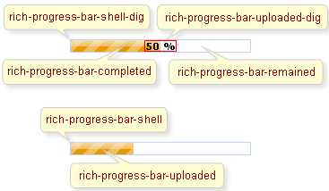
On the screenshot there are classes names that define styles for component elements.
Table 6.267. Classes names for the progressBar without a label
| Class name | Description |
|---|---|
| rich-progress-bar-shell | Defines styles for a wrapper <div> element of a progressBar |
| rich-progress-bar-uploaded | Defines styles for the completed progress area |
| rich-progress-bar-height | Defines height for a progressBar |
| rich-progress-bar-width | Defines width for a progressBar |
Table 6.268. Classes names for the progressBar with a label
| Class name | Description |
|---|---|
| rich-progress-bar-shell-dig | Defines styles for a wrapper <div> element of a progressBar |
| rich-progress-bar-uploaded-dig | Defines styles for the label |
| rich-progress-bar-remained | Defines styles for the remained progress area |
| rich-progress-bar-completed | Defines styles for the completed progress area |
| rich-progress-bar-height-dig | Defines height for a progressBar |
| rich-progress-bar-width | Defines width for a progressBar |
It's necessary to define width of the component in pixels only.
In order to redefine styles for all <rich:progressBar> components on a page using CSS, it's enough to create classes with the same names (possible classes could be found in the tables above) and define necessary properties in them.
Example:
...

.richfacesSkin .mceButton {

    border: 1px #FF0000 solid;

}

...
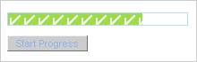
This is the result:
In the example above background color of the remained part of progress area was changed.
It's also possible to change styles of a particular <rich:progressBar> component. In this case you should create own style classes and use them in corresponding <rich:progressBar> styleClass attributes. An example is placed below:
Example:
...

.myClass{

        background-color: #ebf3fd;

}

...
The "styleClass" attribute for <rich:progressBar> is defined as it's shown in the example below:
Example:
<rich:progressBar value="#{bean.incValue1}" styleClass="myClass"/>
This is the result:
As it could be seen on the picture above, background color of the remained part of progress area was changed.
In order to change background image for the
<rich:progressBar>
it is necessary to create a CSS class with the same name as predefined one
(see the tables above) and change background-image CSS property for it:
...

.rich-progress-bar-uploaded {

      background-image : url(images/accept.gif);

}

...
This is the result:
On the component Live Demo page you can see the example of <rich:progressBar> usage and sources for the given example.