Create new RichFaces Documentation Jira issue

This will launch the RichFaces Jira page - to complete your feedback please login if needed, and submit the Jira.
JBoss.orgCommunity Documentation
The <rich:panelMenuItem> component is used to define a single item inside popup list.
Highly customizable look-and-feel
Different submission modes
Optionally supports any content inside
Custom and predefined icons supported
Support for disabling
Table 6.250. rich : panelMenuItem attributes
| Attribute Name |
Description

|
|---|---|
| action | MethodBinding pointing at the application action to be invoked, if this UIComponent is activated by you, during the Apply Request Values or Invoke Application phase of the request processing lifecycle, depending on the value of the immediate property |
| actionListener | MethodBinding pointing at method accepting an ActionEvent with return type void |
| ajaxSingle | Limits JSF tree processing (decoding, conversion, validation and model updating) only to a component that sends the request. Boolean |
| binding | JSF: The attribute takes a value-binding expression for a component property of a backing bean |
| bypassUpdates | If "true", after process validations phase it skips updates of model beans on a force render response. It can be used for validating components input |
| data | Serialized (on default with JSON) data passed on the client by a developer on AJAX request. It's accessible via "data.foo" syntax |
| disabled | HTML: If true sets state of the item to disabled state. Default value is "false". |
| disabledClass | Assigns one or more space-separated CSS class names to the disabled item |
| disabledStyle | CSS style rules to be applied to the disabled item |
| eventsQueue | Name of requests queue to avoid send next request before complete other from same event. Can be used to reduce number of requests of frequently events (key press, mouse move etc.) |
| focus | ID of an element to set focus after request is completed on client side |
| hoverClass | Assigns one or more space-separated CSS class names to the hovered item |
| hoverStyle | CSS style rules to be applied to the hovered item |
| icon | Path to the icon or the default one name to be displayed for the enabled item state. You can also use predefined icons, setting the attribute to one of these possible values: "triangle", "triangleUp", "triangleDown", "disc", "chevron", "chevronUp", "chevronDown", "grid". Default value is "grid". |
| iconClass | Assigns one or more space-separated CSS class names to the item icon element |
| iconDisabled | Path to the icon to be displayed for the disabled item state. You can also use predefined icons, setting the attribute to one of these possible values: "triangle", "triangleUp", "triangleDown", "disc", "chevron", "chevronUp", "chevronDown", "grid". Default value is "grid". |
| iconStyle | CSS style rules to be applied to the item icon element |
| id | JSF: Every component may have a unique id that is automatically created if omitted |
| ignoreDupResponses | Attribute allows to ignore an Ajax Response produced by a request if the newest 'similar' request is in a queue already. ignoreDupResponses="true" does not cancel the request while it is processed on the server, but just allows to avoid unnecessary updates on the client side if the response isn't actual now |
| immediate | True means, that the default ActionListener should be executed immediately (i.e. during Apply Request Values phase of the request processing lifecycle), rather than waiting until the Invoke Application phase |
| label | Defines representation text for menuItem. |
| limitToList | If "true", then of all AJAX-rendered on the page components only those will be updated, which ID's are passed to the "reRender" attribute of the describable component. "false"-the default value-means that all components with ajaxRendered="true" will be updated. |
| mode | Set the submission mode. Possible values are "ajax", "server", "none". Default value is "none". |
| name | 'selectedChild' attribute of PanelMenu refers to group/item with the same name. Default value is "getId()". |
| onbeforedomupdate | The client-side script method to be called before DOM is updated |
| onclick | DHTML: The client-side script method to be called when the element is clicked |
| oncomplete | The client-side script method to be called after the request is completed |
| ondblclick | DHTML: The client-side script method to be called when the element is double-clicked |
| onkeydown | DHTML: The client-side script method to be called when a key is pressed down over the element |
| onkeypress | DHTML: The client-side script method to be called when a key is pressed over the element and released |
| onkeyup | DHTML: The client-side script method to be called when a key is released |
| onmousedown | DHTML: The client-side script method to be called when a mouse button is pressed down over the element |
| onmousemove | DHTML: The client-side script method to be called when a pointer is moved within the element |
| onmouseout | DHTML: The client-side script method to be called when a pointer is moved away from the element |
| onmouseover | DHTML: The client-side script method to be called when a pointer is moved onto the element |
| onmouseup | DHTML: The client-side script method to be called when a mouse button is released |
| process | Id['s] (in format of call UIComponent.findComponent()) of components, processed at the phases 2-5 in case of AjaxRequest caused by this component. Can be single id, comma-separated list of Id's, or EL Expression with array or Collection |
| rendered | JSF: If "false", this component is not rendered |
| requestDelay | Attribute defines the time (in ms.) that the request will be wait in the queue before it is ready to send. When the delay time is over, the request will be sent to the server or removed if the newest 'similar' request is in a queue already |
| reRender | Id['s] (in format of call UIComponent.findComponent()) of components, rendered in case of AjaxRequest caused by this component. Can be single id, comma-separated list of Id's, or EL Expression with array or Collection |
| similarityGroupingId | If there are any component requests with identical IDs then these requests will be grouped. |
| status | ID (in format of call UIComponent.findComponent()) of Request status component |
| style | HTML: CSS style rules to be applied to the component |
| styleClass | JSF: Assigns one or more CSS class names to the component. Corresponds to the HTML "class" attribute. |
| target | HTML: Target frame for action to execute. |
| timeout | Response waiting time on a particular request. If a response is not received during this time, the request is aborted |
| value | JSF: The current value for this component |
Table 6.251. Component identification parameters
| Name | Value |
|---|---|
| component-type | org.richfaces.PanelMenuItem |
| component-class | org.richfaces.component.html.HtmlPanelMenuItem |
| component-family | org.richfaces.PanelMenuItem |
| renderer-type | org.richfaces.PanelMenuItemRenderer |
| tag-class | org.richfaces.taglib.PanelMenuItemTag |
To create the simplest variant on a page use the following syntax:
Example:
...

<rich:panelMenu>

        ...

        <rich:panelMenuItem value="Item1"/>

        ...

</rich:panelMenu>

...
Example:
import org.richfaces.component.html.HtmlPanelMenuItem;

...

HtmlPanelMenuItem myPanelMenuItem = new HtmlPanelMenuItem();

...
All attributes except "label" are optional. The "label" attribute defines text to be represented.
The "mode" attribute could be used with three possible parameters:
Server (default)
Regular form submission request is used.
Ajax
Ajax submission is used for switching.
None
"Action" and "actionListener" attributes are ignored. Items don't fire any submits itself. Behavior is fully defined by the components nested into items.
Here is an example for value "none":
Example:
...

<rich:panelMenu>

        ...

       <rich:panelMenuItem mode="none" onclick="document.location.href='http://labs.jboss.com/jbossrichfaces/">

                <h:outputLink value="http://labs.jboss.com/jbossrichfaces/">

                    <h:outputText value="RichFaces Home Page"></h:outputText>

                </h:outputLink>

        </rich:panelMenuItem>

        ...

</rich:panelMenu>

...
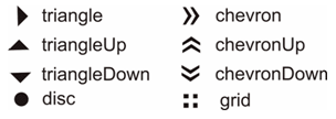
There are two icon-related attributes. The "icon" attribute defines an icon. The "iconDisabled" attribute defines an icon for a disabled item.
Default icons are shown on the picture below:
Here is an example:
Example:
...
<rich:panelMenu>
...
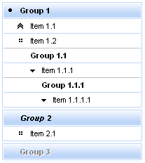
<rich:panelMenuItem value="Item 1.1" icon="chevronUp" />
...
</rich:panelMenu>
...
As the result the picture is shown below:
It's also possible to define a path to the icon. Simple code is placed below.
...

<rich:panelMenu>

        ...

        <rich:panelMenuItem value="Item 1.1" icon="\images\img1.png" />

        ...

</rich:panelMenu>

...
Information about the "process" attribute usage you can find in the "Decide what to process" guide section.
For skinnability implementation, the components use a style class redefinition method. Default style classes are mapped on skin parameters.
There are two ways to redefine the appearance of all <rich:panelMenuItem> components at once:
Redefine the corresponding skin parameters
Add to your style sheets style classes used by a <rich:panelMenuItem> component
Table 6.252. Skin parameters redefinition for a table element of the first level item
| Skin parameters | CSS properties |
|---|---|
| generalFamilyFont | font-family |
| generalWeightFont | font-weight |
| generalSizeFont | font-size |
| generalTextColor | color |
| panelBorderColor | border-top-color |
Table 6.253. Skin parameter redefinition for a disabled item
| Parameter for disabled item | CSS properties |
|---|---|
| tabDisabledTextColor | color |
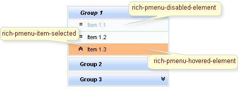
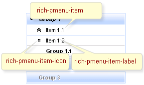
On the screenshot there are classes names that define styles for component elements.
Table 6.254. Classes names that define the first level items
| Class name | Description |
|---|---|
| rich-pmenu-top-item | Defines styles for a top panel menu item |
| rich-pmenu-top-item-icon | Defines styles for a top panel menu item icon |
| rich-pmenu-top-item-label | Defines styles for a top panel menu item label |
Table 6.255. Classes names that define the second and lower level items
| Class name | Description |
|---|---|
| rich-pmenu-item | Defines styles for a panel menu item |
| rich-pmenu-item-icon | Defines styles for a panel menu item icon |
| rich-pmenu-item-label | Defines styles for a panel menu item label |
Table 6.256. Classes names that define items state
| Class name | Description |
|---|---|
| rich-pmenu-item-selected | Defines styles for a panel menu selected item |
| rich-pmenu-disabled-element | Defines styles for a disabled panel menu item |
| rich-pmenu-hovered-element | Defines styles for a hovered panel menu item |
In order to redefine styles for all <rich:panelMenuItem> components on a page using CSS, it's enough to create classes with the same names (possible classes could be found in the tables above) and define necessary properties in them.
Example:
...
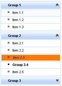
.rich-pmenu-hovered-element {
background-color: #ff7800;
}
...
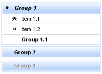
This is a result:
In the example a hovered element background color was changed.
Also it's possible to change styles of particular <rich:panelMenuItem> component. In this case you should create own style classes and use them in corresponding <rich:panelMenuItem> styleClass attributes. An example is placed below:
Example:
...

.myClass {

        color: #a0a0a0;

}

...
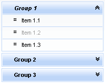
The "disabledClass" attribute for <rich:panelMenuItem> is defined as it's shown in the example below:
Example:
<rich:panelMenuItem ... disabledClass="myClass"/>
This is a result:
As it could be seen on the picture above, the text color for disabled item was changed.
Some additional information about usage of component can be found on this LiveDemo page.