Create new RichFaces Documentation Jira issue

This will launch the RichFaces Jira page - to complete your feedback please login if needed, and submit the Jira.
JBoss.orgCommunity Documentation
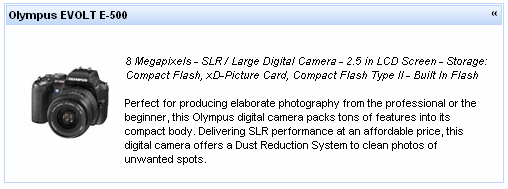
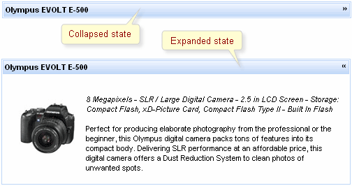
A collapsible panel, which content shows/hides after activating a header control.
Highly customizable look and feel
Support for any content inside
Collapsing expanding content
Three modes of collapsing/expanding
Server
Client
Ajax
Table 6.272. rich : simpleTogglePanel attributes
| Attribute Name |
Description

|
|---|---|
| action | MethodBinding pointing at the application action to be invoked, if this UIComponent is activated by you, during the Apply Request Values or Invoke Application phase of the request processing lifecycle, depending on the value of the immediate property |
| actionListener | MethodBinding pointing at method accepting an ActionEvent with return type void |
| ajaxSingle | Limits JSF tree processing (decoding, conversion, validation and model updating) only to a component that sends the request. Boolean |
| binding | JSF: The attribute takes a value-binding expression for a component property of a backing bean |
| bodyClass | Assigns one or more space-separated CSS class names to the panel content |
| bypassUpdates | If "true", after process validations phase it skips updates of model beans on a force render response. It can be used for validating components input |
| data | Serialized (on default with JSON) data passed on the client by a developer on AJAX request. It's accessible via "data.foo" syntax |
| eventsQueue | Name of requests queue to avoid send next request before complete other from same event. Can be used to reduce number of requests of frequently events (key press, mouse move etc.) |
| focus | ID of an element to set focus after request is completed on client side |
| headerClass | Assigns one or more space-separated CSS class names to the panel header |
| height | Height of a simple toggle panel content area might be defined as pixels or in percents. By default height is not defined |
| id | JSF: Every component may have a unique id that is automatically created if omitted |
| ignoreDupResponses | Attribute allows to ignore an Ajax Response produced by a request if the newest 'similar' request is in a queue already. ignoreDupResponses="true" does not cancel the request while it is processed on the server, but just allows to avoid unnecessary updates on the client side if the response isn't actual now |
| immediate | True means, that the default ActionListener should be executed immediately (i.e. during Apply Request Values phase of the request processing lifecycle), rather than waiting until the Invoke Application phase |
| label | Marker to be rendered on a panel header |
| limitToList | If "true", then of all AJAX-rendered on the page components only those will be updated, which ID's are passed to the "reRender" attribute of the describable component. "false"-the default value-means that all components with ajaxRendered="true" will be updated. |
| onbeforedomupdate | The client-side script method to be called before DOM is updated |
| onclick | DHTML: The client-side script method to be called when the element is clicked |
| oncollapse | The client-side script method to be called before a panel is collapsed |
| oncomplete | The client-side script method to be called after the request is completed |
| ondblclick | DHTML: The client-side script method to be called when the element is double-clicked |
| onexpand | The client-side script method to be called before a panel is expanded |
| onkeydown | DHTML: The client-side script method to be called when a key is pressed down over the element |
| onkeypress | DHTML: The client-side script method to be called when a key is pressed over the element and released |
| onkeyup | DHTML: The client-side script method to be called when a key is released |
| onmousedown | DHTML: The client-side script method to be called when a mouse button is pressed down over the element |
| onmousemove | DHTML: The client-side script method to be called when a pointer is moved within the element |
| onmouseout | DHTML: The client-side script method to be called when a pointer is moved away from the element |
| onmouseover | DHTML: The client-side script method to be called when a pointer is moved onto the element |
| onmouseup | DHTML: The client-side script method to be called when a mouse button is released |
| opened | A "false" value for this attribute makes the panel closed by default. Default value is "true". |
| process | Id['s] (in format of call UIComponent.findComponent()) of components, processed at the phases 2-5 in case of AjaxRequest caused by this component. Can be single id, comma-separated list of Id's, or EL Expression with array or Collection |
| rendered | JSF: If "false", this component is not rendered |
| requestDelay | Attribute defines the time (in ms.) that the request will be wait in the queue before it is ready to send. When the delay time is over, the request will be sent to the server or removed if the newest 'similar' request is in a queue already |
| reRender | Id['s] (in format of call UIComponent.findComponent()) of components, rendered in case of AjaxRequest caused by this component. Can be single id, comma-separated list of Id's, or EL Expression with array or Collection |
| similarityGroupingId | If there are any component requests with identical IDs then these requests will be grouped. |
| status | ID (in format of call UIComponent.findComponent()) of Request status component |
| style | HTML: CSS style rules to be applied to the component |
| styleClass | JSF: Assigns one or more CSS class names to the component. Corresponds to the HTML "class" attribute. |
| switchType | Panels switch mode: "client", "server"(default), "ajax" |
| timeout | Response waiting time on a particular request. If a response is not received during this time, the request is aborted |
| value | JSF: The current value for this component |
| width | HTML: Width of a simple toggle panel might be defined as pixels or in percents. By default width is not defined |
Table 6.273. Component identification parameters
| Name | Value |
|---|---|
| component-type | org.richfaces.SimpleTogglePanel |
| component-class | org.richfaces.component.html.HtmlSimpleTogglePanel |
| component-family | org.richfaces.SimpleTogglePanel |
| renderer-type | org.richfaces.SimpleTogglePanelRenderer |
| tag-class | org.richfaces.taglib.SimpleTogglePanelTag |
To create the simplest variant on a page use the following syntax:
Example:
...

<rich:simpleTogglePanel>

    ...

</rich:simpleTogglePanel>

...
Example:
import org.richfaces.component.html.HtmlSimpleTogglePanel;

...

HtmlSimpleTogglePanel myPanel = new HtmlSimpleTogglePanel();

...
The component is a simplified version of toggle panel that initially has a defined layout as a panel with a header playing a role of a mode switching control. On a component header element, it's possible to define a label using an attribute with the same name.
Switching mode could be defined with the "switchType" attribute with three possible parameters.
Server (DEFAULT)
The common submission is performed around simpleTogglePanel and a page is completely rendered on a called panel. Only one at a time panel is uploaded onto the client side.
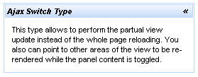
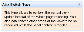
Ajax
AJAX form submission is performed around the panel, content of the called panel is uploaded on Ajax request and additionally specified elements in the "reRender" attribute are rendered. Only one at a time panel is uploaded on the client side.
Client
All panels are uploaded on the client side. Switching from the active to the hidden panel is performed with client JavaScript.
The <rich:simpleTogglePanel> component also has an "opened" attribute responsible for keeping a panel state. It gives an opportunity to manage state of the component from a model. If the value of this attribute is"true" the component is expanded.
"onmouseover "
"onclick "
"onmouseout "
etc.
With help of "openMarker" and "closeMarker" facets you can set toggle icon for simpleTogglePanel .
Information about the "process" attribute usage you can find " Decide what to process " guide section.
Table 6.274. Facets
| Facet name | Description |
|---|---|
| openMarker | Redefines the icon for expanding the panel |
| closeMarker | Redefines the icon for collapsing the panel |
For skinnability implementation, the components use a style class redefinition method. Default style classes are mapped on skin parameters.
There are two ways to redefine the appearance of all <rich:simpleTooglePanel> components at once:
Redefine the corresponding skin parameters
Add to your style sheets style classes used by a <rich:simpleTooglePanel> component
Table 6.275. Skin parameters for a whole component
| Skin parameters | CSS properties |
|---|---|
| generalBackgroundColor | background-color |
| panelBorderColor | border-color |
Table 6.276. Skin parameters for a header element
| Skin parameters | CSS properties |
|---|---|
| headerBackgroundColor | background-color |
| headerBackgroundColor | border-color |
| headerSizeFont | font-size |
| headTextColor | color |
| headerWeightFont | font-weight |
| headerFamilyFont | font-family |
Table 6.277. Skin parameters for a body element
| Skin parameters | CSS properties |
|---|---|
| generalBackgroundColor | background-color |
| generalSizeFont | font-size |
| panelTextColor | color |
| generalFamilyFont | font-family |
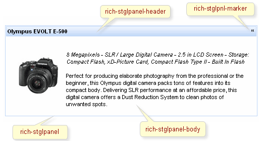
On the screenshot there are classes names that define styles for component elements.
Table 6.278. Classes names that define a component appearance
| Class name | Class description |
|---|---|
| rich-stglpanel | Defines styles for a wrapper <div> element of a component |
| rich-stglpanel-header | Defines styles for header element of a component |
| rich-stglpnl-marker | Defines styles for a wrapper <div> element of a marker |
| rich-stglpanel-body | Defines styles for a component content |
Table 6.279. Style component classes
| Class name | Class description |
|---|---|
| styleClass | The class defines panel common style. It's used in the outside <div> element |
| bodyClass | applicable to panels body elements |
| headerClass | applicable to header elements |
In order to redefine styles for all <rich:simpleTogglePanel> components on a page using CSS, it's enough to create classes with the same names (possible classes could be found in the tables above) and define necessary properties in them.
Example:
...

.rich-stglpanel-header{

    font-style:italic;

}

...
This is a result:
In the example the font style for header was changed.
Also it's possible to change styles of particular <rich:simpleTogglePanel> component. In this case you should create own style classes and use them in corresponding <rich:simpleTogglePanel> styleClass attributes. An example is placed below:
Example:
...

.myClass{

    background-color:#ffead9;

}

...
The "bodyClass" attribute for <rich:simpleTogglePanel> is defined as it's shown in the example below:
Example:
<rich:simpleTogglePanel ... bodyClass="myClass"/>
This is a result:
As it could be seen on the picture above,background color for body was changed.
On the component LiveDemo page you can see the example of <rich:simpleTogglePanel> usage and sources for the given example.