Create new RichFaces Documentation Jira issue

This will launch the RichFaces Jira page - to complete your feedback please login if needed, and submit the Jira.
JBoss.orgCommunity Documentation
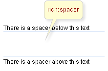
A spacer that is used in layout and rendered as a transparent image.
Easily used as a transparent layout spacer
Horizontal or vertical spacing is managed by an attribute
Easily customizable sizes parameters
Table 6.280. rich : spacer attributes
| Attribute Name |
Description

|
|---|---|
| binding | JSF: The attribute takes a value-binding expression for a component property of a backing bean |
| height | The height of the spacer defined in pixels. Default value is "1px". |
| id | JSF: Every component may have a unique id that is automatically created if omitted |
| onclick | DHTML: The client-side script method to be called when the element is clicked |
| ondblclick | DHTML: The client-side script method to be called when the element is double-clicked |
| onkeydown | DHTML: The client-side script method to be called when a key is pressed down over the element |
| onkeypress | DHTML: The client-side script method to be called when a key is pressed over the element and released |
| onkeyup | DHTML: The client-side script method to be called when a key is released |
| onmousedown | DHTML: The client-side script method to be called when a mouse button is pressed down over the element |
| onmousemove | DHTML: The client-side script method to be called when a pointer is moved within the element |
| onmouseout | DHTML: The client-side script method to be called when a pointer is moved away from the element |
| onmouseover | DHTML: The client-side script method to be called when a pointer is moved onto the element |
| onmouseup | DHTML: The client-side script method to be called when a mouse button is released |
| rendered | JSF: If "false", this component is not rendered |
| style | HTML: CSS style rules to be applied to the component |
| styleClass | JSF: Assigns one or more CSS class names to the component. Corresponds to the HTML "class" attribute. |
| title | HTML: HTML: An advisory title for this element. Often used by the user agent as a tooltip |
| width | HTML: The width of the spacer defined in pixels. Default value is "1px". |
Table 6.281. Component identification parameters
| Name | Value |
|---|---|
| component-type | org.richfaces.spacer |
| component-class | org.richfaces.component.html.HtmlSpacer |
| component-family | org.richfaces.spacer |
| renderer-type | org.richfaces.SpacerRenderer |
| tag-class | org.richfaces.taglib.SpacerTag |
To create the simplest variant on a page use the following syntax::
Example:
...

<rich:spacer/>

...
Example:
import org.richfaces.component.html.HtmlSpacer;

...

HtmlSpacer mySpacer = new HtmlSpacer();

...
<rich:spacer> is a simple layout component which represents a transparent spacer. Thus, the main attributes that define its style are "style" and "styleClass".
In addition, the attributes are responsible for the component size: "width" and "height".
Moreover, to add e.g. some JavaScript effects, events defined on it are used.
"onmouseover "
"onclick "
"onmouseout "
etc.
On the component generation, the framework presents a default rich-spacer class in "styleClass" of a generated component, i.e. in order to redefine appearance of all spacers at once, it's necessary to redefine this class in your own CSS (replacing in the result properties defined in a skin with your own).
To define appearance of the particular spacer, it's possible to write your own CSS classes and properties in the component style attributes ( "style", "styleClass" ) modifying component property.
On the component LiveDemo page you can see the example of <rich:spacer> usage and sources for the given example.