Create new RichFaces Documentation Jira issue

This will launch the RichFaces Jira page - to complete your feedback please login if needed, and submit the Jira.
JBoss.orgCommunity Documentation
A tab panel displaying tabs for grouping content of the panel.
Skinnable tab panel and child items
Disabled/enabled tab options
Customizable headers
Group any content inside a tab
Each tab has a unique name for direct access (e.g. for switching between tabs)
Switch methods can be easily customized with attribute to:
Server
Client
AJAX
Switch methods can be selected for the whole tab panel and for the each tab separately
Table 6.282. rich : tabPanel attributes
| Attribute Name |
Description

|
|---|---|
| activeTabClass | Assigns one or more space-separated CSS class names to the component active tab |
| binding | JSF: The attribute takes a value-binding expression for a component property of a backing bean |
| contentClass | CSS style rules to be applied to the panel content |
| contentStyle | Assigns one or more space-separated CSS class names to the panel content |
| converter | JSF: Id of Converter to be used or reference to a Converter |
| converterMessage | A ValueExpression enabled attribute that, if present, will be used as the text of the converter message, replacing any message that comes from the converter |
| dir | HTML: Direction indication for text that does not inherit directionality. Valid values are "LTR" (left-to-right) and "RTL" (right-to-left) |
| disabledTabClass | Assigns one or more space-separated CSS class names to the component disabled tab |
| headerAlignment | Sets tab headers alignment. It can be "left" or "right". Default value is "left". |
| headerClass | Assigns one or more space-separated CSS class names to the panel header |
| headerSpacing | Sets tab headers spacing. It should be a valid size unit expression. Default value is "1px". |
| height | Height of a tab panel defined in pixels or in percents |
| id | JSF: Every component may have a unique id that is automatically created if omitted |
| immediate | A flag indicating that this component value must be converted and validated immediately (that is, during Apply Request Values phase), rather than waiting until a Process Validations phase |
| inactiveTabClass | Assigns one or more space-separated CSS class names to the component inactive (but not disabled) tabs |
| label | A localized user presentable name for this component. |
| lang | HTML: Code describing the language used in the generated markup for this component |
| onclick | DHTML: The client-side script method to be called when the element is clicked |
| ondblclick | DHTML: The client-side script method to be called when the element is double-clicked |
| onkeydown | DHTML: The client-side script method to be called when a key is pressed down over the element |
| onkeypress | DHTML: The client-side script method to be called when a key is pressed over the element and released |
| onkeyup | DHTML: The client-side script method to be called when a key is released |
| onmousedown | DHTML: The client-side script method to be called when a mouse button is pressed down over the element |
| onmousemove | DHTML: The client-side script method to be called when a pointer is moved within the element |
| onmouseout | DHTML: The client-side script method to be called when a pointer is moved away from the element |
| onmouseover | DHTML: The client-side script method to be called when a pointer is moved onto the element |
| onmouseup | DHTML: The client-side script method to be called when a mouse button is released |
| ontabchange | The client-side script method to be called before a tab is changed |
| rendered | JSF: If "false", this component is not rendered |
| required | JSF: If "true", this component is checked for non-empty input |
| requiredMessage | A ValueExpression enabled attribute which defines text of validation message to show, if a required field is missing |
| selectedTab | Attribute defines name of selected tab |
| style | HTML: CSS style rules to be applied to the component |
| styleClass | JSF: Assigns one or more CSS class names to the component. Corresponds to the HTML "class" attribute. |
| switchType | Tabs switch mode: "client", "server"(default), "ajax" |
| tabClass | Assigns one or more space-separated CSS class names to the component tabs |
| title | HTML: Advisory title information about markup elements generated for this component |
| validator | JSF: MethodBinding pointing at a method that is called during Process Validations phase of the request processing lifecycle, to validate the current value of this component |
| validatorMessage | A ValueExpression enabled attribute that, if present, will be used as the text of the validator message, replacing any message that comes from the validator |
| value | JSF: The current value of this component |
| valueChangeListener | JSF: Listener for value changes |
| width | HTML: Width of a tab panel defined in pixels or in percents. The default value is 100% |
Table 6.283. Component identification parameters
| Name | Value |
|---|---|
| component-type | org.richfaces.tabPanel |
| component-class | org.richfaces.component.html.HtmltabPanel |
| component-family | org.richfaces.tabPanel |
| renderer-type | org.richfaces.tabPanelRenderer |
| tag-class | org.richfaces.taglib.tabPanelTag |
To create the simplest variant on a page use the following syntax:
Example:
...

<rich:tabPanel>

        <!--Set of Tabs inside-->

        <rich:tab>

                ...

        </rich:tab>

</rich:tabPanel>

...
Example:
import org.richfaces.component.html.HtmltabPanel;

...

HtmltabPanel mytabPanel = new HtmltabPanel();

...
As it was mentioned above, tabPanel groups content on panels and performs switching from one to another. Hence, modes of switching between panels are described first of all.
All tabPanels should be wrapped into a form element so as content is correctly submitted inside. If a form is placed into each tab, the Action elements of Tab controls appear to be out of the form and content submission inside the panels could be performed only for Action components inside tabs.
Switching mode could be chosen with the tabPanel attribute "switchType" with three possible parameters.
Server (DEFAULT)
The common submission is performed around tabPanel and a page is completely rendered on a called panel. Only one at a time tabPanel is uploaded onto the client side.
Ajax
AJAX form submission is performed around the tabPanel, content of the called tabPanel is uploaded on Ajax request. Only one at a time tabPanel is uploaded on the client.
Client
All tabPanels are uploaded on the client side. The switching from the active to the hidden panel is performed with client JavaScript.
As a result, the tabPanel is switched to the second tab according to the action returning outcome for moving onto another page and switching from the second to the first tab is performed.
There is also the "selectedTab" attribute. The attribute keeps an active tab name; therefore, an active tabPanel could be changed with setting a name of the necessary tab to this attribute.
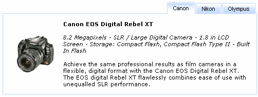
There is also the "headerAlignment" attribute responsible for rendering of tabPanel components. The attribute has several values: "left" (Default), "right", "center", which specify Tabs components location on the top of the tabPanel.
Example:
...

<rich:tabPanel width="40%" headerAlignment="right">

        <rich:tab label="Canon">

                ...

        </rich:tab>

        <rich:tab label="Nikon">

                ...

        </rich:tab>

        <rich:tab label="Olympus">

                ...

        </rich:tab>

</rich:tabPanel>

...
The
"label"
attribute is a generic attribute. The
"label"
attribute provides an association between a component, and
the message that the component (indirectly) produced. This attribute
defines the parameters of localized error and informational messages
that occur as a result of conversion, validation, or other application
actions during the request processing lifecycle. With the help of this
attribute you can replace the last parameter substitution token shown
in the messages. For example, {1} for
"DoubleRangeValidator.MAXIMUM",
{2} for "ShortConverter.SHORT".
Except the specific attributes, the component has all necessary attributes for JavaScript events definition.
"onmouseover"
"onmouseout"
etc.
For skinnability implementation, the components use a style class redefinition method. Default style classes are mapped on skin parameters.
There are two ways to redefine the appearance of all <rich:tabPanel> components at once:
Redefine the corresponding skin parameters
Add to your style sheets style classes used by a <rich:tabPanel> component
Table 6.284. Skin parameters redefinition for a header
| Skin parameters | CSS properties |
|---|---|
| panelBorderColor | border-top-color |
Table 6.285. Skin parameters redefinition for an internal content
| Skin parameters | CSS properties |
|---|---|
| generalBackgroundColor | background-color |
| generalTextColor | color |
| panelBorderColor | border-bottom-color |
| panelBorderColor | border-right-color |
| panelBorderColor | border-left-color |
| generalSizeFont | font-size |
| generalFamilyFont | font-family |
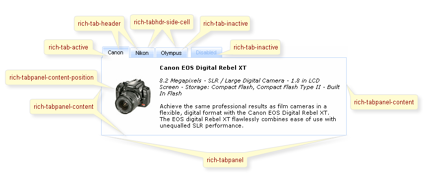
On the screenshot there are classes names that define styles for component elements.
Table 6.286. Classes names that define a component appearance
| Class name | Description |
|---|---|
| rich-tabpanel | Defines styles for all tabPanel |
| rich-tabpanel-content | Defines styles for an internal content |
| rich-tabpanel-content-position | Defines styles for a wrapper element of a tabPanel content. It should define a shift equal to borders width in order to overlap panel tabs |
| rich-tabhdr-side-border | Defines styles for side elements of a tabPanel header |
| rich-tabhdr-side-cell | Defines styles for a header internal element |
| rich-tab-bottom-line | Defines styles for a tab bottom line element of a tabPanel |
Table 6.287. Classes names that define different tab header states (corresponds to rich-tabhdr-side-cell)
| Class name | Description |
|---|---|
| rich-tabhdr-cell-active | Defines styles for an internal element of an active header |
| rich-tabhdr-cell-inactive | Defines styles for an internal element of an inactive label |
| rich-tabhdr-cell-disabled | Defines styles for an internal element of a disabled label |
In order to redefine styles for all <rich:tabPanel> components on a page using CSS, it's enough to create classes with the same names (possible classes could be found in the table above) and define necessary properties in them. An example is placed below:
Example:
...
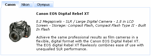
.rich-tabhdr-cell-active{
font-weight: bold;
}
...
This is a result:
In the example a tab active font weight and text color were changed.
Also it's possible to change styles of particular <rich:tabPanel> component. In this case you should create own style classes and use them in corresponding <rich:tabPanel> styleClass attributes. An example is placed below:
Example:
...

.myClass{

       font-style: italic;

}

...
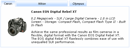
The "styleClass" attribute for <rich:tabPanel> is defined as it's shown in the example below:
Example:
<rich:tabPanel ... activeTabClass="myClass"/>
This is a result:
As it could be seen on the picture above, font style on inactive tab was changed.
On the component LiveDemo page you can see the example of <rich:tabPanel> usage and sources for the given example.