Create new RichFaces Documentation Jira issue

This will launch the RichFaces Jira page - to complete your feedback please login if needed, and submit the Jira.
JBoss.orgCommunity Documentation
The component adds on-keypress suggestions capabilities to any input text component (like <h:inputText> ). When a key is pressed in the field Ajax request is sent to the server. When the suggestion action returns a list of possible values, it pop ups them inside the <div> element bellow the input.
Fully skinnable component
Adds "onkeypress" suggestions capabilities to any input text component
Performs suggestion via Ajax requests without any line of JavaScript code written by you
Possible to render table as a popup suggestion
Can be pointed to any Ajax request status indicator of the page
Easily customizable size of suggestion popup
Setting rules that appear between cells within a table of popup values
"Event queue" and "request delay" attributes present to divide frequently requests
Managing area of components submitted on Ajax request
Flexible list of components to update after Ajax request managed by attributes
Setting restriction to Ajax request generation
Easily setting action to collect suggestion data
Keyboard navigation support
Table 6.468. rich : suggestionbox attributes
| Attribute Name |
Description

|
|---|---|
| ajaxSingle | Boolean attribute which provides possibility to limit JSF tree processing(decoding, conversion/validation, value applying) to the component which send the request only. Default value is "true" |
| bgcolor | Deprecated. This attribute sets the background color for the document body or table cells. This attribute sets the background color of the canvas for the document body (the BODY element) or for tables (the TABLE, TR, TH, and TD elements). Additional attributes for specifying text color can be used with the BODY element. This attribute has been deprecated in favor of style sheets for specifying background color information |
| binding | JSF: The attribute takes a value-binding expression for a component property of a backing bean |
| border | HTML: This attributes specifies the width (in pixels only) of the frame around a table |
| bypassUpdates | If "true", after process validations phase it skips updates of model beans on a force render response. It can be used for validating components input |
| cellpadding | This attribute specifies the amount of space between the border of the cell and its contents. If the value of this attribute is a pixel length, all four margins should be this distance from the contents. If the value of the attribute is percentage length, the top and bottom margins should be equally separated from the content based on percentage of the available vertical space, and the left and right margins should be equally separated from the content based on percentage of the available horizontal space |
| cellspacing | This attribute specifies how much space the user agent should leave between the table and the column on all four sides. The attribute also specifies the amount of space to leave between cells |
| dir | HTML: Direction indication for text that does not inherit directionality. Valid values are "LTR" (left-to-right) and "RTL" (right-to-left) |
| entryClass | Assigns one or more space-separated CSS class names to the suggestion entry elements (table rows) |
| eventsQueue | Name of requests queue to avoid send next request before complete other from same event. Can be used to reduce number of requests of frequently events (key press, mouse move etc.) |
| fetchValue | A value to set in the target input element on a choice suggestion that isn't shown in the suggestion table. It can be used for descriptive output comments or suggestions. If not set, all text in the suggestion row is set as a value |
| first | A zero-relative row number of the first row to display |
| for | id (or full path of id's) of target components, for which this element must provide support. If a target component inside of the same <code>NamingContainer</code> (UIForm, UIData in base implementations), can be simple value of the "id" attribute. For other cases must include id's of <code>NamingContainer</code> components, separated by ':'. For search from the root of components, must be started with ':'. |
| frame | This attribute specifies which sides of the frame surrounding a table will be visible. Possible values: "void", "above", "below", "hsides", "lhs", "rhs", "vsides", "box" and "border". The default value is "void". |
| frequency | Delay (in seconds) before activating the suggestion pop-up. Default value is 400ms |
| height | Height of the pop-up window in pixels. Default value is "200". |
| id | JSF: Every component may have a unique id that is automatically created if omitted |
| ignoreDupResponses | Attribute allows to ignore an Ajax Response produced by a request if the newest 'similar' request is in a queue already. ignoreDupResponses="true" does not cancel the request while it is processed on the server, but just allows to avoid unnecessary updates on the client side if the response isn't actual now |
| immediate | A flag indicating that this component value must be converted and validated immediately (that is, during Apply Request Values phase), rather than waiting until a Process Validations phase. |
| lang | HTML: Code describing the language used in the generated markup for this component |
| limitToList | If "true", then of all AJAX-rendered on the page components only those will be updated, which ID's are passed to the "reRender" attribute of the describable component. "false"-the default value-means that all components with ajaxRendered="true" will be updated. |
| minChars | Minimal number of chars in input to activate suggestion pop-up |
| nothingLabel | "nothingLabel" is inserted to popup list if the autocomplete returns empty list. It isn't selectable and list is closed as always after click on it and nothing is put to input. |
| onbeforedomupdate | The client-side script method to be called before DOM is updated |
| oncomplete | The client-side script method to be called after the request is completed |
| onobjectchange | The client-side script method to be called before the list of suggested objects is changed |
| onselect | The client-side script method to be called after the value of the target element is updated |
| onsubmit | DHTML: The client-side script method to be called before an ajax event is submitted |
| param | Name the HTTP request parameter with the value of input element token. If not set, it be will sent as an input element name. In this case, input will perform validation and update the value. Default value is "inputvalue". |
| popupClass | Assigns one or more space-separated CSS class names to the content of the pop-up suggestion element |
| popupStyle | CSS style rules to be applied to the content of the pop-up suggestion element |
| process | Id['s] (in format of call UIComponent.findComponent()) of components, processed at the phases 2-5 in case of AjaxRequest caused by this component. Can be single id, comma-separated list of Id's, or EL Expression with array or Collection |
| rendered | JSF: If "false", this component is not rendered |
| requestDelay | Attribute defines the time (in ms.) that the request will be wait in the queue before it is ready to send. When the delay time is over, the request will be sent to the server or removed if the newest 'similar' request is in a queue already |
| reRender | Id['s] (in format of call UIComponent.findComponent()) of components, rendered in case of AjaxRequest caused by this component. Can be single id, comma-separated list of Id's, or EL Expression with array or Collection |
| rowClasses | JSF: Assigns one or more space-separated CSS class names to the rows. If the CSS class names are comma-separated, each class will be assigned to a particular row in the order they follow in the attribute. If you have less class names than rows, the class will be applied to every n-fold row where n is the order in which the class is listed in the attribute. If there are more class names than rows, the overflow ones are ignored. |
| rules | This attribute specifies which rules will appear between cells within a table. The rendering of rules is user agent dependent. Possible values: * none: No rules. This is the default value. * groups: Rules will appear between row groups (see THEAD, TFOOT, and TBODY) and column groups (see COLGROUP and COL) only. * rows: Rules will appear between rows only. * cols: Rules will appear between columns only. * all: Rules will appear between all rows and columns |
| selectedClass | Assigns one or more space-separated CSS class names to the selected suggestion entry (table rows) |
| selectValueClass | Assigns one or more space-separated CSS class names to the cells of the selected suggestion entry (table cells) |
| selfRendered | If "true", forces active Ajax region render response directly from stored components tree, bypasses page processing. Can be used for increase performance. Also, must be set to 'true' inside iteration components, such as dataTable. |
| shadowDepth | Pop-up shadow depth for suggestion content |
| shadowOpacity | Attribute defines shadow opacity for suggestion content |
| similarityGroupingId | If there are any component requests with identical IDs then these requests will be grouped. |
| status | ID (in format of call UIComponent.findComponent()) of Request status component |
| style | HTML: CSS style rules to be applied to the component |
| styleClass | JSF: Assigns one or more space-separated CSS class names to the component. Corresponds to the HTML "class" attribute. |
| suggestionAction | Method calls an expression to get a collection of suggestion data on request. It must have one parameter with a type of Object with content of input component and must return any type allowed for <h:datatable> |
| summary | This attribute provides a summary of the table's purpose and structure for user agents rendering to non-visual media such as speech and Braille |
| timeout | Response waiting time on a particular request. If a response is not received during this time, the request is aborted |
| title | HTML: Advisory title information about markup elements generated for this component |
| tokens | The list (or single value) of symbols which can be used for division chosen of suggestion pop-up values in a target element. After input of a symbol from the list suggestion pop-up it is caused again |
| usingSuggestObjects | if true, a suggested object list will be created and will be updated every time when an input value is changed. Default value is "false". |
| var | A request-scope attribute via which the data object for the current row will be used when iterating |
| width | HTML: Width of the pop-up window in pixels. Default value is "200". |
| zindex | Attribute is similar to the standard HTML attribute and can specify window placement relative to the content. Default value is "200". |
Table 6.469. Component identification parameters
| Name | Value |
|---|---|
| component-type | org.richfaces.SuggestionBox |
| component-class | org.richfaces.component.html.HtmlSuggestionBox |
| component-family | org.richfaces.SuggestionBox |
| renderer-type | org.richfaces.SuggestionBoxRenderer |
| tag-class | org.richfaces.taglib.SuggestionBoxTag |
To create the simplest variant on a page use the following syntax:
Example:
...

<h:inputText value="#{bean.property}" id="suggest"/>

<rich:suggestionbox for="suggest" suggestionAction="#{bean.autocomplete}"  var="suggest">

        <h:column>

                <h:outputText value="#{suggest.text}"/>

        </h:column>

</rich:suggestionbox>

...
Here is the bean.autocomplete method that returns the
collection to pop up:
Example:
public List autocomplete(Object event) {

    String pref = event.toString();

    //Collecting some data that begins with "pref" letters

    ...

    return result;

}
Example:
import org.richfaces.component.html.HtmlSuggestionBox;

...

HtmlSuggestionBox myList = new HtmlSuggestionBox();

...
As it is shown in the example above, the main component attribute are:
"for"
The attribute where there is an input component which activation causes a suggestion activation
"suggestionAction"
is an accepting parameter of a suggestionEvent type that returns as a result a collection for rendering in a tool tip window.
"var"
a collection name that provides access for inputting into a table in a popup
There are also two size attributes ( "width" and "height" ) that are obligatory for the suggestion component. The attributes have initial Defaults but should be specified manually in order to be changed.
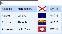
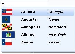
The suggestionbox component, as it is shown on the screenshot, could get any collection for an output and outputs it in a ToolTip window the same as a custom dataTable (in several columns)
...

<rich:suggestionbox for="test" suggestionAction="#{bean.autocomplete}" var="cit" fetchValue="#{cit.text}">

        <h:column>

                <h:outputText value="#{cit.label}"/>

        </h:column>

        <h:column>

                <h:outputText value="#{cit.text}"/>

        </h:column>

</rich:suggestionbox>

...
It looks on a page in the following way:
When some string is chosen input receives the corresponding value from the
second column containing #{cit.text}
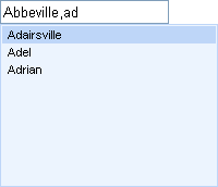
There is also one more important attribute named "tokens" that specifies separators after which a set of some characters sequence is defined as a new prefix beginning from this separator and not from the string beginning.
Example:
...

<rich:suggestionbox for="test" suggestionAction="#{bean.autocomplete}" var="cit" selfRendered="true" tokens=",">

        <h:column>

                <h:outputText value="#{cit.text}"/>

        </h:column>

</rich:suggestionbox>

...
This example shows that when a city is chosen and a comma and first letter character are input, Ajax request is called again, but it submits a value starting from the last token:
For a multiple definition use either ",.; "
syntax as a value for tokens or link a parameter to some bean property
transmitting separators collection.
The component also encompasses "style" attributes corresponding to dataTable ones for a table appearing in popup (for additional information, read JSF Reference) and custom attribute managing Ajax requests sending (for additional information, see Ajax4JSF Project).
In addition to these attributes common for Ajax action components and limiting requests quantity and frequency, suggestionbox has one more its own attribute limiting requests (the "minChars" attribute). The attribute defines characters quantity inputted into a field after which Ajax requests are called to perform suggestion.
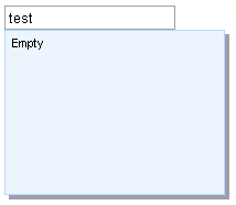
There is possibility to define what be shown if the autocomplete returns empty list. Attribute "nothingLabel" or facet with the same name could be used for it.
Example:
...

<rich:suggestionbox nothingLabel="Empty" for="test" suggestionAction="#{bean.autocomplete}" var="cit">

        <h:column>

                <h:outputText value="#{cit.text}"/>

        </h:column>

</rich:suggestionbox>

...
Example:
...

<rich:suggestionbox for="test" suggestionAction="#{bean.autocomplete}" var="cit">

    <f:facet name="nothingLabel">

        <h:outputText value="Empty"/>

    </f:facet>

    <h:column>

        <h:outputText value="#{cit.text}"/>

    </h:column>

</rich:suggestionbox>

...
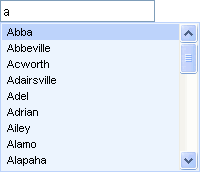
It looks on a page in the following way:
There is such feature in <rich:suggestionbox> component as object selection. If you want that selected item has been represented as object, you could set to "true" the value for "usingSuggestObjects" attribute, "false" value means that selected item represents as string.
Example:
...

<rich:suggestionbox for="test" suggestionAction="#{bean.autocomplete}" var="cit" usingSuggestObjects="true">

        <h:column>

                <h:outputText value="#{cit.text}"/>

        </h:column>

</rich:suggestionbox>

...
Information about the "process" attribute usage you can findin the "Decide what to process" guide section.
In RichFaces Wiki article about Additional Properties you can find example of getting additional properties.
Table 6.470. JavaScript API
| Function | Description |
|---|---|
| callSuggestion() | Calls the suggestion. If the "ignoreMinChars" value is "true" then the number of symbols to send a query is no longer actual for callSuggestion() |
| getSelectedItems() | Returns the array of objects |
Table 6.471. Facets
| Facet name | Description |
|---|---|
| nothingLabel | Redefines the content item if the autocomplete returns empty list. Related attribute is "nothingLabel" |
| popup | Redefines the content for the popup list of the suggestion |
| header | Defines the header content |
| footer | Defines the footer content |
For skinnability implementation, the components use a style class redefinition method. Default style classes are mapped on skin parameters.
There are two ways to redefine the appearance of all <rich:suggestionbox> components at once:
Redefine the corresponding skin parameters
Add to your style sheets style classes used by a <rich:suggestionbox> component
Table 6.472. General skin parameters redefinition for popup list
| Parameters for popup list | CSS properties |
|---|---|
| additionalBackgroundColor | background-color |
| panelBorderColor | border-color |
Table 6.473. Skin parameters redefinition for shadow element of the list
| Parameters for shadow element of the list | CSS properties |
|---|---|
| shadowBackgroundColor | background-color |
| shadowBackgroundColor | border-color |
| shadowOpacity | opacity |
Table 6.474. Skin parameters redefinition for popup table rows
| Parameters for popup table rows | CSS properties |
|---|---|
| generalSizeFont | font-size |
| generalTextColor | color |
| generalFamilyFont | font-family |
Table 6.475. Skin parameters redefinition for selected row
| Parameters for selected row | CSS properties |
|---|---|
| headerBackgroundColor | background-color |
| generalSizeFont | font-size |
| generalFamilyFont | font-family |
| headerTextColor | color |
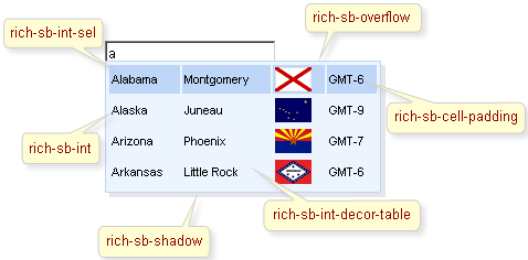
On the screenshot, there are classes names defining specified elements.
Table 6.476. Classes names that define a suggestionbox
| Class name | Description |
|---|---|
| rich-sb-common-container | Defines styles for a wrapper <div> element of a suggestion container |
| rich-sb-ext-decor-1 | Defines styles for the first wrapper <div> element of a suggestion box exterior |
| rich-sb-ext-decor-2 | Defines styles for the second wrapper <div> element of a suggestion box exterior |
| rich-sb-ext-decor-3 | Defines styles for the third wrapper <div> element of a suggestion box exterior |
| rich-sb-overflow | Defines styles for a wrapper <div> element |
| rich-sb-int-decor-table | Defines styles for a suggestion box table |
| rich-sb-int | Defines the styles for a suggestion box table rows (tr) |
| rich-sb-cell-padding | Defines the styles for suggestion box table cells (td) |
| rich-sb-int-sel | Defines styles for a selected row |
| rich-sb-shadow | Defines styles for a suggestion boxshadow |
In order to redefine styles for all <rich:suggestionbox> components on a page using CSS, it's enough to create classes with the same names (possible classes could be found in the tables above) and define necessary properties in them.
Example:
...

.rich-sb-int{

        font-weight:bold;

}

...
This is a result:
In the example the font weight for rows was changed.
Also it's possible to change styles of particular <rich:suggestionbox> component. In this case you should create own style classes and use them in corresponding <rich:suggestionbox> styleClass attributes. An example is placed below:
Example:
...

.myClass{

        background-color:#f0ddcd;

}

...
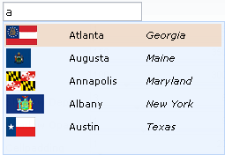
The "selectedClass" attribute for <rich:suggestionbox> is defined as it's shown in the example below:
Example:
<rich:suggestionbox ... selectedClass="myClass"/>
This is a result:
As it could be seen on the picture above,background color for selected item was changed.
Vizit SuggestionBox page at RichFaces Livedemo for examples of component usage and sources.
RichFaces cookbook at JBoss Portal includes some articles that cover different aspects of working with <rich:suggestionbox> :