Create new RichFaces Documentation Jira issue

This will launch the RichFaces Jira page - to complete your feedback please login if needed, and submit the Jira.
JBoss.orgCommunity Documentation
A horizontal bar with Action items on it that accepts any JSF components as children.
Skinnable menu panel and child items
Standard top menu bar that can be used in accordance with a menu component
Grouping bar content
Easily place content on any side of a menu bar using predefined group layout
Predefined separators for menu items and groups
Any content inside
Table 6.303. rich : toolBar attributes
| Attribute Name |
Description

|
|---|---|
| binding | JSF: The attribute takes a value-binding expression for a component property of a backing bean |
| contentClass | Assigns one or more space-separated CSS class names to the tool bar content |
| contentStyle | CSS style rules to be applied to the tool bar content |
| height | A height of a bar in pixels. If a height is not defined, a bar height depends of the "headerFontSize" skin parameter. |
| id | JSF: Every component may have a unique id that is automatically created if omitted |
| itemSeparator | A separator between items on a bar. Possible values are "none", "line", "square", "disc" and "grid". Default value is "none". |
| onclick | DHTML: The client-side script method to be called when the element is clicked |
| ondblclick | DHTML: The client-side script method to be called when the element is double-clicked |
| onitemclick | The client-side script method to be called when an item is clicked |
| onitemdblclick | The client-side script method to be called when an item is double-clicked |
| onitemkeydown | The client-side script method to be called when a key is pressed down over an item |
| onitemkeypress | The client-side script method to be called when a key is pressed and released over an item |
| onitemkeyup | The client-side script method to be called when a key is released over an item |
| onitemmousedown | The client-side script method to be called when a mouse button is pressed down over an item |
| onitemmousemove | The client-side script method to be called when a pointer is moved within an item |
| onitemmouseout | The client-side script method to be called when a pointer is moved away from an item |
| onitemmouseover | The client-side script method to be called when a pointer is moved onto an item |
| onitemmouseup | The client-side script method to be called when a mouse button is released over an item |
| onkeydown | DHTML: The client-side script method to be called when a key is pressed down over the element |
| onkeypress | DHTML: The client-side script method to be called when a key is pressed over the element and released |
| onkeyup | DHTML: The client-side script method to be called when a key is released |
| onmousedown | DHTML: The client-side script method to be called when a mouse button is pressed down over the element |
| onmousemove | DHTML: The client-side script method to be called when a pointer is moved within the element |
| onmouseout | DHTML: The client-side script method to be called when a pointer is moved away from the element |
| onmouseover | DHTML: The client-side script method to be called when a pointer is moved onto the element |
| onmouseup | DHTML: The client-side script method to be called when a mouse button is released |
| rendered | JSF: If "false", this component is not rendered |
| separatorClass | Assigns one or more space-separated CSS class names to the tool bar separators |
| style | HTML: CSS style rules to be applied to the component |
| styleClass | JSF: Assigns one or more CSS class names to the component. Corresponds to the HTML "class" attribute. |
| width | HTML: A width of a bar that can be defined in pixels or as percentage. Default value is "100%". |
Table 6.304. Component identification parameters
| Name | Value |
|---|---|
| component-type | org.richfaces.ToolBar |
| component-class | org.richfaces.component.html.HtmlToolBar |
| component-family | org.richfaces.ToolBar |
| renderer-type | org.richfaces.ToolBarRenderer |
| tag-class | org.richfaces.taglib.ToolBarTag |
To create the simplest variant on a page use the following syntax:
Example:
...

<rich:toolBar>

        <!--Set of action or other JSF components-->

</rich:toolBar>

...
Example:
import org.richfaces.component.html.HtmlToolBar;

...

HtmlToolBar myToolBar = new HtmlToolBar();

...
A toolBar is a wrapper component that facilitates creation of menu and tool bars. All components defined inside are located on a stylized bar with possibility to group, arrange on the both bar sides, and place predefined separators between them.
Grouping and an input side definition is described for toolBarGroup that defines this functionality.
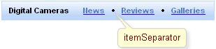
Separators are located between components with the help of the "itemSeparator" attribute with four predefined values:
"none"
"line"
"square"
"disc"
For example, when setting a separator of a disc type, the following result is produced:
Moreover, for toolBar style "width" and "height" attributes are placed above all.
A custom separator can be added with the help of "itemSeparator" facet.
Example:
...

<f:facet name="itemSeparator">

    <rich:separator width="2" height="14" />

</f:facet>

...
Custom separator can be also specified by URL to the separator image in the attribute "itemSeparator" of the <rich:toolBar> .
Example:
...

<rich:toolBar id="toolBar" width="#{bean.width}" height="#{bean.height}" itemSeparator="/images/separator_img.jpg"/>

...
This is a result:
As it could be seen in the picture above, the image for itemSeparator was changed.
Table 6.305. Facets
| Facet name | Description |
|---|---|
| itemSeparator | Defines the custom separator. Related attribute is "itemSeparator" |
For skinnability implementation, the components use a style class redefinition method. Default style classes are mapped on skin parameters.
There are two ways to redefine the appearance of all <rich:toolBar> components at once:
Redefine the corresponding skin parameters
Add to your style sheets style classes used by a <rich:toolBar> component
Table 6.306. Skin parameters redefinition for a component exterior
| Skin parameters | CSS properties |
|---|---|
| panelBorderColor | border-color |
| headerBackgroundColor | background-color |
Table 6.307. Skin parameters redefinition for a component item
| Skin parameters | CSS properties |
|---|---|
| headerSizeFont | font-size |
| headerTextColor | color |
| headerWeightFont | font-weight |
| headerFamilyFont | font-family |
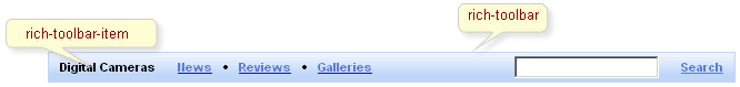
Table 6.308. Classes names that define a component appearance
| Class name | Description |
|---|---|
| rich-toolbar | Defines styles for a toolbar element |
| rich-toolbar-item | Defines styles for a toolbar item |
In order to redefine styles for all <rich:toolBar> components on a page using CSS, it's enough to create classes with the same names (possible classes could be found in the tables above) and define necessary properties in them.
Example:
...

.rich-toolbar-item{

    font-weight:bold;

}

...
This is a result:
In the example font weight for items was changed.
Also it's possible to change styles of particular <rich:toolBar> component. In this case you should create own style classes and use them in corresponding <rich:toolBar> styleClass attributes. An example is placed below:
Example:
...

.myClass{

    font-style:italic;

    font-weight:bold;

}

...
The "styleClass" attribute for <rich:toolBar> is defined as it's shown in the example below:
Example:
<rich:toolBar ... styleClass="myClass"/>
This is a result:
As it could be seen on the picture above,the font style and the font weight for items was changed.
The component also has the standard attributes "style" and "styleClass" that could redefine an appearance of a particular component variants.
On the component LiveDemo page you can see the example of <rich:toolBar> usage and sources for the given example.